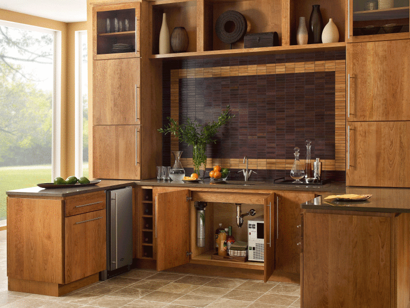
Slate Countertop Test!

There's always a good bit of conversation on the slate post that I did way back, and that's good, I'm glad people are digging through the archives. Lots of good stuff in the archives.

I thought it might be a good idea to redo my test, albeit in a very limited way, on the staining properties of slate, at least in regard to oil.

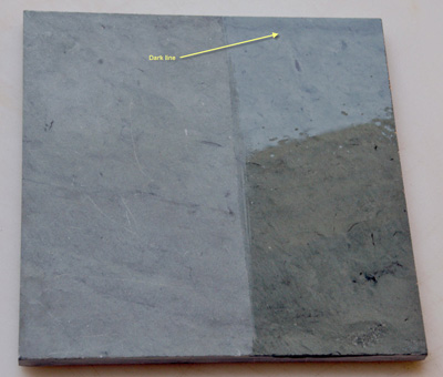
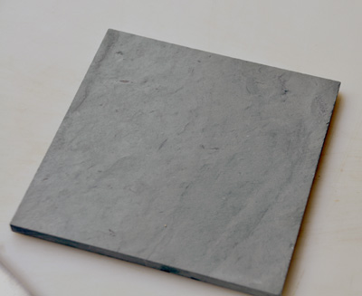
See for yourself what the result is. No staining! If you look closely at the first sample with the oil on it, you may see, on the unoiled part, a few white marks which are scratches. After I wiped off the oil on the sample with dishwashing soap and water on a sponge and brushed the slate using the opposite side of the sponge fairly roughly, "wah laaa" the white spots disappear! If they do not completely disappear, then it is my understanding (although I have not done it myself) that one can lightly sand any significant white scratches and they will disappear.

Yes, slate is strong, VERY strong (and very dense)! Take a look....the yellow text, which is too small, says "dark line" meaning to please try to find the dark line on the second image too so you can get it oriented. Sorry, when I tried to rotate one image or the other, it looked much more skewed and a bit more difficult to see, so you'll have to reorient yourself to find the similar graining of each sample so you can see where the oil was on the second sample. Still, do your own test, on any countertop surface.
Hot Countertops!

No, I don't mean stylish, I don't mean beautiful, I mean hot as in radon hot!

At this moment, The New York Times' article "What's Lurking In Your Countertop" is the Number One most popular article that is being emailed!

I'm no scientist or geologist, but, I'm paying attention and passing it along for you too. Oh, if you have to register for The Times, it's worth it. They do not do anything with your email address, so I'm told. Definitely register.

What you may want to do is contact a certified technician who will test your countertop here, or for $20-$30 you can pick up a radon testing kit at hardware stores.

What's Lurking In Your Countertop? 

When the French Country Kitchens Go Marching In...

I'm sitting here listening to WWOZ radio on the net as I often do, listening to a very modern version of "When the Saints Go Marching In" part rap, part gospel, part jazz, and of course, with that New Orleans influence everywhere. I know, you're saying "whaaaa?" but trust me, it's a good thing. Now, here comes another rendition after that one? Ok, I'll take it!

Oy vey, so how do I weave this into kitchens? There must be a way. Hmmmm....now I'm hearing "When the Saints win the Superbowl...." Ya gotta love NOLA!

NOLA! Yes, there is a huge, historical, French influence in NOLA, plus, I watched le Tour again this morning, from somewhere in France, so how about a few more Frenchy kitchens? I found them here, and many of them seem to be the Americanized version of French Country, but some are so good that I can't tell where they're from, so THAT'S interesting.

What a difference between kitchens from France and French "inspired" American kitchens. And, that's ok, say la vee, we're a melting pot after all over here, oui? Have fun!

Kitchen Open Shelves and More

Wow, you'd think I was on vacation or something! No, just occupied with a wide variety of things. Potential posts go in and out of my head, topics, images, and then time goes by. But, before any MORE time goes by, I want to do some show and tell. I hope you're all enjoying the summer. Please say hi! And, yes, I'm still watching le Tour every day! Everyone is skinny over there, they all need to eat a little something.

 THIS image propelled me into action right now. Come on, how absolutely "feel good" is this image? I found it at the kitchn, always good for wonderfully random good stuff. Really, the kitchn is so much more than recipes, it's very well rounded. Come to think of it, I've been meaning to add some food related info to the blog, after all, without food, what's a kitchen??


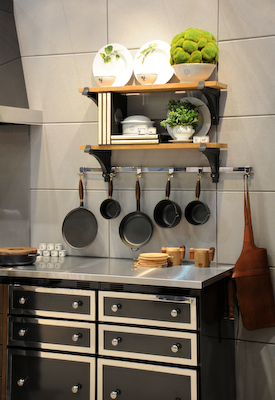
And, THESE IMAGES by Habitually Chic, are really fantastic. Showing open shelving in a kitchen, I love how it has caused such a great discussion. It seems one either loves them or could NEVER live with them. I've done posts on open shelves and have lived with open shelves. I love them, they work for me!


French Country Kitchens - Tour de France Inspiration!

As you may remember if you've been a reader for some time, I LOVE the Tour de France!

I never paid much attention to the Tour until our son took up cycling in a very serious way, with dreams of riding in le Tour himself one day. That particular dream has been replaced now, but it was very much alive for a few years. And so it goes.

But, watching the Tour is now a fixture in our home. It's a beautiful sport, one of the most beautiful, I think. Combined with the incredible scenery, the colorful jerseys, the huge pieces of artwork in the farm fields as tributes to the tour, and the magnificent look of the peloton, not to mention the aerial views, I recommend it highly. it's on the channel Versus for the next 3 weeks until the triumphant entrance into Paris.

SO, in the spirit of the Tour and the beautiful tour of the French countryside, let's look at some kitchens. I think we can learn many things from looking at authentic French kitchens.

We get out of our comfort zone

We see new ways of looking at color and texture

We see new ways at looking at form and function

At other times during the Tour, I'll add more images of French kitchens, both modern, farm country kitchens, and formal, elegant kitchens as well.

And, tell me what your likes, dislikes, opinions on these kitchens. Have fun!! Want to rent a French chateau? Images are from Just France.

Kitchen Design - Less Is More

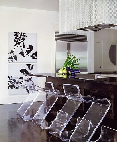
I came across this picture of a kitchen, again, in Veranda magazine, designed by Benjamin Noriega-Ortiz. I immediately liked it.

This kitchen goes more under the heading of "highly stylized" rather than "highly personal". More "showcase", less "high end catalog". And, that said, it's a viable look. Glam meets function meets texture. There was no other image of the working part of the kitchen.

I like the variety of elements, but what I like more is the strength, yet, restraint. I need to continue to explain to my clients that less is more. Fewer, larger, shapes and forms will enlarge a space as opposed to many, smaller, pieces, door sizes, accessories, etc. This is not a good vs. bad evaluation, simply an observation and another way to design a kitchen. The look is simple and elegant, so that the individual pieces say something meaningful yet are linked together in other ways, perhaps in color or tone, if not style

Here, my eye sees a variety of styles:

utility (stainless refrigerator)

rustic (dark wood island)

glamour (beaded hood)

something hip/fun (plexiglass chairs)

elegance/sophistication yet modern (prints on wall)

modern/sleek yet textural (floor)

contrast (floor and walls)

There are common threads among these elements which tie one disparate piece to another and it's fun looking for them.  I'm actually pretty crazy about this kitchen, although I'd probably want to change the prints to something A BIT more personal...give me that. But those chairs...what a WOW!

One question that comes to mind is, what came first, or simultaneously? Was the flooring color picked first, knowing that those chairs would be used, which relate to the walls in terms of tone? Was the big picture seen from the start, or were pieces brought in, to build on the previous concept. How were the layers developed? It appears to me that there was a desire to have a strong foundation first and foremost, as seen in the flooring and the island being similar tones. Other than that, it's hard to guess.

What do you think??

Kitchen Flooring II - Still Light Colored

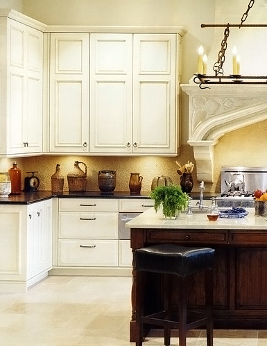
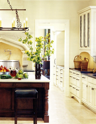
I've been meaning to show you this picture of another light floor. I simply love the feel of the light floor and the light cabinetry.

I like the horizontal dark element of the counters and I like the "important" or strong, feeling of the island in wood. 

The island, to my eye, does not overpower the other light colored elements. The reason it looks balanced to me is that there is so much MORE light colored elements in the room, balanced with just a few areas of the dark color. In other words, it makes sense proportionately in regard to color and tone balance. 

I also think this image goes a long way toward being serene, don't you? It has great interest, yet it is easy on the eyes and looks very spacious. The light floor, walls, and cabinetry, and understated backsplash, go a long way to achieve this quiet elegance. 

The floor...I think this type of floor, being quite textured, is fine in terms of being "busy enough" so you don't see every crumb immediately (unless you bake a lot of brownies.) The recent popularity of super dark wood floors is no better for spots, dings, dust, and so on. The best floor is a medium tone. But, to me, something REALLY speaks to me about a light floor. And, yes, for me, it would have to be textured. I'll have one, one day, in some form. This floor is limestone by Walker Zanger. Yes, limestone needs sealing and nervous care. I'm usually a conservative type, so I do not recommend it.

As seen in the June issue of Veranda.

What do you think of this combination of tones?


Over The Range Microwave - My Love/Hate Relationship

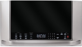
ge%20mw.jpgIt's funny...I looked through my project images, and I think I knew right away that I didn't have an image of a project I'd designed with an over-the-range microwave. I may have used this type of microwave a handful of times, possibly many, in builder projects I've done, but, I've always had a huge bias against them...and I bought one yesterday!

Let me just make it simple and do a pros and cons evaluation:

PROS

1. A space saving appliance. For an apartment-sized kitchen, it's no less than a God-send.

(I honestly cannot think of another "pro" to the over-the-range microwave...geez.)

CONS

1. It is typically situated at an uncomfortable height. If one is short in height, or a child, it can be difficult to reach in and out.

2. Along with #1, of course, comes the possibility of danger, first, if the container becomes hot, and one is taking it out at this uncomfortable height, but also, if there are items cooking on the stove and one reaches for the microwave. Take care!

3. If the microwave cannot be ducted out, the fan is nearly useless, as it becomes a recirculating fan.

4. Most microwaves are approximately 12" deep, which only cover the rear two burners if the ducted fan is turned on.

5.  The typical 300 cfm fan capacity is a poor performer in terms of ventilating power.

6. Due to the height of the microwave, very tall pots pose a problem in cooking comfortably, including being able to see the contents of the pot.


I mentioned the reasons that I bought one of these in this post. It's definitely a love/hate thing, I'm sure, for many of us.  Image is from GE, which has a whole lot of choices in microwaves. Kelli, in a comment from the original post mentioned, asked, "What's the alternative?"

ALTERNATIVES

1. Do you REALLY use a microwave, do you really need one? A good question to ask, in general. 

2. Can you find any other space to build in a microwave? If built in, remember, you must have a trim kit for proper ventilation around the appliance.

3. Can you simply place the microwave (perhaps a small one) on the countertop?

4. Check out GE's Trivection range...not a microwave, but a speedy oven, with microwave technology inside.

5. Perhaps a microwave drawer?

6. Are you rich? Buy a TurboChef.


Much of this discussion depends on if the kitchen is being designed from scratch, or, simply, as in my case, a space is open, and now that space will be filled again with this type of microwave. I can deal with this solution for now.


Microwave Must See

Have you seen this LG microwave, below? It came out last year. I did not cover it in this blog, and I rarely have a need for over-the-range microwaves in my design practice, until now, for myself!

LG.jpgYou may have read about my apartment kitchen remodel.  Well, to get you up to speed, quickly, while some improvements continue to be done, we're putting the bulk of the renovation on hold for now. The basic issue is that we are undecided on what should drive certain important decisions...resale or personal wants and needs. Plus, since our son will be staying there for at least a couple of more years while in college, there is not an urgency to do the renovation.

SO...in the course of having to remove the existing over-the-range microwave this weekend, due to its extreme venting inefficiency and age, we stopped at Best Buy to pick up another one, a 400cfm model by Samsung, since we were told by our super we could duct it through the existing path in the ceiling. We found most new models were 300 cfms.

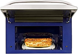
lg-over-the-range-microwave-oven-interior.jpgBUT, while in Best Buy, all of a sudden, we saw this LG microwave and immediately had a WOW reaction. It's very sexy, it's a few inches deeper than normal, it's taller, which we needed, and best of all, it has a 470 cfm fan, which was very impressive. Our son and his girlfriend cook up a STORM  in our NYC apartment, nearly every night, and the gunk of small airborne particles that settle all over the apartment is not a pretty sight. So, THIS appliance seems to fit what we need for now.

As I've said before, I'm not a fan of the over-the-range microwave in general, for several reasons, but, in this case, the spot is open for it, so we'll fill it. This is the most powerful over-the-range microwave cfm rating I know of, which leads to healthier living in an open kitchen!

I LOVE the lift up door, the cfm capacity, the depth to better cover the burners, and the very cool look!


Viking Range Color - What To Do?

Here's a question from Maryann:

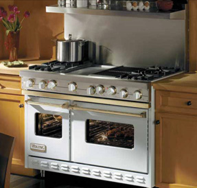
viking.jpg"We are remodeling our kitchen.  The look we're going for is whitewashed custom cabinets with chocolate glaze and a large black  island.  We planned on stainless steel appliances - 42" fridge and 48" viking range.  We were considering the 48" white viking range - would that color work in this kitchen or would a white range be better suited in another style kitchen?"

Maryann


Maryann, right off the bat, it sounds to me like you will be dealing with two different whites...a bright white (if that is what you are referring to) for the Viking, and a glazed white cabinet color, which will be somewhere in the ivory/cream family.

I'd be very careful when mixing whites. Some whites have a pink cast, some a green, some, a yellow, for example. It is critical that you see the actual Viking color samples alongside of your cabinet color, preferrably in your own home during different times of the day and lighting conditions. Pay attention to the tones.

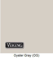
oyster%20gray.jpgI'll tell you what you may consider. Check out the Oyster Gray. I've used it before. It's deep enough to be enough of a contrast with your cabinets, but only you will be able to tell if the tones work well or not. It's a great neutral shade.

I will also tell you that a lesser used, but beautiful combination IS using white and cream colors together. You may want to carefully think through using white and cream elsewhere in the room as well so that it is viewed as a theme of sorts, rather than one item white and one item cream. Done well, I actually really love this look.


I hope this was helpful!

I'm (Kitchen) Floored!! (Again!)

Had you there for a minute!

I've talked lots about the lightness in Scandinavian kitchens. Light tones are seen in many kitchen materials such as walls, cabinets, countertops, backsplashes and so on. But, I think what is, really, a very cool look, and one that is very UNcommon here in the U.S. are super light floors as are often seen in Scandinavian kitchens. There is SOMETHING about a light floor, and I'm not even sure I can express what it is, but I'll try.

I think light toned floors contribute a number of interesting attributes to a kitchen design:

  • The space appears larger than it really is.
  • If the walls are light as well as the floors, the space seems to float, almost suspended, and there is a flow to the space that, in all light tones, almost defies description.
  • If the large elements such as cabinetry, are dark, the expected contrast is reversed and is a very cool look.
  • The space looks clean! One may want to choose an imperfect light floor, so the inevitable nicks and spots are not so offensive.
  • In my opinion, it is, at once, modern and elegant.
  • The light reflecting work of a light floor contributes to well being, especially in the winter months 
  • A light floor helps reduce the need for artificial lighting, a good green solution.

What do you think of light floors? Me, I'm crazy about them! If I didn't have red oak in my kitchen/family room area, I'd definitely bleach it, but it comes up pink. MAYBE, I'll paint them. Here you go, what do you think of light flooring?

I'm back

The days just go! I'm not quite sure where they go, but I know they pass by so fast. I've been wall-to-wall busy, first and foremost with my clients.

I may have said it before...it's the perfect storm, something I could not have predicted. Projects, highly detailed, large, all needing to be ordered at once, all having come on board at different times, nearly all which should have been finished a long time ago, at different times from one another, except for architectural or construction delays. Or both. I swear, every project gets a life of its own! Will my clients be patient with me as I have been with them? I think they will.

I'm in the middle of all the detail right now. But, here's my philosophy. The day before Thanksgiving, I sometimes don't go food shopping till 3 pm or so (now THAT'S professional procrastination, although procrastination is not the issue), AND, I make everything from scratch, and I'm not kidding. When I come home and start preparing the food, I think, I'm not sure HOW a fabulous dinner will be on the table the next day, sometimes for 20+ people...but I know it will be. And, so, these projects will all turn out as they always do - correct.

In between, our garden of somewhere close to 200 roses is just beginning to bloom with a few blooms here and there. The garden has been a source of real excitement in recent weeks..real anticipation. I planned my kitchen mostly around the garden some years back, adding 20' of windows to have a panoramic view of all that happens beyond the house, which changes by the hour. The view from the kitchen window is always, always, an important consideration in the planning stages.

More stuff soon...green topics, Scandinavian kitchens, new products, and just the random things that come up. Good to be back with you!

Beautiful Kitchen - Remodel Magazine

I received a copy of Remodel magazine in the mail today, a Better Homes & Gardens Special Interest Publication. I'm definitely psychic, that's a fact, but I never know why I'm getting these thoughts! It's been forever since this project of mine was shot by BH&G. A long time has passed. The funny thing is, they were in such a rush to shoot it. Maybe they shot it a year and a half ago? Anyway, what do you know, just yesterday I wondered, where is this feature?? It was already in the mail to me, and it had been months and months since I last thought of it.

This was a crazy project. The problems just kept coming, one after another. It's a very old house and the house just did what it wanted to do, end of story. So, I was left to figure out the ceiling due to various beams not willing to move, but they had to relate to the different kitchen sections. It worked out very well, I think, although you can't appreciate it very much in the shots.

I think it's simple, yet elegant. Gena was so much fun to work with. I don't think she says more than a few words without laughing or smiling. That made everything very enjoyable. We had a few tense times, as can happen, but it all came together beautifully in the end. Take a look...

KBIS Kitchen Trends 2008

Kbis%20Kitchens-14.jpgOh, it occurred to me that I took images of all these kitchens at KBIS to show you! I think you will see a good deal of modern design as well as dark, rich, browns. You'll also see a common thread of lights, such as creams, and browns, combined. I thought that was interesting. I did not see the same amount of black cabinetry that I did last year, although it is still seen.

I was able to get some very good shots without people in them, and, short of a few shots that are, well, cockeyed, my new camera did an excellent job! The Idea Center kitchens by Meredith, will be up soon. Enjoy it! And, Happy Mother's Day!

KBIS Kitchen Slideshow

Kitchen Miscellanea

You know, it's funny. All of a sudden, I discovered a pattern in my thinking. Day after day, in the midst of a very busy period for me, I'm thinking, hmmmmm, maybe I should just show you some gorgeous Scandinavian kitchens from my recent magazines. No, not that, I'll blog about this problem I'm having on a job. No, I'll blog about new products, or this or that, or whatever, and each time, it causes me to delay a little longer. I seem to be experiencing a "no, not that" sort of feeling. I think I have so much I want to say and not enough time to say it all!

So, let me refocus!

One thing I know I've really wanted to do is to take you to some favorite blogs.

Design Hole: Take a look at Jennifer's recent trip to Milan, to Salone del Mobile, where she took a very active interest in all things kitchen related. Talk about innovation...

Dwell's Kitchen Blog: I like Dwell's Kitchen Blog. It's quirky, definitely quirky, and broad in its pick of things, trends, and other good stuff (that's being pretty specific) to talk about. Always something new to learn.

Pardon Our Dust: I really, really want you to check out this blog, written by Kathy Price-Robinson. Kathy has written about remodeling for, I don't know how many years, but I know it's a long time. Kathy is smart and provocative and very green minded. Lots of kitchen related posts. I think Kathy loves kitchens.

The Kitchn: I've been meaning to bring this to you for ages. I actually signed up for the Kitchen Cure. The goal of the Cure was to get one's kitchen in shape via organization, new ideas, enabling the kitchen to be used more enjoyable and more efficiently. Unfortunately, I just did not find the time to commit to doing it, but, I really wanted to. See how the Cure progressed.

Kitchen Design Notes: I like my colleague Laurie's take on blue being the new black, and all those gorgeous images included. Laurie knows her stuff!

Surroundings: What Inspires You? Let it all out and enter the contest at the same time!

Enjoy!


Electrolux is Cooking Up Some Philanthropy

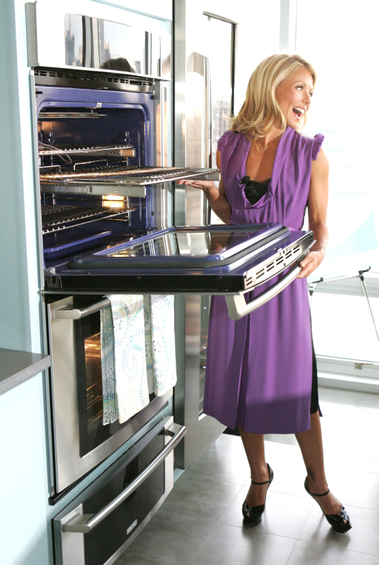
Have you seen those new commercials with the young and beautiful Kelly Ripa buzzing around her kitchen, appeasing wee ones and preparing for adult guests while cooking on a new state-of-the-art-stove? Ripa is the mother of three small children, the Star of Regis and Kelly and a Soap Opera diva. The commercials showcase a glam kitchen with a glam star. However, despite the fact that most women don’t whiz around the kitchen in pumps and full make-up, the commercials resonate with most multi-tasking moms (OK that’s a major oxymoron).

a.jpg

The kitchen is central to all homes and good appliances make the job easier and more enjoyable. Electrolux is showcasing the popular star for the launch of their new North American premium kitchen appliance line showcasing appliances with European flair.

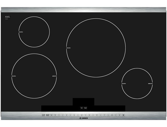
Ripa is shown cooking on a chic cook top that boils water in 90 seconds! Electrolux offers an energy efficient Induction Hybrid cook top in both 30 and 36 inch models. Induction heating is new and faster, more energy efficient and promises easier clean-up.

In addition to their new high-tech line, Electrolux is joining Ripa in supporting the Ovarian Cancer Research Fund. “Thousands of women and their families are affected each year. That’s why I am so grateful to Electrolux for stepping up and helping me to raise money and awareness to help support this important cause,” said Ripa. Together, America’s sweetheart and Electrolux are cooking up some philanthropy and that’s always delicious!.......Maureentheassistant

cooktop.jpg


Another Kitchen Weekend For Me

And, so this is another weekend of total kitchen immersion for me...lots of work to do!!! And, here I sit, with the music cranked WAY up. For a moment, there, we almost got crazy and booked a flight to the jazzfest, but can you imagine, coming back on Monday, leaving at 11 am (the only flight) and arriving at jfk (an hour from home) after 6 pm for a typical 3 hour flight, if that? Not even I am that crazy!

But, turn it on and crank it up, that's what I recommend...

JAZZFEST LIVE THIS WEEKEND ON WWOZ

Oh, and if the music cuts in and out...that's sort of how it goes down there, stuff happens, you get what you get (hmmm, sort of like kitchens!) No, I'm kidding, really, no one get nervous now!  I'm loving this music, enjoy your weekend!

The song now is something about needing eyes behind your head. :)

Quartz Made in USA Gets A+

Quartz Produced in the USA Gets A+

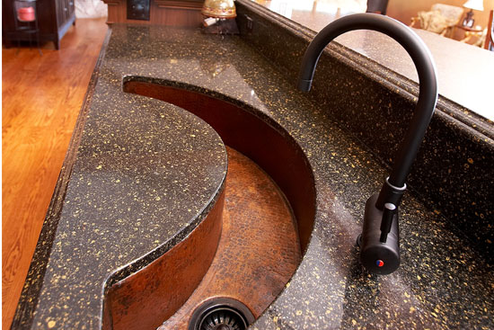
cambria%20quartz.jpgCambria produces the only quartz countertop made in the USA and lives up to their mantra: Live Green, Live Life, Live Cambria. American made quartz equals less of a carbon footprint with regard to transporting the product. “At Cambria, we are committed to environmental responsibility in both our product offerings and businesses practices,” says a Cambria spokesman.

They’re not kidding.

Their quartz is nonporous which means harsh chemicals are not necessary to seal or polish the surface. Cambria is certified GREENGUARD for children and Schools certified. GREENGUARD is a nonprofit organication that oversees acceptable indoor air standards for indoor products. In addition to their product being green, they run a very green office and plant. One hundred percent of the water used in the production process is recycled! Their fleet of vehicles is hybrid, their shipping crates are recycled and scrap material is collected and used as road base for local construction projects. I'm impressed!

In addition there is an on-site drainer pond that they use to water and beautify the plant grounds. All office waste is recycled including computers and batteries. Quartz is a popular choice for kitchen countertops because it is maintenance free and stain resistant - that means no wine stains or grape juice stains.  It's even impervious to coffee and nail polish!   In addition, as the strongest natural stone found on the Earth's surface, it is durable. Cambria gets an A+ for being kitchen friendly and for it's impressive green efforts!

Best, Maureen (Susan's assistant)

 cambria%20sink.jpg


Water Filtration - Move Away From the Bottle

Helia-Bar.gif

Here is a post from my assistant, Maureen, who is a strong advocate for green living. We'll be hearing from Maureen from time to time. Give her a little welcome too! Good work Maureen!

Thirty-Eight years after the inception of Earth Day, it has gone mainstream with events in countries all over the globe. Flooding the Blogosphere, networks and print media, Green has gone global, political and earned a former Vice President a Nobel Peace Price. It also made a strong presence at this year’s KBIS where Green was a hot theme as social consciousness entered the Kitchen Design world in a multitude of ways.

Intrinsically, we all want to lessen our environmental footprint – how does a mere mortal go about doing such (especially a SUV driving suburban mom)? Although not a terribly glam topic –we can begin our personal green campaigns in a very tangible and quantitative way. We can move away from the bottle!

An Inconvenient Truth

  • Americans used 50 billions plastic water bottles last year – 40 billion of them ended up in landfills.
  • To distribute the bottled water that’s hauled to and fro within the U.S. each week required the equivalent of 37,800 18 wheel trucks.
  • Worldwide, 2.7 million tons of plastic are used each year to make water bottles, and in the United States, less than 20% of these are recycled.
  • Americans throw away 22 billion water bottles each year, over 60 million a day.
  • The 29 billion plastic bottles manufactured in the United States each year require the equivalent of more than 17 million barrels of crude oil.
  • In 2006, American spent nearly $11 billion on over 8 billion gallons of bottled water.

Ouch! - from an environmental and financial standpoint. Plastic bottles are made from fossil fuels; fossil fuels are used to bottle the water, deliver the water to the stores, used to get consumers to the stores to buy the water and also used to get the garbage trucks to the homes to pick up the bottles. If the bottled are recycled, then you got it, more fossil fuels! Ok I am officially riddled with guilt about the countless bottles of water served to dinner guests, tucked into lunch boxes (OK bags that I didn't recycle) and taken to countless sporting events (yes in the SUV). In addition to the environmental impact, the cost is something to be considered in this teetering economy that’s gasping for air.

Helia-Faucet---Cold.gifTaking Back The Tap

Victoria Kaplan is the senior organizer with Food and Water Watch – a nonprofit that recent launched a Take Back the Tap campaign to get consumers to ditch bottled water. “The bottled water industry spends millions of dollars a year to convince us that their product is somehow safer or healthier than tap water, when in fact that is just not true,|” says Kaplan. Did you know that bottled water is subject to less-stringent government standards for quality than tap water? That’s not marketing hype, according to National Geographic Green Guide, as much as 40 percent of bottled water started out as the same tap water that we get at home. Americans are beginning to get the message that bottled water is expensive (more expensive per gallon than gasoline), not necessary safer than the H20 that flows from the tap water and burdened with incalculable environmental problems.

Everpure showcased at this year’s KBIS where they offered a powerful visual presentation of the environmental impact of bottled water. Although in the business of filtering water for restaurants for over 75 years, they now tout several products for the home. The H-300 Water Filtration System employs Everpure’s Micro-Pure® filtration removing impurities and providing what they say is the best tasting water available.

Although secondary to health issues, taste is critical when it comes to cooking and creating sauces, breads, pastries and making stocks and even cocktails.  Home filtration units are a great step forward for both concerting cooks and envrionmentals alike.  If you move away from the bottle, the results will be palpable. 

The Everpure Exubera System dispenses chilled still or sparkling water right from the tap.

For more information about water and reusable bottles and canteens:

www.allaboutwater.org

www.kleankanteen.com

www.mysigg.com