A White Kitchen - Tricia's Interesting Design Choice

I'm pleased to show you a blogging buddy's kitchen. The kitchen is Tricia's from Avolli, the online store for Swedish antique furniture. Gorgeous stuff, all different price points, and some of my favorite things are the antique rag rugs. Just love them!
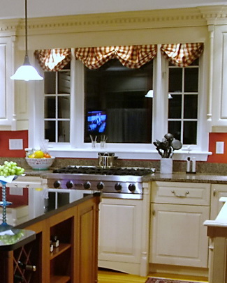
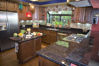
Tricia's kitchen is very lovely, but there is one feature that immediately jumped out at me...a feature that I have never designed into a kitchen, which is a big reason why I find her kitchen so compellingly interesting (besides the red, which I love!) I immediately questioned Tricia on it first thing. Questions surrounding any angle I could think of.  To my surprise, my questions were met with a "huh, should there be an issue here?"

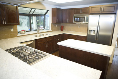
OK, what's the issue? Tricia has her cooktop situated in front of her window.

I know it sounds as if I next expected to tell a story of the kitchen police visiting Tricia's home, but trust me when I say, this is a highly unusual location for a cooktop, let alone a range top.

Tricia reports (after my countless crack designer questions) that there is zero issue with cooking fumes, grease and moisture landing on her windows, woodwork or curtains above, zero. Tricia has a downdraft ventilation system behind the cooktop. I asked Tricia repeated questions all around this issue, and of course, I believe what she reports. Maybe it's a testament to the efficiency of the Viking downdraft.

Here's more on Tricia's kitchen, a Q&A:


What were your original goals? What was most important to you?

When we purchased this house in 1998, the original kitchen had builder made cabinets, which in our case were poorly constructed and designed.  There were no tracks on the drawers, there was dead space in the design, the appliances were outdated, and overall it was unappealing to us.  We wanted a brand new kitchen with top of the line appliances and beautiful details in the overall design but within the existing floor plan.
Were your goals achieved?

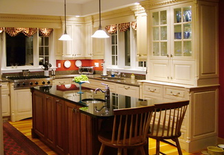
In my opinion we did achieve a beautiful kitchen with wonderful details.  The door panels on the cabinet ends, the dentil moldings, columns and plinths that flank the cabinet ends, the built-in hutch with internal lights all contribute to what I find to be quality and beauty.

Tell me about the window behind the cooktop. Did anyone try to talk you out of it? Were you nervous about it?
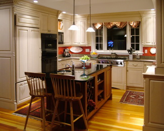
The windows are part of the original floor plan.  We could not remove them, or change the kitchen footprint, without making major changes to the rest of the house.  I was not nervous about having the cook top there because that is where the original cook top was so it seemed ok to me.  Honestly it never occurred to me to not have it there.  I enjoy being able to look out the window when I cook.

Did you work with a kitchen designer or cabinet maker or what? What was that experience like?

I did work with a kitchen designer and remember it as a good experience.  I had strong ideas and opinions and was highly detail oriented in the process.  It is my understanding that the installer took some issues with the designer though.  Something about designing a kitchen that was nearly impossible to install??? I don’t remember the issues clearly but do remember him grumbling throughout the installation.

What did you want in your appliances? What was important to you?
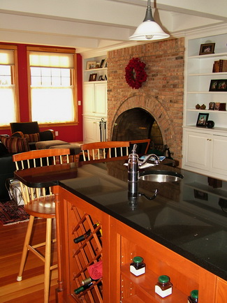
We definitely wanted high end appliances and felt strongly about an integrated Sub-Zero and dishwasher, double wall ovens and the six burner Viking cook top.  I wanted the double wall ovens because I have a bad back and bending down to put things in or take things out of a traditionally designed oven would not work well for me. We have loved having two ovens and not having to struggle or juggle when planning big meals or for holidays.  My husband wanted the large, single bowl sink for washing big pots, etc. We both wanted the island prep sink which had become quite popular at that time.

Do you cook much? Do you like to cook?
The first part of my marriage I absolutely loved to cook and would read cookbooks in bed at night.  It was fun to created elaborate home made meals to dazzle our guests…and I did all that on an old and outdated kitchen.  By the time we bought this house and renovated this kitchen my children were in 2nd grade and pre-school and were very picky eaters.  This became disheartening to me because I would create a wonderful meal and they wouldn’t eat it.  As time when by their willingness to try new things did change and I was cooking less and less and resorting to the easy meals that I knew they would eat.  Now that I have one off to college I am starting to rediscover cooking, to my husband's delight, and look forward to the weekends when I can devote an afternoon to creating something special.  

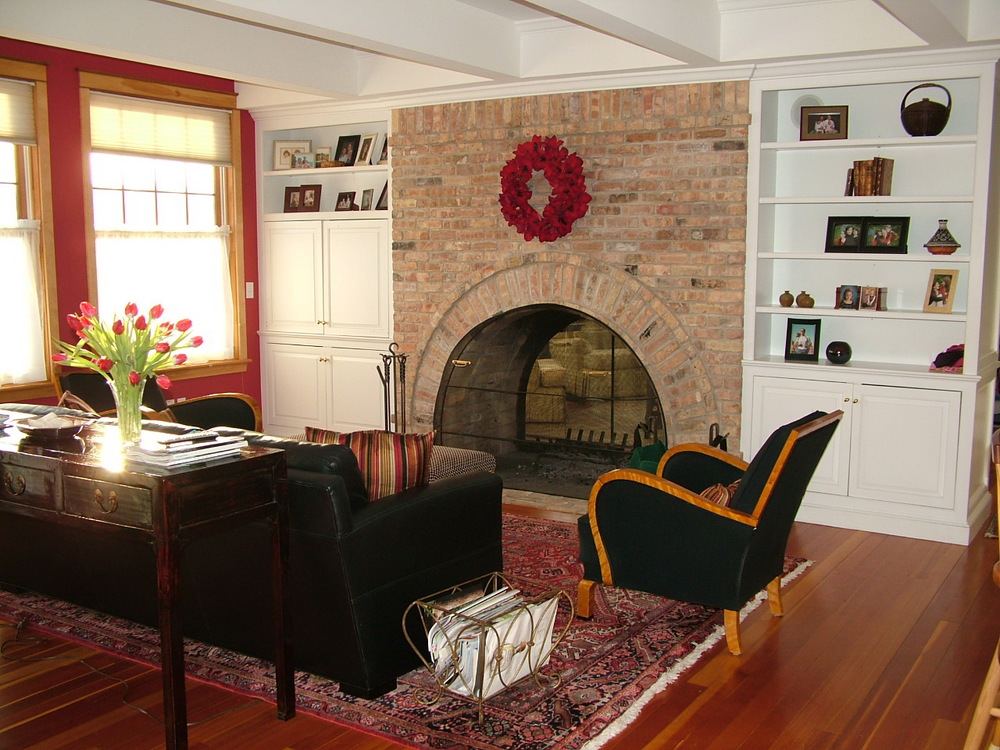
I think it's a very nice renovation, and I love the family room too. Thanks, Tricia, for sharing your kitchen with me! I'm secretly jealous of your cooktop under the window! 

GE Monogram Appliance Adventure

I had an eventful past couple of days, being immersed in GE Monogram appliances via invitation to GE Monogram's headquarters in Louisville, Kentucky. 

Louisville (Loo-uh-vuhl or Loo-ee-vuhl or Loo-ee-vill) is a great place to visit! Home of the Louisville Slugger, really great old architecture, a mix of old/new food, arts, architecture, nestled alongside the Ohio River, if it had to be renamed, I'd rename it Pleasantville (or vuhl). I just love going to places I have not been to before. This is one sweet city, emphasis on sweet, as in charm.
The hotel we all stayed at was, simply, fantastic. The second day of training actually started at the Kentucky Museum of Art and Craft. I had a few burning questions...do they have a gift shop, do they take Amex and do they ship? $400 later, the answers are yes.  I love handmade crafts, and the prices at the gift shop were very good (shhh!)

The group was a mix of professional kitchen designers and a few remodelers and design professionals from architectural firms. Sure, it's immersion in a brand for nearly 2 days (3 full, including travel) and that's a good thing. I'm not a kool-aid drinker, although I do look for positive information and try to listen to my inner voice if details/issues crop up that I'm not in tune with. I can report that the product details that I learned about felt overall, solid to me. They will hear from me on one issue in particular that did not sit well with me, but no one is perfect.

I'm impressed, most of all, with GE Monogram's pro range. I've never been, believe it or not, a super fan of pro ranges of any ilk. The logical thought process about my view (one would THINK) might be that I pooh pooh them as being status symbols, which I'm sure they may be to some. However, my concerns have always been rooted toward the concern for those who are immediately seduced by several features...their size, power, brand name, not to mention being influenced by the sex appeal of the ads. In other words, I think a large number of homeowners just lose all logic when they see these cooking monsters in an appliance showroom. I've always thought that. Does the kitchen design follow the appliance package or vice versa? See what I mean?

Am I a total buzzkill?? 

So, my advice is to think of the feeling you want your kitchen to convey as you begin to design it, even before that process begins. A pro range, its large volume, has everything to do with the design message that your kitchen will send to those who enter it, in a positive or negative way, depending on what your vision is...if you are truly connected to it. But, that's also a bigger discussion for another day. 

Let's assume you're on track, after careful consideration, to purchase a pro range. The GE Monogram pro range has been recently completely redesigned...from scratch...and was introduced just last year. 

The design and the features are impressive, beginning with the installation...having four wheels and a power cord, it's an easy installation. And, if you care for your floors, you should care about these 4 wheels and an easy installation!

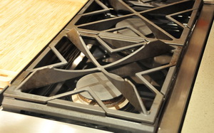
Here's a rundown of some cool features: Do you have a need for power? Maybe 72,000 btus over 4 burners should do it. Covers for the grill and griddle are included, full extension pull out racks, burner grates that turn upside down to accommodate a wok (see image), the grill grate that has a groove in it on one side to drain fat and a flat surface on the other side for fish/veggies, and a griddle that's adjustable in height are good places to start. 

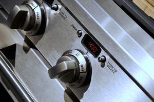
I love the grain on the stainless steel. It's very consistent in color and finish all around the range. The knobs are a nice, modern design and color. The range is beveled on the corners, which makes for another nice installation detail and each knob has an indicator light. 

Another great product, which you can see in the cooking image (that's our group cooking-we were slaves and cooked 3 meals throughout this training...from scratch) is the induction cooktop. GE Monogram has one of the most powerful induction cooktops around. I cannot expand on this too much at this moment, but two things come to mind...power and instant response...ok, three, incredibly easy clean-up. 

Gotta run...the GE Experience Center, as it's called was a good experience. Did you know GE has their own zip code? Yeesh! GE people, feel free to answer comments and questions. 

HGTV Design Star Kitchen Revisited


The kitchen episode of the 2009 HGTV Design Star was so revealing and the design work so yeesh(!) (I take NO pleasure in this criticism) that I could not let it go after my previous post on this episode. A busy summer allowed my angst to go on hold for awhile, but tonight's Design Star finale put the pressure on me to share more insight on kitchen design issues from that episode!

My good friend and colleague, Kelly Morisseau of Kitchen_Sync and I have teamed up to deliver the insight. Kelly took the warm modern kitchen, and I took the Moroccan/Italian-fusion-ridiculousness kitchen. I've been to Morocco, I love Morocco, but Moroccan/Italian fusion?

Kelly and I are each equally comfortable with modern and traditional design. Together, we have decided to show our readers that great things can be done with stock cabinets. You just need creativity. Kelly understands this and has worked HER magic to design a better version, in many ways, of the warm modern theme, the second kitchen on this episode.

Here's another piece of insight: For those who are committed to producing good design, a kitchen meant to last 20+ years should not, but CAN be done in very short order.

That does seem like a contradiction! But, I suppose the HGTV "test" to design the kitchen fast has some merit to it. If one is creative, one should be able to think fairly quickly and come up with creative solutions. We know the "designer" was the cabinet distributor. There was obviously zero interest from that distributor to do something creative for the HGTV designers. Most likely, the producers didn't have a clue as to what is possible with cabinetry, so they logically did not push this issue. What a wasted opportunity all the way around and especially to the viewers. But, all is not lost! Here, then, is my take on a couple of quick solutions (quick: key word) for this kitchen renovation, as speed was a factor in this episode (although the design was obviously done in advance). My disclaimers:

  • The clients' wants and needs are not considered, as I have no knowledge of what they are. Good design fundamentals, however, are shown herein.
  • Very important: The appliance locations and window, Kelly and I agreed, were to stay exactly where they were originally. To completely redesign the kitchen would not be fair, we thought, since the appliances also remained in the same locations the second time around in that episode. Our point is to show what can be done creatively with cabinetry for functional and aesthetic purposes, given existing conditions/limits.
  • A taller countertop was kept in as well for expedience sake in my case.
  • My personal disclaimer is that my emphasis was on the design process, and I did not have the luxury of time to spend on other decorative elements such as choosing colors, tile, countertops, etc. I also did not take a lot of time to further enhance my drawings. That can take many hours.  So, my drawings reflect a short amount of time devoted to decorative embellishments, but do include larger elements in the design itself which relate to the stated theme (um, Italian/Moroccan Fusion.) It took me an hour or two to develop both designs (collectively, not individually.)
  • The microwave is on the unseen wall of cabinetry, opposite the sink wall. I do not like it on that wall. Because it was not in the main kitchen area in the Design Stars' renovation, I did not include it. However, each plan can be easily adjusted to add a microwave in the main area. 

 TWO IDEAS FOR THE MOROCCAN-ITALIAN KITCHEN

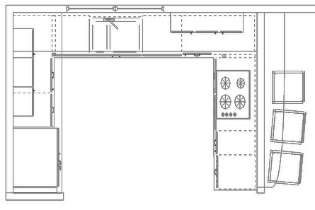
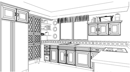
  • My first plan is about being conventional but still interesting-It's meant to be simple.
  • The island is removed. I feel it's an obstacle. 
  • The upper section of the plan now allows for a much lighter feeling. The wall cabinets are FLOATING on each side, a nice look. In fact, much better in my opinion.
  • The corner wall cabinets are removed. Too much cabinetry; there was way too much! There is a whole other wall opposite the kitchen, which can accommodate lots of storage, so aesthetics need to be addressed as well rather than JUST storage...a VERY common mistake in American kitchen design. It's not all about storage. 
  • I would do away with the hood and do a downdraft. An island hood and a downdraft do not differ much in their efficiency. In this case, the bottom of the hood appears to be approximately 40" above the cooktop, which is basically, ineffective. To make the hood lower would mean that the people sitting at the higher bar would experience the hood to be quite low, if it were positioned where it should be.
  • In both cases, as a concession to the loss of the island, countertops have been deepened, a cool benefit. One may wish to, then, install the wall cabinets deeper as well and use molding to cover gaps (a must do for stock cabinetry.) 
  • Also, in both cases, we are assuming that the soffit stays intact. 

While this design, above, may appear to be simple and basic, it offers more visual logic. Also, a secondary layer of decorative detailing (not shown) will add to the theme.

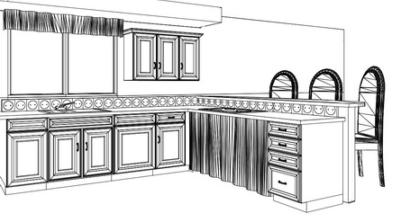
The second plan, below, didn't take long at all, and reflects my desire to open up the space even MORE (and be a bit more stylish in the design). I do not expect the counter space, seen in my first plan, to the right of the refrigerator, to be used as a prep space in a significant way. I expect that space will be used for storage of small appliances, things like that, which will accumulate clutter quite quickly. Some or all of those items can easily go into the wall cabinets that I've designed to be easily accessible.

In addition, no one uses a 90 degree corner to prep at. It cannot be done. Therefore, again, clutter accumulates.

In the interest of achieving more openness, without a loss of storage or meaningful counter space, take a look at the second plan:


As I was putting this together, I could not resist one more quick tweak. In this version, the wall cabinet to the right is short and the pantry to the right of the refrigerator hits the bottom of the soffit. Take a look.

 Wow, I was blown away with what Kelly came up with for HER version of the warm modern kitchen design! It's clearly elegant yet simple, interesting yet soft. It's GOOD design work, done with stock cabinets, and it shows what can be done by a designer who is creative and thoughtful. THIS is design work that is night and day in comparison to what we were left with in the kitchen episode.

Take a look! Kelly, what a great time I had working out the logistics with you! As far as design work on this project, we each saw our finished versions (for the first time) just before posting!

My work here is done. ;) I hope I have illustrated that a kitchen, often being done only once or twice in one's life, and lasting for 2 decades or more, should not be designed quickly.  The function and beauty of a kitchen has everything to do with the experience and creativity of the design professional. The cabinetry is but a secondary player, the follower. 


Kitchen Design - Advice From Allied Professionals

Cathy sent me an email and asked if I thought there was a design flaw in a section of her cabinet design. I had to write back that, yes, I agreed with her that part of the design was flawed. Unfortunately, it was a finished picture of the kitchen that Cathy had sent me, which made it even more uncomfortable for me to give my opinion. The kitchen was installed, and it looked like it cost a pretty penny. Here are words from Cathy:

"Lesson Learned 

I learned a big lesson the hard way and wish I had gone with my instinct to hire a kitchen designer during my kitchen design process.

My contractor convinced me that it would make more sense for him to design the kitchen layout because he was also working on the electrical, plumbing etc. so there would be a cost savings to me if he designed it and worked with his preferred cabinet company.

We decided to go ahead and in the end I thought the kitchen looked great until I noticed some design elements that look flawed to me. 

I believe that a good kitchen designer would have done a much better job and the money I am thinking of spending to make some changes to the existing kitchen could have been used towards the cost of hiring a kitchen designer.

It is very basic when you think of it. You are paying a kitchen designer for their expertise, experience and knowledge. I even believe that a good kitchen designer could probably help a client with cost-saving plus time saving advice because they have all the resources and know where to look for all the elements that go into a kitchen design project.

If I had to do it all over again I would spend the money to hire an independent kitchen designer. I have learned so much and wanted to pass this on so that someone can learn from my experience. I am definitely an advocate for kitchen designers. 

Cathy"


Here's my advice in terms of the medical profession, which just makes sense to most people:

The pediatrician knows a little about skin problems - go to the dermatologist instead

The orthopedist knows a little about heart problems - go to the cardiologist instead

The ob-gyn knows a little about head injuries - go to a neurologist instead

LIKEWISE...

The architect has designed a few kitchens - go to a kitchen designer instead

The kitchen designer suggests a roof line change for a kitchen renovation - go see an architect

The contractor "lays out" the cabinets - find a kitchen designer

The interior designer discusses the size of a kitchen island - find a kitchen designer

The kitchen designer suggests coordinating, expensive fabrics for the kitchen - find an interior designer

The point is simple. Whatever someone does "every day" as a working professional, that's who you go to for expert advice. It means that you must interview several design professionals to find the right one. It doesn't mean that you do not listen to any advice, given by an allied professional. It means that you put the weight of consideration on the advice from the professional who works in a particular discipline every day, especially if you hired that person after a thoughtful interview process, considering others' advice very, very, carefully in the context of what THEY do "every day."

UPDATE: Cathy said I could post the images she sent me. Now, you may not see a glaring, horrible, mistake, but in my world, it doesn't have to be very obvious. I think the intention was to have "weight" on each end of the L, but to my eye, it doesn't work. Each end ends with an identical pantry, which, again, just doesn't make sense. The weight of the hood is sort of scrunched toward the left, and then you have a run to the right of lighter weight cabinetry. Everything is off. I would also have switched the oven and the refrigerator. Cathy will remove the lower drawers on the countertop cabinet, and it will be much better. Thanks, Cathy, for allowing us to look at this. You're a trooper!

UPDATE 2: Cathy emailed me to ask me to ask me to remove the images of her kitchen, so I did. 

Julie and Julia - Kitchen Thoughts

Marcy Goldman is a new friend. I met Marcy some time ago, and we just seem to hit it off really well. I respect Marcy's hard work and experience as a talented baker and chef. I wanted to celebrate the movie Julie and Julia, and while I'm sure I will have more to say about Julia Child's kitchen, I want to start off with this very wonderful and interesting piece, written by my new friend Marcy.

Marcy Goldman is a cookbook author and master baker, and the creator of BetterBaking.com. She is an occasional baking guest on Martha Stewart Sirius and this fall has two new cookbooks coming out, as well as the current A Passion for Baking, Oxmoor House 2007. Follow Marcy on Twitter.

Marcy's newest cookbooks, A Treasury of Jewish Holiday Baking, and The New Best of Betterbaking.com, both Whitecap Books, will be available September 2009.

Get Marcy's book here: A Passion for Baking: Bake to celebrate, Bake to nourish, Bake for funHere's Marcy, in her own words, talking about Julia Child's kitchen. Enjoy.

I am both a curious chef and a nosy person. While in line at the supermarket, I find I peek at everyone’s grocery order and draw conclusions. Vegan, bachelor, busy working mom, non-cook, potential baker, meat lover, healthy eater, new dieter, and the family and/or must-have-tons-of-kids – those are some main categories. I observe more than actually spy, and I hope I am merely playing food and lifestyle sleuth – and not judging. I am just – as most food people are – interested in everything to do with food.

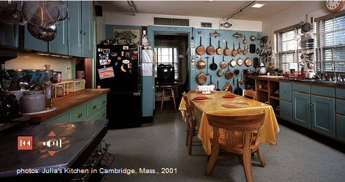
So when I gaze at Julia Child’s kitchen, now enthroned at the Smithsonian Institute, complete with Julia’s own voice inviting you to visit her famed home kitchen from Cambridge, I am both curious – as if I was a neighbor strolling through, and as a fellow chef and cookbook author. What does this kitchen say to me? What sort of person lived and worked here? On occasion of Julie and Julia, the new Nora Ephron movie, I felt a need to go behind the movies and myth and revisit the real thing.

The first thing I notice is that Julia was organized. There are acres of tools, pots, and pans – many choices, and a full battalion of back-up pans. I like that. That speaks of generosity too – a person who had a richesse insofar as she was outfitted with good stuff – not even lavish, but good stuff, easily at hand, and doubles of essentials. Brilliant. Such is the manner of my own kitchen.

I notice the good layout, the spaciousness, and the thoughtfulness in having things in easy reach and visually accessible. Chances are, if you see it, you’ll use it. If you hide tools and equipment away – true, your kitchen (and Julia’s) will look neat and streamlined but the very inspiration (and efficiency!) that comes from having visual reminders of potential culinary adventures cannot be overstated. You lose so much with things being hidden away – as aesthetic as it is, it robs you in other ways. Still, everything in its place, in a mindful way, is aesthetic in its own right. One takes a chance in being cluttered I suppose but Julia’s kitchen is inviting- not cluttered – so it’s possible to do it right.

In Julia’s kitchen you also notice a fusion of objects that were meaningful or serviceable. Items brought back from travel, collectibles, and simply decent, basic, good quality cook and bake ware. There is a charming mix of heavy duty things like her Garland (a range I also have in my own kitchen), a huge sprawling table to work on and host meals on, as well as back-to-basics like choppers, mortar and pestle, and a sweet collection of tea tins. The tins are robin’s egg blue, as is much of the woodwork in the kitchen. Such a sweetness in that blue tone, with its hints of New England tradition, as well as a calm and cheeriness –also trademarks of Julia.

Without doubt, in sensibility and design, Julia’s place is an expansive kitchen, as befits Julia herself. It captures a hominess, hospitality, as well as the spirit of a serious cook and dedicated professional. It seems designed to suit Julia or a team of helpers both. It appears a kitchen that saw miles of food, good times, wonderful chats, and perhaps quiet toasts between just Julia, and her beloved Paul.

Mostly, what I see when I take a glimpse of Julia’s kitchen, is a kitchen and a life, both well-lived. Chef or no, cookbook author or not, I would conclude this is the domain of a person I would like very much.

What do our kitchens say about us? Our homes speak but our kitchens, the heart and hearth of our domain – sing our theme song to world and company we keep. Knowing this, seeing Julia’s kitchen, I think again of my own kitchen with new eyes. Like Julia’s, mine is a place of many recipes, many miles of hospitality. Like Julia’s kitchen, even in repose, there is an energy. Stilled rolling pins, cooled stove, measuring cups dangling from stainless steel hooks – it’s life, it’s a stage, it’s a fusion of love and food, in equal measure. It’s the perfect recipe. Always.

More information on Julia here: Smithsonian


Kitchen Artisans - I Want YOU!

Artisans of unique decorative products for the kitchen (or can be used/situated in a kitchen) please show me your products! Please send information to: susan @ susanserraassociates.com

I haven't tried this before, a general announcement, but I like the idea, and I'm always open to seeing new products from artisans or small manufacturers! I love to receive information from large manufacturers as well, so keep or add me to your press list. 

Thank you!

New Products for the Kitchen! Take a look...

FIRST...JOIN ME FOR MY SECOND FACEBOOK EVENT! I'M TAKING QUESTIONS ON KITCHEN DESIGN. SEND ME YOUR QUESTIONS BY THIS SATURDAY, AND I'LL DO Q&AS ON SUNDAY. DO THE TEST...PLEASE LOOK AT YOUR QUESTION AS IF YOU KNEW NOTHING OF YOUR ISSUE, TO BE SURE IT'S CLEAR AND CONCISE. LOOKING FORWARD TO HELPING YOU WITH YOUR KICHEN DESIGN QUESTIONS! SEND TO: SUSAN @ SUSANSERRAASSOCIATES.COM AND BE A FAN OF MY FACEBOOK PAGE! 

Here is what's catching my attention...new and/or interesting products you need to know about.

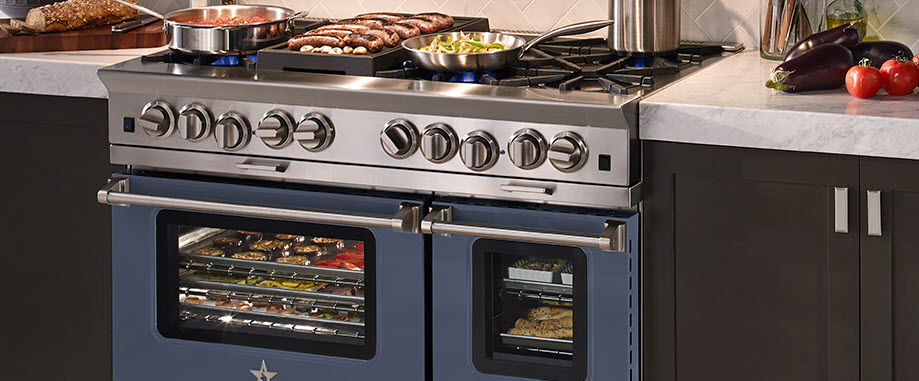
Blue Star is sort of a lone wolf (no pun intended) in the pro range category. A somewhat silent player, it's a product that deserves more attention. Blue Star says that they are the only genuine restaurant range for the home due to their open burner system, producing 22,000 btus of power, resulting in shorter cooking times and an even simmer. BUILD YOUR OWN Blue Star range (that's what I built in the image) to reflect your personal style and preferences.


Miele hasjust redesigned their CombiSets, or modular cooking pieces. I LOVE modular pieces. It's a super flexible, super functional way to precision-design your cooking needs. The new line includes an induction cooktop and Japanese Tepan Yaki. The design of these pieces are gorgeous, with controls that are slanted in an ergonomic way. A slightly larger 15" size is available for some models and that really makes sense to me.


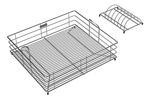
I'm crazy about sink accessories! In my new home, I have this one small built-in cutting board, and it's so incredibly useful to have it right nearby. We do so many tasks at our sinks...sink accessories are a huge help throughout the process. Elkay is introducing a wide assortment of new sink accessories, enhancing aesthetics and expanding functionality in the kitchen. Designed for the Gourmet e-granite and Avado sink families. There are 39 new accessories!


Oceanside Glasstile's Muse is a clean edge, handcrafted, recycled glass mosaic tile. It comes in over 42 colors and nine patterns. 

Some of the colors contain up to 97% recycled bottle glass, which is collected from curbside recycling programs (definitely a ton of Corona bottles!)


I love these random products that I find, just love them.

Here is a copper spice rack. Doesn't it look so elegant? It also comes in aluminum, brass or stainless steel. I would imagine there may be some polishing required on occasion, unless a sealer is used, better check with the manufacturer.

The finishes available are mirror, fine satin, anodized, antique and etched. By Quality Metal Works, in business since 1965. 10 1/4W x 31H x 4 3/4D


Another cool accessory for the sink, here's a cloth holder from Magisso. A clever concept, the cloth holder uses magnets to keep it in place...one magnet inside the sink cabinet on the outside of the sink and one in the cloth holder to attach to the outside magnet. It will not scratch the surface of your sink. Some cool, Scandinavian designs too!


The Next Food Network Star

I love how these things happen. Yesterday, the tv was on in the background in the kitchen, and, while I'm not a frequent Food Network viewer by any means, my son and his girlfriend are big fans. They had been here for the weekend and we were just hanging out in the kitchen. I switched the channel to the Food Network and my son's favorite chef, Bobby Flay, was on. 

Yesterday was the recap of the previous episodes of The Next Food Network Star, with the winner to be announced last night. 

Eventually, my son and his girlfriend left to return to their home (ok, mine, where they're living in NYC, lucky kids) and I found myself, now in my office, keeping the Food Network channel on for the rest of the day, up to the final show, and getting more and more into the series in the process! Throughout the day, the series took me from kitchen to office to bedroom (I know, it's a sad state of affairs when I have to admit the Food Network channel was yesterday's entertainment ALL DAY, but it's virtually unheard of for me, ok???)

Putting my marketing hat on, I should have predicted the winner from the start. Of COURSE Melissa won! Obviously, she has proven that she is a very talented cook. But, beyond that, I would guess that she speaks to the Food Network's coveted demographic...moms, moms who want fast but interesting meals for their families, moms on a budget, moms who can relate to Melissa's simple, friendly, somewhat humble manner, busy moms. 

Melissa's very positive demeanor will help uplift anyone's spirits, and she already feels like a trusted friend. Compared to Jeffrey's "Ingredient Smuggler" concept, which seems a bit exotic, maybe ever so slightly snobbish  right about now, Melissa's approach is exactly what should appeal to the mainstream Food Network audience during these still very unsettled economic times. And with more of us cooking at home, it seems like a great demographic fit. 

How could I have missed the demographic appeal paired with her cooking ability? What a match for the Food Network!


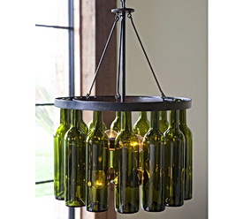
Pottery Barn Lighting

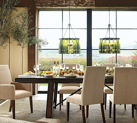
I just saw this new fixture from Pottery Barn. It is showcased in their newsletter that I received. At first glance I really didn't care for it. Too...something. Contrived? Uninspired? Too much like other lighting fixtures that incorporate common objects like silverware or glasses, etc. etc?

Twenty seconds later, I think I like it. While I don't think I'd buy it, it's the sculptural quality of it that's speaking to me now. I think I'm over my initial cynical thoughts. I do like the use of two fixtures over a table, although these should be set further apart. Could be great for a kitchen dining area/breakfast room too.

What do you think? 1) Like it or 2) hate it or 3) a New Yorker's "eh" (with a smirk and a right tilt of the head-stop, let's not forget the half closed eyes)?

HGTV Design Star Kitchen Episode

I will admit to only having seen HGTV's Design Star maybe once or twice before, a year or two ago. Somehow, my consciousness was raised about it this past week (good work HGTV) and I thought it would be interesting to view the kitchen episode, which aired last night. 

Of course, I'm going to look at this with a critical eye, how could I not?

Because I have not seen this season before last night, I do not know everyone's names, all their dynamics, abilities, and so on. In any case, it's the end result that matters. So, here are my impressions. Whether or not you watch the show, you can learn from this episode, so keep reading. 

When people go on game shows, I've heard that they brush up on facts, details, and so on. Is designing a kitchen something that these designers could have predicted they might have to tackle during the course of this season? If so, I'd assume that the designers would have spent an hour or two studying kitchen images to pick up creative ideas, tips, etc. Sit down, focus, observe, an hour or two, done. 

This episode goes to the crux of two important concepts:

  • What are the clients' expectations for creative solutions?
  • What is the designer's care/commitment/interest in providing creative solutions?

Did these designers fall into the trap of focusing solely on finishes? IT SURE SEEMS SO. The design of the cabinetry in both of these finished kitchens is kitchen design 101.

The cabinetry, being the largest element in the space (by far), has the fundamental opportunity (key word) to contribute to the design statement for the entire kitchen...in a significant way.

Who came up with the design for the cabinets? Was it the cabinet supplier? I don't remember seeing any plans or planning sessions on how to design the cabinetry into the space. I saw a lifestyle discussion with the clients, but not an overall kitchen design planning session. Did I miss it? 

Yes, I know they had 26 hours to get this done. BUT, taking an additional 20 minutes, at the barest minimum, after, say, the cabinet supplier presented the cabinet design (if that's what occurred) could have brought forth some creative ideas, even just one or two, from the design team(s). 

This is a competition on design ability, isn't it? Or is it just about speed, and how to throw in a BASIC kitchen with new finishes, in which case, nearly anything new will look decent, so what's the point in using designers, who may get their own show on HGTV no less? I expected more. And, not a whole lot more, given the time constraints, but more. Did you?

Here are some VERY simple ideas, one or two which would have sufficed to make it a more creative design. Again, we're talking simple ideas, given the time crunch.

MOROCCAN/ITALIAN KITCHEN 

  1. remove the two round cabinets on each side of the window
  2. remove the diagonal wall cabinet to the left of the window
  3. in their places, just run the wall cabinets straight to the wall and put something decorative on the wall to the left of the window to partially fill that volume of space if it needs it
  4. the island is unattractive. Push the cabinet to one side and add a stool under the countertop overhang at one end
  5. OR push the cabinet to one side of the available countertop and add an open shelf cabinet which one will see upon entering the kitchen
  6. consider having a cohesive section of the wall cabinets "floating" on the wall/unconnected to the refrigerator end panel and right wall and, likewise, the wall on the other side of the window for a less utilitarian look.


WARM MODERN KITCHEN

  1. Same recommendation, just run the wall cabinet on the microwave wall straight to the end of the wall and remove the one that is to the right of the window
  2. I think the cabinets should have touched the soffit or be 1/3 less the height. This height, to my eye, makes the ceiling look lower
  3. I would have considered a light cream/white color for the upper cabinets
  4. The island looks too large and with everything very simple, there was an opportunity to do SOMETHING to the island, even something little to keep the simple concept. What? How about using 2 refrigerator wall cabinets (24 deep typically) that are about 24" tall and put them on legs (straight, simple, pieces of lumber painted white, so easy) to make a more open feeling.
  5. Use a microwave drawer on the island and create a combination open shelves (seeing wall behind) and closed door wall cabinets on the refrigerator wall


Call me crazy, but a kitchen design is not all about the finishes. Again, the cabinets contribute to the largest volume in the room. A little thought goes a very long way. 

Also, I believe in both cases, the teams talked about entertaining. A few of these ideas above would make the kitchen feel, again, less utilitarian, and more like a "living" environment. If they entertain many people, and as we know, people like to hang out in the kitchen, is an island the best choice in THESE spaces? Could the peninsula end have been angled for more counter space, allowing more area to walk around in the kitchen? How many people can you really accommodate in these kitchens? I can't say, I can't see the dimensions. 

The point is, there was obviously zero time spent in the cabinet design process, except to go the easy way out...what their clients would most likely consider a "wow": either doing a simple, uninspired kitchen design billed as "modern" or embellishing the accessories/finishes as was done in the Moroccan/Italian kitchen. It sells the clients short. 

Twenty extra minutes to come up with something interesting in the cabinet plan by one of these designers OR a request to the cabinet supplier to "add a twist or two to this plan NOW!" is what a designer should have done to exhibit real creativity. 

And, please do not try to move a refrigerator yourself. Only the pros should move refrigerators into a house. 

I only made one comment on a specific finish recommendation. That's a whole other topic on these kitchens! And, rather than answer the top two conceptual questions myself, I'll leave that to others and would like your input. So, what did you think of this episode?


House Beautiful Kitchen Of The Year 2009

Now I know why someone associated with House Beautiful yesterday said to me "We love bloggers!" This post will have taken me about 6 hours to produce by the time I'm finished. Why? It's the images! I'm not even going to tell you how how many I took...but maybe I'm the worst editor, or maybe there are just WAY too many inspiring vignettes in this beauitful kitchen/living space. In either case, maybe I was a little obsessive. That's ok, I surrender to it and you benefit.

Ok, let's talk about the kitchen. There's A LOT going on in this kitchen, a lot to talk about. I think I'll be organized about it. Yes, Susan, that's a good concept.

OVERALL DESIGN

The kitchen design, by Robert Stilin in close collaboration with Ina Garten, was meant to replicate Ina's East Hampton kitchen for House Beautiful's Kitchen Of The Year 2009. The kitchen of the year can be viewed at Rockefeller Center (you can't miss it) until July 24.

You're hearing it more and more...the kitchen is the new living room. The drum beat is getting louder. I think we were shocked by the financial crisis into rediscovering the pleasures of our homes, adding a renewed desire to be cozy, and of course, to save some money and get back into cooking for family and friends to nourish our souls as well as our bodies. Simple pleasures came back into the forefront. Sharing tasks, communicating easily, using the cookware, servingware and other precious pieces that we love and using them more frequently.

Ina's kitchen seems to embody these philosophies and more. Along with wanting things more simple in and around the kitchen, many of us want to cook up a storm too! Just like Ina. The "chef's kitchen" philosophy is one that promises everything right where you need it, with the eye toward common things being seen as sculptural and beautiful in their own right.

The overall design is one, then, of easy transitions from one place to the next in this space. A flow that can be manipulated as desired, depending on the type of entertaining or cooking activities taking place. Cooking. Eating. Very simple. Lounge and rest areas, abundant seating for guests, an efficient galley design helps the flow.

CONVERSATION WITH INA

Ina told me (we chatted about her kitchen) that she prefers to assign tasks, accept help when offered, and later, to use the rear of the island as a buffet. Ina uses her dining room maybe twice a year and otherwise serves her wonderful meals in the kitchen dining area. Ina also has on hand her favorite things (dressy serving ware, etc.) as seen in the open shelving, and she uses them frequently. Organization is important...note the utensils in the pottery near the sink, utensils arranged in the same material in each container for quick tool identification. Small appliances require immediate access and somehow look perfect in their various homes along the backsplash.

COLORS AND FINISHES

I just love the Caesarstone countertops. It's a warm gray. It's understated. An understated material such as this supports the kitchen design. It doesn't draw attention to itself except to enhance the feeling of the space. To me, that's what a countertop is supposed to do, play a supporting role. It's lovely and super functional at the same time. With so much going on on top of countertops, take it down a few notches in terms of pattern and I promise you your experience in the kitchen will be more peaceful and serene. Doesn't that make sense?

DETAILS

In random order off the top of my head:

The lamp is SO cozy and useful and, did I say cozy(?) at the end of the countertop.

Items we do not normally think to put into drawers are stored to Ina's preferences. Glasses are in a drawer, favorite bowls, jars laying down in a shallow drawer. A very efficient double silverware drawer insert (I was always against them but I changed my mind now).

Cabinet access at the rear of the island (why not, for rarely used items?)

CABINETRY

The cabinetry is by Kraftmaid. I spoke with an old colleague of mind, Sarah Reep, Director of Design from Kraftmaid. Sarah said that she sees cleaner, brighter whites emerging. I agreed with her and said I see more white walls as an anectodal point. Sarah sees super functional chef-type kitchens being even more important than ever, connected to the current movement toward staying at home more and the process of cooking healthy foods a result of the trend toward healthier living. Take a look at some of the cabinet details and woodworking details, especially above the refrigerators. Simple, clean lines. Easy to be timeless.

FINISHES

So, we have neutrals, it seems in this kitchen. We have whites, creams, grays, wood tones, a mix of metals and bursts of color to lift our spirits. It sounds good to me! I think neutrals play a big role these days, again, as we are looking for value and performance over the long term in our more expensive components of a kitchen which are flooring, countertops and cabinetry. How can you go wrong with that thinking? Again, the countertop selection is a perfect example of keeping it simple.

APPLIANCES

Appliances are by Viking. The range and hood are a warm shade. Warm is nice. Warm feels good. Warm is what many of us want. I'm not sure it's the exact shade, but one of my clients wanted a Viking range about 4-5 years ago, maybe less, and I encouraged her to use Viking's khaki color. She did. It's easy to be around, so much less "cold" than lots swaths of stainless, don't you think? Two dishwashers are a must for a chef's kitchen, which we see here and plenty of cold storage too. Love the sink, love that Kohler sink. Ina told me it's extra deep so that dishes can disappear if they don't get into the dishwasher while guests are here. An induction cooktop toward the end of the cooktop handles another working chef, another way to cook, or just another place to work as a preference. 

THE FEELING

It's about comfort, easy and casual living however YOU define it. 

That's it for the moment. I have GOT to get back to work! I just may add on to this as I think of other details, but take a look at this slide show...enjoy it!

OH, before I forget....on the way back from the kitchen tour, I was lucky enough to get a parking space on the upper west side. I thought I'd give my daughter a call to see if I could literally swing by, pull the car over, and give her and her 4 week old baby (my first grandchild!) a kiss, just a quickie. She said sure! So, the last picture is of my two girls. The best reason of all to have a live-in, play-in, entertain-in, anything goes kitchen. Can't wait till they (and my SIL) visit me this weekend...we'll be hanging out in the kitchen a lot!

It's what it's all about.

http://www.flickr.com/photos/kitchendesigner/sets/72157621636705273/show/


The Skirted Roundtable Podcast With Me!

It was my pleasure the other day to chat with Linda from Surroundings and Joni from Cote de Texas on all things kitchen design related. I think we delved into some interesting territory. 

Joni and Linda do love kitchens, that is apparent, and they have a genuine interest in hearing new points of view and I'm interested in their points of view, as interior designers. We can each teach one another if we are open to it. 

I listen to their podcasts. I'll put it on, go about my work and always learn something. 

In this podcast, I talk about trends, countertops, blogging, more. I was SO taken with this podcast experience that I'm going to do some podcasts here. If you can get past my Long Island accent and singsong voice pattern, you're prepared!

Thank you ladies, what a pleasure! I've been a fan of both of you!

House Beautiful Kitchen - Smaller Focus

I follow so many great people on Twitter, but cannot stay on Twitter constantly, so I'm sure I miss many great tweets. Oftentimes, I'll catch tweets that really relate to something I'm thinking about or bring me great new information, as I'm quickly scanning, and I'm delighted. This morning is one such occasion. I happened to catch House Beautiful's tweet, in part, on a case made for refrigerator drawers in a small kitchen.

This REALLY spoke to me because I have thought about this issue a LOT. The issue is if one should substitute refrigerator drawers in place of a traditional tall refrigerator in a small kitchen.

This is a personal issue for me as well as being a basic kitchen design issue that I am interested in.

We own our own little piece of New York City. At the moment, our apartment is used full time, as our son, attending college, is living here for perhaps one more year. He and his girlfriend cook up a storm most nights a week. The tall, old, 33" refrigerator is packed.

As my husband and I talk about the future, we'd love to be in this apartment on a part time basis for the foreseeable future.

Last year we removed the wall that separated the kitchen from the main living area in the apartment, exposing the kitchen. It was the very best thing we could have done. It opens up and combines the living area and the kitchen but makes the aesthetics of the kitchen more important than ever.

So, in thinking about renovating our kitchen down the road, I consider three issues, as I think everyone must when designing a small kitchen space: resale, fumction, and aesthetics.

RESALE

I think the default position on resale considerations is that a tall refrigerator is better than refrigerator drawers for the vast majority of potential buyers. I think that is safe to say. In our case, we think we will hold on to this apartment down the road, but we do not feel 100% sure which makes resale an issue.

FUNCTION

Bending, bending, fruit near the floor, sift through food (while bending.) Limited storage...and where does the freezer go? Platters, larger quantities of refrigerated food storage? Better think about that.

AESTHETICS

Aesthetics IS an issue in kitchen planning and should be examined carefully, the plan with and without a tall refrigerator. My heart wants to forget about the two issues above and build in refrigerator drawers solely for aesthetic reasons! In a small space, yes, I agree with the designer of this featured kitchen by House Beautiful...refrigerator drawers can be an enormous plus aesthetically as opposed to a tall refrigerator - even a fabulously built in slim refrigerator.

That's the thing...aesthetics, at least in my world, are as important, and sometimes more important, (gasp) than function, to which I, personally, am (sometimes) willing to adapt to. That's the other thing...if you go with your heart, make sure your head is very well aware of potential consequences (oh, how responsible, sigh)

I don't know what I'll end up doing when we eventually renovate this kitchen, but I know I will consider ALL issues very carefully and I'll beware of my emotions taking control of the decision. Then, I just may say, ok, whatever, I really want to open the kitchen up to the max, come what may. I can see that. :)

KITCHEN OF THE YEAR

Do you know about the kitchen of the year? It's being built as we speak in the middle of Rockefeller Center in New York. Designed in collaboration with Ina Garten, one of my favorite cookbook authors of all time. I think I have every cookbook she's authored! The KOTY will be on display from July 20-24.  I'll certainly be attending the event!

Tour de Kitchens and Tour de France Together Again

Welcome to my third annual series of posts on French kitchens inspired by the Tour de France! This 3 week event is an excellent opportunity to celebrate authentic French kitchens and to study their many wonderful design details.

In the coming weeks, I'd love to look at all sorts of French kitchens, from modern to (really) rustic to those French country kitchens rich with charm and texture. Let's take these kitchens apart, look at the details, compare and contrast, and just admire what makes these French kitchens uniquely....French!

This year of the Tour is particularly exciting for me. After all, it's the Tour de Lance! Lance Armstrong has returned to the Tour to raise funds and awareness and to bring people together toward a common enemy...cancer. I think what he is doing is amazing. Check out Lance's videos and explore the site of Lance's foundation, Livestrong.  Follow Lance on Twitter, I love his tweets.

SO...onward! The prologue of the Tour began today in fabulous Monaco. What kind of kitchens do they have in Monaco? If you rented an apartment in one of the many apartment buildings surrounding the harbor to see the start of the Tour, most likely the style of the interiors would be largely simple, elegant, modern. I would call the kitchens an international style. They are nearly all very similar! Some sort of combination of stainless, black or rich browns and/or white, and you're done. Minimalist. Simplicity and elegance.

Images from


Facebook Event: Ask Susan!

Here are answers to a selected three questions I am presenting for today's Facebook Event: Ask Susan! And be a fan of the Susan Serra Associates facebook page right here!

QUESTION #1:

Susan! Love your blog. Here's my question: Redoing my 1960s kitchen that has a bump out bay window area intended for a tiny dinette table. I wish to change the space to serve a function other than seating. Have you done such a modification before in your work? Could you describe or show other options? Thanks! --Erin in Dallas

HI Erin! My own home had a bump out bay that just didn't work for us. We ended up straightening out the bay section and bumping out another section of a wall in a rectangular way and this dining image shown was the result.

Another idea is to create a lovely (non dining) seating area such as here (bay window partially obscured). In yet another project, actually 2, a kitchen island is floating in the center of the bay window, with enough room around it to clean, or even to walk entirely around, but which features the bay window fully as the architectural element it is. Decorative items can be placed on the floor.

The bay window can stand alone-perhaps install nice, long windows. And, of course, one can build in book shelves, set in a low furniture piece or make it a wonderful spot for a desk. I can also see it as a spot for a decorative/functional wood stove, with some alteration of perhaps a solid tiled wall behind the stove in the center of the bay if necessary.

And, do not forget the view beyond the bay windows. That can be as important a feature to the space as the inside treatment. Consider what your view is and what you would like it to be/how you'd like to relate to the outdoors. That will also give you clues as to how you'd like to enjoy the view from the inside.

Here's one of many possible concepts:


QUESTION #2

Hi. Thanks for this. I was wondering is there a way for me to test whether I really would like to live with a completely different colour on my kitchen cabinets? Currently I have an off-white colour of cabinet and would like to consider a deep, moody blue. I have a lot of natural light in my kitchen so am not worried about it being dark and depressing but am worried about "how can I tell if the tiny picture I saw on Flickr for inspiration will really work in my space"? thanks again, Melissa p.s. I live in Australia

Hi Melissa, and thanks for your question, all the way from Australia! Definitely on my list of places to visit.

That's a really great question. In the end, we never REALLY know how we are going to feel on the "other side" of a decorating/design decision, but the most preparation you can do beforehand will help ease the transition from your current look to something totally new. You mention a tiny picture that you saw on Flickr that is inspiration.

Your instinct is right. One tiny picture is not enough. Have you done a simple search of "blue kitchen cabinets"? If not, here you go, and look at the images tab above the search page as well. Here is a recent post by interior designer Linda Merrill who just posted on blue kitchens. Look at many images. Observe the foundation elements of flooring, walls, lighting, overall size, countertop color, style and find several that are relatively close to your situation, and that will bring you one step closer to YOUR reality. This phase is very important.

Do multiple searches and create an organized bookmarking system, perhaps on delicious of, say, blue kitchens with light or dark countertops, blue kitchens with light walls, a certain type of flooring, etc. This is a research phase. Be methodical. Take your time.

The more you understand about what you like about certain images, being fully aware of what ELSE is going on in the image besides the blue cabinetry, in other words, looking at the space as a whole but understanding the parts, will bring you closer to feeling either more or less comfortable. You need to put the time in. I was going to mention using design software to upload your room and then color the cabinets blue, but that will not go far enough. Be a temporary student of the separate elements of a kitchen with blue cabinetry. That's what will give you understanding of this look.


QUESTION #3

Susan, Sending a photo of our current kitchen cabinet color and flooring. We have an oak - mocha colored hardwood that runs through the kitchen/nook and formal living room (we use as a formal dining room). We are having to replace the flooring due to a leaky dishwasher that caused it to buckle. I chose a black/stainless dishwasher (other appliances are all black at this time), lighting and faucets are that very dark brown that looks blackish. We will be selling in 2 years (military). I am hoping for some quick advice on flooring material/color. We can't get the same to repair. Should we go tile in the kitchen/nook area (color?) and leave the dark hardwood in the DR? Or chance wood again, and if so what color? I don't love the dark wood b/c although it looks great clean it shows ever spec of dirt immediately. We are not in a position to replace more of the kitchen than our insurance will cover ie. cabinetry. Thanks for any suggestions! Becky Colorado Springs

Hi Becky! Thanks for your question. Thank you for your service to our country!

Here we go. There are several missing pieces here, Becky, making it a bit of a challenge to give you solid advice, but I will try my best. Not seeing the context of flooring as relates from the kitchen into other rooms, where the nook is, what it looks like, etc. all have an impact on recommendations.

When you say that you "cannot get the same to repair", that leads me to believe that the existing flooring was a kind of engineered wood. No, I would not do wood strip flooring, even in another color. It can be done, but I cannot see the space enough to recommend it in this situation. If you'd like an earthy, less kitchen-y feel like the wood floor you have now, definitely consider a cork floor. It's comes in many beautiful neutral colors, or other colors such as, say, a smoky blue, is easy to walk on, a sustainable material, and should blend very well with surrounding rooms. If you have 12x12 cork tiles, I'd consider laying the floor in a brick pattern.

You can consider a ceramic tile black and white checkerboard, which is classic and formal. It will relate to your black appliances as well. You can do that also in Marmoleum Click tiles: http://bit.ly/FTvoR another sustainable flooring option, a good one.

Another idea to consider, one that is not very common these days, but may be perfect for you, considering the formality of your surrounding rooms, is wood parquet flooring. If you look hard enough, you can find good deals. Here is parquet flooring in a foyer: http://bit.ly/OI5cP It could be a DIY project too if that is an attractive idea.

As for ceramic tile, the sky is the limit in terms of ideas. Not knowing the layout, you could attempt to bring in a tile "rug" design in your nook or even in the center of the kitchen. Look for similar tile thicknesses, and combine a foundation of simple textured tile in the space with patterned tiles to form a "rug" or other sort of central/formal tile design in a logical area of your kitchen. Ask the tile store for assistance in selecting tiles to work with each other.

I hope this has been helpful!

That's all the time I have now for questions. I'll do this again soon...


Insinkerator Instant Hot/Cold Water Dispenser - Cool! (No, Hot!)

Out of the gate, I'll say it...the InSinkErator instant hot/cold water dispenser is the appliance that I didn't know I wanted until I was asked to try it. Sure, why not? Brings me one step closer to experiencing an appliance I have not used before, good for my knowledge base!

I never had one and I never thought much about owning one, even though I have installed many for my clients over the years. I guess it was the cooktop or microwave that did the jobs I needed.

It has a generous 2/3-gallon capacity that dispenses 200 degree water instantly. And the filtration system reduces chlorine taste and odor and is listed under NSF Standard 42 so you can be assured of its performance.

One of my first questions was that I wanted to learn about the green aspects of this appliance. It does use energy, after all. Each tank uses about the same energy as a 40-watt light bulb. That is enough energy to heat and cool the water that is currently in each tank. 

When you use the handle on the instant hot water dispenser, cool tap water flows into the tank. The cool tap water is first filtered and then heated to approximately 200 degrees F for the stainless steel tank and up to 38 degrees F for the chilled water tank, and flows into the expansion chamber where it's ready for later use. So, new tap water is filtered (FILTERED, YES!) and then displaces the hot and cold water that was dispensed. Since the dispenser is not used for extended amounts of time during each use, like a dishwasher or washing machine, it is a very practical and energy efficient product for daily use. 

Here are some great uses for it:

Loosen Jar Lids-great for Aging in Place Seniors.

Remove Labels From Bottles.

Remove Wax Residue.

Polishing Silver.

Polishing Jewelry.

Faster Cooking.

Warming Baby Food.

Quick First Aid.

Keeping Food Hot.

Remove Baked-On Food.

Melt Chocolate.

Remove Shortening.

Creaming Butter.

Removing Fruit/Vegetable Skins.

Cutting Cheese.

Cleaning Cheese Graters.

Scooping Ice Cream.

I love it because the cold water is cold and not only does it speed the cooking process but when I think of how long the gas cooktop has to be on to heat water over and over during the week, among numerous other things, this has to be a better solution.

Creative Backsplash Inspiration

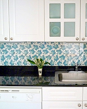
What a coincidence...no sooner did I do a post on Decorati on alternative backsplash inspiration via decorative panels, than I see this post on Design*Sponge! It's a very similar, actually, identical concept, and a good one.

As we see on Design*Sponge famous for great ideas, it can be a DIY project or not. However you tackle it, it's different, it's creative, and it makes an alternative design statement with material other than tile, which is beautiful, of course, often stunning, but, let's face it, there really ARE more possibilities for the backsplash than tile.

Laura is the owner of Open Face Designs and this is a printed design that she created! Laura used plexiglass on top of her printed fabric, but I'd recommend that plexiglass not be used behind a cooktop or range. Glass is a better material, or, I could definitely see engineered stone or corian behind the cooktop to not clash with the beautiful pattern of the fabric. 

Think beyond tile...I think in this situation the backsplash looks warm, inviting, and "living room like." Don't you? 

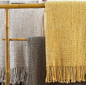
Use any kind of fabric behind glass, decorative panels, yarns (wow, that could be amazing!) shade material, take a fuzzy throw blanket, the list goes on. What textures you could dream up! I want someone to put a chenille throw blanket behind glass and then send me a picture when you do, please!