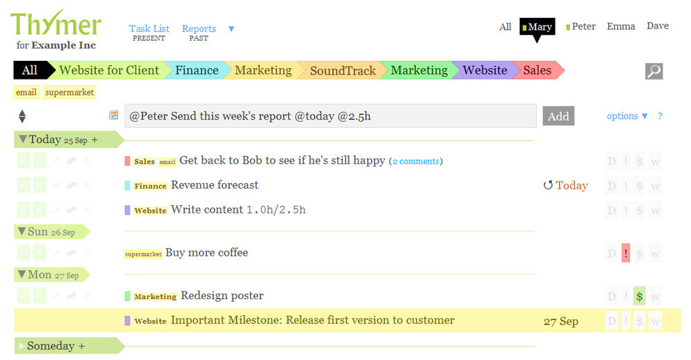
Thymer.com Tames Kitchen Design

It does not take much time, once one delves into the black hole of even thinking about a kitchen renovation, that the thoughts become disorganized, to say the least, given all the parts, pieces, concepts, ideas, not to mention products that are part of a whole kitchen renovation.

There is absolutely NO excuse in 2011 not to be organized when embarking on a kitchen renovation. There are many online management tools to keep track of every single detail. You can be organized in several ways:

  • in a super simple task focused way where tasks are simpl written down and checked off
  • tasks are attached to projects
  • tasks are attached to tags and/or projects
  • tasks are attached to tags, projects, and a calendar
  • tasks are shared by others in the same program 

and those are just a few ways to think of the detail/task/organizing process for a kitchen renovation.

If I told you how many free trials I've taken of task and project management programs, based online, I'd be embarrassed to tell you. The program I have kept coming back to over a couple of years, even though I needed to stray to find the greener grass, of which I never found...is Thymer. I've had many interactions with the developers over this time and they are extremely, and quickly, responsive, even over weekends. Best customer service I've encountered bar none, truly.

Thymer is SO simple, so lightweight, you wonder if it's a serious player in the project management world. It is. But, let's talk about how to use Thymer for a kitchen renovation.

First, Thymer is PRETTY. I don't know about you, but I like pretty. I like colors. If it is just a kitchen renovation you are doing as opposed to, say, a whole house, which could also handle Thymer, you may want "projects" labelled such as:

kitchen misc., countertops, cabinetry, appliances, flooring, backsplash, tile, designer, floorplan/design, trades, building materials

Great - you have your projects. As each task gets created, begin to add tags. For example, the appliances project would have tags such as: cooktop, refrigerator, double ovens ... you get the idea. And, those tags are available to you when you create each task. 

Don't need to deal with appliances for a few weeks out? Put a date on it - set it and forget it! Sync it with your calendar too.

One feature I'm MOSTLY crazy about is that at a glance, due to the innovative calendar within the task list, I immediately know what my day and week looks like...what has to be accomplished today. It instantly makes sense, since I'm seeing the complete picture. Thymer works on a loose GTD format, based on a concept called "Getting Things Done." Again, I cannot overstate that for me, to instantly look, without constant clicking, at what needs to be done/when, that's where Thymer excels.

Do you know where the real power is though? It's the ability to effortlessly and quickly send your emails, WITH ATTACHMENTS, into the Thymer system. Just forward an email, with attachments if it has any, to: addtask@thymer.com. It will recognize your email address and add it to your list. You can even add lots of different instructions into the subject line to further organize that email into a task. If you just throw the email into thymer, like I do, it will land in your inbox, to be dealt with later. Beautiful.

It's the easiest way ever, to organize a kitchen renovation. How would you use Thymer

Countertop Etch Drama - Can This Countertop Be Saved?

A reader asks:

"Hi there, I am house sitting for some friends whose kitchen counters are (I believe) a type of dark slate.I acidentally left a paper towel soaked in lemon juice (I was making lemonade) on the counter and now it seems as though it has etched into the counter...the stain is very noticeable and cleaning it just stripped the sealer!! What can I do? Does it need to be resurfaced?" Thanks for your help. (name withheld) 

Dearest Name Witheld, 

It's not your fault - who, really, would even be able to germinate the thought that lemon could possibly etch a hard countertop material? VERY few. Etching is different than staining, and you may want to tip off the homeowner that they should attempt to find solutions for the etching problem. 

Image from countertopnetwork.comTell them what substance caused the problem (was it only lemon juice?) How much lemon juice and how long was it sitting on the countertop? What did you do after you saw it/how did you attempt to clean it up? That will be helpful information. 

Beyond that, I am not a stone expert, and there are countless types of stone countertop materials which makes it impossible to understand the properties of all of them. 

Image by A Bluebonnet in BeantownBest piece of advice I can give is to recommend that they seek, probably several opinions of stone specialists but start with the stone fabricator or showroom which sold it to them. Me, I like concensus, so I would naturally seek out several opinions to find concensus.

I cannot say if the etch marks can disappear via a rejuvenation of the countertop or not, but that is one method that might be suggested to the homeowners. 

Countertop durability is no joke. A great looking countertop may just be waiting for the chance to turn on the homeowner...just because it can! 

A few tips:

  • Get large samples of the countertops you are considering
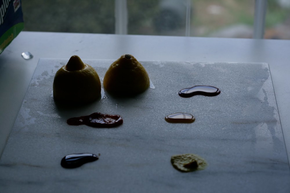
  • Put the sample through substance testing: add dabs of ketchup, wine, oil, lemon, wine vinegar, worsc sauce, mustard, more
  • Add those substances to one half of the sample, taping it off in half so that the original side may be compared to the side with substances on it
  • After 48 hours, remove the substances and view the good (or bad) behavior of the countertop sample

Purchase accordingly!

Sears are applied on to many types of countertop surfaces, and they work very well as a rule. One aspect of using a sealer makes me nervous...it is often difficult to tell when the sealer has been worn away from use. The length of time that a sealer will last depends on:

the properties of the stone

the sealer

food products

other products having a home on the countertop or moving on/off/around the top

lifestyle use pattern (light/heavy use/in between.)

When should a sealer be reapplied? No one can advise a precise date based on the above variables, which partially defines the risk of installing porous countertop materials.

So, dear Namewithheld, it is not your fault...you had no idea of the properties of the countertop and unless you are a geologist or stone specialist, it's called an accident.


Kelly's Kitchen Sync - The Book!

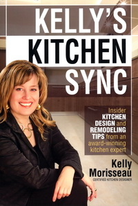
Kelly Morisseau, CMKBD, author of Kelly's Kitchen Sync, just released, has been a great friend, colleague and fellow blogger for many years. Kelly's new book provides a wealth of practical information and tips on all those pesky little details which make ALL the difference in a kitchen design that works for the way you live, both aesthetically and functionally, for perhaps, the next few decades or so.

I have reviewed a few books before. In one case, a long term professional relationship completely dissolved forevermore because my colleague's book on kitchen design, sent to me for review, was so far below my standard for useful (and current) information, that I felt that I could not and would not endorse it (there is no way to say that gently to a colleague, trust me on that). My memory fades on another two books that I also could not endorse, but one refusal was due to flat out inaccuracies that I easily uncovered. Point? My professional standards for information relating to the kitchen and bath industry and design process are VERY high and no, friendship does not trump endorsing what I might consider to be sub par information on kitchen design released to the public at large. I'm a bit wound tight like a lionness in that regard for some very strange reason. I know...I probably need to fix a margharita and relax. 

"Kelly's Kitchen Sync" is a good book. It's the real deal by a smart and experienced (key word) certified kitchen designer, and it offers solid information that is important to know as one navigates the universe of designing a kitchen. The information in Kelly Morisseau's book can truly enhance one's investment in one's home, often the biggest investment one makes, not to mention enhancing one's lifestyle in the kitchen.

Following are nuggets of information (every page offers valuable gold nuggets) that are not only good to know but will add a layer of detail that makes all the difference in the design process, resulting in a kitchen with a higher level of aesthetics and function, especially if one tackles the kitchen design without a professional kitchen designer (no one does that, right?) Following are snippets of good information!

"Clear as glass", page 97:

Kelly talks about mullions on glass wall cabinet doors intersecting with shelves and offers solutions to work around what can be a collision of lines which would otherwise most likely not have been noticed till...later. Four pages on glass shelves and glass doors? Impressive.

Here's just one insider tip on hardware...so simple, yet proportion and scale is the foundation behind this simple, but important, advice.

"Which is better, knob or pull, page 102:

Before you buy, check the width of both your smallest and widest drawers. Buy a few sizes and see what looks best. If your cabinet is 27" wide and the handles are 4" or less, I sometimes recommend using 2 handles, spaced 3"-5" from each side of the drawer."

 Ah yes...the insider's tips for ordering cabinetry correctly...

"Order up! The top 11 beginner mistakes of cabinetry orders (and how to avoid them)", page 81:

(One of my favorites) - "Tall cabinets, such as a 96" high x 24" deep cabinet, will NOT tilt upright in a 96" high room. It's a simple law of physics - the corner of the cabinet will strike the ceiling first."

Perhaps you get the idea - endless tips are provided throughout the book to help, yes, avoid disaster! An experienced kitchen designer has multiple solutions at the ready for nearly every situation that arises. Here, Kelly has laid the foundation for one to understand not only what those solutions are, but WHY these issues are important to know. And, she explains them in an easy going manner that is both entertaining and informative. Kelly's Kitchen Sync - the book!


Martha Stewart's Morning Living Program - 10 Tips To A Great Kitchen Design

Well, we covered a lot of territory in the chat on kitchens with Brian Kelsey (Kelsey On The House) host of Martha Stewart's Morning Living radio show on SiriusXM in which I was the guest. I know, since Brian is a lover of all things "home improvement" we could have kept the conversation going for a long time!

Here is a wrap up of ten tips for a great kitchen design:

1. How long will you be in your home? The answer to this question will guide you toward budget, style and issues of function. If you will be in your home less than 5 years - think in terms of resale and be conservative in your selections. Longer than 5 years, put more of "yourself" into the kitchen design to create a kitchen that works for you.

2. Speaking of personal design, that is surely where we are headed in recent years. Do the hard work up front to determine what is a habit and what is something you really desire in the kitchen. For example - do you want the dishwasher on the adjacent wall of kitchen because you are used to it or because you really like to use it in that position? Beware of kneejerk reactions - think carefully!

3. What is timeless? I think it is safe to say that classic wood species such as cherry, maple, and other, somewhat "quiet" grained woods in brown stained finishes are truly timeless, as they communicate a classic furniture quality. Whites as well are classic for kitchen cabinetry - who doesn't love a white kitchen?

4. How to get value? Value is received, as above, in a timeless design, in timeless products and components, in quality products which will last over time. It is a sustainable way of thinking as well.

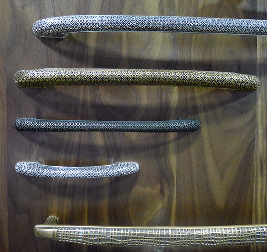
5. What are cool products? Having been to many design shows, I can tell you that sinks with glass worktop covers to conceal the sink from an open kitchen are hot! Hardware in warm finishes and hardware that is more bulky in nature (more bang for the buck) works well in today's kitchens, and of course, hardware is the jewelry of the kitchen! A warm/modern look for the kitchen is what many people are thinking about now.

6. Appliances! Appliances are becoming increasingly concealed as the kitchen floorplan is becoming more open to surrounding rooms. Even ovens are being seen behind closed doors. Panels on appliances do the trick to disguise the function behind the cabinetry facade.

7. Social Network - The kitchen is the social hub of the house and we are seeing larger, multifunctional islands being designed into the kitchen. Easy to communicate with others and great for assisting the chef or a spot to use for entertaining purposes such as arranging wine and wine glasses on one end, islands serve endless social functions. 

8. Where to start? With so many activities happening in our kitchens, write a list of all the activities you see going on in your kitchen. What is your lifestyle? How much importance and use will certain activities take on in the kitchen? Be realistic about your lifestyle and a functional kitchen design will follow!

9. Healthy Kitchen Design - Appliances today have healthy features! Grills, steamers, steam cooking in ovens, rotisseries, filtered water in our taps, fresher refrigerator storage, induction cooking - these are some examples of how appliances can truly work to produce and enhance a more healthy lifestyle.

10. Take your time! The kitchen was not built in a day! The more time you can shed old habits and hone in on what is really important to your family "now", the better your kitchen will be aligned to the real "you." 

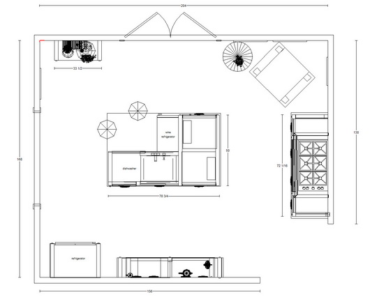
Below, a preliminary floorplan for an open kitchen. Cozy, social, ahhhhh!

Induction Cooking - Electrolux Icon 36" Cooktop

Electrolux invited me to review their Icon 36" induction cooktop in my personal kitchen. I accepted the invitation, looking forward to begin cooking with induction and with gratitude for the opportunity to replace my 20 year old gas cooktop with induction. I have cooked briefly on induction before, but I was very interested in cooking on an induction cooktop over a period of time, to truly understand its properties. I am approaching this review on several fronts.

AESTHETICS

Around this time, I was due to exhibit my new line of kitchen furniture, Bornholm Kitchen, at the Architectural Digest Show in New York. I thought it would be a good idea to incorporate an island into the show which would have a cooktop installed.

As Bornholm Kitchen is easily experienced as furniture and was designed as such, nonetheless, it was fun to see the reaction of visitors to my booth. The Electrolux Icon cooktop has such a low profile that many visitors to the booth were surprised that the island was meant to be designed into a kitchen and was not a dresser or other type of furniture. Their eyes lit up and we saw a smile, or heard a "wow". It is a response that made perfect sense, was fun to see, and confirmed to me that this type of cooktop is a real advantage for the open kitchen floorplan.

The point? Sleek = nearly invisible = aesthetically clean, especially in an open floorplan situation.

CONTROLS

The controls were very quickly and easily understood. I don't remember even looking at the manual before I started cooking; the cooktop is very intuitive. One more note about aesthetics - please remove the word "Induction" from the burners - it's simply not necessary and takes away from an otherwise GORG (gorgeous) stunning cooktop design. That said, I don't even notice it at all anymore - I have other things to think about when I'm cooking, but it's worth a mention.

If I'm going into another level of detail, I'll note that the design of the controls is, well, beautiful. The controls are simple in design and very cool. Less is more aesthetically, and all that. Well done.

COOKING!

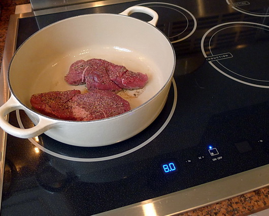
I couldn't wait to cook my favorite things on this cooktop. I like to sear meat and fish, like filet mignon or salmon, then finish it in the oven for a perfect medium rare (especially for salmon, yum!) I also use grill pans to grill asparagas or other vegetables or to saute brocolli rabe, steam veggies or putting that pot of water on to boil, which I want done fast! We (my husband and I) cook with fresh foods all week and the induction cooktop has made the cooking experience a pleasure in all these ways mentioned.

The cooktop is fast. Very fast. Much faster than my gas cooktop. I'm impatient, so I like that, a lot! I'm also fundamentally lazy in some respects, so I like that all I have to do is to put my finger on either high or low, keep it there to control the heat, end of story. Fast, easy, intuitive. One of the very best features of induction cooking is that it has instant response - same as gas. So far, we have instant response to heat control, and more power than gas (see "power boost"). I'm happy. Is it more powerful than the most powerful gas btu burners? I'd love to see a test done. I do not know the answer to that.

A "Keep Warm" feature, multiple low heat 1/2 heat number selections, and a timer round out useful cooktop controls.

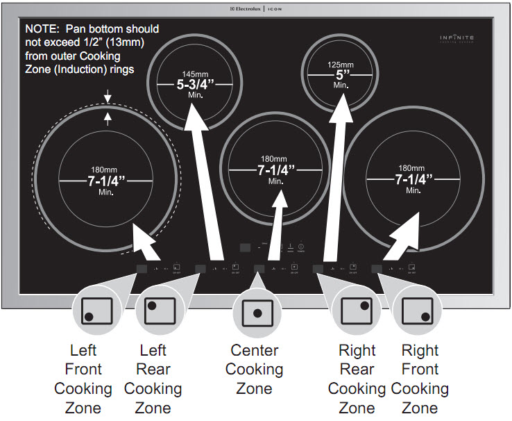
I love the versatility of the cooking zones and how different size pots can be used. I like flexibility. Take a look: 

Induction cooking is THE safest method of cooking, the most energy efficient way to cook, perhaps the fastest method and certainly the most understated in terms of aesthetics. These features are compelling reasons to seriously consider induction cooking. I have the utmost confidence in Electrolux Icon as a brand, based on my clients having purchased Electrolux products over the years and being very pleased with the products...and I hear feedback. 

I love induction cooking, and I'm NOT looking back at my much less powerful (and small) gas burners!


KBIS TOP TRENDS 2011

Where else could this be but Vegas?KBIS is always a carnival of great product discoveries to be found, and this year, although much smaller, it was no exception. The exhibitors had their best game on to present products that are beautiful, highly functional, and classic winners. 

I took 800+ pictures (I'm a little obsessive when I go to a design show) so the ones I show in this collection are those that truly spoke to me and which I feel are worthy to share. Also, take a look at the products that I will be entering in an ongoing basis in our New Products section. You may also find some connections to my previous post on KBIS trends. Enjoy the eye candy!!

And don't miss my post in the fabulous blog, Design Milk!

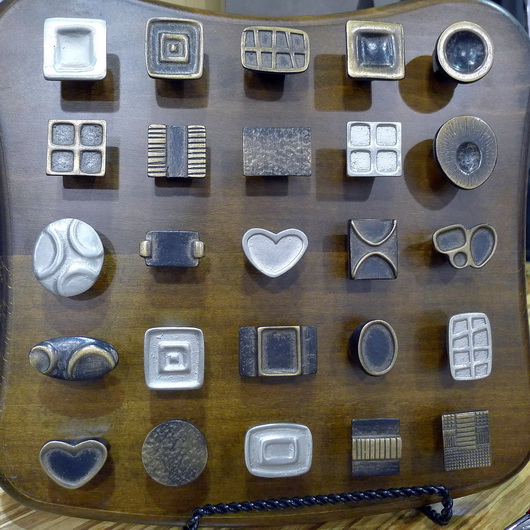
Below: I love this hardware, it's just my style - sort of organic yet whimsical and modern at the same time Schaub Hardware
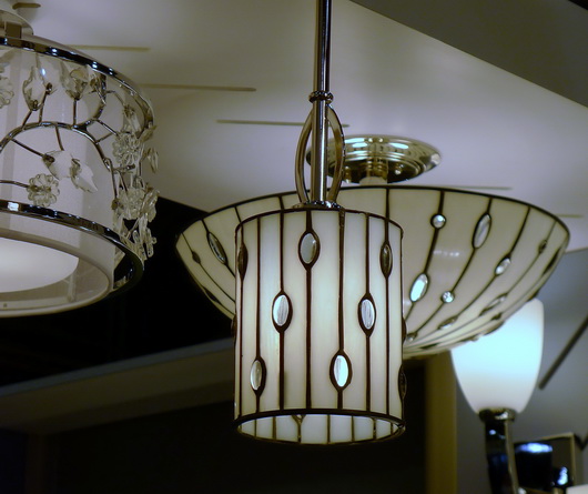
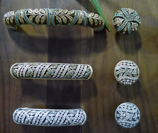
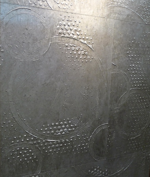
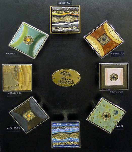
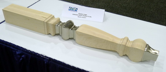
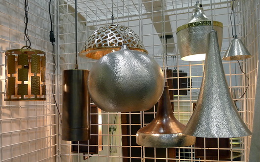
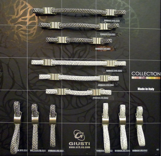
schaub_resize Below: Kichler always displays beautiful and innovative lighting at KBIS. Definitely worth a close look.  kichler_resize Below: Edgar Berebi Hardware - New to KBIS, this hardware company displayed true jewelry for the kitchen or bath! Unlike hardware I have seen before. Edgar Berebi_resize Below: Corian displayed their new colors in very interesting and creative ways at KBIS - Corian Spice Collection corian_resize Below: Custom hand painted wallpapers add a strength and vibrancy to any interior - awesome papers! Vahallan vahallan_resize Below: Wow-Perhaps you can tell that I was very impressed by all the beautiful hardware at KBIS, this year more than others. Love: Classic Hardware classic hardware_resize Below: Multi Media materials were the hot trend at KBIS - I would not expect a leg such as this to be a huge, mainstream trend, rather, a peripheral trend - so you're safe! Osborne Wood osborne wood_resize Below: The rounded relief pattern of Context, an eco friendly tile by Ann Sacks Below: Thompson Traders simply has stunning products - from hammered sinks to lighting, a real treat for the eyes Thompson Tradersthompson traders_resize Below: Enkeboll has introduced several new collections and metallic finishes! Enkeboll enkeboll_resize Below: The Nebula series by Silestone has depth and movement with an organic point of view Silestone Silestone Below: Beautiful hardware Giusti Hardware Giusti
Bosch Appliances–Beauty and Brains!
I was delighted to be invited to the Bosch training and showroom facility in beautiful Scottsdale, Arizona. I so welcome these opportunities to travel to corporate showrooms around the country (and abroad) for focused product training, which always adds another dimension of insight into a brand’s unique history and philosophy.

Robert BoschWho knew the founder’s name was Robert Bosch (1861-1942) who was equal parts socialist and capitalist, botanist and inventor, pacifist and philanthropist … whose company was one of the first to provide health care to its employees as well as the eight hour work day … who worked with Thomas Edison for a year here in the US and who had a commitment in theory and in practice to (what we now fashionably call) Reuse, Recycle and Reduce - in extreme ways? Bosch (the corporation) has recently celebrated 125 years of being in business as well as celebrating their equally long tradition to social commitment.

Half of the profit that Bosch generates each year goes toward philanthropic and environmental endeavors-nearly astounding! Since 1964 the Robert Bosch foundation has funded more than one billion euros toward the company’s social and environmental commitment. What an inspiring piece of “corporate history.”
BOSCH SHOWROOM DELIGHTS

I will have more information on some of the great features of Bosch appliances in another post. Quite frankly, I lost track of all the #1 awards Bosch has won, but it is impressive. Half the fun of going to these events is to enjoy the beautiful showroom design! I’ll take you for a short tour. Let’s take a look, and note the appliance integration. Enjoy the view.

Below: A look at the Bosch reception area just past the front desk. Tranquil and serene, connected to the feeling of the Arizona landscape 

bosch showroom 1

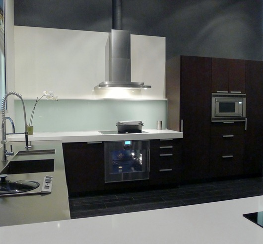
Below: A wide shot (with the exception of one leg of the “U” shape) of the kitchen we cooked in, with a complete suite of Bosch appliances. A simple design with just a touch of coolness in the countertop and tile backsplash, accented with cool (toned as well as featured) stainless steel appliances.

Bosch showroom 2

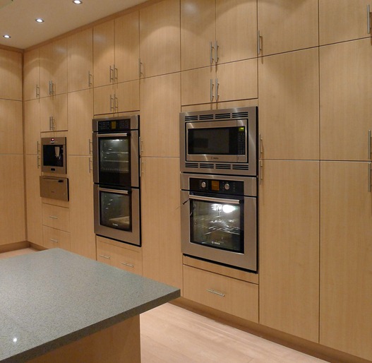
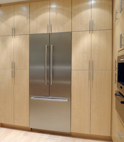
Below: The tall wall of appliances and storage – so popular in European kitchen design, it serves as a visual foundation to the kitchen.

Bosch showroom 3

bosch showroom 10

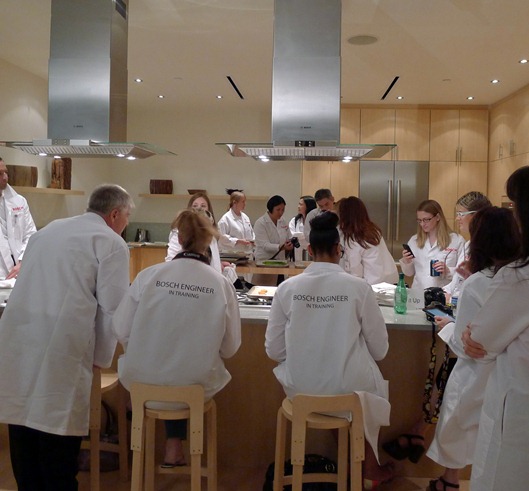
Below: We were all “Engineers in Training” for the day with real Bosch product engineers! Taking a short break in between learning all sorts of mathematical equations and theories-exhausting! Winking smile

bosch showroom 4

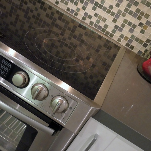
Below: A nice tight integration with cabinetry and countertop – the Bosch slide-in range. A slide-in range is a superb and elegant solution (and less costly than the purchase of a separate cooktop and oven) to what could otherwise be the bulky look of a freestanding range. An often forgotten product solution, the slide-in range provides a “flow” to your kitchen

bosch showroom 5

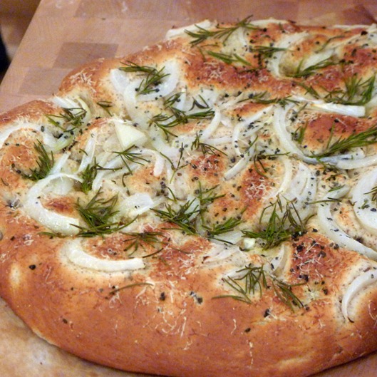
Below: A fantastic and delicious artisan focaccia, just out of the Bosch true convection oven. It was delicious! Part of our experience cooking with Bosch appliances

bosch showroom 6

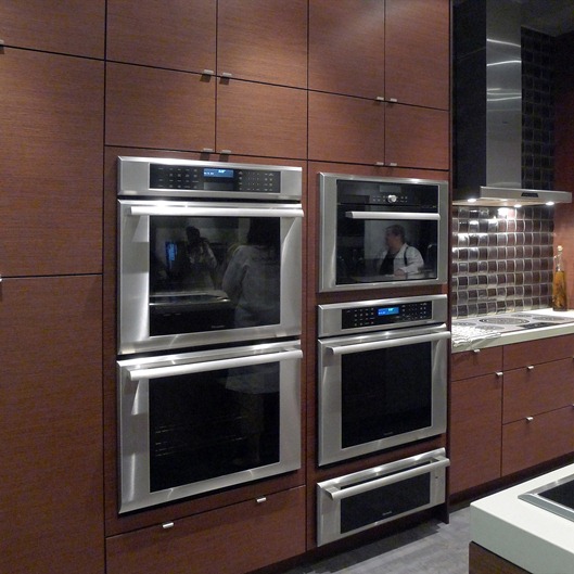
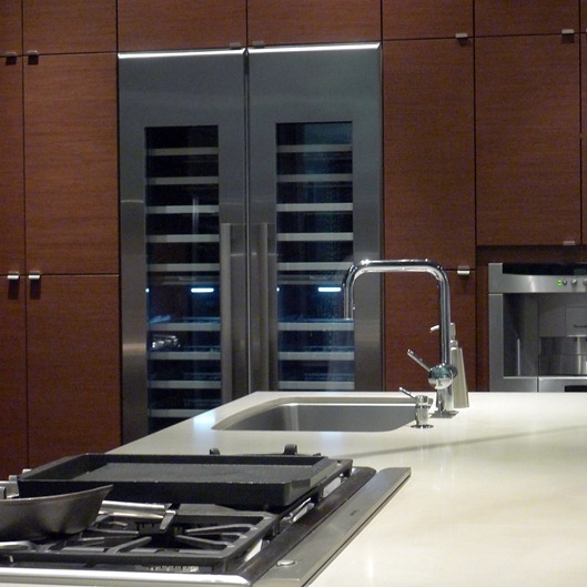
Below: Now, let’s take a peak at a few other kitchens in the Bosch facility with either Thermador or Gaggenau appliances, both under the Bosch corporate umbrella

bosch showroom 7

bosch showroom 8

bosch showroom 9

bosch showroom 11

bosch showroom 12

Bye, Scottsdale! (sniff...)

bosch showroom 12a

English Fancy–Royal Wedding Edition

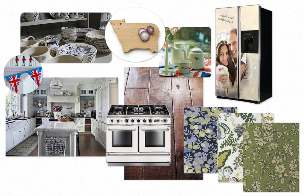
Are you all recovering from your Royal Wedding revelry?  I didn't think I'd get caught up in the hoopla, but found myself stalling my toddler from heading to the playground so we could catch the tail end of the festivities.  I bribed her with promises of seeing "horsies" and princesses err...Duchesses of Cambridge (?!).  Now, onto festivities of our own, though no less majestic - Moodboard Monday Royal Wedding Edition!

Paying homage to the formality of traditional English Kitchens, we've kept things sophisticated in this week's installment with a subtle and classic color palate of white, nickel & blue.  For initial inspiration I've drawn from one of my all-time favorite images of a gorgeous kitchen designed by our very own Susan.  Though not technically located in England, the aesthetic is definitely reminiscent of a traditional, luxurious English farmhouse kitchen. 

Loving the striking look of this Falcon Range, with its rich heritage as one of the UK's leading manufacturers of professional range equipment.  Care to greet a life size portrait of the happy couple every time you reach for the milk?  Enter this GE fridge and get your royal fix in a prominent manner. 

Finally, what Royal roundup would be complete without a healthy dose of the great UK emporium, Liberty?  Cut up some crumpets on Carmen the Sheep. Host tea time with thisEmma Bridgewater dish ware set, and sew up a quick apron & tea towels with these gorgeous Liberty textiles

Cheerio!

Best, Kelly

KBIS 2011 Kitchens

I always like to walk the kitchen and bath show and take pictures of the kitchen displays. Having just been at IMM Cologne in January, the kitchen designs were dramatically different at KBIS and I MUST gather together the images I have of full size kitchen displays from the IMM Cologne show.

There is much more detail in the KBIS kitchens (that is not a positive or negative, it's in the eye of the beholder.) The first image is from an Italian manufacturer and all others are American manufacturers - the style contrast is clear!

My opinion: in some cases, more is not better. Restraint is a good thing...less is more and all that. We also need to remember that we will have reactions to these different styles and there is a kitchen design for everyone, just like there is a guy for every girl and vice versa. Enjoy!


Get the flash player here: http://www.adobe.com/flashplayer


KBIS 2011 Decorative Details

I'm sitting at the gate waiting for a flight delayed quite a few hours. Let's take a look at random, decorative details in no order, seen at KBIS, for no reason other than I have time for a free form "gorgeous" fix.

Below, hardware from Schaub

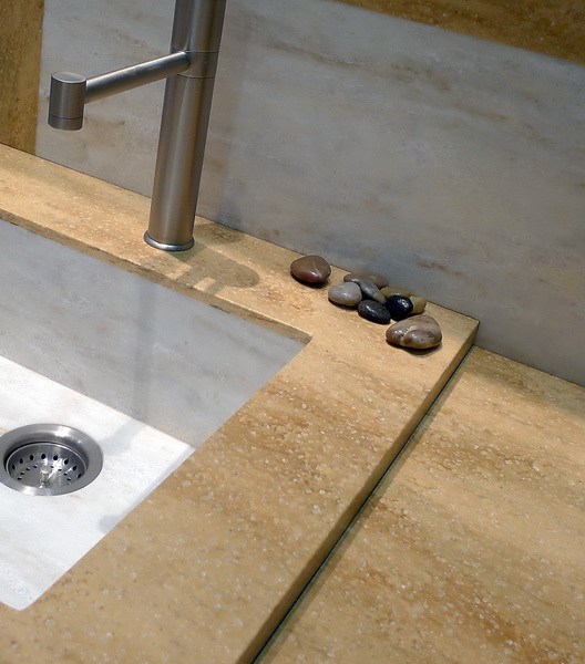
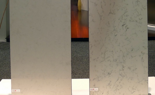
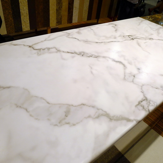
Below, Calacatta marble from Italy Formica

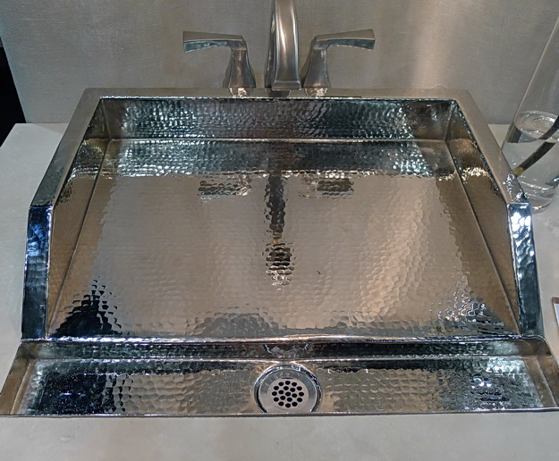
Below, a fabulous sink by Thompson Traders

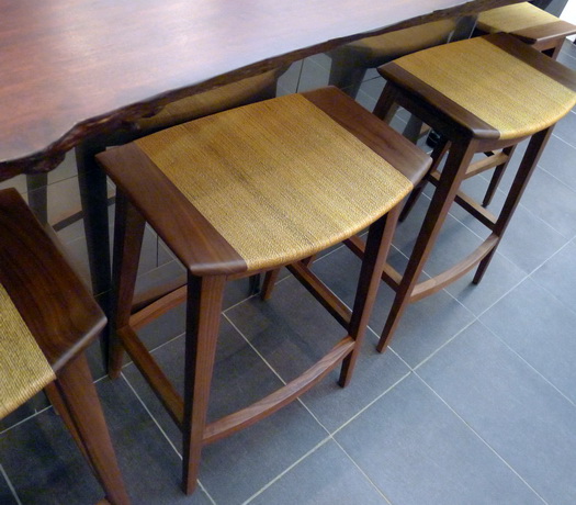
 Below, beautiful stools with no name at the Kallista booth


KBIS 2011 - Kitchen Bath Industry Show in Las Vegas

Merrilat KitchenFresh from walking the show floor of KBIS (Kitchen Bath Industry Show) held in Las Vegas, following is an overview of my impressions of what's new, what's trending and why. 

THE SHOW FLOOR

The kitchen and bath show (KBIS) was smaller than last year, three years after the financial crisis, which was quite surprising to me and to other veteran industry attendees I spoke to. Those who attended their first, second, or even third KBIS, have no concept of how different a show KBIS has become since before 2009 (I've gone for about 20 years now.) To see the show even smaller this year, and the booths stretched out (wider aisles, etc.)  within the exhibit hall to achieve a perceived "fit", was obvious and a bit disconcerting, 3 years after 2008. 

Exhibit booths for major brands were drastically smaller, in probably all cases, often with little adornment (thank you Formica for a smallish but fabulously designed booth.) And, countless major national brands simply disappeared from the show floor this year. KBIS is a shadow of the show it used to be. The show program (a sort of soft cover book of conference schedules and exhibitor list) tells the story too -geez, was it small!!

That said, I would never not go. It (the basis of the show) is my world, the one I reside in every day. How can I not go? So, I go, and I'm still genuinely very excited to attend every year. Good for those companies who did display...I assume due to the show's size, they had quality visitors to their booths.

NEWS FROM THE KITCHEN AND BATH SHOW

Without further ado, here are the major trend messages observed from the show floor! Visual examples will be forthcoming in future posts.

It's all about BROWN undertones - the whole spectrum from light, mid tones to coffee - brown finishes and often gray browns (more brown than gray) dominate cabinetry, new countertop introductions, tile, more. Black, at least in cabinetry, and white (as always), are in the mix....black as the new (yet classic) neutral for cabinetry?

Transitional cabinet door styles, the shaker door in various forms, and the soft modern style or a more simple traditional theme, was a focus for the kitchen and bath

Technology focused on quiet, soft, easy access, ergonomic design solutions for cabinetry

Multimedia - products mixing disparate materials for a fresh design statement...the theory that interesting texture can be a small price to pay here and there in the context of the cost of a whole kitchen remodel

Sinks - seamless integrated sinks and countertop solutions and sinks designed to perform multiple functions including doubling as counter space

Budget - Many manufacturers introduced a lower priced line or moved/modified existing products into a lower price point to provide expanded choices to their customers. Even luxury brands such as Artistic Tile, Corian, Dacor and others have discovered and introduced new ways to make their products affordable. This is an across the board trend and seen in product design with a focus on style, durability and longevity.

Tile - Tile is getting smaller and longer lengths in many cases with newly introduced high def imaging to create a truly authentic look. Many/varied glass accents. Tile continues its style story in the kitchen with softer/simple, often mosaic, designs that encompass expanded areas in the kitchen beyond the backsplash for a look that flows (example, surrounding a window to the ceiling)

Lighting innovations continue to focus on led and substitutes were shown for the typical incandescent light bulb design but with energy efficiency built in. Task and accent lighting keeps getting smaller and more flexible in terms of installation and design (lighted tile in a backsplash anyone?) even color of lighting available.

Cabinet hardware is focusing on additional warm finishes and styles with more visual weight to make a statement (bang for the buck theory and a good one). More soft modern styles and styles which are very modern, projecting significantly off the cabinet for its own statement, are trending. I also observed this in Germany in January at IMM Cologne.

Green - An effort to "go green" but not as prominant an effort as I've seen previously

Color - I did see quite a few products of neutral shades which had a soft green undertone, sort of a gray green. Otherwise, color, in its bold form, was hard to find! I observed it in pockets, certainly not as a dominant theme at the show.

Innovation? Not so terribly much this year as compared to other years. More repositioning/tightening of existing product lines and thinking more creatively in terms of budget products...which of course, is good news to many, many Americans, making the kitchen design process fun again for lower budgets.

This is my preliminary (but well thought through) report. After looking more closely at my 800 images, I may add additional thoughts. More to come!!

KBCULTURE 2011 Awards - Bornholm Kitchen Wins Cabinet Category

We are so honored to have won KBCULTURE 2011 Award for the Cabinet category!  Thank you, Leslie & Mervyn!  We feel humbled to have been considered amongst such an esteemed group of products and companies and are very appreciative of this prestigious recognition.  

The award criteria evaluates commitment toward innovative thinking and design from the smallest aesthetic detail to the larger scope of the product's position in the overall market landscape.  Of course, all of the entrants have taken huge strides in these areas and we look forward to spec'ing many of these products in future jobs.  


KBIS 2011 - Kitchen and Bath Industry Show

KBIS 2011, the trade show for all products related to the world of kitchens and baths, begins next week from April 26-29 in Las Vegas. As always, and as for the past, approximately, past 20 years, I will be there again, enthusiastically, to:

  • scour the show floor
  • spot trends
  • discover new products
  • meet friends!
  • attend fabulous events
  • gather tons of information

 Already, pre show, I can share a few choice sneak peeks of products that will debut at KBIS. Here we go!

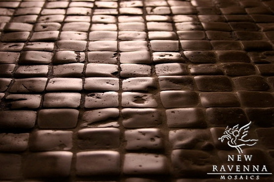
New Ravenna Mosaics promises to have stunning new collections of tile! 

Below - Seemingly, authenticity is redefined in this new collection by Giovanni Barbieri. It immediately reminds me of this post on antique floors from Spain I wrote for thekitchn. 

Below - A NEW product to the kitchen world, the introduction of a glass kitchen sink by JSG Oceana. I've got to take a look at this, especially to touch it, feel it, see it in action. It is said not to scratch or stain. Made in USA!

Below -  Hafele, an incredible company with some of the most innovative products for kitchen and bath, introduces the LOOX LED System. Think "plug and play", think "easy" solutions where multiple products work together for lighting design flexibility. I KNOW lighting information often begets a groan...in this case, all you have to do is to look for color coded products which all work together.

I am so ready for Vegas!!!! So much more to come!

Introducing Kelly to "The Kitchen Designer" Friends

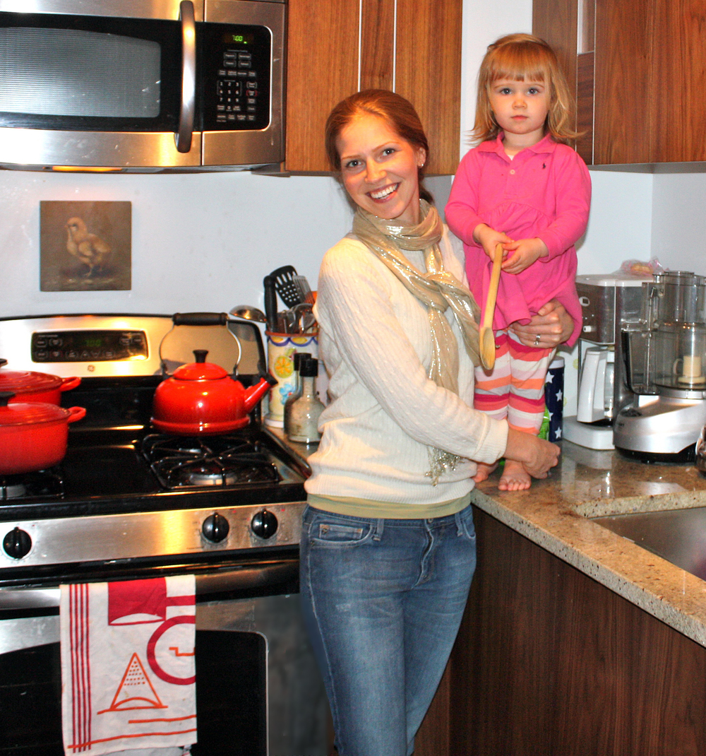
Kelly and Susan, standing on the grand stairs in Central Park near Bethesda Fountain! Hello! For my first official post, I wanted to take a minute to introduce myself to you lovely readers.  I'm Kelly Donovan and excited to be joining my mother, Susan, around the proverbial kitchen table to dish about all things related to our favorite room in the home.  A bit about me personally...
 
Having a mother who is a long time accomplished kitchen designer, and a father in the construction trade, I've grown up surrounded by all types of home renovation, specifically of the kitchen kind.  I've worked with (ok, for) my mom on and off since I was a teenager - looking to supplement my babysitting income with a little extra to buy that awesome jean jacket that all my friends had - and now as an adult, feeling privileged to join the family business in a bigger way and follow a true innate passion.  

Living in Manhattan for the past 8 years, it's been admittedly difficult to fulfill my passion for beautiful and functional kitchens while having my own space to cook in that was barely bigger than a shoe box.  I've made do, however, and never let the lack of a four-burner stove or dishwasher stop me from hosting huge dinner parties or cooking up elaborate, special meals for my family.  I've become an expert in space efficiency, and while I have graduated to full size appliances and granite countertops, I'm still storing my pots and pans in the oven.  I look forward to the day when everything has its place and I can have all the single-use small appliances of my dreams!

Perhaps you're wondering what took me so long to follow my passion and join my mother in her business.  It's long been a thought in the back of my mind, and something I knew I'd pursue eventually.  However, as children do, I fought hard forging a path of my own and after college (Fordham University) fell first into publishing and then online advertising, working for great companies such as Harper Collins, CNET and Yahoo! and enjoying the many perks of a sales & marketing executive to Fortune 100 clients.  As nature took its course, I got married, had a baby, and decided the full time corporate life just wasn't for me anymore.  I felt it was time to come home, in more ways then one. So here I am...thrilled to be joining my mom in this adventure - from the blog, to our launch of Bornholm Kitchen, and all things in between!  

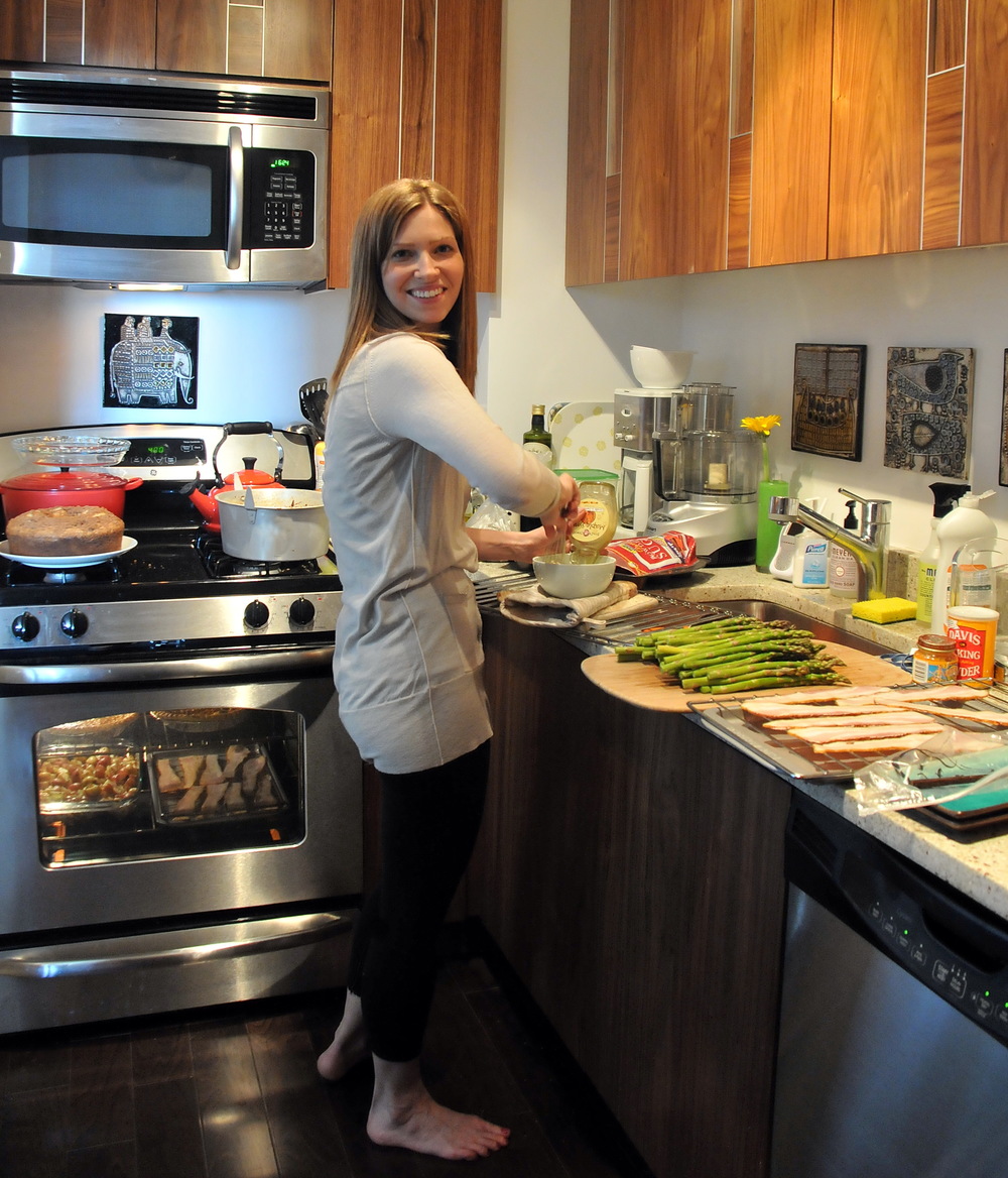
Now, what should you expect from me?  In terms of blog content, I'll be focusing on style, products, accessories, and appliances and trying to add a little personality to this once-utilitarian room. You've probably noticed the new sections we've added above.  Moodboard Mondays is simply a coalescence of products, surfaces, rooms, and images meant to delight and inspire.  Kelly's Finds will profile unique and useful products I'll be seeking out in my travels throughout the city and across the web that can add some character and efficiencies to your kitchen.  We've come a long way from working kitchens of yesteryear designed purely for function, and I look forward to livening up this space with you! Here I am...in full production below!


 A couple of words from Susan/aka mom: I have been anxious (to say the least) for Kelly to join me in the family business. I could not be more thrilled - Kelly is smart, uber stylish, on trend to the MOMENT but with a global foresight and interest in the word "why." I'm VERY lucky to have her and I think you'll enjoy Kelly's insight too. Most of all, we LUV to laugh out loud and often! Oh, look at this brunch to see the fabulous finished dishes from the image above.

Autokitchen 10 - Amazing Graphics, Smart Design

As gushed noted previously in this blog, I have been, and remain, captivated by the visual poetry of, yes, the graphics of Autokitchen! (Going to KBIS? Autokitchen will be at booth C4990.)

Some time ago, my eye and my brain got married to Autokitchen. The brain put it this way: “This program is relatively easy to learn, is fast, and has every part and piece I need to create as simple or as custom a kitchen as I need without skipping a beat.” The eye felt this way: “The graphics are simply to DIE for!” A happy marriage (cue the white picket fence).

Enter the next generation, Autokitchen 10 (do you love this analogy so far?) The next generation often has it better than the previous generation and this is no exception. Here are some of the attributes of Autokitchen 10:

A new mosaic collection from New Ravenna (stunning tile)

Several new collections of wood carvings including Art for Every Day, Classic Designs by Matthew Burak and Adams Wood Products

New architectural tools to create even more professional architectural drawings, including new, impressive, dimension styles

Many new appliances, door styles and countertop materials

This week Autokitchen is releasing the catalogs for Wood Mode /Brookhaven and allmilmo – that’s big!

These are strong new additions to Autokitchen, already the leader in high quality kitchen design software. The color graphics of the program are outstanding. Floorplans, elevations, and perspective drawings are detailed, with a crisp, architectural look.

On a personal note, I tell my children more than they want to hear that a secret to life is to think flexibly. Autokitchen thinks so too - it allows a designer to go with the flow with enormous flexibility to modify cabinetry on the fly and/or to draw and extrude shapes into 3d objects FAST. It's reliable and the technical support, from my own personal experience, is a notch above top notch, maybe two; you will receive superb and friendly service.

Two versions of the Autokitchen Studio version begin at $995 and software prices are on the website; affordable and price transparent. 

What I am REALLY excited about is my forthcoming affiliation with Autokitchen and my new collection, Bornholm Kitchen. Our partnership will allow Bornholm Kitchen designs to be brought to life as only Autokitchen can do. Soon, I will give you a few sneak peeks of our exclusive new designs for our web retailers 2Modern and Avolli.com. For now, take a look at these images by Autokitchen... (Going to KBIS? Autokitchen will be at booth C4990.)


Nautical Bornholm Kitchen

Without fail, as the mercury begins to rise and I can see Spring on the horizon, I feel a gravitational pull towards all things nautical.  So it's no surprise that while perusing the AD Show a few weeks ago I was stopped in my tracks by these stunning ship lights and thought they'd make a fabulous addition to a Bornholm Kitchen. 

If you're at all familiar with the geography of Bornholm, you'll know it's a small island off the coast of Denmark, and being surrounded by water, fishing has been both an industry and pastime near and dear to the heart of Danish culture for centuries, from their diet rich in Herring to the sea-bound Vikings of Scandinavian ancestral legends.

We thought of no better way to pay homage to our line's namesake than to style it accordingly, of course!  Here are a few selections to heighten the authenticity of your Bornholm Kitchen and bring this wonderful legacy into your home.

We love the industrial feel of this Blanco faucet.  I can just imagine the vikings using this in their ship galleys...that is, if gorgeous, semi-professional high end faucets were around centuries ago and vikings had a hankering for luxury.

Throw down this authentic Swedish rag rug and feel the waves lapping underfoot. 

Place a few of these shiny red varnished stools, designed in 1934, alongside the bar overhang of your island and add a fun splash of color in keeping with our nautical theme.

Add in the simple, clean lines and professional feel of this punchy red espresso maker and enjoy a homemade Danish caffe latte.

Finally, soften up the look and tie our colors together with this gorgeous painting of the most famous (and historically notorious) fishing port called Nyhavn, in Copenhagen.

Careful planning on the part of those 17th century Swedish builders to incorporate all of the shades mingling in our Scandinavian sea heritage inspired kitchen. 


Appliance Spotting At IMM Cologne - The Living Kitchen

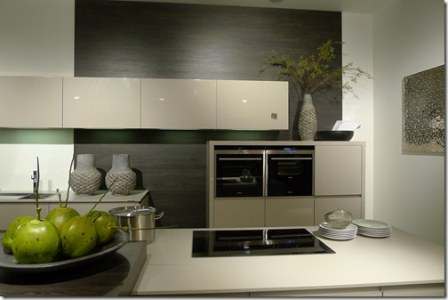
As anyone who has even remotely followed European kitchen design knows, appliances are virtually engineered into the most seamless fit within cabinetry to create as seamless a look as humanly possible.

To me, built in appliances are a special type of beauty to behold. It's sculptural, often a look of architectural permanance in the home and the design just flows. But, it's certainly not all about appliances being built in...some of the coolest appliances were freestanding or top mounted.  Let's take a look at some appliance awesomeness.

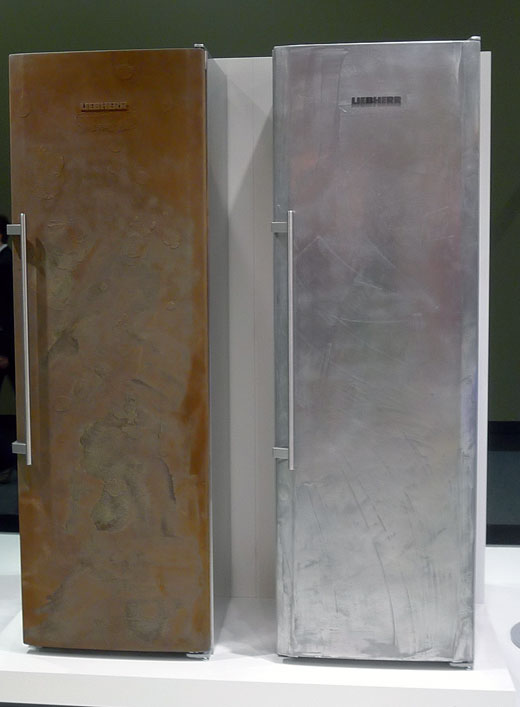
Below, Liebherr's experiment with texture-I was told it was a concept

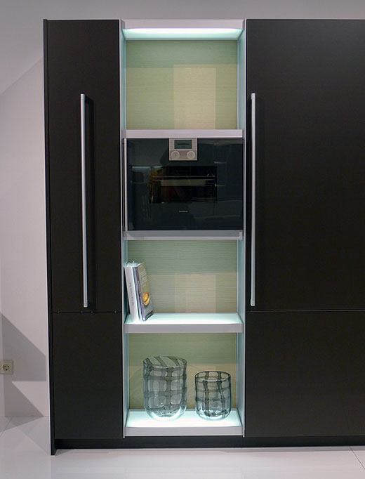
Below, a sleek built-in Gaggenau oven...just fits in there so snugly!

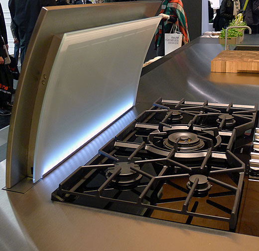
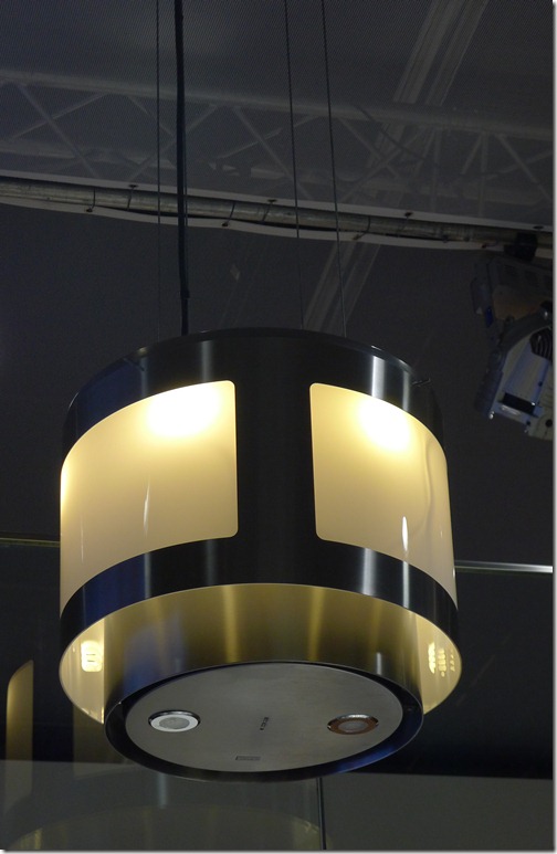
Below, a very cool downdraft fan that glows - I did not get the name of this appliance, but I'll attempt to find out and report back!

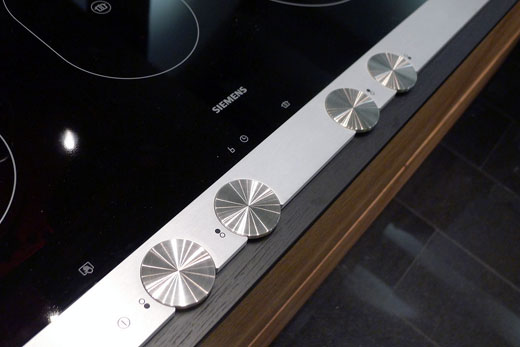
Below, I just loved the knobs of this Siemen's cooktop...enjoy!

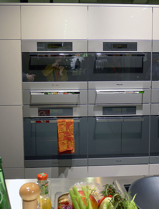
Below, love the stacked, super built in Miele ovens, don't you?

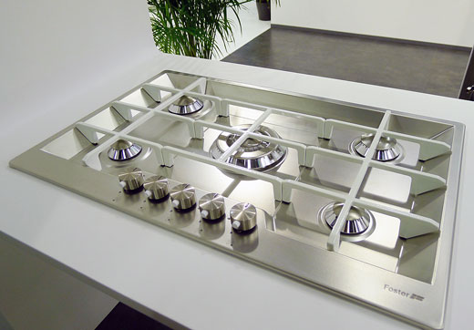
Below, an elegant drop in gas cooktop by Foster

Below, how about this curved range by Lofra

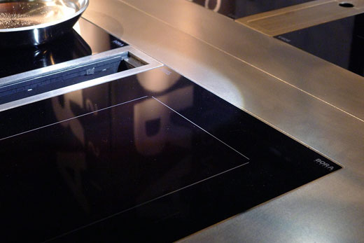
Below, uber built in cooktop in stainless steel by Bora - note the flush installation

Below, sexy built in Miele ovens once again!

Below, I really love this cooktop by Foster that is a long span of one cooktop wide, front to back

This is pure eye candy (at least for me!) I like many of the details. I have more appliances to show, which I will, soon! Much more to come from the IMM Cologne Living Kitchen show in Germany, especially the fantastic design of kitchens and furnishings...not to mention the displays within the exhibits!


IMM Cologne - Living Kitchen Overview

The Living Kitchen show at IMM Cologne, held in Germany less than less than 2 weeks ago was kitchen heaven, purely and absolutely. The exhibits “told” many visual stories – whole stories, as the displays were large, some, enormous. I was a guest of Blanco (a bigger player in the global sink and faucet scene in terms of design and product presence than I realized) and was invited as a member of the Blanco Design Council. Here are some of the most compelling chapters in the book of today’s kitchen!

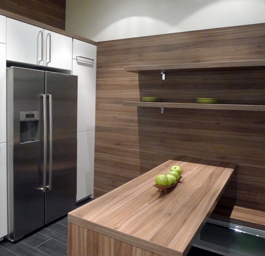
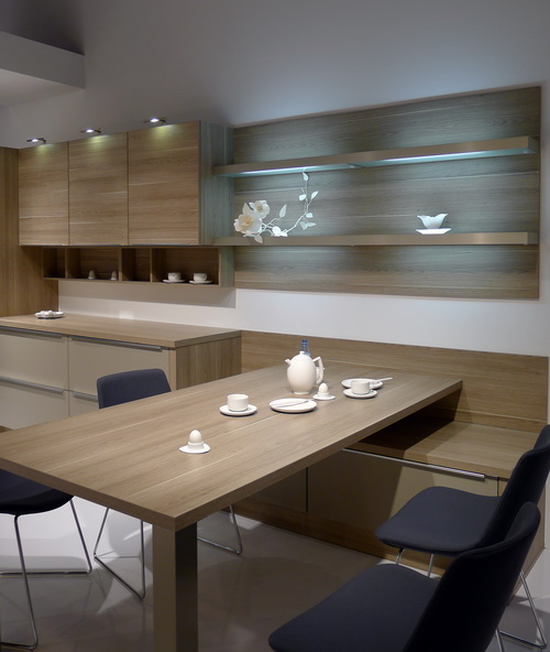
Chapter I Overview – The Living Kitchen was a very appropriate name for this show. Lowered “platforms” and varying levels for alternative living in the kitchen, a more “living room-like” aesthetic, the warmth of wood or faux wood, are a few of the specific features  which define this movement. Sinks and faucets are going along for the “living kitchen” ride and fabulous examples will follow. It is clear that style and function have met, fallen in love, and are planning for the future. Simply, it’s about living in the kitchen…see how:

livingkitchen1a

Chapter 2 – Cabinetry designed as sculpture is a traditional strong point of European kitchen design but seems to take another step into integration with surrounding rooms, which is VERY exciting visually yet may also make that connection in a quiet and elegant way, the result of which can be a space which appears more expansive.

nolte_32

Chapter 3 – Appliance Integration and Technology – European kitchen design has always been the leader in integrating appliances (seamlessly.) Appliances, any type, are now fully concealed into cabinetry which replicates truly invisible cabinetry, and I would not even say they are integrated into pantry cabinetry; I would call it the built in closet look! In addition, exposed appliances are showing super seamless integration into countertop design.

One appliance which is not so much about integration is the hood – the hoods total transformation into a design element is complete. Whether your style is pretty, modern, super stylized or elegantly low profile, the hood is a wonderful opportunity to express oneself and I think that’s one of the feel good stories here!

Appliance technology is about energy efficiency, a variety of neutral color choices (very exciting to see) healthy cooking, and the ultimate: personal cooking flexibility-where would you like the burner positioned on the cooktop? And there’s more! A food preparation appliance that allows food to last in a refrigerator for 2-3 weeks – surely, a game changer! Examples to be shown soon!

Germany II 878

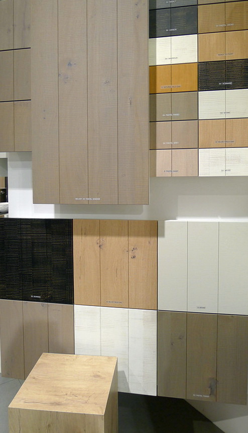
Chapter 4 – Natural real or natural faux materials – What this means is that natural wood grain rules…sometimes, the more textured the better, which adds visual interest, sometimes a little whimsy too. But, the story here is about an appreciation of nature in many forms.

Chapter 5 – Color - Well, the fun news is that the accent colors were clearly lime green. There were accents of magenta as well. The biggest color story was the greige, beige, mushroom neutral, which I have mentioned before. It seems that quiet and serene has spoken more loudly than color at this show, at this time. But, that is not to say that color was not present in bold, fun, ways. I'd say that its presence felt more focused than broad. I'd call it: "color optional." 


Sooooooo much more to talk about, all coming soon!!! Do you want to see more??

IMM Cologne - Kitchen Thoughts


I am writing this on the plane on my way back from IMM Cologne, the Living Kitchen trade fair in Cologne, Germany. I was a guest of Blanco, as were four other bloggers (Paul_Anater, Jamie Goldberg, Cheryl Clenendon and Leslie Clagett) who are also part of the Blanco Design Council. It was an AMAZING trip. Germany is rich, culturally, and visually beautiful, not to mention on top of its game, showcasing innovative kitchen design and that includes Blanco's line of products which were exactly on the mark for today's (interestingly, US) consumer.

So, I think the best approach might be to present my discoveries, impressions, and information in an organized way. I have just spent the last five hours of this flight sorting into categories, one by one, just around 2,360 images, taken over several partial days. THAT is a record for me!

My singular goal at any show is to size up products and displays quickly (for the most part) and be ready to shoot fast, really fast, even as I see people walking into the image I want to shoot. In a nano second, I know that a section of an image can easily be cropped, so there is no dilly dallying, camera in hand. As a result, speed and quick right brain visualizing gets me lots (and lots) of good information in my images. It's an obstacle course, and I love it!!

That said, I'm trying to do several things at once at the show...understand the products, the details, and the design, ask questions of those working at the booth...and move on! A veteran of 20 years of trade shows has made my particular process into a science!

Now that the images are categorized, I think (unless I change something later) I will do an in depth series on the following topics.

Here are the categories that we will be covering over the next few weeks:


  • Kitchen Living Show Overview-talk about trends
  • Appliances
  • Countertops
  • Cool and Uber Cool Kitchen Design Details
  • Dining Tables
  • Kitchen Stools (so fun to look at, I think!)
  • Drawer Inserts (wait till you see THESE)
  • Hardware
  • Overview of Kitchen Design Trends
  • The "Living Kitchen" Special Exhibit 
  • Sinks and Faucets
  • Color and Texture
  • Possibly flooring

Oh yes, and I really want to include a post on kitchens on a budget, as I have been inspired by some of the displays I've seen - let's just say, high design/low budget is SO doable and you've got to see how easy it is to achieve a fantastic modern kitchen.

If anything else comes to mind, I will adjust the agenda. What about you - what information are you interested in knowing??

I'm soooooooooo excited - it's great to feel that spark of excitement..many sparks in this case! (I took this image below while on the train from Dusseldorf to the Blanco factory in southern Germany - what views!)