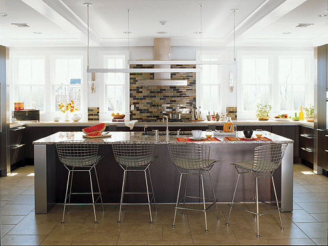
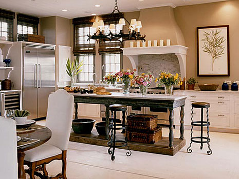
Le Tour - Belgian Kitchens Today and Yesterday

A-Maid-In-The-Kitchen.jpgToday Le Tour de France goes through Belgium, through beautiful Flanders, amongst chateaus, canals, and wonderful little villages. Unfortunately, there was rainy weather and a huge crash! Watching the peloton is really something awesome.

While I won't be updating you on the tour every day (I promise) I do feel compelled to give a bit of a showcase of Belgium by virtue of, what else, Belgian kitchens! Now, it's not the easiest thing to do to find Belgian kitchen design, so we have a mix of the very old Belgian kitchen by Belgian painters, and the uber-cool and awesome new kitchens, found in Design Addict.


The first image is called "A Maid In The Kitchen" by David Emile Joseph de Noter. I don't think the maid is doing her job, do you?  She looks awfully depressed!


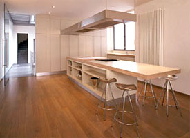
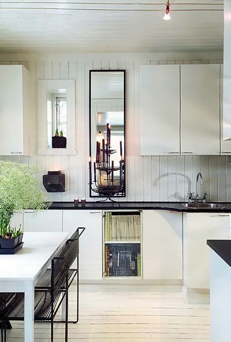
Belgium-3.jpgNext up is a kitchen by Suzon Inber & Associates at www.inger.be  


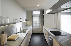
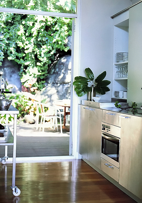
Let's take a look at another kitchen from Suzon Inber & Associates. belgium-1.jpg


And one more ancient kitchen. I think they had issues in those days. What a mess! This  was painted by Joachim Antonisz Uytaewael, 1605.

Here is an interesting explanation of this painting from lepg.org:"Another erotic kitchen scene, with the cook spitting a chicken in the center of the picture (apparently a suggestive activity to the 16th century mind). She is wearing the same type of clothing as the woman in the van Ryck kitchen scene, only her partlet is more decently done up. There are two men in the picture. they are wearing trunk hose, gathered to just above the knee. In both cases their nether hose (stockings) are falling down. I think this was probably pretty typical for working men.  The stockings come just above the knee normally and are gartered, usually just below the knee, but since elastic hadn't yet been invented, it would not be untypical for the socks to still end up coming down around your ankles all the time. This scene has wonderful details of redware, cooking utensils, and orange carrots. Most carrots at the time were white." 

Take a look at that site, there's some very interesting kitchen scenes and analysis of the paintings.

lepg.org-goddess.jpg

An iPhone For Every Kitchen Project?

Yes, I succumbed, followed the crowd, became an iPhone fangirl, and all the rest, I admit it! But, oh, it's soooooooo sweet! Needing a new phone, I researched for a month before the iPhone's release, hardly even considering the iPhone in the equation, discarding it early on as a contender, as I was focused on Blackberrys, the Nokia N95 (with an incredible camera, but alas had some dealbreakers) and other smart phones. I was democratic in my comparisons. That said, I ultimately decided to purchase the iPhone, and it has already made my life and my work easier, and isn't that the test?

Here's why I bought the iPhone, but please note, in general, how important some of these features can be, whether one is a designer or a client. It's a tool!

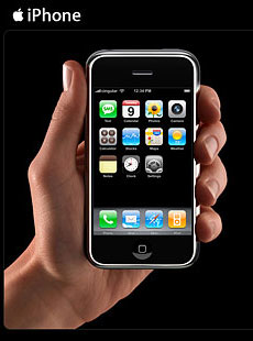
iPhone-1.jpgThe large screen

In the end, this was my number one reason for purchasing the iPhone, end of story. I am so done with small screens! The experience of using a large screen (important when having a smart phone) enhances the usefulness of the device by a huge margin in comparison to other devices. I mean, otherwise, what's the point? I want the biggest screen I can get, and this is it (at least from what I researched).

Images - Great for Designers' & Clients' Purposes

The iPhone is ALL about images. Let me clarify that. Kitchen Design is MUCH about images, therefore, how a device handles images, to me, is huge. The camera is 2 megapixels, better quality than most other camera phones (except the Blackberry Curve, also 2 mp), not as good as the N95, with an astonishing 5 mp camera. But, it's definitely good enough.

It's good enough for clients to take quick shots (again, with a large screen as a handy tool) in a showroom (ask permission first!), at a detail from a friend's house, at the granite yard, to remember whatever details you want to remember on the spot.  And, the image can be quickly and easily emailed to anyone, meaning your designer! I don't know how I lived without a camera in my previous smart phones before! A tip when using the camera: hold very still and make sure you have enough light. That's really all you need to know.

iPhone-2.jpgBesides the camera capabilities, I quickly loaded nearly 200 images into the iPhone from my computer, of kitchens, built ins, and custom furniture pieces, and it took up a negligible amount of space in the phone's storage capacity. I'll add many more. I've already shown details, and whole kitchens, easily seen on the large screen, to clients at meetings in their home. The iPhone turned sideways, makes the images even larger, if they are horizontal images. AND, to make it even more crazy, the images are organized into albums that I can quickly and eaisly select!  The images are viewable in a meaningful way.  It doesn't get much better than that.

Taking additional images at a client's home that I may have missed with my camera the first time around, taking pictures of images from a book or magazine that they are showing me, of an architect's floorplan before I get my copy of it, is invaluable.  For so many purposes, a quick snapshot tells a story far better than words can.

iPhone-3.jpgAppointments

This really makes me happy. There are TWO alerts you can set. I set one alert the day before, the second alert two hours before the appointment. I'm covered! 

Internet

While not super fast, to be able to enlarge text and images, and situate a page sideways, is far more valuable than any other device out there for that reason alone.  

Google Maps

If you don't have gps in your car and you need to get to my design studio, again, you're covered. Google maps has already saved me from being late to an appointment after a detour in the road changed my route.

iphone-5.jpgEmail

I have 4 email accounts loaded, and the large text and fast scrolling is delightful to use, mostly, due to the large screen. A vast improvement over my previous pda.

Conclusion

These are just a few of the features that I'm enjoying using. Sure, it's not perfect. There is not one phone that is, that I've found. But, for my profession, where images are so important, it's so much and more! It's an elegant device, and it definitely exceeded my expectations. The images shown are from my design studio and have been (very) quickly enhanced to show the possibilities, as I never NOT tweak an image straight from the camera. All right, they're just ok, but it gets the job (an important job) done.

Oh, please take a look at this absolutely over the top, hysterical video on the iPhone from the New York Times technology critic, the adorable David Pogue. 

Kitchens on Le Tour De France!

bike-racer-1.jpgThe first stage of the 94th Tour de France began today in London, for the first time ever. They say one million spectators lined the streets to take in the start of Le Tour, the route going from London to Canterbury, 203 kilometers. 189 of the world's best cyclists are now on their way toward 20 stages in all, through villages, mountains, long flats, and ultimately, of course, into Paris (wait till you see the luxury Paris kitchens I already have lined up!)

I have a personal interest in the Tour. My son is a bike racer and aspires to great cycling accomplishments! We frequently attend races around our region. I'll be watching the Tour every day. I must say, the producers of the tour tv footage frequently include amazing views of the French countryside and villages. Turn it on for an hour, you'll see what I mean. It is a fabulous tour of France. Those aerial views are crazy!

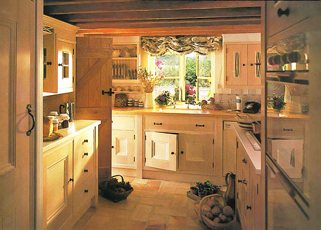
So, in honor of the first stage of Le Tour, beginning in London, here is a collection of kitchens from England, in England's distinctive, and really wonderful, traditional styling. Images from Kitchens Bathrooms and Bedrooms magazines. More images will follow, coming from my binder of clippings I have accummulated for some time. More coverage of the tour, and of regional French kitchens will follow from time to time over the next three weeks of the Tour. If it's Monday, it must be Belgium - tomorrow's Stage 2! Enjoy!

English%20Kitchen

Kitchen Design Details - Banquette Height

I've added a new category, "Kitchen Design Details". Sometimes, I'll come across a useful piece of information, or am reminded by a detail from an image that I feel might be important to pass on, so I thought I'd create this new category.

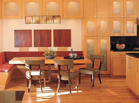
It's funny how this happens. Today, I saw an image in the hot, new, building and design site, PointClickHome. I immediately honed in on the built in banquette. First, let me say, this is a beautiful image, isn't it? It is a lovely representation of a rectiliniar design.

What I want to highlight in this image is the height of the banquette, nothing else. When planning a banquette, consider the following:

  • What is your table height?
  • Will you want a cushion on the top of the banquette?
  • How comfortable will you want the banquette to be? 
  • If you want super comfort, then think in terms of THICK cushions, sofa-like, as much as 4-5" thick, and watch the firmess of the cushions as the cushions dimension will then compress easily or not, changing your seat height.
  • When planning for thick, comfy, cushions, your banquette may be as low as 14-15" high, which LOOKS very low, but have no fear, this is an acceptable height to plan for, if, for example, your cushions are a medium firmness.
  • If you do not want a cushion, your banquette height may be 17-18" - measure a chair and compare that height to your table height to determine a comfortable height
  • Try to experiment in advance with a variety of seat cushions you have on hand from existing furniture, to guage your comfort needs/desires. And, yes, take that sofa cushion off as well and try it out!
  • Visualize if you will want to linger at the table or even stretch out with a book, or if the purpose is for quick, efficient, meals only. This will also help you focus in on the comfort factor you want designed into your banquette.

Me, I don't think this particular cushion would serve my purposes for comfort, being so thin, but that's just me. Know what you want to feel when you sit down at the table! 

PointClickHome.jpg 


KBIS 2007 Kitchen Design for Better Homes and Gardens Midwest Living Magazine

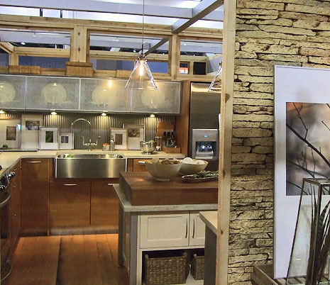
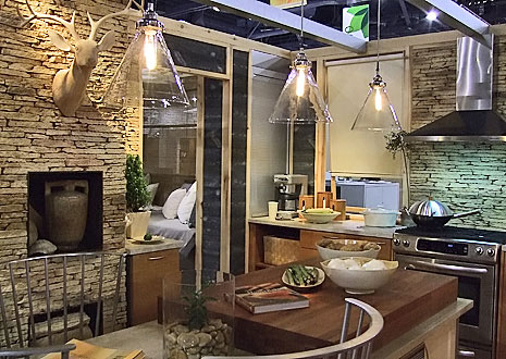
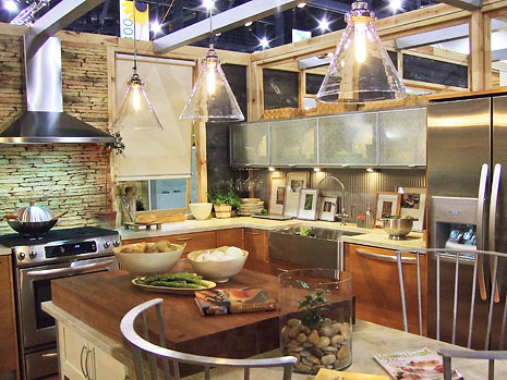
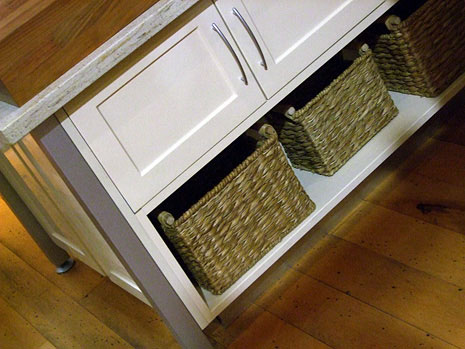
So, I've been real busy since KBIS, and I took so many pictures and brought back so much information that I have more to share with you! The "Idea Center", which is either three or four full, real, kitchens, produced on the KBIS site in a wonderful, huge area, was, as usual, well, wonderful! Meredith Corp., produces these kitchens, each from a particular magazine, and each has a specific theme. It is a trends spotting experience also! In this case, trends that I am spotting are:

  • a soft contemporary styling
  • walls of tile or stone
  • rustic features
  • an eclectic look
  • mini version of a work stations concept
  • comfortable feeling
  • large, multi-functional sink

From the press release: Midwest Living's kitchen at KBIS, "Back to Basics" is a relaxing weekend retreat, with its ‘back-to-nature’ kitchen and bath space. Pairing the Heartland’s agricultural heritage with contemporary cabinetry and appliances, the converted barn is designed to relax and enhance the weekend getaway experience. The space plays on the growing trend towards more outdoor living, as the entire structure opens to nature with an 8’ entrance flanked by barn doors, an outdoor shower, and a screened porch with daybed.

How gorgeous is this?? Enjoy! 

  Midwest-Living-Kitchen_1.jpg

  Midwest-Living-Kitchen_2.jpg

  Midwest-Living-Kitchen_3.jpg

  Midwest-Living-Kitchen_4.jpg


Absolutely Beautiful Kitchens

I love the blog Absolutely Beautiful Things, authored by Anna. Today, I looked through it and found a few posts on particularly beautiful kitchens, which I'd like to show you.

The first post shows a gorgeous white kitchen which is actually very similar to one that I did recently.  And, in Anna's later post Kitchen Love Part Two, please check out the inspiring ways to use shelving on walls and in pantries. Anna is an Interior Designer in Brisbane, Australia and owns a very wonderful shop called Black and Spiro.

shelving.jpgPlease also take a look at the blog At Home With Kim Vallee. The advice on this blog is excellent. It is practical and insightful and creative, a special and important combination. Kim's writing translates into focus and direction and makes it easy to follow too.

And one more, more shelving from Small Space Style, another blog with great ideas and again, very practical advice.

I need to do a post about shelving in kitchens, it is so HOT these days. These blogs have inspired me! In my practice, I am designing with open shelving more and more. It is accepted more than it ever was. A shelving post is coming soon!

The image shown is one of my favorite images. I love the way this shelving looks. That said, I must say that of course it is completely misplaced and even dangerous due to the placement of the range underneath it. I think this image was from a show house some years back. You can tell it's old because of the dishwasher. Nonetheless, I love the shelving if we look at that alone! 

Scandinavian Kitchens and Independence Day!

It turns out it's perfectly appropriate, and I even wish I had planned it this way, that I'm two days late for my weekly Monday Scandinavian Kitchens exhibit. Today, being, July 4, Independence Day, is the perfect tie-in to dedicate this post to my parents, who came from Copenhagen to the U.S., at that time, sailing past Lady Liberty, to pursue the American dream.

chezlisen.blogspot.com2.jpgMy parents, especially my mother, wanted to assimilate as seamlessly as possible into American life. She quickly found a church to become a member of, got involved in school and PTA activities, made lots of genuinely good friends and was happy to gain citizenship and to feel like an American. My father founded a business, made his fortune, later lost it all, blaming it on unions, also typically American! I lived the American dream growing up, and while assimilation was important to my parents, the wonderful Scandinavian cultural traditions remained intact. Food, the language (between my parents), the fantastic Danish modern furnishings, the special Danish sense of humor, and more, remained inside the home as I grew up. To think of the furnishings that were thrown out in later years, I can't go there! I was raised in two cultures with perfect balance and proportion.

So, hats off to my parents and those who dream of a better life in the U.S. I still cannot imagine the pain there must have been to leave one's home country, family, friends and all that is precious, but the promise and draw of the United States surely burned strongly then and burns ever stronger in so many people dreaming of living in the U.S. And, the dream of a better life became official on July 4, 1776!

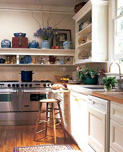
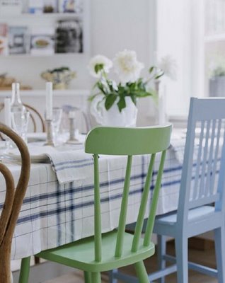
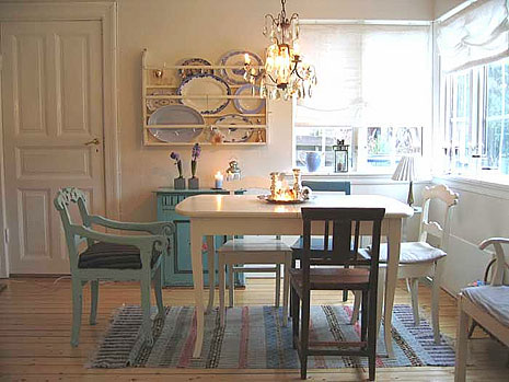
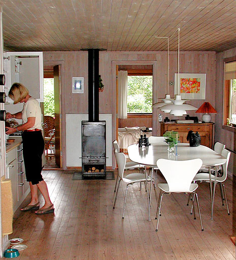
It is with great pride as a Danish-American, that I share with you some simple, yet lovely, vignettes of Scandinavian kitchens, with a little bias toward dining together, on this July 4! Enjoy! 

huset-fullt-a.jpg 

Here is my cousin Lis in her kitchen in her and her husband's summer house.  A great memory:

Lis.jpg 

 The top image is from the wonderful blog chezlisen and the next image is from Huset Fullt adnother enjoyable Scandinavian blog!

Kitchen Appliances - Retro, Color, Cool

bigchillfridge.jpgI've been wanting to show you the very cool appliances from Big Chill Retro Appliance, and now, seeing this post from Desire To Inspire, this is the moment to do it! As soon as I saw these Big Chill refrigerators, I knew they were done right.

I don't know what 50s or 60s vehicle the special logo comes from, but it's the kind of thing that you know you've seen before. And, the lines of these refrigerators, I feel like I've seen that style before too. It has personality, not just bulk. I'm wild about the lines of this refrigerator!

Very interesting too that the ranges are identical to Elmira's line of ranges, another great line of retro inspired appliances. Oftentimes, one manufacturer distributes the same item to multiple brands, I think that is common knowledge. That said, there could be some tweaks of differentiation on the inside of the appliance, tailored to a brand's specifications.


bigchillrange.jpgNow, I know that Scrappy Girl over at Domino Magazine is interested in retro cool appliances for her future kitchen renovation, and I've been wanting to send this over to her, so here it is. Don't you just love the chrome trim? And those handles!

Of course, we know these appliances are also all about color! That's where a whole lot of fun comes into the pictures, yet, look at how wonderful these images of soft colors looks on these appliances.  

The Big Chill's website has good information on it. The FAQ answers all your questions, I was impressed by how complete it is. The Big Chill is based in Boulder, Colorado. Cool, in more ways than one.


Green Kitchens - Consuming to Conserve?

Very interesting article in The New York Times, Buying Into The Green Movement. This piece talks about our eagerness to literally "buy into" the green movement, causing critics to question the fundamental issue...are we "consuming to conserve", thus, this line of thinking being a paradox? Are we eager to buy new green products, products, whether green or not green, which may not truly be needed at all, thus, creating an unnecessary environmental impact?

I can't advise new homeowners whose kitchen is 40 years old and damaged, to forego renovating their kitchen. I am not of that philosophy, although some may be. To me, THAT is an oxymoron. However, there are ways to think a little deeper as to how one can be green, with, or even without, the use of green products.  

Chelsea%20Kitchen%202a.jpgLet's take new kitchen cabinetry. A client may have an interest in designing with "green" products. One issue, which has a huge environmental impact, of course, is fuel. A homeowner may want to consider if they really want to order green cabinetry from a fabulous and highly styled eco-sensitive cabinet manufacturer, their single order being trucked in from Washington State, if they live in New York.  Is it wiser to buy cabinetry within a radius of a few nearby states, which will be delivered in a truck along with other orders for multiple local deliveries? This is one approach to thinking green in another way.

And, what about countertops? I know at least one of my suppliers will make wood kitchen countertops, which can be shipped along with the kitchen cabinetry. I also carry wood countertops that come from Atlanta, Georgia, and from far away Denmark (some woods which talk of being from sustainable sources-except for the jet fuel transporting it from one place in the world to another.) Likewise, slate countertops which I use on occasion, originating from Vermont, are relatively close by and intrinsically eco friendly.

Can a kitchen be designed in a green way to use less cabinetry but still maximize storage? Absolutely. Another way to "think green."  I did it in my own kitchen in some very clever ways, which I will describe in more detail down the road.

I am open to all ways of lowering our environmental impact, including the use of products which, while they may not be green according to one set of specifications, may indeed be green(er) than previously thought, when compared to how they are transported to their destination, how they are designed, or according to other alternative ways of defining "green."

Other ways of thinking about the green movement and consumer behavior are presented in this article. I thought it was very interesting. 


French Country Kitchens Friday!

I just uploaded another ten images into my now growing authentic, charming (admittedly not for everyone) French Country Kitchens album. I think it's because I just booked an apartment in Copenhagen this week for my vacation and I'm thinking vacation...villas...authentic European kitchens. I'll bet there are those who want to rent a home in France for vacation and experience living and cooking in one of these kitchens. I really hope they don't end up cooking meatloaf, that would be a crime and subject to banishment from French soil, FOREVER! But, I digress.

If you're inspired to create a French country kitchen, a word of advice. Look at these images. Get inspired. But, also look for the details. For example, you may not care for the general look and feel of an entire kitchen, but look more closely, and you may see that you like the hood or the shelving or another detail.  Don't judge any one of these too quickly. In a few cases, while I didn't love the kitchen, there was something about it which made me save it. Dozens and dozens and dozens of images I came across didn't make the cut. To me, these are the best of what I've seen. And, I'll lkeep looking.

(Someone REALLY needs to distribute foolproof and upgraded cameras to the French population. In most of the cases, the quality of the images are abysmal.) Luckily, I can come to the rescue with my major image tweaking skills!

Want to take a vacation and stay in a wonderful French kitchen? Contact the source of these images, Just France.


french-kitchen-4.jpg

Kitchen And Bath Ideas Magazine

I like Meredith's Kitchen And Bath Ideas magazine, I always have. I used it many moons ago as inspiration for my own kitchen design before this profession sucked me in I began in this profession. I have always found them to be right on top of what's happening in kitchens today. Yes, they are a mainstream, old, company, under the Meredith Corp./Better Homes & Gardens umbrella of publications, but I'd strongly advise you to pick up a copy of Kitchen And Bath Ideas today, and here's why. They may not show all the up-to-the-minute, cutting edge, fabulous Italian kitchens over and over, throughout the magazine, but, truthfully, how many people own those kitchens? There's a kitchen style for everyone, and Meredith does a fantastic job of mixing it up in every issue, showing just that, something for everyone. Kitchen and Bath Ideas are as relevant today as they ever have been, and I absolutely use them as a go to source for inspiration. Likewise, on occasion, I am a go-to source for them!

OK, I'm also biased, they've been publishing my projects for 12 years! Two more of my projects coming soon later this year! The inside scoop is that the editors I work with on my featured kitchens uncover every last detail of what happened in the kitchen, why, how, and so on. They're professional, and VERY interested in the planning behind the scenes of the kitchen. It's actually why I have submitted my projects to them for so long.

Orange-Kitchen040.jpgHere's a sneak preview of the July/August issue. Just coming off totally inhaling Holly at Decor 8's post on the color orange, supplemented by Rachel Perl's words of wisdom, there are a few kitchens in here too. Meanwhile, I pick up the Kitchen And Bath Ideas magazine and what do I see but orange! 

If this is not enough, Decor 8 continues with an insightful post on color theory, just what you need to consider when planning all the materials and surfaces we use in the kitchen.

This is a full page image in the magazine. There are pages and pages of other shots of this kitchen which you need to see.  

Also in this issue is a kitchen that was set up at KBIS in Vegas in May. It's a great kitchen to just be in and only leave under protest! Here's another sneak preview, with many images surrounding this feature. I took my own pictures of this kitchen, and also interviewed Kit Selzer, Group Editor, Meredith Special Interest Media Kitchen and Bath Group, who took me around the kitchen. We'll get to that story in greater depth soon. Go get your copy!

KBIS%20Kitchen041.jpg 


Kitchen Planning In The New York Times

The New York Times is my home page for my computer, and I check it throughout the day. It's informative and entertaining, and that MUST be a slogan for some newspaper somewhere!

kitchenB.jpgSo, I see this blog in the Times Home & Garden section called "Dream Home Diaries" and this week, the homeowner is unsure about what to do with the kitchen plan. I immediately went into planning mode (as if I don't already have enough planning to do for my paying clients!) and plunged in.

But there's something really fun about putting your plan out there for the world to give you opinions on, especially for something as important as a kitchen. And, of course, the entertainment part comes in where you get all the many and varied people who have all the answers or chastise the writer for something or other.

After the "enlarge" feature started working on the plan, on the Time's site, my opinion changed about the kitchen design regarding what should go where, since I saw a bigger drawing, and I wrote in again about some alternative ideas that came to me.

Lots of fun, check it out! 

Kitchen Countertops - Slate, Yes, Slate!

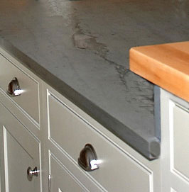
Slate-2.jpgSlate is the quiet, little known, but serious, player in countertops for kitchens! Of course, slate is traditionally seen as a building material for flooring, roofing, cladding on buildings, wherever there is a need for a very strong, solidly performing material. So, why not kitchen countertops? I'll warn you in advance...mention slate to people in the biz, including countertop fabricators, and most likely you'll get, "No way, slate will stain and is too porous!" It could be followed by "You're nuts!" While I've been accused of being nuts on numerous occasions, it doesn't apply to this situation. Trust me...

Rarely marketed to kitchen and bath designers for some reason, slate is, perhaps, one of the strongest, if not the strongest, materials one can use as a kitchen countertop, even exceeding the properties of granite. Slate, as a countertop material, has numerous properties that we need in a hard working countertop surface. And, by the by, I'm VERY conservative in terms of recommending countertop surfaces to my clients. Countertops are expensive, permanent, materials, not to be taken lightly by a specifier. I don't. Slate works!

Color

Slate is available in a variety of colors. Mostly understated, in middle to dark tones, the colors of slate are generally seen as:

  •     Red
  •     Deep Purple
  •     Deep Purple/Turquoise Combination
  •     Turquoise
  •     Gray
  •     Black

The look is quiet, elegant, strong, simplistic, nature-like, minimalist, dependent on its application within the room. Slate is almost always honed, although it can be oiled for a slightly more glossy look.

Pattern/Graining

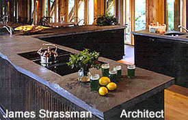
Slate-4.jpgDepending on the variety of the slate, the grain type and pattern can vary. Some slates, as Black Lace, has a distinctive highly textural, high-style look. Other slates exhibit very little graining whatsoever. Others are mottled. Some are quiet, with little graining, except for one strong, localized grain pattern, running through the slate, for a look of pure, natural beauty! Graining pattern/direction/type cannot be predicted.  Unless you want to schlep to the factory in New England, pick out your own slabs and tell them where to cut and where not to cut. Short of that, pictures of existing installations should prove to be a good guide.

Edging

Typically, slate edges are simple square edges with a very small radius top and bottom. Variations could be any edge one would see in granite. Due to the understated look, slate is not often seen with an ogee (OG) edge. Slate is perfect for a rough cut, exposed, edge. Perfect for today's uber-rustic-eco aesthetics.

Properties


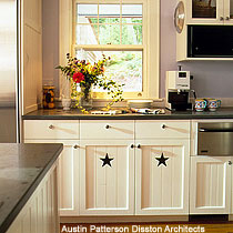
Austin-Patterson-Disston.jpgOne of the best properties of slate is its extremely low absorption rate, lower than granite. Designers can consider most slates as being stain-free. I have performed testing on the turquoise/green colors and have found these slate colors to be stain-free. Slate in the gray/black family may need a sealer. As a result of slate's low absorption, the material can be considered anti bacterial in nature and totally eco friendly.

Some slates (and partially-metamorphosed “mudstones” which are incorrectly called slates) are significantly weaker, than the slates I am talking about and are more absorptive, softer and prone to delamination and “self-splitting”.  The slates that are good for countertops are found in the New England region.

Slab material generally is available in smaller sizes than granite, resulting in an additional seam or two. You should pay attention to seaming issues. Have your designer take a close look at how best to put the pieces together according to your cabinet plan.

Care

slate-5-copy.jpgSoap and water, or even a tough cleaning product such as Fantastic can be used. If a sheen is desired, use a diluted solution of Murphy's Oil Soap and water. Apply, and buff off before it dries.

Scratches are easily removed, simply, with a sponge, during normal cleaning of the countertop. Deeper scratches are easily rubbed out with wet steel wool. Small white scratches are fairly typical to see during use over time, but are easily wiped clean during the day, if you see them at all.

Really only the gray and black stones need to be sealed as they are more absorptive in nature than other colored slates. Thus, mild soaps only should be used on these colors, so as not to strip the sealer. I usually get samples and then do a whole "food stuffs" test over a 24 hour period, beat it up in other ways and then evaluate.

I really love slate. It's eco friendly, it feels like butter to the touch, it's understated and fits many design aesthetics. I can't wait till I use it again for a project. Never had a client complain once installed, and I've installed quite a few slate countertops, only raves. And, THAT'S the test!


KBIS 2007 - Faucet Action!

Back to showing more KBIS items after a too long hiatus! Some companies bring press releases to KBIS on products they have introduced some months back, even as early as the fall of the year before, with KBIS taking place in the spring. As I go through the press kits, I'm not looking for the newest product release dates, although that's always fun and "now." But, with hundreds and thousands of products out in the marketplace, I won't NOT show a product because it's already been introduced some months back. If I think it's cool (thus "new/cool products" category) meaning either good value, good design, finish, or whatever strikes me about it, I'll show you. It may not be THE newest introduction or THE most modern/innovative styling. I just have to think there is something special about it. That's good enough!

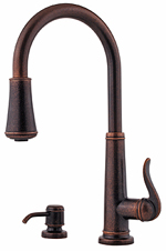
Ashfield.jpgSo, I saw this Price Pfister faucet, and thought, wow, that's traditional, affordable, Price Pfister? I mean, I don't associate PF with fashion forward high end innovation. But, this faucet looks pretty awesome to me, and you can bet it's not going to cost $1,000 either. I think it's very good looking.

This "Ashfield" pull down ergonomic sprayhead includes an innovative ‘anti-splash’ spray volume control. This allows users to adjust spray volume to a desired pressure level between 20 and 100 percent. The sprayhead also lets homeowners toggle easily between spray and stream modes. Equipped with 360-degree swivel spouts that permit custom handle positioning, the Ashfield™ single-control, kitchen pull-down faucets incorporates a 75-inch nylon hose with ball swivel spray connection that allows for maximum flexibility. Plus, longer levers on the single-handle design provide users a better grip and improved access.


velaD-2.jpgMGS Designs has some great looking contemporary faucets. The VelaD, new for 2007, has a sort of industrial look to it which I like. Crisp/flat edges but with curves. I'm crazy about the pull out spout.

MGS Designs is one of the only "true stainless steel" fixture manufacturers offering products in North America. An integral component of the MGS design philosophy is innovative functionality.

An interesting note, prior to assembly, each element is hand polished. No additional materials such as brass or sheet metal, thus 100% polished stainless steel or matte SS.  


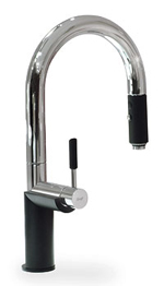
Graff-Oscar.jpgGraff's new faucet introduction (among others) for 2007 is the very cool Oscar kitchen faucet. Two versions of this faucet are offered, one with the black trim, which is my personal favorite, and one without the black trim, called Steelnox. I love the black half circle holder under the control!

This faucet is constructed of solid brass and designed in a minimalist style for modern kitchens. It has a pull down spray/stream configuration. Another good thing, it carries a lifetime warranty on all mechanical aspects of the entire product line. Nice, right? 

Is Your Kitchen Designer Driving You Crazy?

I didn't plan on writing about this topic, I haven't thought about it much at all recently. I don't currently have any conflicts with clients, all is quiet on the eastern front. To set the scene even more oddly, I was out in the quiet early morning taking pictures of my incredible delphiniums in the garden with just the birds as my companions, when these thoughts started creeping into my head. Truthfully, it's an issue I've cared very much about for years.

delphiniums.jpgSo, I got to thinking out in the garden about conflicts between clients and their kitchen designers this morning. And, this will not be about how kitchen designers are so wonderful and well, misunderstood. I won't go down that biased and defensive road.  Objectivity is my goal.

I'm going to go backwards, take the negative feeling and try to offer up ways out of it.

The one thing I will say is that what makes a kitchen and bath designer, "professional", besides our experience and expertise, is the way we handle stress, find solutions for problems, and so forth, to a point. It's not about the problem, it's how the problem is handled!

And, as always, I will be speaking very frankly, below...(oh no, they groan, not AGAIN, please, for all that is sacred...) I will be speaking to clients and to kitchen designers, my peers.

 
Annoyances

Clients - Be prepared for annoyances. You cannot do a remodeling project without being annoyed at something, or someone, sometime. At least I don't think it's possible.  Annoyances here and there are ok. The alternative, nightmares, make annoyances seem like a walk in the park. After a nightmare, you'll be looking under rocks for annoyances! Keep that in perspective and do not make an annoyance more than it is. Speak of the annoyance if it could potentially grate on your last nerve? Absolutely. You must. Annoyances? They come and go, not a biggie.

Kitchen Designers - are allowed to be annoyed, it's a human emotion. Being a professional, however, means keeping annoyances in perspective, dealing with them, and stress, quickly, or overlooking them where appropriate. This includes clients, suppliers, coworkers, whoever, with annoying habits. I have had clients where every conversation, even about something quick and small, can be 20 minutes, as the client goes on tangent after tangent. A needless disruption in my day when I got the point immediately? No doubt. Am I very happy that the client feels comfortable with me to go on and on? I really and truly am. Find the good. It's there. Look at the bigger picture. Are you annoying? Ask your coworkers. You need to know.

Mistakes

Clients -  If your kitchen designer is a human being, there is a real possibility that a mistake will be made somewhere. Doesn't mean it will happen. But figure it might and you're prepared. Gauge how serious the mistake is to determine your response, if any. Stop, think, evaluate and then reevaluate a response. Are you in any way responsible? If so, take whole or partial responsibility! What you want is peace and harmony, not conflict. If you're in constant blame/paranoia mode, your remodeling experience will be misery. Be aware of mood swings and your ability to handle stress. Self awareness will get you through the entire process. There are tough times in the best of projects! Oh, and let me also say this. It is absolutely not unusual that a mistake makes for a better solution than was originally planned. That has a funny way of happening sometimes, so please be open to solutions and you just may be rewarded with something better than expected!

Kitchen Designers - Again, there are many people on a project who can make a mistake including yourself/myself. Deal with it professionally and quickly and move on. Speed is everything and is often where we fall short. Mistakes should be handled as an urgent matter to resolve. People's lives are disrupted enough in this process. They want and deserve progress in a timely manner. Get tools such as a camera, voice recorder, software, plain daytimer, etc. to have an organized way to note details. It's all about details and documenting those details, and then, getting things done!

Entitlement

Clients -  Understand that, although you may have a fairly close, enjoyable relationship with your kitchen designer, the designer has other clients and other obligations and cannot always respond to your request immediately. The contract you sign should be for specific materials and services. If you desire more services and materials, please be prepared to pay for same. Sometimes, in fact, often, in a spirit of goodwill, a designer will go above and beyond what is written on the contract or invoices, but this should not be assumed. Abide by a company's policies and what you have agreed to on paper. Anything that happens beyond that is good fortune for you, but is not to be expected.

Kitchen Designers -  We cannot control everything. Our clients have their own agendas and short of factory deadlines, our job is to cater to their agendas and timing, as they arise, not ours. We serve their needs, not vice versa.  It means that we need to take seriously what their needs, desires, and issues are. Our clients are entitled to good service, end of story regardless of their race, socioeconomic status, sex, age, physical disabilities and yes, even difficult behavioral issues.

Disrespect

Clients - I had a client not too long ago who gave disrespect a new name. This client was arrogant, difficult, miserable, well, I won't go on. Another was purely sexist. Be careful about that. The response of the professional you hired will most likely be that they will shut down emotionally (yes, we care deeply about our projects more than you will ever know!) and honor their contract in its most minimal way to hurridly get out of the bad karma abode. When I had these clients, I went into "self satisfaction" mode. I wanted the kitchen to be done the right way, so I disregarded this (continual) abuse and sort of worked on the kitchen for ME...and I did go above and beyond, as noted above, but for my personal satisfaction. That worked for me, but I'm not sure how common this approach is. Don't be disrespectful. Just don't. If you have a spouse who is, please speak to them about it. You're really doing yourself more harm than good. If there is a real issue, talk about it.

Kitchen Designers - Designers' preoccupation with our clients' socioeconomic status, judgments on how they live and ensuing (dis)respect can be intertwined and confused and has no place in the design service business. Satisfaction is there in abundance for any designer working with smaller budgets, whose kitchens mean the world to their clients and for bigger budgets where design satisfaction is equally attractive. People have needs to be met, and they trust us to put aside our "issues" to help them achieve their goals. By us accepting their money, they deserve our respect and attention.

High Prices

Clients -  Are your kitchen designer's prices too high? Compared to who? In truth, there really is no easy way to compare a business's operating costs, or their own perception of value, vs. what region of the country they are in, how much time is involved behind the scenes, quality control steps, who else is involved in the transaction, office workers or sub contractors, handmade vs. manufactured, and on and on. And, on. So many factors go into setting pricing, including, interestingly, confidence, or lack thereof. Likewise, industry experience, and lack thereof. And, let's not forget the level of risk involved in various methods of executing a purchase that the client is unaware of. Someone may take two times longer to delve into a greater level of detail surrounding a purchase than someone else. Do not assume the worst because the price you get is not what you think it "should" be. Accept it and either take it or do not take it, leaving judgment behind.

Kitchen Designers - Know your costs, your risks, and other factors, to evaluate the least costly way possible to deliver a product to a client. Be consistent, speak frankly about costs and above all, document all costs including estimates. Never order an item without written consent, otherwise your clients are not responsible if they changed their mind midstream, but you didn't "hear" it or they neglected to tell you. Badger your clients with details and documentation if necessary.

The Blame Game - It's Your Fault!

Clients -  This is really tricky. You blame the kitchen designer. The kitchen designer blames the installer who blames the contractor who blames the architect, and on and on. This is a tough one. Some professionals refuse to play this game. That doesn't mean that they are accepting the blame, it just means that they don't play. Take everything you hear from everyone with a mountain of salt, even your most trusted tradespeople, and focus instead on how to solve the problem at hand. Unless you, the client, are a remodeling professional and were at the scene of the crime at the moment it happened, you really don't know what happened and why. I cannot overstate this advice to move to more productive and positive territory as quickly as possible. Who needs the aggravation? Keep your wits and your head about you. But, beware that job dynamics are always at play for various reasons. Stay above the fray.

Kitchen Designers -  Do the right thing, take the time to go through the job with all of the appropriate people, and all should go smoothly. Do not allow room for misunderstandings, as the devil is in the details and the client deserves to have input on their investment. Be objective. Accept responsibility where necessary. Take the high road even if you suspect you are being blamed on occasion or continually.  Are you the outsider on the project? Just do your job in a professional manner and do not go down this negative road for any reason.  

 
Conclusion! 

Much of the above is about communication and interpretation. Our past experiences, our family and business culture can surely cause us to speak to one another in different ways, ways that each assumes the other understands. There are project "dynamics" present in every project swirling about, usually unnoticed or misunderstood. So, the saying "What we have here is a lack of communication" is  probably one of the issues at hand when a conflict arises. So, what to do?


Here are five suggestions for both clients and kitchen designers:


Communicate clearly, ask questions were necessary

Listen

See the other side

Accept responsibility partially or wholly

Be motivated to get along

Respect your designer/client

Do not allow your project "culture" to deteriorate, work toward a positive experience with all concerned, you will be glad you did. Find the good.


I hope this has helped bring further understanding to what absolutely can be a truly enjoyable experience. I guarantee it!

 

Scandinavian Kitchens - Summer Fresh!

Since my last Scandinavian Kitchens post, summer has arrived! Summer, to me, is one of those extreme experiences in many ways. I wouldn't want it all year, I like it just long enough to really enjoy it fully. I happen to like the summer garden better than my huge spring rose flush with thousands of rose blooms. Likewise, eating any meal of the day al fresco enhances the dining experience and creates summertime memories.

As another summer solstice-inspired change, I lightened up the look of the blog a little bit...also more light filled and clean for the summer. I hope you like it. 

Here are some fresh, summery, Scandinavian kitchens for you to dream on (ok, put wireless in the backyard and then bring your laptop, jump in the hammock, and dream that way!)

 Scandinavian%20Kitchen039.jpg

Scandinavian%20Kitchen037.jpg 

scandinavian kitchen038a.jpgvakre hjem.jpg


Denmark%2005%20632ba.jpgI'm especially excited this week because just this morning I found and booked an extremely (that word again) charming apartment in Copenhagen for our vacation this summer, for 2 weeks.

Made the plane reservations first and then began the search for as perfect a place as I could find. Think real brick floors and whitewashed stone walls. It's near the palace, a park, the harbor, and the street with the finest mid century furniture and art galleries.

You'll see pictures of that Scandinavian kitchen and others for sure. In fact, you'll get lots of beautiful images. I'm hoping to get a shot of my mother's cousin's kitchen in her tiny, hand built log home on a hill overlooking the water. That's a special kitchen!

There is truly nothing like Copenhagen in the summer. Unless it's in the winter!

And, as usual, Scandinavian blogs for inspiration this week are designe, interiorhuset, and Karna. Enjoy!

Kitchens at PointClickHome

I just heard from my blogging counterpart, Timothy, at Charles and Hudson that he's a part of the hot new site PointClickHome, the new shelter hub that brings together ElleDecor, Metropolitan Home, and HOME magazines.  From what I see, there are lots of lifestyle  areas to check out, such as food, decorating, remodeling,  gardening, and more good stuff. It's laid out well and logically, with lots of great images, informative, and down-to-earth chat across the site. The two words that come to my mind are "fresh" and "smart!" Good work, Timothy!

nouveau_01.jpg 

The Kitchen Electric Estimate

IMG_6583a%20copy.jpgGeez, I spent a long time trying to spice up the title to this little piece, (I can't always just stick to pretty kitchen pictures!) and I just couldn't find anything clever to describe an electrical estimate. Give me some ideas, please! Maybe something about sparks flying? No, bad idea.
It's a GOOD idea, when getting multiple bids for your kitchen renovation, to be organized so that your bids from contractors will use the same set of specifications. It sounds like a no brainer, and it should be, but the only way to make sure the estimates are comparable is to have one set of specs to give out to your electrical contractors to bid from.

Here's what you may want to include, or make sure your designer includes, on a floorplan and/or separate sheet of specifications:


Appliances - Brands and model numbers if possible. List all appliances, including:


Refrigerator

 
Freezer

Refrigerator Drawers

Wine Refrigerator

Under Counter Beverage Refrigerator 

Stand Alone Icemaker 

Cooktop - gas or electric

Ovens, Single or Double - gas or electric

Microwave

Other Ovens (steam, etc.) - gas or electric

Pizza Oven 

Deep Fryer

Grill, gas or electric - separate from cooktop/range

Built In Wall Rotisserie - separate from oven 

Built In Wok

Built In Mixer 

Range - gas or electric

Warming Drawer 

Built-in Coffee Station

Instant Hot Water

Garbage Disposal

Trash Compactor

Dishwasher(s) 

Hood/Blower or Downdraft


Receptacles - Will you use Plugmold or standard receptacles? Note GFI protection. Note location and number if possible.

Special circuits - Do you need multiple separate circuits for special needs in any one area? A monster toaster that takes 17 amps? Paired with another appliance on the same circuit, it will trip. Be aware of potential lifestyle electrical needs.

Circuits - A good guideline is a separate circuit for appliances (not countertop appliances) over 10 amps, but the electrical codes takes precedence

Accent lighting - Note if you'd like accent lighting in cabinetry or pointing toward certain cabinetry. How will it be switched? What about accent lighting above cabinetry or as part of a tray ceiling or other ceiling effect? What about sconces? A little used by lovely style of lighting, yes, for the kitchen.

Task lighting - Under cabinet lighting, what type? Halogen, flourescent, xenon, etc. Can you specify the brand? Try to specify the locations and switching if possible.

General lighting - Are you using recessed lights? Pendants? Ceiling Fixtures? Note what you are using, how many, and how they will be switched, whether in multiple locations or a single location. Also specify if dimmers are desired. And, make sure that the wattage in your lights is adequate, which could effect your estimate. Very generally speaking, I specify/prefer as many lights of the same type, say, recessed, switched together, as possible on the electrical plans that I do. I'm not a fan of 3 lights here, 3 lights there on different switches. I feel general lighting is just that, general lighting and is meant to be turned on all, or mostly all, at once. The other reason is that too many switches cause confusion and forgetfulness.

Fancy switches - Oh, there are so many touch-type fancy wall switches out now. Start by checking out these switches at Lutron.

TV/Phone/Computer - Don't forget wiring for media. This type of wiring may be done by audio/video/computer technicians. Check with your electrican.

Speakers - Most likely wired by your audio technician, but not necessarily. Check that out.  

Heat - Any specialty heating solutions such as toekick heaters? 

Last but not least - Check the service panel! 


Home Automation 

Will the kitchen be part of a home lighting control system? Check out Lutron for basic information. For further information on home automation, check out CABA

If you want to see a digital kitchen in action, check out this video, but keep the tissues handy, the emotional guitar music may make a tear fall.

Here are a few more articles with insight from Builder Online,  CABA's page on the digital kitchen and don't miss this humorous look at all the automated frenzy, from Network World.

Apologies for potentially overwhelming you, what can I say? Yes, the world of kitchen remodeling has many devils lurking in the details!

In a future post, I will talk about and show, an electrical plan. (Don't flood me with emails asking, When!! When!!) 

;-) 


Beautiful Kitchens

Want to see some beautiful kitchens? Look through Coastal Living's kitchen section and get inspired! I love lots of things about this kitchen and have a couple of quibbles.

LOVE the same paint on the walls as on the hood

LOVE the dark brown accents

LOVE the contrast of the white floor and dark island/table

LOVE the use of white

DON'T LOVE the refrigerator enclosure

WOULD BETTER LOVE an integral open shelf toward the top of the island for useful storage

WOULD BETTER LOVE the ceiling fixture over the island hanging lower

WOULD BETTER LOVE a piece of artwork hanging over the recessed wall cabinet next to the blinds 

Overall, a winner for me. How about you?? Enjoy these inspiring kitchens.


Coastal-Living.jpg


Designing Your Kitchen - All in Due Time

I cancelled two appointments this week, one for Monday and one for tomorrow. I really don't like to, and therefore, rarely cancel appointments I think it sends a message that somehow I wasn't ready/organized/prepared, and so on. It gives me anxiety, like, oh, so many other little guilt-ridden things like this! (That's why I grow roses, to get outside and take a sniff of a fragrant rose.) OK, I take more than a sniff...I walk around the garden and take photographs when the mood strikes.

Last week, it seems I was out of the office more than I was in, and I had appointments with these same people also last week, at which time we scheduled for this week as well.  Oftentimes I have the weekend to catch up on my work. I'm an early riser 7 days a week, usually well before 5 am or sometimes (on a weekend!) shortly after, so I do have real good quality time to get things done.

This past weekend, with my kids coming in from the city for the Father's Day weekend, there really wasn't time, as I knew I needed to put in blocks of time for these clients. Long story short, I couldn't get my work done for either appointment, so I cancelled. I wrote to my clients that I didn't want to rush for our meeting, time went away from me, so could we reschedule. Of course, no problem.

Yes, there's a point here somewhere! I'm thrilled at the moment, and in fact, stopped my work to write this, (I promise I'll get back to it) because in delaying one appointment, I came up with a great solution to a problem kitchen that far surpassed my expectations. The kitchen is very small, the client specifically asked for a good corner solution (pressure!) with a much smaller than normal corner, making it nearly impossible, along with a list of other challenging items.

I LOVE when all the stars line up and I think of a solution that is different than normal, that pushes the construction and function of cabinetry so that it is customized for a specific need AND goes against conventional wisdom, that's the best. Love that feeling! I'm going to my meeting tomorrow with great excitement, with a solution I thought was not possible, is out of the box, and will enhance these clients' lives in the kitchen for many years, allowing them to not only have more room for precious storage, but they will be able to access their items in an effortless way. I'm really on a high! I didn't think it was possible, after going through all the "typical" solutions. Quality time absolutely permits one to venture beyond the "typical."

So, here's an analogy. Design work, like gardening, is about patience. Patience is important. You cannot rush a garden and you should not rush design work. If any of you out there has a designer who is cancelling an appointment, remember your design may be much better for it in the long run. All in due time...

And, here is one of my favorite roses that smells like ripe peaches, truly. I need to be patient, as I cannot see or smell this rose at all from November to June. But, eventually, good things will come. Here is the rose, "Abraham Darby." This image was taken in my garden this morning. Enjoy!


Rose.jpg