Scandinavian Kitchens - Open Shelving Ideas

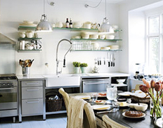
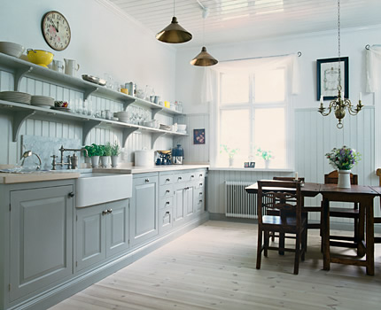
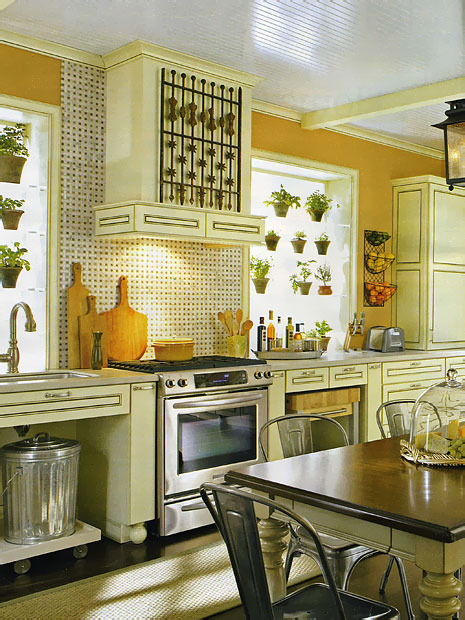
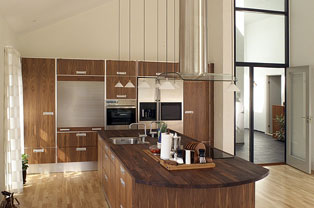
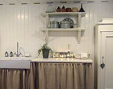
Something I already knew, which was confirmed at KBIS in May...open shelving is HOT! It adds that warm touch, anyway it's done. Although, there IS an art to the arrangement of objects on open shelving, very much so. I designed my own kitchen (meant to be temporary, and here it is 4 years later) with lots of open shelving of various types to allow me to be surrounded by my collections. FYI, in the first image of my kitchen, the objects (all mine) were artfully arranged by the stylist on site when my kitchen was shot for publication last year, so I can't take credit for that! But, I digress.

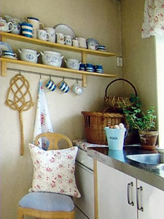
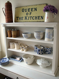
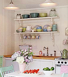
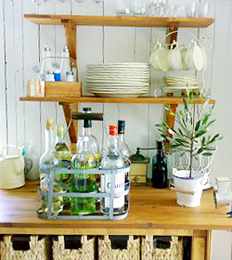
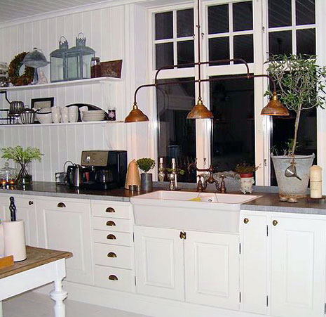
Let's call today's journal entry, Scandinavian Wednesday, rather than Monday (late again) and take a look at how the Scandinavians "do" open shelving. They're very good at arrangements, the shelves themselves, and creating a look and feel of real warmth. Today we'll look at traditional shelves and arrangements in the kitchen.

It's not really difficult to put items on a shelf, but one may want to think in terms of "layering" the shelf. Put something behind, perhaps a plate, platter, or a piece of artwork, then something of a different color or texture in front of that, or monochromatic items if that look is pleasing. Books stacked sideways is always lovely, and a piece on top of the books, and so on. For me, it takes some time arranging until I'm happy with the look. There is volume, color, texture, proportion and balance to consider. Sometimes there are happy accidents, other times, it has taken precious time.

Next week (if I remember!) we'll look at shelving in modern kitchens.

Images are from left to right from the top down as follows: First, from lantligt, second, from boligmagasinet, third from sol-solstad, fourth, from Karna.sprayblogg, fifth, from Savannah-beach, sixth, from Masan Shabby Chic, and last but not least, from min lilla veranda.

Oh, I hate when I forget a detail, that's why it's also good for my subscribers to come to the blog to see if I've added something...take a look at the entire Scandinavian Kitchens category for more inspiring open shelving ideas! Heck, look at all the kitchens on the blog!  :-) 
 

http://www.pbase.com/susankbp/image/83211097.jpghttp://www.pbase.com/susankbp/image/83211109.jpg
http://www.pbase.com/susankbp/image/83211131.jpghttp://www.pbase.com/susankbp/image/83211148.jpg
http://www.pbase.com/susankbp/image/83211156.jpghttp://www.pbase.com/susankbp/image/83211160.jpg

10 Questions To Ask Before Hiring A Kitchen Designer

File0003a.jpgSometimes you just need a quick guide, a "how to" to get the ball rolling. Follow these tips and you'll be on your way to choosing the kitchen designer that is right for you. It's that easy.

You need to be organized and focused in order to make a reasoned evaluation. It's easy to be seduced by, well, so many things you encounter in a design studio or showroom, everything is so beautiful! But, don't mold yourself to the product, and be "stuck with" the design firm. Find a talented designer who you feel you can work well with and whom you respect. Good Great design work will follow, but first, ask these questions...


What do you think are good questions to ask? I would love to know!


  1. How many design solutions (plans) do you provide? Hint: Three or more is what you are looking for. With one or two plans designed, the vision is most likely narrow and subjective on the part of the designer. You need to see the possibilities for your space. Otherwise, it's "coulda shoulda woulda."
  2. How long does the process take? Two weeks? Four Weeks? According to your (the client's) timetable? This lets you know the timing expectations of the designer for the design process from start to completion. It also will tell you if this timing "fits" for you. You may also want to find out if the firm has a "policy" on changes during the design process.
  3. May I see work samples? It is useful to see both images of completed projects as well as proposed designs. Oftentimes the bulk of a design firm's clientele may be of one "style" or another, depending upon the region, although the designer may have proposed alternative design solutions in an effort to move beyond the typical, and this would be very interesting to see, as it shows creativity. I have more "alternative" design ideas in my client files that my clients were too afraid to consider as the concepts were not "safe." 
  4. How do you keep up with new ideas, products, industry advancements? Does the designer ever leave the office? Does he/she go to kitchen and bath shows, seminars, conventions? Interior design shows? Subscribe to kitchen and bath industry publications? Have a library of design books? Read interior design blogs? There are many ways to keep pace with the ever changing kitchen and bath world, but it is important that this is done.
  5. How long have you been designing kitchens? Just a minor detail...something you will want to know! In this business, experience is a good thing, provided #4, above is in place.
  6. Do you have any special accomplishments that I should know about? Accomplishments within the industry show involvement, motivation, interest, and recognition, all important to have as part of one's resume/career highlights.
  7. How mobile are you?  Is the designer available for jobsite meetings, even (occasionally) on short notice? Can meetings take place at your home, or only at the design studio/showroom? This last question should not be a dealbreaker...unless it is for you. Any availability via cell phone or pda? Mobility is a good thing. For me, I'll email 24/7 during off hours, but the phone takes a break from Saturday afternoon through Monday morning.
  8. Will you give me cost alternatives or just one single cost at the end of the design process? Assuming you have already received an estimate (a separate issue) will the designer tell you during the process where there may be costly design decisions and make an effort to suggest lower cost options? I provide my clients with a limited "chinese menu" of items at the end of the process, when presenting the final cost, to illustrate where particularly large cost items are seen in the plan, and offer substitutions. If a hood costs $10,000, which recently occurred, you may want to be aware of that cost! What's the cost procedure? And, what is the payment schedule?
  9. How do you handle the labor? Can I use my favorite plumber and electrician? Do I need to purchase the labor through your company? Will you provide me with more than one contractor for estimating purposes? You should have freedom of choice here. That said, a team approach is a good way to proceed.
  10. What will be your role after the sale of the cabinetry? Does the designer hand off the project to someone else in the firm? If so, you may want to meet the project manager. How often will you see a presence from the firm during installation?

 
BHG_2a.jpgAnd the bonus question: What if something goes wrong? What are the policies of the firm? What issues are likely and unlikely to arise during the project in the firm's experience? Who is responsible for what, when, and why? This is such a large question, it bears a separate post, however, the germ of the issue is presented. Think of your own difficult scenarios and ask questions. Look for a reasoned response, service focused.


Sure, there are other questions you need to ask, which I will cover at another time. These came to the forefront, covering a balanced criteria of design, money, and logistics issues. I recommend that you actually write down a list of questions and go in with those questions at hand and start the interview process!


No Running In The Kitchen - I've Been Tagged!

OK, here we go, I've been tagged by the fabulous (and I do mean fabulous) Linda from Surroundings.  Let me take a moment, comply, and totally excite you with details about me...

Four jobs I have had or currently have in my life:
1. demonstrator of cuisinarts
2. chef in a small Italian restaurant, including pizza maker
3. mom of 3
4. designer of cabinetry for kitchens, baths, built-ins, custom furniture

Four countries I have been to:
1. Denmark
2. Spain
3. Sweden
4. Norway

Four places I’d rather be right now:
1. Copenhagen
2. Martha's Vineyard
3. My apartment - Upper West Side, NYC
4. Bornholm, an island in Denmark

Four foods I like to eat:
1. Frikadeller (Danish meatballs)
2. mint chocolate chip ice cream
3. sushi
4. bread from Cassis restaurant

I'm tagging:

Old Friend, Peggy - Kitchen Exchange 

New Colleague, Ann - KitchAnn Style

New Blogging Friend - Patricia Gray

New Dad, Mark - Living Well in Westchester


Kitchen Design - Fresh Traditional

As I mentioned in my last post, I was away this past weekend. We went to visit good friends at this amazing (and I don't use that word lightly) place. I went to Thousand Island Park on Wellesley Island, located on the St. Lawrence main shipping channel in upstate New York.


This description from www.thousandislands.com talks about the island we stayed at better than I can:  "The charm of Thousand Island Park derives from many things: its splendid setting, its sense of detachment, and its special social history, but not the least from its delightful buildings. The Thousand Island Park Historic District is a unique collection of late 19th and early 20th century structures, and the only surviving example of the late 19th-century summer religious colonies found in the Thousand Islands region. The architecture of the buildings derives its characteristics from the prominent styles of the 19th century: Queen Anne, Eastlake, Stick style, Shingle style and later Bungalow. A more precise architectural description of the cottages in the Park may be found in the Thousand Park Landmark Society office. This is a 19th century town, which has changed very little from a century ago. There is a strong sense of community here and the happy quality of the buildings in the Park is a natural expression of the people who built them and continue to use them."


I felt as if I stepped back in time. The yards all blend into one another. There is one main, central, grassy commons area with an outdoor pavilion for community events situated at the waterfront. This place is about community, and as noted above, the architecture is just rich in its Victorian spendor and charm. The community is on the National Register of Historic Places because of its many Victorian houses. It is a place of simple pleasures, as our hosts described.


Designing The Kitchen - Purist or Not?

How would you design a kitchen in these homes? So far, I have seen a few. Our hosts, just having renovated their kitchen, chose a style totally appropriate to the architecture of the home. It just fits. Beadboard cabinet doors in white, original woodwork all around the kitchen, original windows stayed with the wonderful wavy glass. It feels right.

I think it bears mentioning that one can stay true to the historic nature of a home, design a kitchen in a traditional manner, but use a fresh interpretation of materials such as slate countertops, or wood tops for that matter, an apron sink, perhaps in concrete or a matte fireclay, wide plank floors, in their natural or bleached coloring, among many other opportunities for a new point of view. Think fresh, think natural, think simple, just....think, and the ideas will begin to flow, I promise!

Oh, take a look (trust me, it's worth it) at these flikr photos of 1000 island homes, and dream of an island of your own. I know I do... 


Paris Kitchen Design and Le Desastreaux Tour de France

As the cyclists in Le Tour de France make their way to Paris, a much smaller group than first started in London 3 weeks ago, but we won't go down THAT road, it is still time for celebration. Why? Because it ends in Paris, after all! The cyclists will be making their numerous rounds on the Champs Elysses this Sunday, to the delight of huge, cheering, crowds, always an incredibly beautiful sight. If you haven't seen the ending of le Tour de France, you've just got to!

So, where will you be? Perhaps you have rented an apartment in Paris for the event! Will you be spotted sipping a glass of champagne, or going to the markets for fresh baguettes and fabulous food? Perhaps you will create your own celebration in your luxury Paris apartment kitchen as you gaze upon the chaos below. One can dream of Paris kitchens...oui?

Au Revoir....away for the weekend (thank goodness for the DVR-le Tour is recorded!) Here is your source for luxury Paris apartments at which these beautiful images reside!


paris-kitchen-1.jpg 

paris-kitchen-2.jpgcallas6.jpg


eiffelpalacekitchen1amd.jpgchi7.jpg


Kitchen Tile Styles!

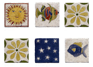
Here is a collection of diverse tile styles that I have become familiar with. I would urge you to look deeper into the links, as there are many wonderfully inspiring tiles quite UNLIKE these that you see here as representatives. Take a look!

KBIS-2007-097a.jpgThe first tile is by a company called Vetro Mosaico.  Oddly, the text says it is tiles for showers, pools, and spas. I think they forgot about the kitchen! They offer a beautiful variety of colored glass, including the ability to do custom blends. They also show glass pebbles, which are very interesting, with an organic sort of look.


tilevera.jpgThe next lovely tile product I'd like to show you is by Tilevera. Tilevera uses 500 master painters to create works of art, all of whom are trained in the heritage of Spain's Talavara region. The tiles are exquisitely deisgned and hand painted. You must look at this collection! 


And, last but not least, some really really (I can use that word twice, right?) truly artistic mosaic tiles and murals from Manet Tiles. Each piece is the result of the time and effort of skillful artisans who are committed to working the clay and natural stone into works of art. I show two here to showcase the diversity in their line. The work is just fantastic. If you are one who wants art in your kitchen, well, this is one great way to get it!

manet-tiles.jpgma_0035.jpg

Architect + Kitchen Designer - Matching Up Dimensions

I had a curious day yesterday...it actually started last week when I received a second drawing in the mail from an architect for a project I am involved in.

It is my practice, in a renovation situation, to take an architect's plans as soon as I receive them, and to check the architect's dimensions against the dimensions that I have taken. This is very important, to discover errors on my part or on an architect's part. It exposes questions, good questions, which must be answered sooner than later!

I had already done this once for this project, and as revisions were made to the project, was set to do it again. I need to set aside a few hours to "justify" these dimensions.

plans.jpgLong Story Short

The architect's plan was filled with errors (this image is not the plan in question.)

I respect architects. I really do. They go through enormous training to become a licensed practitioner, responsible for safety, first and foremost, and usually, their work results in a highly accurate set of plans. Quite honestly, it is very rare that I find more than minor differences of dimensions in the process of checking, yet, the dimensions must be checked and always are...just in case! The errors in this case were many, strange, and very worrisome.

The thing is, it's not enough to uncover the errors, which I spent two hours with my clients doing (there were that many), and included taking out the tape measure, together (which is never done!), double checking existing dimensions in the home, where we had our meeting, and then comparing them with the architect's plan. What happens next, especially if there are many errors, is that a client can begin to lose confidence concerning any given line that is drawn on the plans, and to also question structural issues too. Loss of confidence is not a good thing.

I had this meeting last night, and the architect and contractor met with the clients today. I don't know what the outcome was, but I'm sure glad I wasn't there. I feel very badly for these clients. They are very busy people, lovely people as well, I like them very very much, and they simply don't deserve this. All that, and the process has taken a ridiculous amount of time as well.

I think what happened here was that the architect "farmed out" the work to a CAD drafter, who had no knowledge of this project and made many assumptions. Then, well, the architect did not check the drafter's work. 

When the revised plans come, again, to me, you'll see me with my scale ruler all over again!

The Lesson 

So, what can we learn here if you are a consumer thinking of doing a renovation? I suppose the first order of defense would be to make sure that your designer checks your architect's drawings for dimensional accuracy. Make sure that happens. And be a pest and ask if the professionals who do drawings can measure twice (I measure 3-4 times and always end up tweaking). Do your part to buy a scale ruler, check the plans yourself here and there, and speak about accuracy in dimensions to your hired professionals. No, you shouldn't have to do any of this, that's right. But, it may be a good idea...

What would have happened if assumptions of accuracy were made, easy to do, and this extension and interior renovation got built, and all of a sudden cabinets are ordered and the space is different?

That's a bloody nightmare.


Kitchen Accessories - Scandinavian Style!

I think it's time to trick out the Scandinavian kitchens that we're loving every Monday (ok, it's Tuesday, skipped right over Monday)! As innovative as the Scandinavians are with their design and decor with such a rich history to draw from, that innovation and great design has also historically reached over into housewares in a very big way over many decades. It seems there has always been some item that's been hot, a "must have." Even recently, we've seen a large introduction of Danish crafts in the MoMA store, and others just devoted to Scandinavian housewares. Here are a few bright and fun items that reflect the Scandinavian point of view.

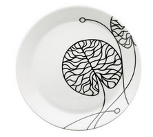
First, look at this dish pattern from Scandinavian Details. From the site: Kristina Runske, founder of Scandinavian Details,returns home to Scandinavia several times each year to connect with emerging designers and trends. Her commitment to bring you superior craftsmanship matched with leading-edge technology and environmentally-friendly materials can be seen in each of the products she personally selects for this thoughtful collection of clean, clever, contemporary objects for modern living.

scandinavian%20details.jpg 


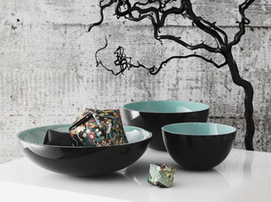
All right, I admit it. I selected this next piece for several reasons...yes, I love the background, but more than that, look at that wonderful turquoise. And, ok, I'll also admit that turquoise has been my favorite color for decades! So, there you go. But, it is such an elegant, simple, and useful piece from Tivoli Home. From the site: We are a couple of Danes who love to share our passion for good design from Scandinavia.

The store is located in the Dumbo section of Brooklyn, such a delightful area, worth a trip.

 tivolihome.jpg
And, next, I found this great site, Fjorn Scandinavian. From the site: Envisioning a collection that was both elegant and soothing to the senses, Sigurd and Ann sought out the most beautiful Swedish table linens, the softest and warmest hand made woolens, lovable children's things, cozy, colorful blankets and sweaters in an array of great designs, and tableware that reflects the Scandinavian Good Life.


Take a look at this beautiful table runner. I love table runners, and I don't even use them enough. I grew up with table runners, as it is a common Scandinavian part of the table. 

fjorn%20scandinavian.jpg
OK, here's a kitchen you can use them in! Some kitchen inspiration....

 kvanum%205.jpg


All these companies have wonderful products and contribute in a big way to the entire fresh, organic, Scandinavian look. Enjoy! 

Granite Countertops & Samples

IMG_6682ab.jpgIn my neck of the woods, my whole region it seems, it's like the granite yards all got together and said "No more samples!" Previously, they'd have a system where we'd tell the guy with the hammer which slabs we'd like samples of, and with the knock of the hammer, we get a few samples. We would bring our cabinet samples to the granite yard, get the granite samples, and be easily able to select other materials for the renovation.

When my client recently told me that she selected her granite one day, when she had gone without me (gasp!) she said that she loved it, she wanted it, and she wanted me involved in the purchase, templating, details, and logistics. Today, I went to the granite yard to give the fabricator a deposit and to see the granite my client chose.

IMG_0085a.jpgHaving forgotten my camera at the office, I decided to take a bunch of pictures with my cell phone for her (she wasn't with me.) I came back to the office, uploaded the photos to her nearest CVS to make prints from, and left her a message that she should go pick them up and "waa laa" she now has a reminder of her granite. I was happy to have thought of that solution!

Lesson: Take your camera everywhere!!!


Kitchen Design and Style

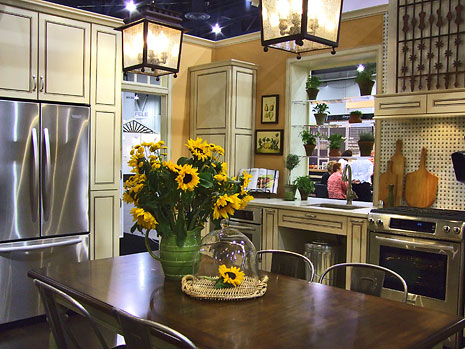
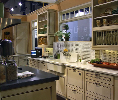
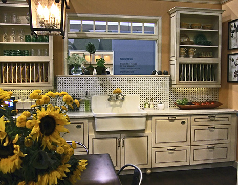
I received my copy of Better Homes & Gardens, which is sent to me automatically since I'm subscribed to Decorating Inspiration, a good resource by the way, and I saw a major featured kitchen in this issue that was also on display at KBIS. I had taken photos of this kitchen, which are the top three, below. This issue is out now with lots of other images and information on this kitchen. It is the August issue.

The real point I want to make about this kitchen is to encourage my readers to consider its style. My sense, which I hope I can communite effectively, is that this is one of a "type" of kitchen style, that, is just that, about (kitchen) style alone. It's not about history, architecture, or about one's unique personality being reflected in the kitchen design.

It's simply all about how to style a kitchen, end of story.  It's the kind of look that I know it when I see it! I've seen it many times before, and to me, it is a distinctive look, this all encompassing theme of "kitchen style," for style's sake. It's a really beautiful kitchen in many ways. It's not for me, personally, but then, I have the luxury to sit here and go into the nuances of all things kitchens and dissect it all! There are a good number of clever and interesting elements in this kitchen. It's beautiful in many ways, and certainly highly functional, but I cannot find the soul. It is subjective, don't forget that. AND, after all, it's a "set" kitchen, made to showcase products' versatilities, which it does quite well.


What are your thoughts?


Decorative Kitchen Pot Racks & Lighting

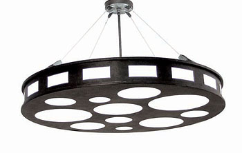
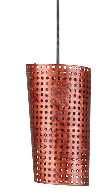
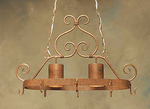
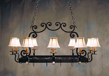
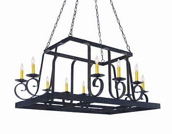
A large catalog came in the mail yesterday and when I opened it I knew it was something special. It's a company called 2nd Ave. Design.  They have some really interesting products. They seem to move from Mediterranean rustic to Soho funk. Let me show you some of the things I thought you'd like to see. It's a cinch to coordinate various types of lighting, sconces, chandeliers, pendants, with the pot racks. I actually like to mix finishes, I think it's more interesting, and their finishes are beautiful.


871256.42.jpg 

05.0934.6.jpg pot-rack.jpg potrack2.jpg potrack3.jpg potrack4.jpg


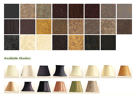
And take a look at these finishes, great selection: 2ndave2.jpg

Kitchen Design - The Work Triangle (then and now)

You've all heard of the work triange in regard to kitchen design. There is so much to discuss regarding kitchen design, and I've already discussed many topics on this blog, but have not yet touched on this most well known of topics, the work triangle.

I've recently been asked some questions by an editor about the work triangle for future publication in a shelter magazine, so it got me thinking. I'll tell you my thoughts on this topic. And, I'll try very, very hard to keep it interesting!

That Was Then

In the old days, oh, up to as recently as 5 years back, kitchen design was straight forward. The work triangle served the vast majority of America very well for decades! Why? Because our choices were limited. The key ingredient in keeping kitchen design on the straight and narrow, in my mind, was standard(ized) appliances. A societal component contributed to kitchen design maintaining the status quo as well...that is, the singular definition of "what is a family?" There was really only ONE definition, as we know.

This Is Now

All of a sudden (past five years) we have so many different appliances which have come on the scene, to serve an increasingly higher level of detailed purposes and lifestyles. Thus, we have many more choices to create the optimum lifestyle scenario within the kitchen environment.

We have also evolved into acknowledging, seeking to fine tune, and to celebrate our cultural needs and differences in regard to HOW one wants and needs to work in the kitchen. This includes considering who else is working in the kitchen, what their choice activities are, and what else goes on in the kitchen besides cooking, which is becoming a big issue. What's happening NOW is that more non-kitchen activities are taking place in the kitchen, such as computer work, big screen tv watching, lounging, and more space needed for congregating in the kitchen in general, which is actively competing with cooking space! The challenge is to look at what will make YOUR kitchen work best, discarding any sort of standard design or recipe for "perceived" efficiency. It's all good, and it's about time!

work%20stations%202%20copy.jpgUm, OK, Great, And The Kitchen Triangle Today? 

Is there still a kitchen triangle in kitchen design today? Mostly, YES! When we consider the three elements which still remain important for most of us to access quickly and easily...the refrigerator, the sink area and the cooking area, yes, sure, those "stations" remain critical to preparing a meal and are often seen in uninterrupted paths, as I have observed in recent years. That said, we are also now increasingly seeing the triangle expanded, broken, shifted, moved, and otherwise changed, to accommodate new, specific, lifestyle needs, based on the evolution noted above in regard to appliances and societal shifts.

For example, if the husband cooks and the wife preps, the cooktop may be far removed from the sink area, which is now designated more of a clean up area than a main prep area. Perhaps, then, the wife preps on the island, removed from the clean up area. Or, as is the case in a current kitchen design I am involved in, we need a separate "breakfast" prep station, where the husband mixes up smoothies, makes coffee, and other foods with the help of small appliances, thus, creating a "small appliance" work station, separate from both the cooking and sink/clean up section. An area where he can spread out and do whatever he's got to do in ample space.

Another client needs a separate "coffee station" where he can do his one special task away from the traffic flow. Still another client will need a special prep area for use of prepping foods for the steam or small high speed oven for their healthy eating lifestyle. A Kosher kitchen design I am currently involved in has so many specialty work areas included, I can't count them all! Highly specific, highly functional, highly efficient.

The bottom line in today's new kitchen seems to be it's all about US (one's family), not "me," with multiple stations designed for specific needs and/or desires. Again, it's all good.

I'll talk much more about kitchen design in general and today's new kitchen in future blog posts. This was an overview to get you thinking and planning! 


Scandinavian Kitchen Design ROCKS!

I'm not kidding about this. It really rocks, trust me. Take a look, and turn up your speakers. A LOT. It doesn't always work for some reason. Refresh your browser if you don't see the video right away. It's short but unlike anything else I've seen!

Scandinavian Kitchens That Rock The House

Or try this link, but try it! (And then report back!)

My cousin, Lis, sent me some links for Scandinavian kitchen websites, many of which I already had, but some were new. I had asked her to send me some magazines, and she said links are easier. Nice! I'll be loading up on magazines when I go to Denmark in August. I usually spend at least $100 on magazines, and they add so much weight, but it's worth it (to me!)

Here are some thoroughly modern kitchens from the company, Trend. The wood really looks fantastic here, doesn't it?

trend-1.jpgtrend-2.jpg
trend-3.jpgtrend-4.jpg
trend-5.jpgtrend-6.jpg

 
And, as always, try out a few blogs. The first, Modern Country, has text in brown in English. Also check out hvitstil, and last but DEFINITELY not least, Karna.


French Kitchens - Chalets in the Alps

French-Alps-9.jpgToday is Bastille Day, commemmorating the storming of the Bastille on 14 July 1789. Of course, on this national holiday, always falling in the midst of the Tour de France, it is traditionally the day upon which French riders will make a special effort to take a stage victory for France! 

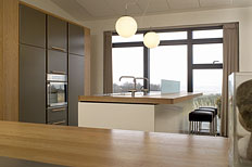
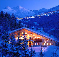
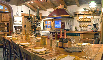
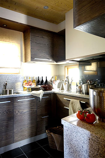
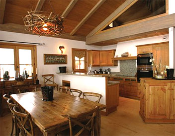
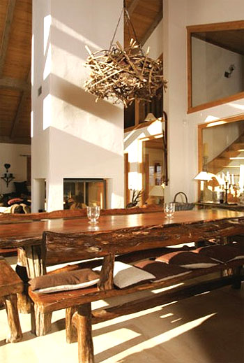
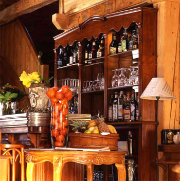
And, so, it is appropriate to show some kitchens from France today, and I think I have a treat for you! Since the Tour is entering the treacherous and stunningly beautiful French alps, let's take a look at some French country kitchens in some luxury chalets, oui?  Images from the Oxford Ski Company, specialists in luxury ski vacations. I'm there...I just need to learn how to ski, just a detail! I hear tomorrow the route for the Tour is even more grueling in the mountains of France. I'm watching, are you?

French-Alps-6.jpg


As you can see in the first image, many of these chalets will accommodate from 10 to 20 people, or more. Some have 8-10 bedrooms, hot tubs, indoor pools, and of course, locations with amazing views of the Alps. Pretty good kitchens too!

French-Alps-5.jpg French-Alps-4.jpg French-Alps-3.jpg French-Alps-2.jpg

Custom Kitchen Cabinets - What You Need To Know, Part 1

custom%20cabinets.jpgChoosing your cabinetry is a huge decision. It's so permanent, isn't it? So many choices too! Since the cabinetry is often one of the largest parts of the kitchen remodeling budget, I'll be doing a series of informational posts on selecting your cabinetry. Today's post will be a simple explanation of custom cabinetry. Is it right for you? We'll see.

The phrase "custom cabinets," or "custom cabinetry" can be quite confusing. In fact, it means different things to different people! Do you want custom kitchen cabinets? Will they last longer? Will you pay much more? Is it worth the money? Here is some insight, and answers to common questions, to help make your decision making a little bit easier. These questions and more will be addressed in future posts. For now, let's begin at the beginning with a description of custom cabinetry and what makes it appealing to some.

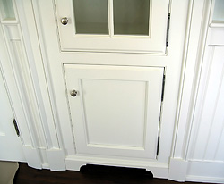
What is this image?? It's an image of custom cabinetry integrating seamlessly with surrounding millwork.

What is custom cabinetry?

Custom cabinetry can be defined as cabinets which are made to order, first and foremost. Whether by an individual at a shop or a factory, the cabinetry is not pre made, taken off a shelf, and delivered. They are not manufactured until an order is placed. This is one definition.

How else is custom cabinetry defined? 

Custom cabinetry can also be defined as cabinetry which allows customizations, such as changes in cabinet sizes, wood species, and finish. True custom factories will also produce anything that can be built! The designer draws it, and the factory builds it, end of story.   

Why should I consider custom cabinetry? 

You should consider custom cabinetry if:


  • in the course of the kitchen design process, you discover that you want specific, and customized, design solutions that may not be widely available in the less costly, more middle quality cabinet lines
  • you want to make the most of every fraction of an inch, engineering your cabinetry to fit as opposed to working with standard sizes
  • you'd like to create a cabinet finish that is yours alone, or you feel you need to tweak an existing standard finish sample to get the look you want
  • you appreciate, desire to own, and can justify the extra expense of a high quality product, the construction and useful features of which will be enjoyable to use and experience every day
  • you appreciate the more distinctive wood species and fiishes that come with custom cabinetry, you want something special and/or innovative
  • you will remain in this home for the very long term and desire a product that has top quality construction and a top quality finish


From my experience as a professional kitchen designer, any or all of these points noted above, are the compelling reasons why my clients choose custom cabinetry. My job, as I see it, is to point out the differences among the cabinet lines that I represent, and let the appropriate product "speak to" my clients and then we go from there.

 
In future posts, I will cover middle quality cabinetry, also known as semi-custom, sellers of cabinetry, differences between types of cabientry, cost issues, and much more. Stay tuned! So much more to come.


Kitchen Dining Inspiration

an-eye-for-an-interior-1.jpgI happened to see that a blog I frequent (A LOT), An Eye for an I:nterior featured this post of mine, an interesting kitchen design, and I immediately noticed the table and chairs that Jen was putting together, and I'd love to chat about it.

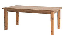
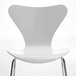
As you notice, the table is raw, rustic, natural, and the chairs are modern, smooth, and white. The thread that they have in common are simple lines.

But, the real interest is found in their differences. I really love this look, and an-eye-for-an-interior-2.jpgI encourage my readers to go beyond their comfort zone and experiment! Pairing together "rustic" and "modern" makes them each POP, a wonderful study of contrasting style and theme.  Another nice contrast is the juxtaposition of straight lines and curved lines. Each element looks strong and important. It also brings to mind my cousin's kitchen in her summer house in Denmark in terms of the rustic/modern combination.

Just thought I'd take a quick opportunity to share this concept.

Thanks, Jen, for the inspiration! 

Kitchen Remodeling Perspective

Next time anyone connected to a kitchen remodel is super stressed, remember this link, below. In order to understand the whole thing, please click on the link in the post "enormous concrete Virgin." Funny story.

kitchen%20remodeling.jpgHow can I tie this into kitchen remodeling? For one thing, I, too, can get carried away with worry, concern, all sorts of emotions in the course of doing my job. I mean, issues with deadlines, clients, tradespeople, allied professionals, delays, suppliers...there are many opportunities for me to get undone, and the same goes for my clients.

I've been reading this blog I have linked to, checking it most days of the week since mid December. It's helped me have a healthy and more serene perspective on life than I had, previous to finding it. It actually has had a profound impact on me, to tell the truth. It also propelled me, after having been far too lax, to go on a campaign to get every test and go to every doctor that I could think of beginning this past January to get all of the appropriate information on my current state of health. It's all been great news! This blog I speak of is an incredible read. The writing is intelligent and very special.

So, next time you really get undone about something, give yourself a reality check. Emotions can come hard and fast in the world of remodeling. Stop everything and get your perspective back. Sure, some issues are important and irritating and unjust, but there are more important things to get nuts about. There really are.  It's just about redirecting emotions which can potentially do damage to fragile relationships. In remodeling, that's pretty important for all sides to remember. Once these relationships are damaged, it's difficult to backtrack and do repair work.

Kitchen%20Remodeling%202.jpgI'll even add one more life changing (truly) event that happened, coincidentally, a week prior to finding this blog I mentioned. I went to Norway as a guest to an event surrounding the Nobel Peace Prize. In seeing the Bangladesh people who were invited to attend the presentation of the Peace Prize as recipients of the micro loans the Prize was based on, people who lived in huts on dirt roads and have never been out of their village, let alone, to Norway, I thought of my lifestyle, and the words came to my mind "....and I'm stressed?" In front of me was another world, which abruptly removed me from my comfortable world. I learned about life in another world, I saw people from many nations come together, and my own perspective changed dramatically. I shook hands with a Banladeshi woman in her full, beautiful, dress, our eyes locked, and I was just transformed to a different, changed, reality.

Have patience, and all these pesky remodeling issues will work out. Patience, trust, effective communication, and perspective, and you'll survive your remodeling with flying colors and even dare I say, enjoyment!

Do you know what one of the most important pieces to survival of a remodeling experience is? For anyone and everyone connected to it? Humor! That's right! Find it, you'll be glad you did.  

This post was not planned, but I really wanted to share that linked post with you when I checked the blog today. Enjoy your day!


Kitchen Design - Tuscan Style!

I sold a kitchen to my client, Grace, today. We've been working together since January. Lots of stops and starts, beginning with Asian design and ending up with a Tuscan themed design!

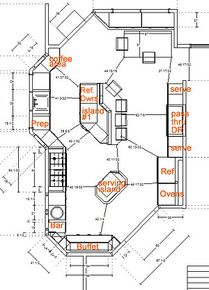
Here are a few very simplistic images of what we're planning. They have not been embellished with wall and backsplash details, they are just simple line drawings. I'd like to point a few things out to you.

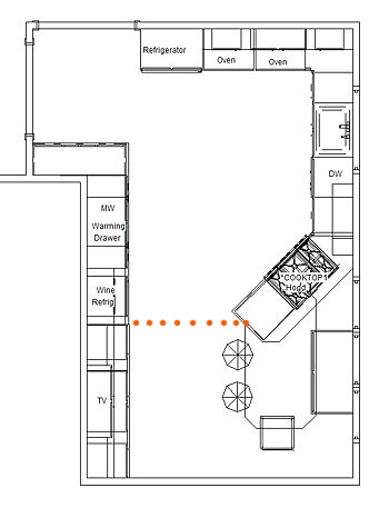
Grace's-Kitchen-1.jpgFloorplan

See the orange dots? That delineates, or transitions, the working part of the kitchen from the dining/furniture area of the kitchen. This is by design so that there is a frame of reference across the width of the room, and the length for that matter.

Grace wanted an expanded work area, and she also wanted to interact with her guests, AND, she needed to seat five people within the space. See the large window parallel to the table? It's a very large window, and very low, so the cooktop had to veer off at that angle, which actually works quite well. 

I don't love the configuration of the window seat. I had wanted to angle that back in the direction of the cooktop, but Grace objected. I may push that again, or we'll review that as it comes together as we can add to that at the time. That remains to be seen.

I see I forgot to add the doorway at the bottom of the floorplan. There will be a wide doorway into the kitchen from the foyer, positioned more away from the table than toward it.

We were going to have a large stone hood above the cooktop but today Grace decided against that. We'll do a downdraft instead.

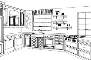
Grace's%20kitchen%202.JPEGSink Wall 

Note the open shelving to the right of the window for interest rather than the cabinet-cabinet effect. I didn't want to put cabinetry every possible place. The eye needs to wander and rest on something of interest. So, to the left of the window, Grace will put something decorative in that wall area. Oh, forget the dishwasher, it won't look like that, it will look like a framed door/drawer combination, which will actually be a panel, much more seamless of a look.

Refrigerator Wall

Note the "built in" section where the wall cabinets are positioned to the right of the refrigerator. This surround will probably be faux painted or stuccoed. Again, this is for interest, something different. I think it works in that area. That theme is continued elsewhere, as you will see.

Opposite Wall 

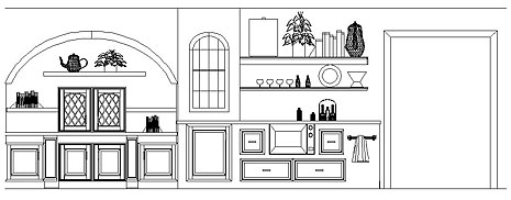
The line of transition, the orange dots I spoke about earlier begins after the arch. This arched area will be, oh, maybe 15-18" deep, maybe less. The TV is in the wall cabinet sitting on the countertop. Then we have a few shelves. The top of the arch, the whole upper arch section, maybe stuccoed and fauxed in some manner. Perhaps we will do mosaic tiles in the center section below the arch, something simple, as decorative items on the shelves will take center stage. Below the countertop are three horizontal areas above the base cabinetry which will be faux painted in a decorative design of some sort.

To the right of the arched area is a wine refrigerator, again, sort of "built in". Above that is another built in cabinet which will most likely project forward about 18", probably more than the arched area. Then we have wrap around shelving, see the floorplan on the upper section, and around the corner is a buffet piece which serves the dining room. And, the microwave and warming drawer are to the right of the wine refrigerator.

Again, lots of possibilities for faux painting, tile, etc. I'll do a post in the near future about the colors we're using. I think you'll really love what we're doing, can't wait to show you. For now, Grace has the samples as she shops for whatever she's shopping for, probably tile. I'll be involved in that too.

One more thing...we purposely wanted the upper left side of this wall (upper left in the floorplan) sort of open, as Grace wanted more of a connection to the family room beyond, and previously there were tall pieces blocking any view. We are widening the doorway to the left of the refrigerator. To the right of the microwave is the entrance into the dining room. See where the towel rack is? That is the side of the buffet piece, but it's actually a short wall, as that is part of the "built in" surrounding the cabinetry.

That's it for the moment! 

Grace's-kitchen-3.jpg 


The Kitchen Designer on the Desire To Inspire Blog!

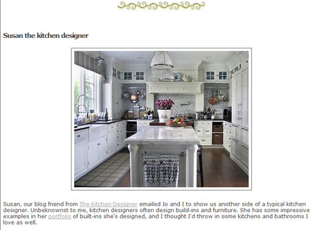
It's really great to be featured on the wonderful interior design blog, Desire To Inspire! Thanks Kim & Jo! I'm honored, truly, because these gals showcase really fantastic interior design, found world wide, in many different styles. It's a source I go to, to get inspiration, ideas, and information. I have often felt that Kim and Jo have a little bit of a kitchen fixation (in a good way!) as it is not unusual to find kitchens among their collections of interiors on any given day. I'm always thrilled to see these kitchen images. 

It's actually helpful to see the kitchens in these interior design collections, as one can see the kitchen design within the context of the entire home. But even beyond helpful, it is a valuable resource, and one of the very few blogs which includes different parts of the home, which one can learn from, in addition to just enjoying the view, a nice enough activity! Again, thank you!


desiretoinspire1b.jpg

desire-to-inspire-1a.jpg