 Merrilat KitchenFresh from walking the show floor of KBIS (Kitchen Bath Industry Show) held in Las Vegas, following is an overview of my impressions of what's new, what's trending and why.
THE SHOW FLOOR
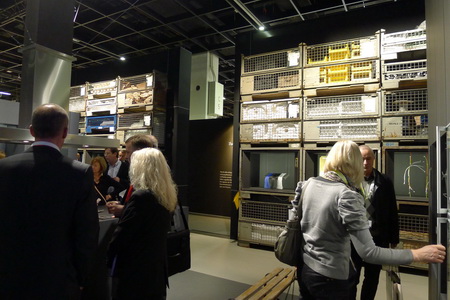
The kitchen and bath show (KBIS) was smaller than last year, three years after the financial crisis, which was quite surprising to me and to other veteran industry attendees I spoke to. Those who attended their first, second, or even third KBIS, have no concept of how different a show KBIS has become since before 2009 (I've gone for about 20 years now.) To see the show even smaller this year, and the booths stretched out (wider aisles, etc.) within the exhibit hall to achieve a perceived "fit", was obvious and a bit disconcerting, 3 years after 2008.
Exhibit booths for major brands were drastically smaller, in probably all cases, often with little adornment (thank you Formica for a smallish but fabulously designed booth.) And, countless major national brands simply disappeared from the show floor this year. KBIS is a shadow of the show it used to be. The show program (a sort of soft cover book of conference schedules and exhibitor list) tells the story too -geez, was it small!!
That said, I would never not go. It (the basis of the show) is my world, the one I reside in every day. How can I not go? So, I go, and I'm still genuinely very excited to attend every year. Good for those companies who did display...I assume due to the show's size, they had quality visitors to their booths.
NEWS FROM THE KITCHEN AND BATH SHOW
Without further ado, here are the major trend messages observed from the show floor! Visual examples will be forthcoming in future posts.
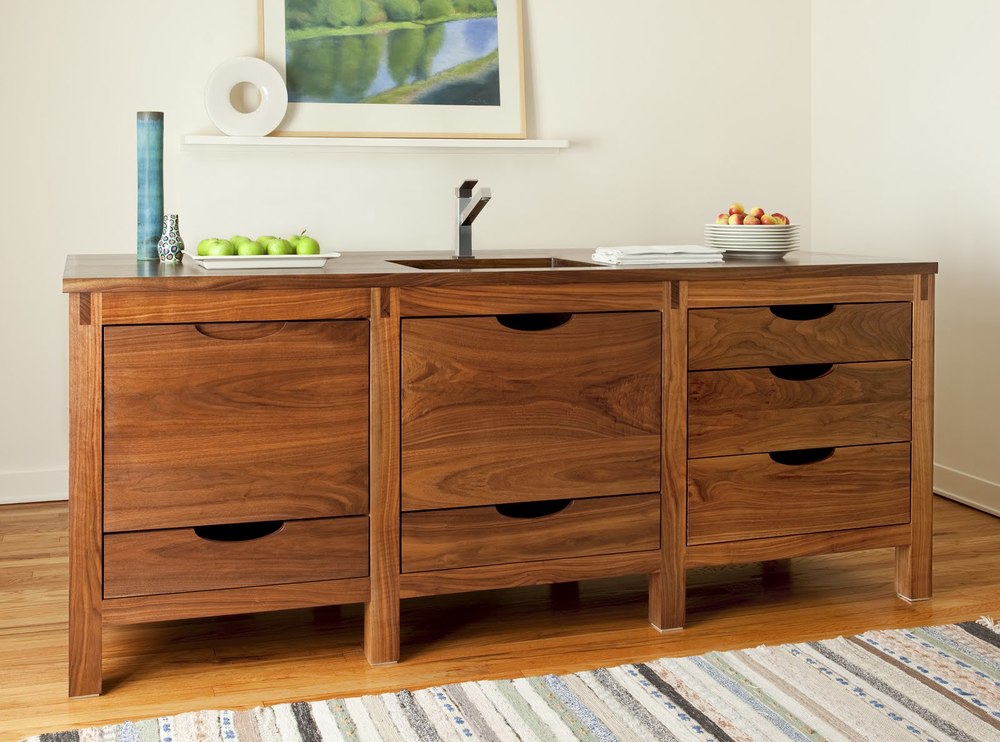
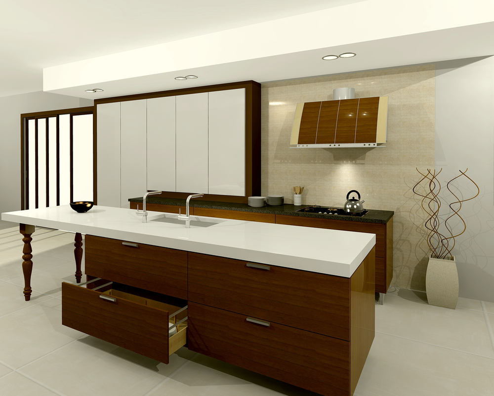
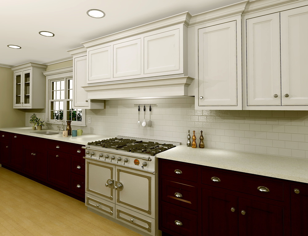
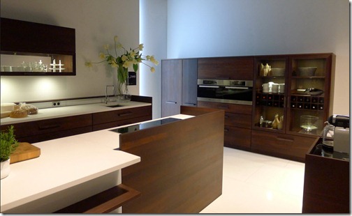
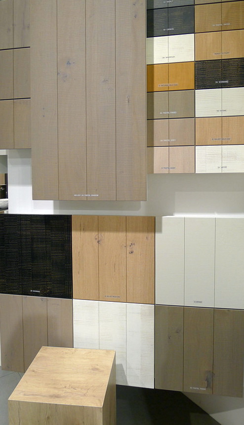
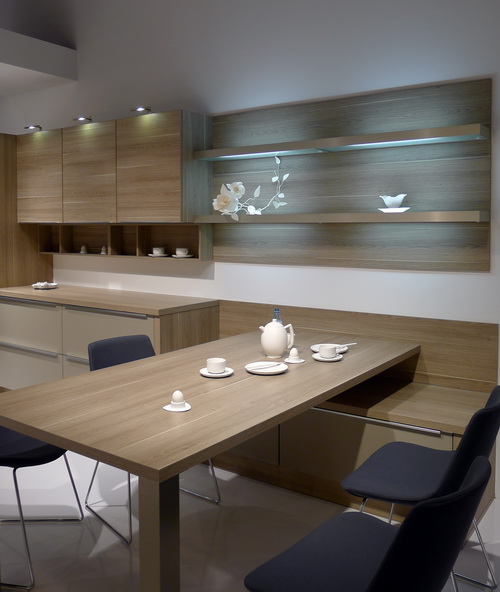
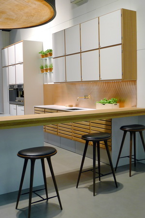
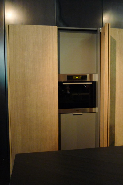
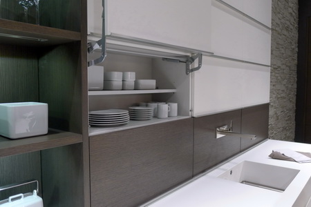
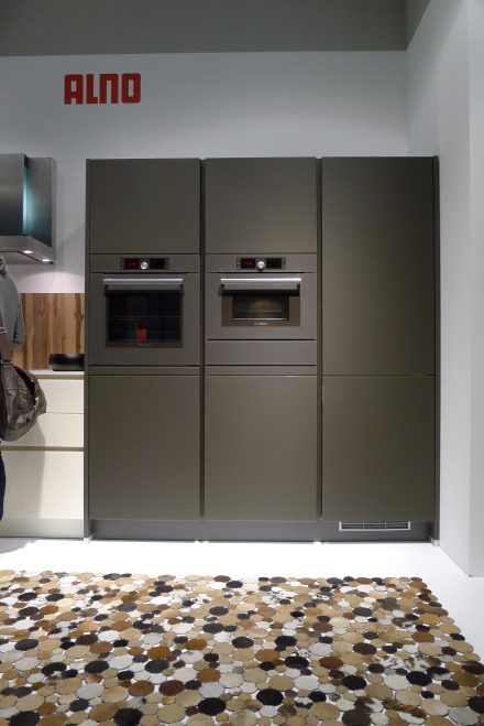
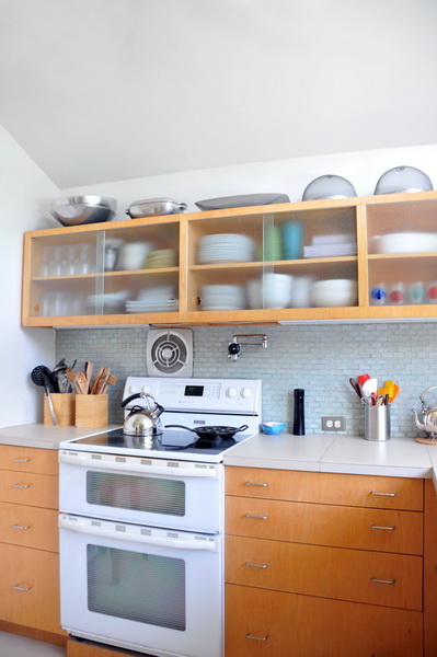
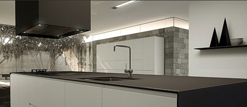
It's all about BROWN undertones - the whole spectrum from light, mid tones to coffee - brown finishes and often gray browns (more brown than gray) dominate cabinetry, new countertop introductions, tile, more. Black, at least in cabinetry, and white (as always), are in the mix....black as the new (yet classic) neutral for cabinetry?
Transitional cabinet door styles, the shaker door in various forms, and the soft modern style or a more simple traditional theme, was a focus for the kitchen and bath
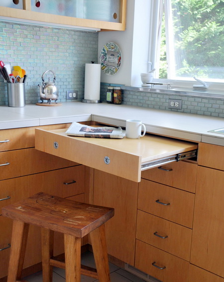
Technology focused on quiet, soft, easy access, ergonomic design solutions for cabinetry
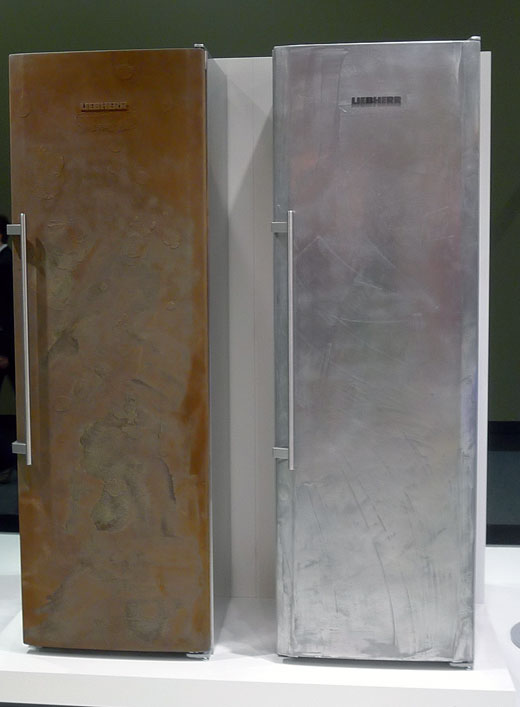
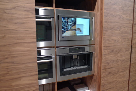
Multimedia - products mixing disparate materials for a fresh design statement...the theory that interesting texture can be a small price to pay here and there in the context of the cost of a whole kitchen remodel
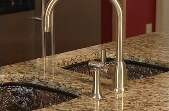
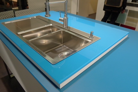
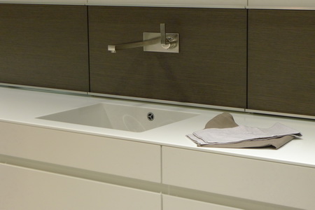
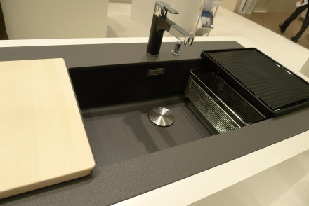
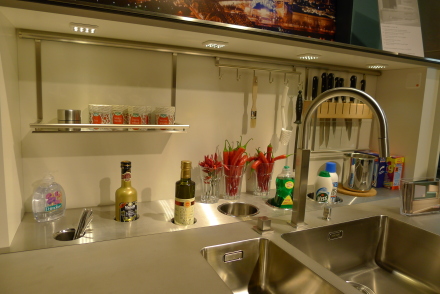
Sinks - seamless integrated sinks and countertop solutions and sinks designed to perform multiple functions including doubling as counter space
Budget - Many manufacturers introduced a lower priced line or moved/modified existing products into a lower price point to provide expanded choices to their customers. Even luxury brands such as Artistic Tile, Corian, Dacor and others have discovered and introduced new ways to make their products affordable. This is an across the board trend and seen in product design with a focus on style, durability and longevity.
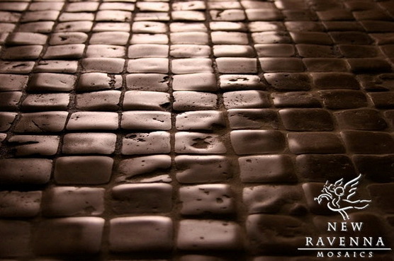
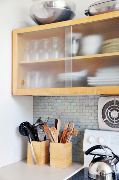
Tile - Tile is getting smaller and longer lengths in many cases with newly introduced high def imaging to create a truly authentic look. Many/varied glass accents. Tile continues its style story in the kitchen with softer/simple, often mosaic, designs that encompass expanded areas in the kitchen beyond the backsplash for a look that flows (example, surrounding a window to the ceiling)
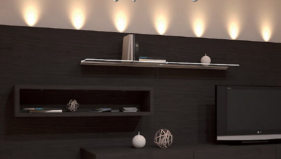
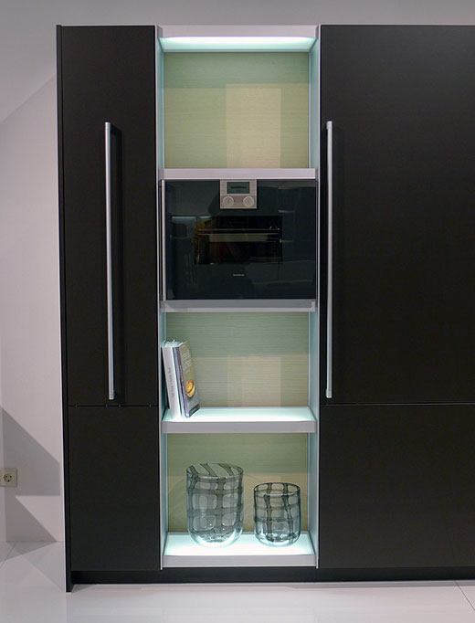
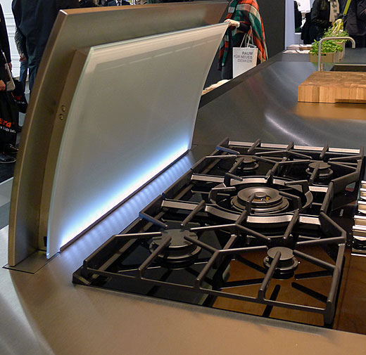
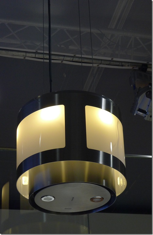
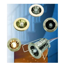
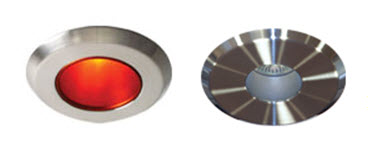
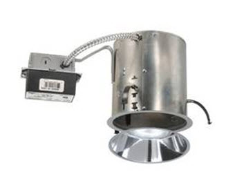
Lighting innovations continue to focus on led and substitutes were shown for the typical incandescent light bulb design but with energy efficiency built in. Task and accent lighting keeps getting smaller and more flexible in terms of installation and design (lighted tile in a backsplash anyone?) even color of lighting available.
Cabinet hardware is focusing on additional warm finishes and styles with more visual weight to make a statement (bang for the buck theory and a good one). More soft modern styles and styles which are very modern, projecting significantly off the cabinet for its own statement, are trending. I also observed this in Germany in January at IMM Cologne.
Green - An effort to "go green" but not as prominant an effort as I've seen previously
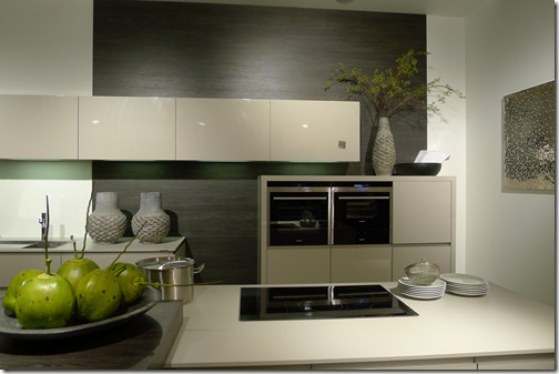
Color - I did see quite a few products of neutral shades which had a soft green undertone, sort of a gray green. Otherwise, color, in its bold form, was hard to find! I observed it in pockets, certainly not as a dominant theme at the show.
Innovation? Not so terribly much this year as compared to other years. More repositioning/tightening of existing product lines and thinking more creatively in terms of budget products...which of course, is good news to many, many Americans, making the kitchen design process fun again for lower budgets.
This is my preliminary (but well thought through) report. After looking more closely at my 800 images, I may add additional thoughts. More to come!!


