Timeless Kitchen Design

It's a question which is being asked with more and more frequency as we want our kitchens to have as much design longevity as possible: What elements make up a kitchen design that translates into a timeless look?

The question comes to mind now as I think about my trip to Spain, from which I have just returned. I was invited to travel to Spain to speak about American kitchen design trends as a guest of Autokitchen, an exhibitor and partner of the SICI fair, at which I and my colleague, Roberta Kravette, conducted our presentations. 

Spain is amazing. Amazing IS the word! I have visited Spain once before, many years ago. Roberta and I took the opportunity to travel to Malaga, Ronda, and Granada, leading up to the SICI fair in Madrid. So, the word "timeless", as we traveled through these ancient cities, is the first concept to grasp in my consciousness as I write this first post on my experience in Spain.

The culture of Spain....the food, its landscape, the architecture and interiors spoke to me in a way that I did not expect. On the second day of photographing endlessly (my obsessive side emerges when I have a camera in my hands and over the course of 5 days, I took a good 1500 images) I felt "it." I saw centuries' old design elements that are perfectly in sync with today's modern kitchens and interiors. The patterns, the flooring, the tile, the colors, the decorative details from ages long past are without question the foundation of a timeless style.

Is this a new concept in design? Decidedly not. Being up close and personal with authenticity is a sort of nudge to stop and observe ancient design elements (which look awesome when observed in situ rather than in a store with flouresent lighting mixed with contemporary items) with today's perspective. Short of visiting old and ancient cultures in person, I'd highly recommend these at-home treasure hunting activities as your road map to inspiration and authenticity:


Visit Museums

Look Carefully at Old Paintings To Observe Decorative Details

Find Books in Your Area of Historic/Cultural Interest (example)

And, Of Course, Google Image and Text Searches (example)

Most of all...take your time and research to find what speaks to you!


I have much more to share about my trip to Spain, including the purpose of the trip...my invitation to speak at the SICI (kitchen show), a request for a meeting in Madrid (via email) by a lovely Spanish couple which was REALLY a treat (I met with them), and the many beautiful things I saw at the kitchen show. More soon!!!

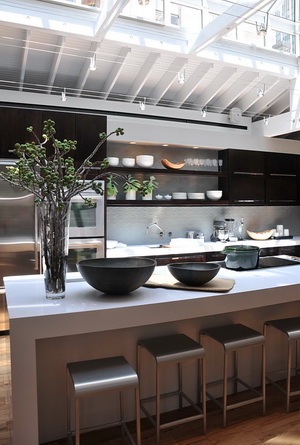
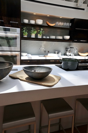
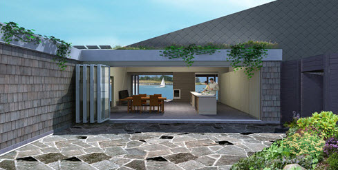
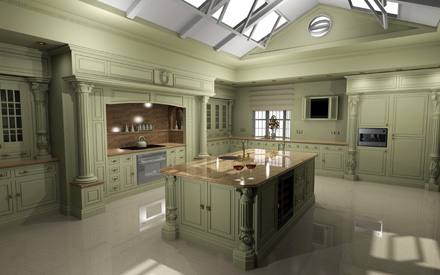
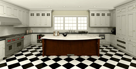
Here is an autokitchen image...no, it's not a photograph, it's a rendering!

Nate Berkus & #Nateday921 #Nateshow921 #Nategate #designbloggers

I'm going to try this again. I wrote a post already on the Nate Berkus "event": the, approximately, 100 design bloggers who gathered in New York city from all around the country, for the purpose of being in the audience for a taping of Nate's show. I deleted the entire post, due to a suspected troll in the comment section, when I should have just removed the single comment. I want to put down my take on this event once again.

This was begun by the (twitter handles) @moggitgirls and @creategirl by declaring a "NateDay" in which design bloggers would blog about Nate Berkus in support of him and his forthcoming show. Mission accomplished and major kudos to these ladies for their hard work and vision!

Later, word spread that a date was set by the producers of the Nate Berkus show to accommodate us bloggers in appreciation for NateDay. We came en masse...a force of 100 or so design bloggers to celebrate Nate. Supporting/celebrating Nate via attending a show taping was the first reason to gather together. A secondary, but, surely, more important reason to gather was the opportunity to meet one another, a fantastic benefit of the trip. That was by FAR, for me, a wonderful experience, seeing so many blogging buddies, seeing old friends and making new ones!

My Feeling About Nate Before the Taping

He's a design talent; there is no question about that. His work is wonderful. He's GOOD. He seems approachable, kind, with a big heart, and for me, there is really nothing not to like or respect. 

The Day of Taping

We watched the taping of the show, which, to me, was very interesting, especially all the behind the scenes action. How fun is that? It was an experience.

Here's my take: The show, both the producers and Nate fell short in not acknowledging on air that a) he had an audience of design bloggers (not 5 pharmaceutical sales bloggers, but 100 interior design bloggers) who paid him a pretty incredible show of support by blogging about him en masse on one given day about his forthcoming show and b) that design blogs are a good thing. To me, personally, it shows a lack of awareness of the importance/relevance/power of social media and a lack of basic manners that in this case, transcends corporations, stars, and doing business as usual.

When done en masse, as this was done (probably representing millions of unique visitors to our blogs combined) in support of the Nate Berkus brand, a very public thank you is appropriate, which could have lasted all of 10 seconds. They have to be kicking themselves about this. "Look what this audience did for me, many thanks...and aren't design blogs amazing?" He SHOULD brag about this tribute to him, why not? At the same time, throw a crumb to design bloggers.

I do want to note that I am one of the ones who did not expect the show to be about design blogs. I expected it to be a regular Nate style show. Once I realized the force that was sitting in the audience, I then thought, hmmm...we should be mentioned briefly, of course.

It simply needs to be said. What am I feeling now? Mild annoyance which will be ancient history very quickly, but again, it must be said, in my opinion, given the efforts, albeit unsolicited, that people made for him and his brand.

Another reason why it is appropriate to make mention of design bloggers is because bloggers give back. In my case, I'm a design professional and have been blogging for 3 1/2 years. I share my professional expertise, tips, resources, how tos, and so much more, with many, many people. I help many people who cannot afford a high end designer via my blog and via my one hour consulting service. I know my blog is appreciated and valued because I get lots of emails saying thank you, you helped me figure "it" out!

Blogging takes an enormous amount of time away from my business and it brings in very little income each month, nothing to speak of, actually, in my case and in most cases. There are countless design bloggers who have this similar situation/model. You don't have to be a professional to help people and those who are not design professionals contribute valuable insight and information to the public as well. We give back every day and perform a free service to an enormous number of people. 

I'm not emotional about this. They dropped the ball, not me. This incident does not affect me directly in any way. But, it's a good opportunity to talk about how we design bloggers play a vital role for many people who aspire to have, simply, well designed, homes that they can feel proud of and comfortable in. It's a public service that we provide, yes it is.

My Feeling About Nate After the Taping

My positive feeling hasn't changed. Nate is a person of authentic talent. Speaking of authenticity, after the show, Nate came out on stage, sat on a stool and took questions for a good 20 minutes. My perception is that he spoke from his heart, he was a good listener, and he shared experiences with us. His answers were thoughtful and not rushed. I liked him more than I did before the taping and I still feel that way as I write this. I think he's a good guy, a smart guy, that could have received better advice, and could have asked his staff to tell him about/research the value of design blogs. Doesn't make him a bad person. Nate being in a position of having reach to millions of people warrants this (fair and balanced) analysis. I hope he understands that. 

Say la vee...(yes, I know it's supposed to be cest la vie..someone once corrected me on that!) everyone makes mistakes and I'll put my mistakes up there with ANYONE...just try me, mine will be better than yours!! This one was a good one, though, given how we gave to Nate and how we do give back to the general public as a group. 

Moving on, I'd encourage Nate to engage with design bloggers again. His brand can go to new heights that he never would have imagined, influencing a whole other category of people who may not (currently) watch his show but may hear of him in another way, via online initiatives, within segments of his show, from the show's website, or other interesting ways to showcase the value of design bloggers. His new and old fans will love him even more! Just some suggestions...


Comments are closed here due to the previous troll, but please comment on my facebook page, where this will show up shortly...and "Like" me while you're there!!

My World of Kitchens!

And, I'm back! I'm more immersed than ever in the world universe of kitchens...maybe slightly underwater may be the better term due to my recent posting absence (I'm so ashamed!)

I honestly have four full time jobs right now: my design practice, all of the social media areas that I touch including the NEW blog I started, Scandinavian Kitchens & Design which is another labor of love, the coming launch of my new product line, www.bornholmstudio.com, and another top secret beeeeeeg project I'm involved in, not to mention appointments, events, and jobsite visits which are on the calendar, one of which is taking me to Madrid on a speaking engagement the first week of October and to a GE summit two days before I leave for Madrid!

Besides that, part of this summer was spent with my dear and youngest son, who unpredictably came home for a couple of days from the city to look for a car with us and ended up staying for nearly 2 weeks, as his girlfriend had also left to visit her family out of the country for that time period. It was such a gift to have this quality time with him in July. Then, we moved him and his girlfriend to Columbia, MD, near DC, in August, to start their next 5 year adventure, his girlfriend attending a PhD program at U of MD. Of course, the move, and a subsequent visit to DC, was surrounded by multiple visits to IKEA and learning to eat crabs! 

Meanwhile, I've never been so stimulated in my life, professionally, by the new people I am continually meeting, materials I am seeing, and new information acquired, and I do love every minute of my busy day and now it's WAY past time to check in here, say a very warm hello and thanks for your patience. I will try to do scheduled blogging (a regular note on my calendar, saying "blog today!") rather than on the fly, which has not been working very well. The point is, it's a very busy time, but I'm happy as a clam, immersed in the kitchen universe, and am just trying to perfect the juggling! 

This ended up being a bit of a hello again post, so next time, I'll be letting you in on some of the pretty amazing things I've been seeing and hearing around the kitchen universe. 


House Beautiful Kitchen Of The Year 2010

"I never thought of myself as a designer." So says Jeff Lewis, host of "Flipping Out" and designer of House Beautiful's Kitchen Of The Year 2010, unveiled on Monday, July 19, at Rockefeller Center. Jeff, and his team set out to create a kitchen that reflected his personal aesthetic - a warm, modern kitchen with super clean lines, sleek surfaces and most of all, a minimalist and most importantly, easy to clean, design. 

"I really thought of myself living here," Jeff says. Jeff's lifestyle is one of often serving drinks and hors d'oeuvres before going out to dinner with friends, or taking in sushi, and when catering an event at home, having someone there to clean up immediately as the kitchen gets messy. The kitchen in his own home is wide open to the living area, and Jeff must have his kitchen "always stellar" as when he entertains, "everyone ends up in the kitchen."

FLICKR SLIDE SHOW - 9 million pictures!

Jeff talked about it being a challenge to design a contemporary space that is warm. I don't agree with that as a professional kitchen designer, but it brings up a great issue. Do you see this kitchen as warm? Here is what I think:

My Take

First, let me say that design is highly personal and highly subjective and my opinion is only ... my opinion! I think the kitchen is stunning. I love the use of neutrals and I also love contrast, especially when tempered with, in this case, the textured floor and the quietly textured backsplash. These elements, as well as the reclaimed elm table, add needed texture, and the floor, needed warmth. 

FLICKR SLIDE SHOW

The juxtaposition of these elements (including deep, rich, brown Kraftmaid cabinetry, and the coolness of Kohler's wall mounted Karbon faucet, SUPER cool and functional Crevasse prep sink with Cynchronus rinsing technology and Caesarstone's amazing island countertop, make life in this kitchen FUN! The Jenn Air appliances add to the fun with super functional ovens that will tell Jeff exactly how to cook anything (say, if his housekeeper is away on vacation if he gives her one)  ;)  without having to waste a second of time and the one-of-a-kind ductless cooktop.

The island shape and size is EXACTLY what is coming on strong today in kitchen design. While Jeff's lifestyle is more entertaining and quick food oriented (he doesn't cook) where the island can serve a use as a buffet, and hang out area, for my own personal demographic, with 3 grown kids and their SO's visiting fairly frequently, a large island serves an important purpose for socializing and meal preparation. This design serves many lifestyles well.

Once one experiences this fabulous, large island, really, who wants to prep or wash or cook, while facing a wall? I think this is one of the questions of our current time as socializing in the kitchen becomes even more important than it ever was before, which my perspective of kitchen design in the past 25 years points me to. Although in the vast majority of kitchens, some food tasks must be done against walls, (and many prefer to keep a mess more toward a concealed area) I predict, and have, in recent years, that islands will get larger in the foreseeable future solely due to an awareness of the importance of connecting with our friends and family, at the same time that we continue to be interested in more casual living. The integration of kitchen and living spaces is all about socializing. We may not all fully realize that we are feeling that desire more and more as we contemplate renovating our kitchens, but I'm seeing from where I sit, that we do indeed feel a push in that direction.

It brings up the question, which I am hearing from my clients, about "the mess" in an open plan kitchen. That is today's design conflict for sure. Jeff deals with it by having his housekeeper vigilant to the presence of clutter and mess! He's a VERY practical guy.

From a personal perspective, disclaimer already noted, I feel that the kitchen lacks a touch of soul. It's a "type" of kitchen design that is appropriate for many people, of course, but I would have liked to see less cabinetry and more interesting (yet still simple) design/storage solutions, particularly near the table. Cabinetry was the only design tool used to fill the main wall here, going from one end to the other. I would have liked to see the introduction of another material, still maintaining a simple design. That said, I love the large soffit above.
FLICKR SLIDE SHOW

The white dinnerware and accessories and rustic wooden bowls say "stylized" to me rather than "personal" or even "creatively quirky." The focus of the kitchen and cabinetry design seems to be a geometrical "frame of reference" lesson of coordinating dimensions. That said, that is absolutely a viable design philosophy. Maybe because I'm a kitchen designer, I see and interpret some design concepts in a different way and look at what the design process might have been. So, is it a warm/modern design to my eye? I would say more modern than warm...again, completely subjective.
There is no doubt that it IS beautifully designed for the lifestyle of its owner. In that respect, it's a winner!

What do you think??


Modern Kitchen

As a random feature, I'd like to show you a kitchen that would be interesting to talk about. In this case, it's a modern kitchen. 

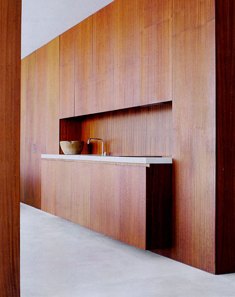
It's always interesting to dissect the foundation and other elements that make up the framework of the design. There are several ways to "see" this kitchen. Images by the ridiculously beautiful magazine, Rum.

Below: Let's look at the largest view of the space. It's very strong, isn't it? Both the wood and the white, to me, are equally strong. This modern kitchen is striking in its simplicity with its super clean lines. Yet the texture of the wood makes a very striking...yet quiet...statement. It's strong, but sort of offers a feeling of security. An exciting mix of contrast on traditionally opposite planes (white used horizontally, wood used vertically) the white, larger in proportion and supplemented by furnishings, indeed serves as a paradoxical foundation. 

Below: THIS shot of this kitchen is a wow, no question about it. Can we achieve any more of a minimalist design? The shot itself is stunning. The wood texture and color radiates warmth and elegance. Clearly, the design is art...a functional and living sculpture.

Below: Well, the modern kitchen plot thickens! Now we see that this is a loft type space. A very open floorplan. The white continues from floor to ceiling to bedding to accessories. Two elements - wood and white. Strong rectilinear shapes focuses the eye toward (in one visual sense) floating and dominating vertical planes, a monument to the most important element of the space - the beauty of the wood. 

I must say that I'm not on board with living in this environment. It's not for me, but I ask these questions: Is the design is a reflection of the designer or the client? Is it a monument to the designer's ego or was it a concept the client was interested in experiencing? The origin of a design like this is of interest to me. Of course, one has to visualize the space with the tools of living. Are there children in the home? Clothing, books, toys, papers, all must have a concealed home and time taken to store used items when finished using them...or else. 

Can one live a 100% completely clutterless life? Seems a requirement for this type of living. Sure, I'd love to experience living in this way, but, as a second home, not a primary home and even so, I'd probably have to "test" it by renting a similarly conceptual home to see if it's a fit for how I live. It's living, functional, art, and it is quite amazing and wonderful, but the paradox and questions remain.

So, what do you think? How does this space make you feel? Would you like to live in these spaces, visualizing everyday living?

Father's Day And Kitchens

This will be a little piece on random tales and my personal observations of fathers...and kitchens and a bit more. I'll tell you what it won't be. It won't be, even on this Father's Day, pure praise for perfect fathers. You can find that in lots of places. 

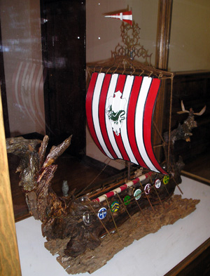
Viking Ship Made by My Father on Display at a Museum in Seattle-he often worked with driftwoodMy father (born in Copenhagen, Denmark) was a flaming narcissist and I say that not with bitterness, no, but with affection, truly. The man was a charmer. And, most of my life, I ate it up and pined for more. I idolized him. He was a little funny looking, but made up for it with a passion for life. He was a free spirit...yet a straight laced entrepreneur who built a business that designed and manufactured a few parts (among other things) for Apollo 11 which went to the moon. He was a government defense contractor. He drove a cadillac, drank scotch, smoked a pipe (had a collection) and wore fancy suits. We lived in a Danish modern home. Some years later, I guess in his 40s, he lost the business. I think it was due to his narcissism and ultimately his difficulty working with others.

He then landed a job with Boeing and moved his new family (he had divorced my very sensible mother, also from Copenhagen) to Seattle. It wasn't long before he lost that job. He sold cars for awhile until he couldn't work cooperatively with anyone. A lover of art, a passionate collector, an artist himself, primarily a sculptor, he reinvented himself, and I mean reinvented! He grew his hair long and wore it in a ponytail or a braid. He grew a beard. I think he evolved more into the core of his identity.

An early drawing of my father'sHe scavenged garage sales and thrift markets and created a small business auctioning off his treasures which he thought had value. He profited and lost. The walls of his house were filled with art. Although I'd say I'm sure he was tormented from time to time, being a narcissist, especially when people didn't give him the time of day, since it was everyone else who was problematic, he stayed in an oddly happy bubble. He always spoke from his heart. That, I've got to give him.

A drawing from Svend Christensen, my father, that he did in his 80s entitled "Night Time Fantasy"Finally, he and his wife could not afford the house, and they moved to an apartment. He had sporadic interest in his 3 kids he left behind in Long Island before and after the move. I once said to him, "you left when we were teenagers to go across the country and you never flew us out there." His reply was, "do you know how much it cost to move to Seattle?" Oy. I knew at the time that was a wacky response! I helped him numerous times financially and toward the last few years of his life, sent him money monthly.

FATHERS AND KITCHENS!

One of countless images my father drew in his 80sEvery Sunday when I was growing up, before the divorce, my mother would take us kids to church and upon arrival home, my father would have prepared a great breakfast! My father was the master breakfast maker and, of course, this being the 60s, the master backyard griller, complete with dog, a beer, and Frank Sinatra. He made a big production (of course) of whatever he cooked and that was fun.

After the good years, I clearly remember my father telling me as I was soon to walk to the bus stop at 13 years old, that he and my mother would be getting divorced, and he would not be there when I returned home from school. He told me in the kitchen when he was sitting down eating his breakfast. Not the best timing for that message, I don't think! 

My father was a big thinker, very big. He had vision. I think too much, actually. He told me out of the blue one day when I was in my 30s that I should sell kitchens in Hong Kong. He was serious. That was an interesting piece of the puzzle...

Yes, he was a difficult, and wonderful-at-moments, father, but certainly an interesting one, and now, I have perspective. But, wow, he was really something. None of us are perfect and we are mostly a product of our own upbringing, and his was especially difficult. I'll always have those Sunday morning breakfasts, that's for sure. It's known among my siblings that I take after him the most...except for the narcissism! I absolutely believe that my similar personality characteristics of being a big, very deep, thinker, a free spirit, having a positive outlook, being a passionate person with vision, one who is comfortable with risk, enjoys creative endeavors, comes almost solely from his influence...geez, sounds a bit narcissistic! BUT, negative attributes coming from him? The same, any one of these characteristics which, if taken too far afield, might not bode well for every day living as history proved for him...the paradox! Checks and balances...I think many of us try to embrace the best qualities and temper the negative ones from our parents.

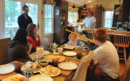
The patriarch in the kitchen preparing breakfast, a few days ago during our Cape Cod vacationBack to kitchens, as I reflect on my father's connection to our kitchen, I will say that in my design practice, more and more men are happy to be cooking in the kitchen. Maybe they have specific dishes or meals they like to cook, maybe they just like to assist. I'm definitely seeing more input from dads about the family's needs in the kitchen, special accommodations for the family, and an overall much higher interest in being involved in the cooking process than ever before. It's a nice trend to see.

FATHER'S DAY IN MY HOUSE TODAY

My husband, father to our 3 children, has also taken on a more involved role in the kitchen as the years have gone by. Always the one to go out and get breakfast foods, especially when our grown children and their SOs are visiting, always the self motivated director of cleaning up, just always happily and selflessly wanting to serve others in the family, having everyone's comfort in mind, today, we will treat him like a King! I will force him to relax, which could at first be uncomfortable for him, but he deserves it. 

All you dads out there...life isn't easy, it's a real roller coaster, but it's days like this that are important to stop the routine for a moment and enjoy the simple pleasures of family....and food is always in the equation, isn't it? To my son-in-law, who we just spent some days with in Cape Cod last week in their rented home to which they graciously invited us as well as our son and his girlfriend, you're an amazing dad to my granddaughter. You are her Prince Charming now and you always will be. I see that you get it. She's a VERY lucky girl, that Chloe! Love you and have a perfect Father's Day today! And all you other dads too! 


Nate Berkus + Kitchen Design = STYLE

I like Nate Berkus' style - I'm definitely a fan! Style is the word that comes to mind when I see interiors that have been touched by his creative hand.

I often see a philosophy of Nate's work which expresses "tradition with an edge." Nate's "edges" are awesome...cool color stories, tradition meets modern, texture meets soft, pattern dominates to unify, among so many more design concepts that delight, and always, for some reason, just feels right! Nate's infectious enthusiasm for design translates into an ease, a gracious informality that's easy to live with. I mean, I see him on Oprah, and before I know it, I'm smiling. He's seems to be such a happy guy! Creating interiors with a happy disposition definitely shines through one's work.

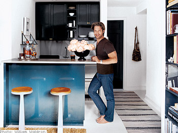
I'd love to see Nate do more kitchens, and I'd love to collaborate with him! Here's Nate's kitchen in his Chicago apartment. 

It flows. I love the black window trim. The turquoise is a great color and just flows into a collection of clean, solid, elements, sort of a framework for the room. And, those chairs and table...LOVE.

And Nate's Manhattan apartment....this kitchen I love! I'm a real lover of white floors...I have two painted white wood floors in my own home. It looks very much like a Swedish rag rug on the floor and the blue, black and touches of wood just punch up the space. The enveloping white on floor, ceiling, and walls, is the unifying element, which adds a flow and maximum spaciousness. There's a Scandinavian aesthetic to this kitchen. Another: LOVE!

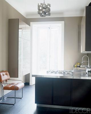
Nate Berkus' kitchen in his Milan apartment is another Wow! See what I mean? He has a vision! This is European modern elegance. It's quite sophisticated, with strength in large color elements, yet quiet. The brown leather chair adds a feeling that this is a room, not only a utilitarian kitchen, and the color of the chair adds life. Very well done! The lighting fixture, honestly, to my eye, is the perfect touch. LOVE!

Nate, I'd love to see more kitchens! This sampling alone includes such a great collection of creative and diverse (and unexpected) details, don't you think? 

First two images from Oprah.com, last image from ElleDecor.com.


The Intoxication of Paris!

Seven nights in Paris...it's taken me so long to begin this post because I just don't know where to start! How about I start with adjectives? Paris was:

incredible, amazing, beautiful, sexy, charming, colorful, historic, elegant, modern, rustic, delicious...and I'll add another "incredible!"

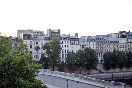
The view from our apartment below over the Seine:


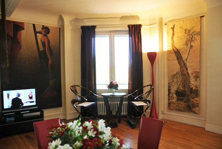
My husband and I stayed for 7 nights. We rented a luxury apartment overlooking the Seine, decorated in blacks, reds, and browns. It was TRES chic! Ok...the luxury part? My husband received a trip from his employer for many years of service and truth be told, we could have made several nice trips out of the gift and stayed at decent places. Instead, we made one small trip and then, um, decided to BLOW the rest of the travel $$ after airfare, on a fabulous apartment. Yeah....we're glad we did. Sometimes you just have to blow the money, you know?

Which brings up an interesting subject. I never feel a need to stay within bounds of whatever I perceive my "class" to be (don't we all have a perception?)...which changes depending on my mood. Could I afford to stay in that apartment for an extended period of time? No! Should I feel comfortable in a luxury apartment that I could barely afford to rent for a week? Why not? And I did feel comfortable the moment I stepped into the building!

Prior to selecting the apartment, we were feeling responsibly frugal. The more we looked at apartments online, however, the more we were falling in love with the fantasy of living in Parisian luxe for a week!

As a designer, it is an experience to stay in beautifully designed surroundings. Good design that I can live in, even temporarily, is a memory for me and a thrill. I'll always have Paris.... :) For Steve, he, too, said let's do it and we thought Paris was the PERFECT place to indulge! 

The Kitchen Parallel

I can surely make a parallel to kitchen design. When it comes to material costs, of course, you must reconcile what your heart AND your head tell you and that is the tricky part. But, if you fall in love, say, with a walnut wood countertop for an island and if you truly can afford it, take care that your "default worry alarm" does not shut off your dream state, only to select a less expensive (but practical) material, crushing the dream yet leaving you feeling (yes, unnecessarily) responsible. Being frugal in a situation such as this when one does not need to be, in my world, is borING! 

Design beyond your comfort zone. Find creative budget solutions which are always out there to find and feel good about that. I've done that, to the max, actually. But, also feel good when you've just.got.to.have.the.....whatever. Go for it, spring for it, indulge your kitchen fantasy. You deserve it, you're worth it, and yes, the material thing you love does not have a pulse, but I sure get lasting joy from some of my possessions and experiences, even over decades, don't you?

Get the flash player here: http://www.adobe.com/flashplayer


A Little Time Off...

Image captured on my recent trip to Paris!As sometimes happens with my blog, I might seemingly disappear for a bit. And, I guess I actually do, at least in terms of regular blog writing. And, I always regret that, while at the same time I am planning post after post as events transpire, only to get involved with something else before I put fingers to the keyboard. Thus, the regret!

Right now, and for some time, I have been juggling some very exciting balls, all in the air (ok, the blog ball dropped!) I am currently working on:

  • designing kitchens for clients
  • running the business and all that entails
  • participating in short design consultations for clients
  • keeping my hand in Twitter, my personal facebook profile and my professional Facebook page ("like" me!
  • working closely with Angela Min, who has been part of my business since the spring (she's awesome, classically trained in Interior Design with a masters degree in ID, and you will be hearing from Angela on this blog and elsewhere!)
  • working on my new product line, Bornholm, to be launched this summer and all THAT entails (a lot!)
  • attending industry events
  • blogging for Sears, Decorati, Divine Caroline, K+BB 
  • interacting with members of the media on various projects
  • not to mention an active personal/family life including a recent trip to Paris! And my 35 babies (roses in my garden!)
Beyond being busy, as we all are of course, sometimes the more I am away from my blog, the more a bit of paralysis sets in too, where I feel, well, I've been gone awhile, now I really have to blog about something special. Maybe some of you bloggers have felt that too. Today, I'm tossing that analysis paralysis aside to just touch base with you.

I did take a number of days off in the middle of a busy time to (obsessively) search for the perfect project management system to keep it all running smoothly and which serves as a great communications platform between Angela and I and for us and our clients. 

Seeking something new, I got my hair cut in Paris! So fun! Total language barrier too!I'd say that my career has never been as interesting, diverse, fun, and hopeful as it has been in the recent past, right now, and for the foreseeable future. I'm loving every day and all the interactions with clients and industry colleagues, new and old. 

I'm deeply entrenched into all things "kitchen" focused and in my new project management system, I have a special place set up for blog ideas so they now will not escape me after I say to myself "YES, I've GOT to blog about that!"

More soon....and I hope this finds you well. I'd love to know what you are finding new and exciting in the world of design...

Oprah.com Home and Garden Feature, and more

Hello visitors from Oprah.com! Angela Min, interior designer, and I, certified kitchen designer, welcome you! Angela and I are a design team, focused on our specialized areas of residential design. You will soon find Angela's insights on design in this blog, her first post to be seen within days.

Angela and I both offer design consulting services, from one hour phone consultations (see the right sidebar) to full turnkey design services. It's just amazing what can be accomplished during this hour as we get our clients focused and work through one creative idea after another, whatever the client's budget. Good design does not have to be expensive! And, we work as a design team on projects too! Thank you, Oprah.com visitors, for visiting, and please leave a comment! Topic suggestions? Let us know.

It's a good time at this point to also make mention of my daughter, Kelly Donovan. Kelly, my buddy, friend, daughter and all around super smart and savvy gal, will also be joining us on The Kitchen Designer blog to share her unique insights on living in no less than five small urban kitchens (in New York City). Kelly is a foodie, a truly passionate cook, mom of a 9 month old, and will share her information and insights on living and cooking in a tiny kitchen! I've often wanted to focus regularly on small kitchens in this blog, so I am thrilled to introduce my readers to Kelly!

Kitchen and Bath Industry Show

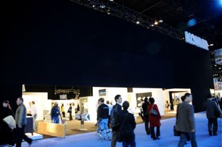
I'm happy, plain and simple! I am writing this on a plane en route to the KBIS show in Chicago. To say I love going to this show is an understatement. It's THE place to go if you are in the kitchen and bath industry. I get reenergized, see colleagues, meet new ones, attend seminars, while having no other distractions. I am as excited about going this year as I ever was, and I guess this is my 19th year attending KBIS. Add some press events into the mix, and we're talking serious fun!

This year I will be serving as a judge for K+BB magazine, a sponsor of KBIS, to judge the best products in the show. I serve as a judge for K+BB magazine at the end of the year to evaluate the most innovative products of each year, so it is another honor to be asked by this venerable kitchen industry magazine to serve in this capacity. Fun!

While at KBIS, I will be visiting the autokitchen.com exhibit. Contact autokitchen.com for a special KBIS price on the latest, and very innovative, version of their software. I have chosen autokitchen.com to work with in my design practice for a number of reasons, but, ok, truth be told...it's the incredibly sexy state of the art photorealistic graphics that had me when I clicked on to the website! Take a look (allied design professionals) and tell the U.S. representative, Miguel, that Susan from The Kitchen Designer blog personally sent you.

KBIS, here I come, and Oprah.com visitors, please bookmark this blog for much more professional design advice on both kitchens and interiors.

Gimmeshelter Project - Join Us On The Journey!

I meant to formally introduce/announce this fantastic project before now, but at this moment, I want to enlist your help in making a decision on the interior of an inspiring house that I am working on. First, a bit about the project...

Leslie Hoffman, Executive Director of Earth Pledge is taking innovative green building and reuse philosophies to a new level with her current project, and personal residence, a modern beach house on bucolic Shelter Island, nestled between the twin forks of eastern Long Island. The project, named GimmeShelter, brings together a team of passionate green building professionals, led by Leslie's decades long commitment to sustainable living. The products used in this home represent the latest green technology, information on which Leslie is particularly eager to share in an effort to inform and educate. The GimmeShelter project introduces a new dimension of community to a single residential home, supporting new thinking in indoor/outdoor living. I will talk much more about this project in the coming weeks and months. I'm thrilled and honored to be a part of this project. It's pretty awesome.


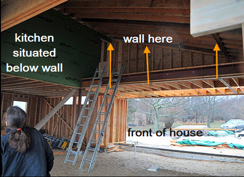
 I went out to the site to meet Leslie (in a huge nor'easter-60mph winds, anyone?) to take a look at a ceiling issue that Leslie needs to make a decision on right away. Design is, and must be, a collaborative process. So, we put it up for discussion, in the spirit of community, one of Leslie's defining personal philosophies. The kitchen plays an important role in this issue.

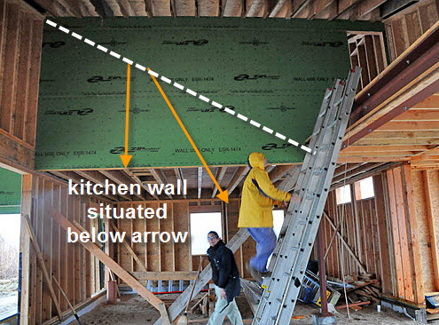
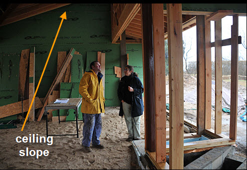
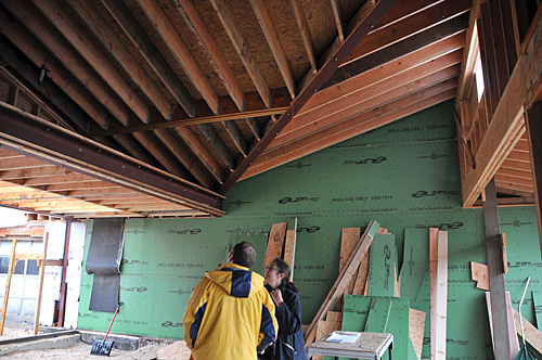
The issue is this: The angled/pitched ceiling line can be built so that it follows through the entire space, from one side to the other, the entire space having a pitched ceiling, ending on the kitchen wall...or not. Each ending wall would have a triangular shape, formed by the pitch of the ceiling. You can see this natural roof pitch on one end of the space, on the wall directly opposite the big green square section of wall. 

One issue to consider is that there will be a wall of 8' tall doors, situated below the start of this higher wall (seen in green), extending to the exterior wall at the front of the house (toward the right of the image). The doors will be made of American walnut in a natural finish, harvested locally to the manufacturer. This "wall" of walnut is a strong visual element.

While the entire space is light filled with high ceilings, my concern lays with this wall of walnut being "heavy" on one end. Therefore, I would lean toward NOT continuing the natural slope of the ceiling all across the space. Given that there are walls of glass at the front and rear of the house, another theory might support a lower ceiling in order to "see" the interiors and their outdoor spaces in a more horizontal, rather than vertical, plane. The walnut "wall" of doors in the kitchen may, then, appear somewhat heavier.

Please tell us what you think about this issue. What would you do? Should the angled wall above Leslie in the last image be constructed to go all the way across the room to the other side? BE A FAN OF THE GIMME SHELTER GROUP ON FACEBOOK


Below: the wall directly opposite the square green wall on the other side of the room


Share |

More Tips For Martha Stewart's Morning Living Sirius Radio Listeners!

As I write this post the day before, I can tell you that it will be my pleasure to speak to the listeners of the Morning Living show on Martha Stewart Living radio on Tuesday, March 16. See this before the 16th? Tune in tomorrow to hear my tips on pitfalls to avoid in the kitchen design process. 

Following is a further collection of my tips to hold disaster at bay as you plan your kitchen design!

1. Identify a trend: I think many of us are aware that trends are something that we see repeatedly in the marketplace. If that is the case, it is most likely that the trend could have a year attached to it down the road as the hot item of that year. When planning a kitchen, made to last for a couple of decades, take care in identifying trends. Planning several trends into your kitchen design will date the kitchen sooner than later!

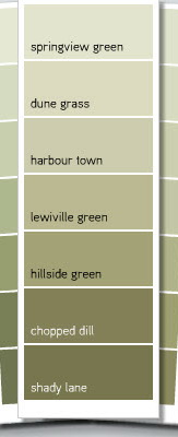
2. When selecting paint colors for your kitchen, always buy small sample bottles of about 3 to 5 different shades. In my experience it is impossible to select a shade from a little paint chip. You'll need to paint at least 1'x1' squares on the wall to see how the paint samples look on your wall during different times of the day. Look for colored undertones. As color is best viewed in context, you will quickly see the color and shade effects.

3. One of my favorite tips...countertop samples. Often, we have these very small countertop samples which fit into the palm of our hands. The countertop characteristics are admired up close. Remember, that small samples that look to have seemingly medium to large size crystals, when viewed from a longer distance, will be remarkably different. It's all perspective. Look at the countertop up close and from varying distances to fully understand the grain distribution and pattern.

4. White cabinetry - It bears repeating, white painted cabinetry with small children under tow for years to come may not be the best combination. Speaking from experience, I can tell you that my white kitchen became considerably worn over time as a result of raising three children who ran into the kitchen directly from the garage door. Think twice about bright white for that reason.

5. Mix it up - Mixing metals can make your kitchen design feel more authentic, as opposed to perfectly matched metals. You will find metal finishes on appliances such as stainless steel, your sink, faucet, hardware and lighting. Chrome (an age old authentic metal, on a comeback) and oil rubbed bronze lighting? Go for it!

6. Collection proportion - Do you have favorite collections in the kitchen? Two pieces of advice here: change it up from time to time for a fresh new look, and watch the sizes. Very small pieces can look dwarfed when placed high above your line of vision and if it is also viewed from a surrounding room. Does a decorative piece seem to large to use? It probably isn't. Try it. 

7. Cooktop Venting - Do you need a vent? Yes! You want to remove odors, toxins, particulate material, smoke, and moisture. Allow for adequate power in the vent, and do not position your hood more than 36" above the cooktop for the best performance. I usually shoot for 32-34" above the cooktop so I am sure nearly all of the nasty fumes will be removed. 

8. A very helpful entertaining companion, the portable induction burner is just that...put it anywhere in the kitchen and you have yourself an extra burner for the holidays. It creates another work station for your assistant chef, and you will not have to juggle pots and pans all around the cooktop. It's a great solution!

9. A comfy suggestion - if a banquette is designed into your kitchen plan, do yourself and your guests a favor. Make the banquette short enough to allow for a super thick comfy cushion. Visualize various lifestyle situations...someone is lounging with a laptop or the newspaper, enjoying the cook's company, relaxing with a cup of tea...there is a lot to be said for a 4 to 5" cushion on top of your banquette as opposed to a thin 2" cushion. Do not underestimate the importance of comfort in the kitchen!

10. The best thing you can do for your kitchen design is to hire a competent and creative kitchen designer! He or she will guide you step by step throughout the design process to help you plan the kitchen you have dreamed about. When you do a kitchen once or twice in your life, it makes sense to seek out a specialist. 

Questions, or comments, please feel free to chat! Here is more of Martha's inspiration too!

Lance Armstrong's Kitchen - Get The Look!

A few weeks ago, Kathy Price-Robinson, a writer, knowledgeable on many and varied remodeling topics, asked me for comments on how to get the look, for less, of Lance Armstrong's kitchen.

I proceeded to write paragraphs (and paragraphs) on elements that I observed that one could replicate fairly easily. I'm thrilled to have been quoted in AOL for this feature, but, unfortunately, many of my paragraphs did not make the cut. There were some good points!

BUILT IN BANQUETTE

One could buy short stock refrigerator cabinets that are 24" in depth, mount the pieces on a platform of studs, put a sturdy top on top of them, and wa-laa you have storage and seating.  Those cabinets should be somewhere between 12-15" tall depending on the structure below and above the cabinets and the height desired for the bench. Take a look at this earlier post I did on banquette seating.

COUNTERTOPS

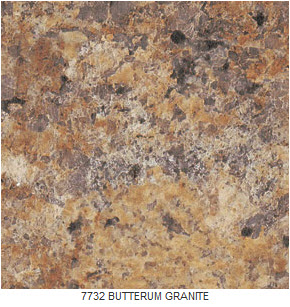
There are GORGEOUS laminate countertops now that truly look identical to granite or other stone except for the touch. They are worth a serious look. Alternatively, in one of my own kitchens, years ago, I used granite tile and wood trim which is an excellent second choice. I loved it. 

COLOR "BLOCKS"

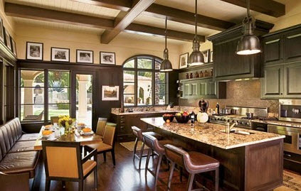
As we see in the image, one of the elements that makes the most impact are the sophisticated colors and shades in Lance's kitchen. Paint your cabinets an elegant, smoky color such as the green in Lance's kitchen. 

Note how the window trim, the island, the cabinetry under the curved window and the bench are dark, muted colors. Rather than feeling cluttered, it flows - this is the essence of this look. It is a close relationship of color from one material/surface to another. I would not advise matching these colors one to another...subtle differences only add interest and sophistication. Be aware of undertones in the color and assemble the colors together so you can see the nuances of one to another, but do not worry about matching. 

There are 3 color stories in this kitchen..keeping it simple. We see the browns, the green, and the yellow/gold. The yellow-gold is seen in the chairs, countertop, tile and wall color. It adds a brightness, a "life" to the space as well as a unifying warmth.

To add to the feeling of "flow" the ceiling color continues from the wall color. 


BACKSPLASH

Observing even more continuity, note the simple backsplash which coordinates with the granite. One or two shades deeper and softer than the granite, it allows the granite countertops to take center stage without competing with it. Less IS more, especially in a large kitchen. Think of this kitchen as "layers" or blocks of color, proportion, contrast and texture to understand how these pieces fit together.

Kitchen Blog Notes

Just a little blog housekeeping to do and to turn you on (do people still say that?) to a few things you may want to take a look at.

First, you'll see a new look for this blog. It's actually an update that I did myself. I may continue tweaking a bit here and there, but I needed a change, and to do a big change requires time that I just do not have right now to work with a professional graphic designer. So, much like organizing the kitchen, my new post on the really great blog, Hatch, here's a small update. I'm open to constructive suggestions too!

NOTE: There is a new share button at the end of every post. Please share! :) I'd love for you to share my posts wherever and with whomever you feel it is relevant for. Sharing is a good thing.


INTERIOR DESIGN CHAT - LIVE ON TWITTER - THURSDAY, FEBRUARY 25, 8-9pm

My great new interior designer friend, Wanda S. Horton, from North Carolina, came up with this very cool and fun idea to have a live chat, open to any questions at all on interior design (including kitchens) on Twitter. All you have to do is go here: #IDzinechat and you will see activity both from those who are asking questions and those who are answering. It's a good reason to start your own Twitter account, if you do not already have one. @tkpleslie (Leslie Carothers) on Twitter also lent her social media expertise to encourage this event to happen.

I'll be participating, so ask your kitchen questions, in 140 characters (I almost said calories-you know what's on my mind!) and I'll be on the lookout for them, and follow me on Twitter too: @susanserrackd

See you there!


A DREAM KITCHEN IN A VENTI CUP!

One day, in the middle of a million things, I suddenly had an urge to ask my Twitter friend, Franki Durbin, whose blog I've read and admired for a long time, to tell me about her dream kitchen. Franki has such a gift for spotting authentic style, so I knew she'd come up with some interesting kitchen dreams!

I love how granite countertops are in her kitchen dreams. You know, I've seen granite in kitchens for, well, 20+ years and yes, there is always the danger that a designer can tire of seeing the same fabulous design element over time. I challenge myself constantly NOT to fall into that trap, and I'm pleased that Franki is of the same mindset...smart gal!

I'd like you to go to Franki's post about her dream kitchen, because there are a number of other GREAT points and design ideas that she talks about, and I don't want to give them away here! Franki has a wonderful way with words...you'll be transported on a path of words right into the heart of that dream kitchen. Thank you for your post, Franki, and for your kind words. Your vision is truly inspirational!


Jason Wu, Brizo & Kitchen Design = NYC Fashion Week

What do fashion in clothing, faucets/fittings and kitchen design have in common? The design and marketing teams behind Brizo, Delta's high end brand, having aligned itself with Jason Wu, designer of Michelle Obama's inaugural gown (one of the most watched fashion designers in recent years) enjoy a relationship that seems to fit like a glove piece of couture. 

I had the opportunity to learn about and examine Brizo's existing line of products a few days ago. Brizo invited a small group of us kitchen/bath bloggers (listed on my colleague Ann Porter's blog) to New York City to see their collection of existing products and to take a sneak peek at new products to be introduced this year. Part of this two day event included attendance at Jason Wu's Fall 2010 collection, part of New York Fashion Week (insert 90 exclamation points here!)

I'll just say this before I get back to the subject at hand. To attend this Jason Wu show was an incredible privilege. It is an experience, simply, like no other I have had, and living near the city, I've attended my share of events in many fabulous venues, sometimes with celebrities in attendance. But, truth be told, I felt downright patriotic (which completely surprised me) as I think back. I feel I was witness to the best in American design and the best in creative production techniques (quite frankly) which, working together (pink carpeting, pink lighting, black flowing curtains, fragrance in the air, amazing music, incredible clothing and let's not forget those super models with 7" heels) produced an atmosphere of awesome creativity as it showcased Jason Wu's very personal design expression. The show manipulated nearly every sense to the max. The creativity, the risks taken, the personal expression, are all qualities that make this country great...I felt a symbiotic convergence of these odd bedfellows (fashion and patriotism) and, thus, felt privileged to be in attendance. 

Back to reality...During these 2 days, I had a sneak peek at new products to be introduced by Brizo this year. My lips are sealed, but, some of those pieces I saw were absolutely stunning! Did I like all of Jason Wu's pieces? No. Likewise, not everything in Brizo's fashion forward collection is for me. That said, I WAS grateful to find myself in another privileged position to be encouraged to offer my comments on their products, which the creative team from Brizo, welcomed.

Jason Wu, for some strange reason, did not ask me what I thought of his collection, although I did ask him a question later in the day when he caught up with us design bloggers at the Brizo cocktail reception. I asked him about his specific vision when he designs a garment and how/if it evolves from that original vision. Answer: The garments are fit precisely to each model within the course of a few hours, so the vision is in "collaboration" with the model's body...much like Brizo's designers need to answer to the faucet engineers and my kitchen designs need to relate to the architecture of the home. Interesting how the creative process connects these disparate design disciplines.

The thread that links fashion, faucet, and kitchen design, begins with creative expression. Creative expression is often influenced by others (in this case, Wu was influenced by Irving Penn). Brizo's designers are inspired by architectural elements, nature, fashion. They wait for a design element to speak to them and the creative process begins. They are open to inspiration. I understand that philosophy; I adhere to it as well in my own work, and I'm thrilled that designers working for a major, mainstream, American corporation are given that freedom of expression, much like the way Wu finds his creative spark. That was enlightening and probably the single most important piece of information that I am coming away with, a sort of satisfaction that ideas are the thing for Brizo. I know that is so because I met and talked to the designers.

Like in kitchen, faucet, and clothing design, function and design blend, collide, and play, ultimately forming the perfect union for that piece of couture, faucet, and for the kitchen of one's dreams. I've been inspired. I'm impressed that Brizo has aligned itself with a fashion designer. THAT is inspiring. In comparison, here was a quick synopsis of a post I did on Fashion Week one year ago, a description of the feeling at that time. We're clearly moving forward. Thank you Brizo for brilliantly linking together American fashion...and fashion forward faucets and fittings. It was an eye opener and a meaningful experience.

NOTE: SHORTLY, I WILL UPLOAD IMAGES OF THE JASON WU FASHION SHOW TO MY FACEBOOK PAGE EXCLUSIVELY. ARE YOU A FAN?? LOOK FOR THE POST WITH THE DATE OF FEBRUARY 14, 2010.

Kitchen Details

Here are a few things that you maybe interested in from my travels around the web recently!


Thom Filicia & Me

First, my interview for Amana with Thom Filicia on kitchen trends. An interviewer asked questions of Thom and me on a variety of topics. I don't think there is anything that I disagreed with in Thom's answers. He is quite passionate about the importance of the kitchen in today's homes. See 2010 Trends

Here are some recent ideabooks I put together and share some tips, on Houzz: 


A Kitchen Design Blog

It's three years today since I made my first entry in this blog! 

Holding a favorite Scandinavian plate in my kitchen from the island of BornholmMy initial thinking was that I finally had an outlet to talk about, really, to share, my 20+ years of experience as a business owner and Certified Kitchen Designer in nearly ALL types of kitchen design...super luxe high end to builders' condos, all different styles and themes, and kitchens in shades of (environmentally) green. I have lots of experience to draw from, knowledge gained from many sources, hopefully presented with a helpful perspective.

KITCHEN THERAPY VIA BLOGGING

Always an intense student of human behavior (including my own ongoing navel-gazing) as well as being fascinated by the WHYS behind my clients' design decisions, in part, to make sure their decisions are authentic/organic to their needs and/or desires, much of this blog has been dedicated to highlighting potential pitfalls in the decision making process of designing one's kitchen.

Many people do a kitchen once in their lives. If not once, then at most, only a few times more. The decisions made NEED to be as right as they can be at those moments in the design process. It's a time to look in the present, as well as forward, and back, especially, as I help my clients and readers unravel habit vs. desire, as one example. This is a part I love about writing this blog and working with clients whether for a one hour session or for a year and a half project. It's easy and natural for me to "nudge", probing for answers, hopefully in positive ways. I simply love the process, and I'm good at it. I define the "still waters run deep" personality for better or worse...my kids will gladly tell you the "worse" part of my being a deep thinker. Hmm, my husband may too, for that matter.

A REAL PASSION OF MINE

At the time I started this blog, I also immediately thought, "Yes, now I can also share another passion of mine, one that is little known and rarely followed here in the US - Scandinavian kitchens! Yes, I'm completely biased, having a 100% Danish heritage as a first generation Danish-American, having visited my family in and around Copenhagen my whole life.

That said, there IS a quality to many Scandinavian kitchens that is unique, intelligent (not as much "stuff"), and just downright visually interesting - if not always beautiful in a conventional way. I've been lax and am gearing up to show you more of these great kitchens soon. I strongly believe the Scandinavian kitchen is at once classic and always fresh. 

At last count, I have close to 160 magazines from Denmark, Norway, and Sweden in my Scandinavian magazine "library" with a subscription of about 5 right now. They are all in my office, categorized by name and date. Did I tell you I'm just a bit obsessive? Let me tell you about my 200 roses from my previous garden, which we just left a year ago, not to mention the tens of thousands of rose, perennial and garden images in my hard drive. But, I digress. It's a blessing and a curse...but it is a life lived with passion, I'll tell you that! It may be why most of my posts are longer than shorter. 

WHAT'S NEXT?

Hmmm...good question! What would YOU like to learn more about from me? Please share that with me in the comments.

You can absolutely count on my continuing, and intense, observation of lifestyle trends in the home, talking about how new products make our lives delightful, all the large and small things we need to remember as we design our kitchens, and always...the meaning of life in the kitchen!

 I'll continue to (happily-cool food and people) trudge through 20+ kitchen/design events/seminars in New York City in one year, attend several design related conventions in and out of New York, scour the blogs and magazines for new insight, hang with my tweeps on Twitter and chat with fb fans (be a fan!) fly here and there for product training, and read every single press release. How lucky am I? This industry is the BEST.

And my readers? You're REALLY the best, and you feed my soul when you comment. Now, speaking of commenting, I do need to be better at responding to comments, and I will try. I read every one. I have my hand in so many things (big news on a few fronts to come) that there is always something that has to "give" somewhere. But I'll tell you this: the second I get a comment, I stop what I'm doing to read it however long or short it is. They just give me such joy during my day. I pledge to engage more with you, to reciprocate for the joy you give me.

Thank you!


Delta Pilar Faucet - Touch20 Technology

About a month ago, I was asked to review the Delta Pilar Faucet with Touch20 technology and provided the product by Delta. I knew this might be a perfect product for my son Independent Product Analyst to test in my apartment in Manhattan Independent Product Testing Laboratory.

Review aside, do you know what the chances are to get your college kid to return an email, let alone write about a piece of his life on his mom's blog? Reading his review (it was sent to me at 3 am-no surprise there) gave me much insight into features, benefits, and new, learned, behaviors surrounding this faucet technology. Without further ado, here is my son's manifesto comprehensive review (as well as evidence of where my college dollars have gone these past nearly four years-graduation in May 2010!) I think you will enjoy reading this as much as I did. I asked for a paragraph or two, but I couldn't edit it, it's too good!


We are a pair living in New York City, and we love to cook, which is a byproduct of our statuses as near-starving college students.  Therefore, the kitchen is a very important place to us. It's a small space, typical of kitchens found in New York's cramped urban dwellings.  We were thrilled at the opportunity to test the Delta faucet because, not only do we appreciate functional kitchen appliances, but we have a constant bone to pick with germs as well.

Our menus consist of a lot of meat, poultry, and fish, and before I met my girlfriend, cross contamination rarely, if ever, crossed my mind.  Since this realm of enlightenment, for better or for worse, every time I touch meat or fish I wash my hands immediately after.  Washing your meaty hands with a typical faucet is trickier than it sounds if you don’t want to spread any germs, as it usually involves a lot of elbows, wrists, forearms, sometimes even a foot, or a chin, in the attempt to maneuver the faucet lever higher or lower.  As you can see, this was becoming an issue.

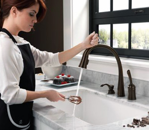
Enter shiny new Delta faucet with removable head. The faucet head can be toggled between two different water flows; spray and regular stream, and it is nice to have both options.  There is a magnetic ring that holds the spout in place for easy removal and reattachment, although the head needs to be faced forward for it to take hold. In addition, the water pressure can go quite high which can be useful, and the temperature changes quickly between hot and cold, which means that unintentional scalding happens a lot less.

When we first started playing around with the touch feature of the faucet, we were like cave people at the dawn of time, touching and poking the object and measuring its responses.  In our studies, we found that it could be slightly temperamental, mostly when the area of the faucet being touched is wet.  This isn’t much of an issue since there is a whole lot of other area on the faucet from which the water flow can be activated and deactivated. 

Since we are dish-glove wearers when doing the dishes, it was of utmost importance that we didn’t have to de-glove to turn on and off the faucet, and thankfully we were not disappointed.  And you may ask “how do you move the faucet around then without activating it?”  It is a logical question, but the engineers at Delta have accounted for that, and designed it such that if you touch or grasp the neck and maintain the touch for a few seconds, it will not turn on or off but stay in the same mode.  This is subject to a certain amount of trial and error, however, and will most likely improve as the technology improves.

The old fashioned on and off handle is also “touchified,” which is confusing at times because you can turn the water on by touching and lifting it, although it must be in the lifted position for water to flow.  This reality takes a bit to wrap one's head around, but in the end we think it’s best to leave it lifted all the time, since it won’t turn on otherwise and it would ultimately defeat the purpose of the “touch and go” aspect of the faucet.  

An understandable concern with this, especially for city dwellers is "what happens when a cockroach (they have P.O. boxes in New York City) or rodent, or perhaps a pet, activates the faucet by accident?"  This is entirely possible since it can be sensitive to a small touch, but there is nothing to fret about because it will automatically turn itself off after four minutes (should be half that). Editor's (mom's) note: We do not have said cockroach or rodent issue-if we did, someone's head would be on a platter!

M&M Cooking TogetherSince Manhattan apartments are especially small, we are constantly in or moving around the kitchen area, so we had a lot of contact with the Delta faucet.  Besides the whole germ thing, the touch feature was very convenient just for the fact that you don’t have to reach those extra few inches and lift up the on/off handle; a quick flail of the finger or forearm is all it takes to turn the water on and let us complete our objective. 

The aesthetics of the brushed metal swan neck faucet are elegant, though I would like to see the touch on/off functionality migrate to different designs to suit a broader range of kitchen and bathroom décor.   The soap dispenser is however surprisingly boring, and it would have been nice if Delta could have taken their mission of decreasing cross contamination a step further by implementing an easy touch soap dispensing system.  Nevertheless, the faucet is the focal point of this unit, and deservedly so.  Since our use began, we have denied millions, if not billions, of pesky germs and other toxic bio hazards from inhabiting the surface of our faucet, making it one less pit-stop the little buggers can hitch a ride from.

As the designated but proud germaphobes of the family, we are happy to have this newly found sense of cleanliness and convenience in our lives.  It is a great start to something that I think will catch on for many. I now have the urge to tap every faucet I see to turn it on, which is either just muscle memory or the mark of a good product.  I think it is the latter.


Editor/mom/Susan: Thanks for the review! My personal observations, after light use over a four day period, are also positive. It was a bit confusing at the start as to what position to leave the main lever in, but it's not rocket science. You figure it out. I felt the faucet spout was too long, falling toward the front of our normal sized sink, which means it should be mounted as far back as possible. As far as the concept behind the technology, although I'm a believer (unlike my son) that exposure to germs makes for a healthy immune system (to a point, trust me) I cannot deny the benefits of its time saving (I'm very impatient) attributes. I like efficiency! 

AutoKitchen Kitchen Design Software

A little bit of shop talk here, but I'm happy to share news of this new kitchen design software and technology that I am using.

I'm excited to debut and share information on my new kitchen software with you. It's called AutoKitchen and it's truly state of the art! The AutoKitchen representative, knowing that I am a working designer, offered to provide me with a copy of AutoKitchen software to review and to use in my practice, gratis. I already was using design software, but having recently upgraded my software and being disappointed in the quality of the renderings at the highest level of detail, I thought it a good time to take a look at all the competitors in this narrow field of kitchen design software for professional designers.

As with any product I review (in 3 years, this is my 3rd review) and as is a typical policy for many bloggers, it has to meet my own personal standards as a useful product with qualities that I feel have merit. Otherwise, I decline to review the product, which I have done once after using a particular product and twice in the case of books.

In this case, the graphics (crazy photo realism) were noticeably better than my existing program. I didn't "need" a new program. I was not looking for another program. In fact, I had just recently upgraded my existing program for a nice sum of $$. But, when I looked at this program in more detail, first, in comparison to what I was using, another very reputable program designed for the kitchen/bath industry, there is no question that I was immediately "wowed" by the super sharp graphics that AutoKitchen produces.

This program, from my perspective, IS state of the art! It's a significant enhancement to my business, an upgrade for my clients who will see their kitchen in better detail, and so, I'm extremely happy to share my thoughts on this program with those who appreciate beautifully designed graphics.

As I become more proficient with AutoKitchen (these images are from AutoKitchen's files) I'll be sharing the very cool drawings that it produces. If you are a designer and looking to make a change, I encourage you to take a look at AutoKitchen. If my existing program had been comparable, I would have had no need to a) learn a new program b) learn a new program c) learn a new program, all of which is extremely time consuming and quite honestly, always slow going at first, then takes more time to get fully up to speed, which designers understand. But, as a designer, beautiful graphics are extremely important, which trumps time spent learning a new program, for sure.

Having used my program (with regular updates) for 18 years, I did not make this change lightly; the software had to produce compelling solutions for my business. After my careful analysis of AutoKitchen and its competition over the course of two months, it does. I did not go for test drives with other software companies, but I very closely analyzed finished renderings on the companies' websites (the ultimate issue for me), talked to industry colleagues, and took a hard look at my existing software as well, which involved several sessions with the manufacturer to make completely sure that I was familiar with its top quality renderings options.

Had I not believed that AutoKitchen produces THE finest graphics in the kitchen design software industry, I would not have been interested. Why change a program I was comfortable with after 18 years to something that is second or third best? That would be a bad decision on several levels.

I can report that AutoKitchen's customer service is superb, otherwise, that would surely be a dealbreaker for me. CAD compatability is a big plus too. There is no question in my mind that the time invested is, and will be, worth it. I'm happy to share my perspective on this program. Miguel, from AutoKitchen, is a delight to work with and endlessly patient. 

For further information, call Miguel Merida. Phone: 201-568-3555 or miguel.merida@microcadsoftware.com.