Decorate - A Book by Holly Becker of Decor8 Blog

BUY THE BOOKBUY THE BOOK!Decorate, a new book by Holly Becker of the iconic blog, Decor8, is an ambitious book (that's the word that comes to mind). There is an enormous number of images for maximum visual delight, clearly and well written text as well as the ability to quickly drill down to the essence of each chapter and core message via quotes, lists, tips, shaded content boxes and other visual aids.

I love this kind of reference material. Give me the option to read or to look quickly for information. To me, this is a useful format, or mix of formats.

I am privileged to have been quoted in the kitchen section of this book in numerous places. It is an honor to me that Holly Becker sought out my insight on the topic of kitchen design. That said, while Holly Becker is a respected and treasured blogging buddy/colleague/friend since early 2007, I have declined to review books by other design industry peers, some of whom had been colleagues of mine (past tense-unfortunately, declining to review a book costs relationships) for many years. It's lovely that I am quoted in this book, but if I did not find the book to have real value in terms of solid and quality design information, I would pass it by and not review it.

In the kitchens section, on page 148, the introductory paragraph is such an inspiring yet succinct, description of what the role of the kitchen can be in our lives. To get this philosophy right, puts anyone on the right track who is planning a kitchen renovation. 

There are countless references to personalizing the kitchen in Decorate that are truly creative. It takes some thought to be creative, which means it takes quality time. More often than not, the content that I see around the web or elsewhere which focuses on creative solutions for kitchen storage, design, whatever it is, is sorely lacking in creative thinking.

The suggestions, tips, ideas on personalizing the kitchen in Decorate, are both enlightening and fresh and are accessible to nearly everyone (perhaps with the exception of the Michael S. Smith sink for Kallista) ;) 

The sections of the kitchen chapter are sort of divided into how we live - Casual Eating, Cook's Kitchen, Built-in Storage, Urban Kitchen and others. I find that the text teaches by describing various lifestyle scenarios which helps the reader to visualize a look more completely. But, it goes even further, describing the feelings that certain creative ideas may elicit, such as mismatching china, how to design in comfort and other creative ideas. At the end of the day, when you stand at the doorway to your kitchen, it's lovely to feel the way you had hoped you would feel at the start of the process, when finally surveying the result of all that work. 

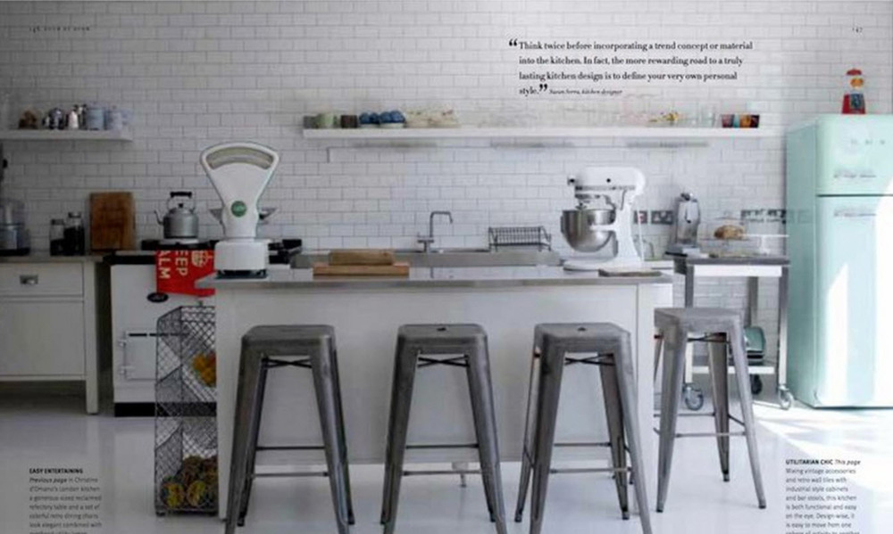
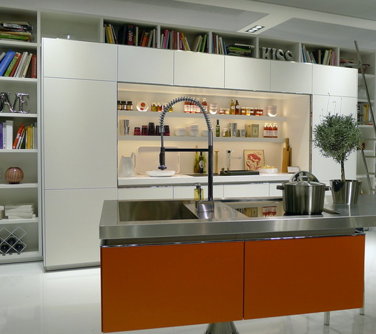
Most of the kitchens in the book are white and modern, but with personal touches, which is the point of the book. You will not find cookie cutter kitchens from manufacturers' brochures here. These are each a personal expression and illustrations of that classic design conflict of function vs. aesthetics that each of us has to reconcile for ourselves - hopefully under the guidance of a kitchen design professional who is understanding of the client's needs and desires.

I'm also thrilled that the social kitchen, a concept that I've talked about for some years, has a special section as well. The advice is there for the taking, without scolding or demanding or even nudging. It's positive and enthusiastic voice is the voice of the Holly I know and many of us are familiar with. The rest of the book? It's awesome. Decorate.

Copenhagen Design Week

A fantastic collection of talks, exhibitions, showrooms, design tours and more, Copenhagen Design Week covered every area of both beautiful and socially responsible design. I've gone to design shows in quite a few countries including many shows in the US on a regular basis.

Honestly, I've never been so inspired, never have been so touched both personally and professionally, as I have been by attending this series of exhibitions. It was more than a design exhibition, it culminated with a reawakened design philosophy within my brain and my soul. The Index Awards, at which I was present at the Opera House, was a centerpiece of the week. Please read more about the Index Awards.

This is a very long post, but these words by the Acting CEO of the Danish Design Center touched me in a significant way, and I hope you can take 10 minutes or less to read through this piece to capture its beautiful and important meaning. In its entirety:

Thank you so much Aura/Ida Corr for the lovely song and for creating the right atmosphere.

Your Royal Highness, ladies and gentlemen,

I offer you all a warm welcome to the Copenhagen Design Week.

For the second time, Copenhagen Design Week welcomes international designers, architects, CEOs, design managers, researchers and students to six days devoted to design.

As we kick off this week of great design events – I think three questions needs to addressed:

  1. Why design?
  2. What is design?
  3. How can design help?


Why design?

What is the importance of design? Why should we bother? What is it that design can do for you? For me? For all of us?

Society is changing and the world as we know it is slowly turning upside down. We face new challenges and opportunities. Our life expectancy is growing and so is the world population. The Western welfare systems are under pressure while the middle classes are booming in Brazil, Russia, India and China. Resources are dwindling while demand is growing and the whole economy is under reconstruction.

In short, we need to think…

The facts of the modern, global society call for action. We cannot address new challenges with traditional solutions. And we cannot wait for someone else to take action.

All of us – nations, global communities, companies and individuals – need to think – and to design new solutions for our longer and safer and cleaner lives.

It is time to design the world we want to live in, and anyone interested in form, function, shape and seduction should pay attention.


But what is design?

Magazines – and the popular belief – will tell you, that design is all about beautiful things. And this is absolutely right. Beauty lies in form and function, and beauty lies in great design…. In Jaguars and Egg Chairs, in Yves Saint Laurent dresses and Erik Magnussen’s jug. Beauty lies in intelligent solutions. Beauty lies in Novo Nordisk’s insulin pen that empowers people with diabetes. Beauty lies in the fact that they are no longer patients. But people.

Beauty lies in products and solutions that help us become better people. And design can really do that. Design can really change who we are, what we do and how we behave.

Smart phones are not making us smarter, but they are changing the ways in which we navigate and interact in our daily lives. They are changing our physical and social behaviour.

We are a designing species, and the designs we make design us in return. This basic understanding is, I believe, the central element in the Danish design DNA.

The first golden age of Danish design coincided with the building of the welfare state in the 50s and 60s. The chairs, the lamps, the cutlery, the buildings were all part of an effort to create new ways of human interaction. Danish design has always been intimately linked to our humanistic and democratic traditions: The traditions of Folk High Schools and Co-ops; the tradition of sustainable solutions and pragmatic products; the tradition of designing for the community and of social inclusion.

We are at the beginning of a second golden age of Danish Design. And this time we are not alone, because the whole world is at the beginning of a golden age of design.

Today, design is much more than styling; much more than form and function. Today design is an instrument for developing innovative, competitive and sustainable products and solutions in order to meet the complex challenges of today’s society.

A holistic grasp of the big picture is a key condition for creating meaningful design solutions.  The humanistic tradition has for decades been the basis of Danish product design, and it is now a driving force in the role of the designer in a complex world.

So, design has come to mean more than giving form; it is increasingly becoming a strategic element in innovation processes in the private as well as in the public sector. To help this process along, the Danish Government last year established the Design 2020 Committee with the vision of making Denmark a society where the use of design is integrated at all levels to improve the quality of peoples’ lives, creating economic value for businesses and improving efficiency and quality in the public sector.


How can design help?

It is very simple, really. The essence of design is thinking human. The essence of design is making products and solutions for human beings with minds and bodies and desires and aspirations and social needs and wishes.

Design is not the answer to every question we can ask. But it is my experience that if you involve designers in your search for answers, the answers will involve thinking human. Beauty lies in this.

Talk in an antique boat given by IKEA - participants on each side of center tableI am proud and happy to welcome you all to Copenhagen Design Week. The programme is full of beautiful solutions to complex challenges, and they will show us ways to a more sustainable future based on the ability and the willingness to Think Human.

Copenhagen Design Week explores and raises awareness of the impact of design, architecture and the environment on human life. In a world of constant change, design has the potential to transform ideas and social values, meet desires and needs – and, not least, create good business outcomes.

We firmly believe that Copenhagen Design Week will show us the way to a more sustainable future based on the ability and the willingness to Think Human. There is plenty of work to do – but the future starts now.

Dance with the Egg Chair at Official Opening of Copenhagen Design WeekLet me conclude by pointing out three things you cannot miss during the Design Week.

First of all - go to Kvæsthusmolen by The Royal Danish Playhouse on the Copenhagen harbor front. Here you will find the Design Zone, which is the venue for the main exhibitions during the Copenhagen Design Week.

Here you will see how design and architecture meet local and global challenges.

Secondly – Kvæsthusmolen is also the venue for the INDEX: exhibition, and you will be able to study the winning projects. The INDEX: exhibition illustrates that design has the environmental, social, and economically sustainable tools to make the world a safer and better environment for people.

And naturally, I recommend a visit to our exhibition right here, in the Danish Design Centre. The exhibition, Challenge Society, pinpoints the role of designers in solving the grand challenges of our society.
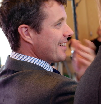
HRH Prince Frederik applauding enthusiastically after a performance at the official opening of Copenhagen Design Week (yes, he was one row in front of me!)But please be aware – that this is only a fraction of all the exciting experiences that lie ahead during the Copenhagen Design Week.

I would like to extend my heartfelt thanks to the Danish Ministry of Economic and Business Affairs and the Danish Enterprise and Construction Agency for supporting the Copenhagen Design Week.

An essential aspect of creating and carrying out an event such as the Copenhagen Design Week is to establish strong partnerships. Therefore, I would also like to give a warm thanks to our main partners: IKEA and Nokia. We deeply appreciate your financial support and your expertise on design and your contributions during the Copenhagen Design Week.

Finally, please let me offer my sincere thanks to the Copenhagen Design Week team. You make me proud.

Danish Design Center immediately following the opening of Copenhagen Design WeekI bid you all a warm welcome and encourage you to seek out some of the many exciting design experiences that Copenhagen is brimming with this week.

Now it is my huge pleasure to give the floor to Mr. Frank Jensen, the Lord Mayor of Copenhagen.

After that, Tina Højlund of the Royal Ballet will perform the Egg Chair Ballet, followed by Aura, who will take us back to where we started with one of her songs.

 

Thermador Pro Grand Steam Range

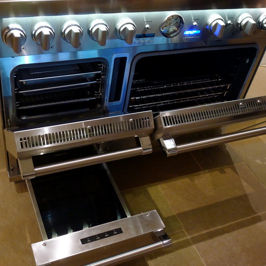
In June I attended a press event at the fabulous Thermador facility in Scottsdale, Arizona to be among the first to view their new, stunningly bold pro range, the new Pro Grand Steam Range. Manufacturers of the first pro range ever in 1950, not to mention in stainless steel at that time, Thermador's latest pro range has features in this new version one would not have dreamed of back then.

Did I say this range is bold? I like bold. I mean, if you're going to do something, be bold! Be awesome and be innovative too, for goodness sakes. Push the envelope, think out of the box and all that. Here's what we have in terms of features:

Steam Oven - If you want to cook in one of the most fabulous ways to achieve superb quality for your cooking efforts, steam oven technology provides the best of all worlds ... namely, a healthy cooking method, moist, flavorful foods with a crisp crust as required. Plumbing? None - just fill the handy reservoir.

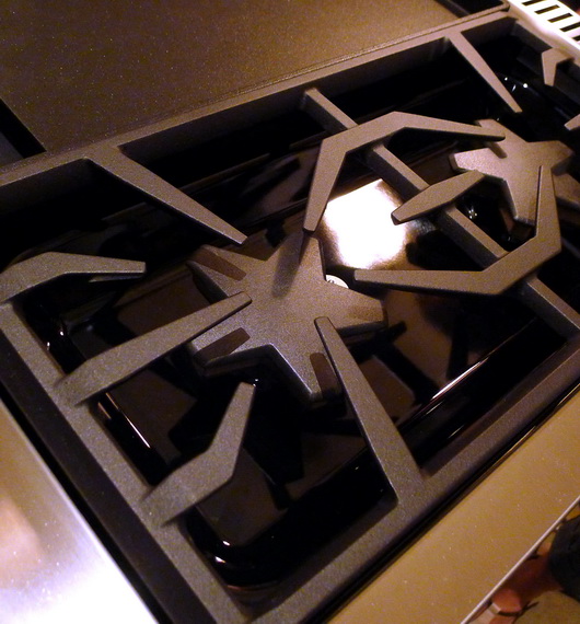
Star Burners - Quite simply, the star burner gives you more real estate within the flame. Add 22,000 BTUs for the power star burner, and the impatient will be impatient no more. For me, that would mean a killer sear on my filet mignon and salmon. I like power! Extra low simmer technology too.

Spacious Oven - A 5.1 cubic foot convection oven offers ample cooking space with nine cooking modes.

Universal Design Features - Soft close hinges, full access racks, easy grip handles and a wonderful electronic oven display and light feature to illuminate words and numbers on the knobs just below. It's also just a little bit sexy - that blue light.

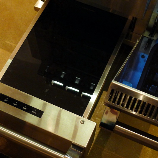
Warming Drawer - I almost forgot! If that's not all, coddle your freshly cooked food in the warming drawer - PERFECT for all those holiday sides and just about anytime something needs to sit ... without losing its wonderfulness.

Grill/Griddle Option - Sweet. Why should I have to decide between grilling the perfect burger and the great features of a griddle? Sauteeing vegetables, making pancakes, home fries and so on.

The fit and finish is of very high quality. I am especially in favor of the universal design features. Yes, it's a bloody fortune at nearly $14,000 MSRP, but this is clearly an investment product. Some things, in my philosophy, are just worth the lifestyle enhancement not to mention longevity, that is purchased along with the basic functions of the product. I've spent a bundle on a few products that were, let's say, seemingly above my financial demographic. I never regretted it, ever. So, a lesson in budgetary restraint? Not from me. If you feel it, it just may enhance your life - that is, if you can swing it financially. If you can, go for it, it's a ridiculously beautiful cooking center.


Modern Dining At Las Vegas World Market 2011

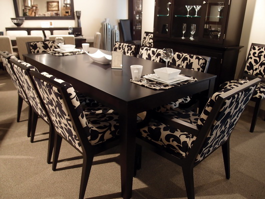
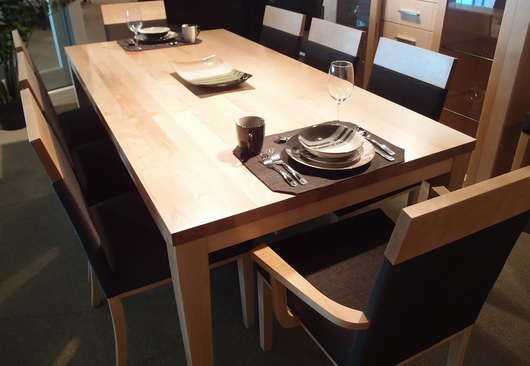
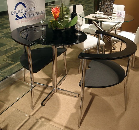
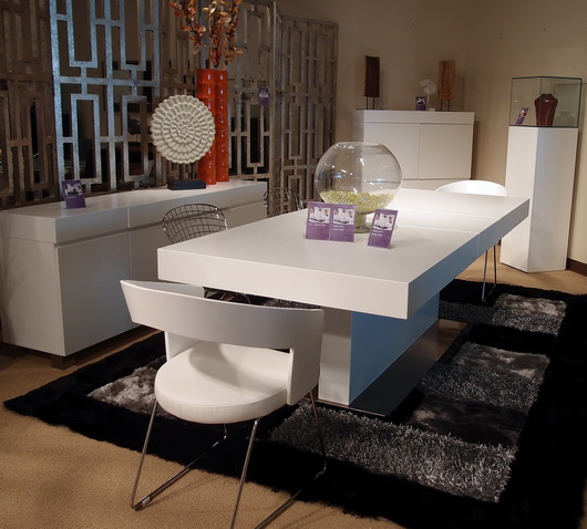
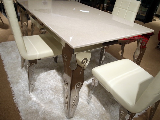
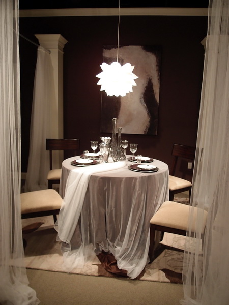
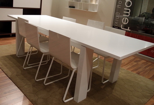
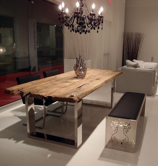
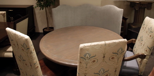
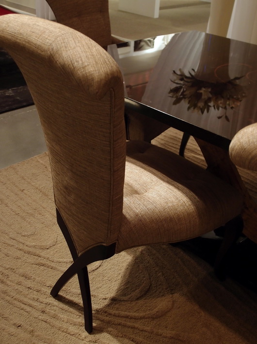
I saw some great pieces, continuing my dining theme from Las Vegas World Market that I need to share with you. Some dining tables and chairs were simple and clean, some super innovative yet elegant, with very exciting decorative details.

Many of these sets are quite affordable. In some cases, it might be advisable to add on a glass top to protect the surface of the table. In some cases a frosted or other patterned glass top could look great and add protection. Oversized glass is also an option, which adds area for dining as well as a nice aesthetic statement.

Take a look!


Bermex Bermex Bermex Diamond Sofa Diamond Sofa Tip Top Furniture Aspen Home Temahome

Las Vegas Market - Dining Inspiration

Earlier this week I walked through the Las Vegas World Market Center, the enormous gravitational center for residential furnishings that struts its stuff twice a year. Vegas is a place that makes me smile, so I'm happy upon arrival. 

Rossetti

I came with a "kitchen context" unlike most interior designers, architects and buyers; a context in which I think about the transition, stylistically, of the kitchen to surrounding spaces. The dining area is a critical element of kitchen design and what a great place to dream of the ideal dining experience. Following are dining tables seen at the Las Vegas Market.

Rossetti

I always put a strong emphasis on the dining area in the earliest stages of designing a kitchen. Unfortunately, I often see it, if already designed within preliminary floorplans presented to me by my clients, as almost an after thought. I find nearly always, the dining area needs more space devoted to it.

Bramble

Making space available for friends and family to travel easily around the dining area and designing adequate space so that lingering at the table is an enjoyable and not a confining experience, are two important elements of a well planned dining space. 

Urbana Home

Durability of a table's surface and of the chairs as well is the measure of longevity and beauty. Ask questions and observe product construction and durability. Ask if materials and surfaces can be refinished or easily cleaned down the road. Be practical and realistic to determine if your lifestyle can withstand a white painted tabletop.

Rossetti

Venturing away from the kitchen, I'm a strong advocate for multiple dining areas in the home. I especially love a dining table, perhaps a 54" round table, depending on the size of the room, situated in a family room.

Lexington

This secondary or tertiary table within the home will serve as an alternative place to dine - maybe on weekend evenings or weekend mornings or the occasional weekday change of scenery. It's definitely about a change of scenery - why eat at the same table every single evening if another table can be accommodated in another space? A little far to bring in food from the kitchen? That's what trays were made for and I promise the effort is SO worthwhile. I've lived it, thus, my endorsement.

What does your ideal casual dining space look like?

Las Vegas Market Summer 2011 - Kitchen Design Interpretation

I'm here in a fabulous hotel suite in Vegas at the invitation of the Las Vegas Market as part of a small group of bloggers. Our mission is simply to walk/work/discover the Market in our own unique way. No requirements, no expectations. Ideal!

Transitions by Sigla My perspective is different than most interior designers who attend Las Vegas Market. In fact, it greatly benefits the home furnishings industry to invite kitchen designers to see the Market. As the kitchen and surrounding rooms become ever more integrated, I, for one, feel a need to understand the current state of home furnishings and design to tap into what designers are thinking and what manufacturers are creating. Of course, also perhaps to specify furniture as opposed to cabinetry in some kitchen areas, to create the look of seamless integration among surrounding spaces as well.

My eye is unique from all others, my perspective toward public rooms surrounding the kitchen is different, and following is a collection of "dots" that I connected while at Market. It was fun!

Antigua FurnitureHappiness is ... the word "happy" came to mind over and over. Living in a pleasant, easy way seemed to be a continuing theme in the furnishings I discovered. Pleasant/simple lines, fabrics, materials and PATTERNS were mostly very easy to live with, often "pretty" and had this wonderful back to basics/simple creativity that I found lovely.

The Rug Market

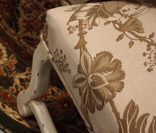
Lots of linen - I did not see as much gray as I did at High Point Market in the spring, although there was a good amount across all furnishings and accessories, but there were beautiful muddied beiges and lots of beige linen fabrics, that whole Belgian country vibe. A resurgence of French Country was talked about at Market as well.

Christopher Guy

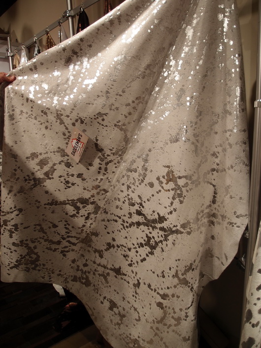
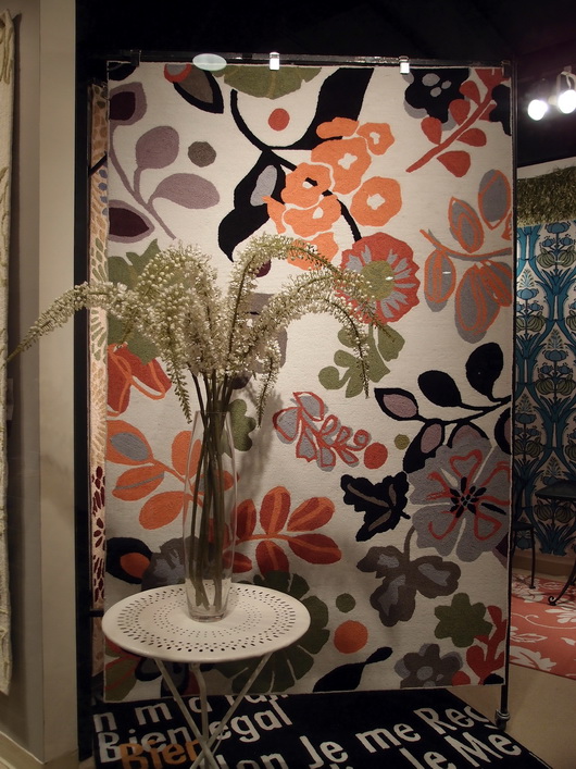
Mixed Media - Experimentation with different materials in unexpected ways was interesting to see - in rugs, case goods and upholstered pieces. The effect was usually very well done in my opinion.

Saddleman's of Sante Fe

Small Scale - Definitely seen throughout Market were smaller scale furnishings across the board, in every category of furniture. Smaller scale furniture seemed to then shed excess ornamentation, allowing for simplicity and elegance in smaller sizes.

Linon

I'll share more of my impressions and inspiration from the Las Vegas Market soon! And more images. I'm very glad I went - it's great to be immersed in the design world!


Le Tour de France - French Country Kitchens

I'm engrossed in le Tour de France, the fabulous cycling event which takes place across France each July for 3 weeks, ending in Paris on the last day. I watch it every day it's on (truthfully, morning and night) and am emotionally transported to the beautiful small villages, the stunning landscape, fields of sunflowers, majestic mountains, and amazing 11th century chateaux...and, the fierce cycling competition too! There are few sights as beautiful as the peleton racing across the French landscape.

Image by Graham Watson

So, what if one were to visit le Tour and rent a Chateau as many do? It's on my list to do one year. Take a look at some of these wonderful, authentic, French country kitchens found in homes and chateaux scattered across the Loire Valley, in today's Stage 8. These are beautiful homes to rent (but I'd also like to rent a chef to cook French cuisine, right?) Images from Luxury Retreats

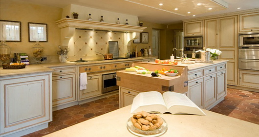
Below, a classic French style - the hood blends into the architecture in a seamless way, the cabinetry is traditional with mustard color on the island as well and is sort of built into a sort of foundation which defines the kitchen. 

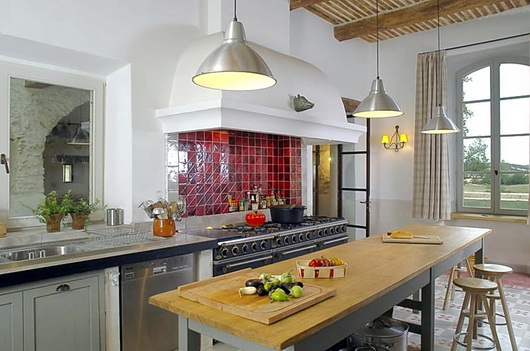
Below, this one may be my favorite. It's SO gorgeous yet simple. The white (and white hood) form a light and spacious backdrop. The red tile backsplash is a perfect focial point to the cooking area. The wood beamed ceiling is beautifully graphic and other simple lines update this otherwise traditional French Country look.

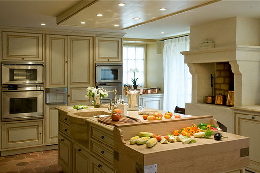
Below, another traditional kitchen. Creamy, dreamy, warm monochromatic colors with minimal contrast. Of course, who would not want a cooking fireplace/oven in the kitchen? The sink is sensual and the terracotta tiles, while out of fashion right now, are classic, timeless, and wonderful.

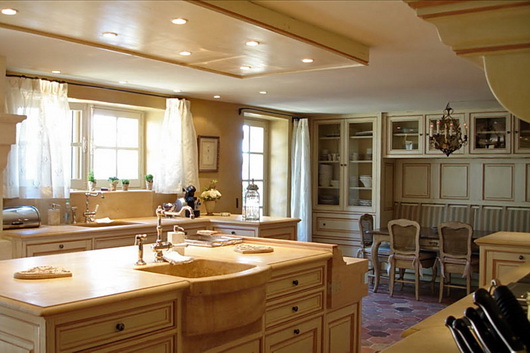
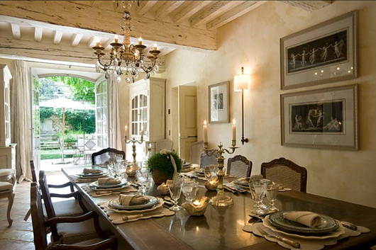
Below, this dining room is: (pick your adjective!) Again - that creamy color throughout all architectural surfaces in various textures creates perfect flow. Even furnishings, doors and trim blend in seamlessly. Defines a timeless look in my opinion. 

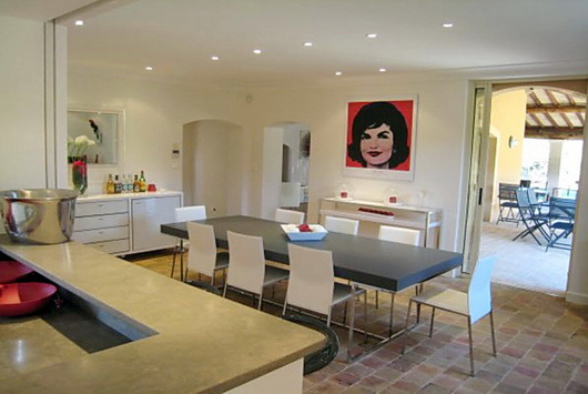
Below: Fabulous. The shots of red are the glam that many French interiors incorporate so effortlessly - it's like it's in the dna of the population! Here we have warmth, coolness, color, texture, clean surfaces - an interesting mix of contrasts.

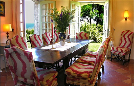
Below, I think when dining in this room, the conversation MUST be stimulating, don't you? It certainly sets the scene for joy, frivolity, and good times. The open doors to the outdoors add the element of nature and light.

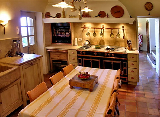
Below, a small but awesome kitchen! Wow, just look at these elements - the copper pieces above the integrated hood, at one with the architecture of the room. The built in rotisserie and fabulous cooking center. A rustic sink and rustic built in/inset cabinetry. And that mustard colored striped table linen - love!

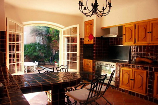
Below, some drama is clearly going on in this kitchen - the dark, rich, brown/black tones of tile surround built in cabinetry in this traditional design. Not the most beautiful kitchen, but the simple shapes, forms, colors and textures do bring style to this kitchen.

Somehow, I think I'd be happy with any meal that is prepared in these kitchens! They look like cooks' kitchens. I'd also love to tour each one to look closely at all materials used and to just sort of drink in the feeling of an authentic French Country kitchen. A cultural authenticity is the thread across these kitchens - can't you just feel it?

To see other posts I've done on le Tour in previous years, take a look at this post on French Country kitchens and this one on kitchens in French Chalets. This is such pure pleasure for me, I may add more throughout the Tour in the coming weeks. Do you like the French Country style?


Reusing Kitchen Cabinets in a New Kitchen Design

BEFORE KITCHEN PLANReusing kitchen cabinets to create a new kitchen design is both a real challenge and extremely gratifying. I've done it, albeit in an experimental way in a previous personal kitchen. In my case, it was an opportunity to try out some design ideas and at the same time hold us over until we were ready for the big remodel down the road. Here is a reader's question on the topic of reusing kitchen cabinetry:

"I read the article on reusing cabinets and there are some great tips there. You mention the fact that reusing cabinets in a new configuration can be difficult but didn't elaborate further. That is exactly what I am trying to do but need some expert advice!

I am in desperate need of a new layout in our kitchen, but our cabinets are in great shape. I have played around with the design and think I have something that will work. I am not a "handy" person so I was hoping to get some pointers on what to look at to determine if the existing cabinets could still be recycled in the new layout.

Do you have any advice on what I should do to detemine if the new kitchen design will allow for reuse of our cabinets? Or is this a project I need to get a contractor in on now to ensure they can physically do it?

Thanks,
Carly"

AFTER KITCHEN PLANHi Carly, 

Thanks for writing! The word that describes reusing kitchen cabinetry is: "puzzle." Finding the right configuration for a brand new design using existing cabinetry can be done, but it will entail very open thinking, meaning that you need to be open to new design ideas, new and different ways to add storage into your kitchen to supplement your existing cabinetry, and a good dose of positive thinking.

You will need to draw the room to scale and then the puzzle begins. An open mind will allow you to experiment with a variety of configurations. There is no absolute way to find "the" right solution. Trial and error and positive "play" in a relaxed setting is how you will find your design solutions.

Of course, you should consider where your existing cabinetry offers the best access near certain appliances and work centers. Narrow drawer cabinets will be useful near the refrigerator or sink. Wider drawer banks or cabinets with doors will be useful near the cooking area.

Watch for the size and proportion of doors and drawers. For sections which you will need to fill in with new cabinetry, do not attempt to match a new color with the old; it most likely will not work - instead, select a painted finish in a new area of the kitchen that makes sense and balances well with surrounding cabinetry.

A trained eye knows how to configure different sizes and proportions of cabinetry. My advice would be to find a local kitchen design professional who can help you on a consultation, or hourly fee, basis at least to get you a head start.

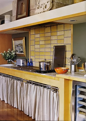
Filling in with metro shelving, curtains and furniture pieces can result in a very interesting kitchen, one which could be super chic in that bohemian/modern sort of way. I know this is true because my reused kitchen cabinetry, once transformed, was published in a national shelter magazine ... thus, the positive thinking! 


::Surroundings:: Guide to Decorative Living Kitchens Feature

Nearly under the wire in bringing you the latest issue of the Surroundings online magazine for May/June on my favorite topic, kitchens, Linda Merrill brings us some great kitchen design information in this issue.

If you don’t know Linda, I’d go so far as to say that she is one of THE hardest working, and most innovative, design bloggers. Linda not only writes the blogs: SurroundingsSilver Screen Surroundings, and Master of Your Domain, she also hosts The Skirted Roundtable and publishes her ::Surroundings:: Guide to Decorative Living digital online shelter magazine every other month. I thought I was hard working! 

Bornholm Kitchen 4In this issue, I am truly honored to be featured in Linda’s digital shelter magazine. Linda has featured me in an extensive interview and we talked abut my new collection, Bornholm Kitchen. There is no doubt that it is most gratifying to get the respect of my peers. With that as a foundation for this new product introduction (and a barometer), I feel confident about the future. Thank you Linda for this lovely feature.

I also like Linda's feature on "Appliances That Designers Love" and who doesn't love to look at Kitchen Bling, another feature in this issue? Linda does her research and does it well.

Take a look at Linda’s digital magazine and follow her in her various venues online. You will learn something – she’s a thinker on all things design focused.

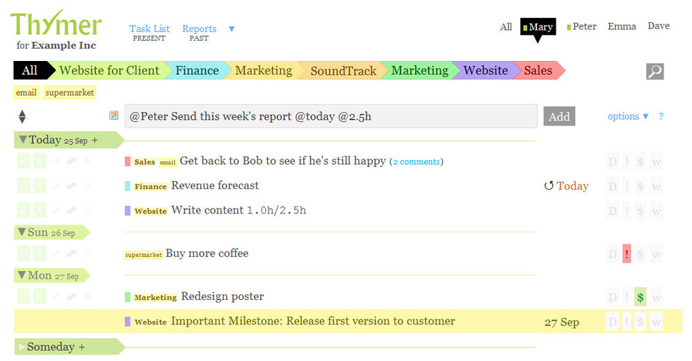
Thymer.com Tames Kitchen Design

It does not take much time, once one delves into the black hole of even thinking about a kitchen renovation, that the thoughts become disorganized, to say the least, given all the parts, pieces, concepts, ideas, not to mention products that are part of a whole kitchen renovation.

There is absolutely NO excuse in 2011 not to be organized when embarking on a kitchen renovation. There are many online management tools to keep track of every single detail. You can be organized in several ways:

  • in a super simple task focused way where tasks are simpl written down and checked off
  • tasks are attached to projects
  • tasks are attached to tags and/or projects
  • tasks are attached to tags, projects, and a calendar
  • tasks are shared by others in the same program 

and those are just a few ways to think of the detail/task/organizing process for a kitchen renovation.

If I told you how many free trials I've taken of task and project management programs, based online, I'd be embarrassed to tell you. The program I have kept coming back to over a couple of years, even though I needed to stray to find the greener grass, of which I never found...is Thymer. I've had many interactions with the developers over this time and they are extremely, and quickly, responsive, even over weekends. Best customer service I've encountered bar none, truly.

Thymer is SO simple, so lightweight, you wonder if it's a serious player in the project management world. It is. But, let's talk about how to use Thymer for a kitchen renovation.

First, Thymer is PRETTY. I don't know about you, but I like pretty. I like colors. If it is just a kitchen renovation you are doing as opposed to, say, a whole house, which could also handle Thymer, you may want "projects" labelled such as:

kitchen misc., countertops, cabinetry, appliances, flooring, backsplash, tile, designer, floorplan/design, trades, building materials

Great - you have your projects. As each task gets created, begin to add tags. For example, the appliances project would have tags such as: cooktop, refrigerator, double ovens ... you get the idea. And, those tags are available to you when you create each task. 

Don't need to deal with appliances for a few weeks out? Put a date on it - set it and forget it! Sync it with your calendar too.

One feature I'm MOSTLY crazy about is that at a glance, due to the innovative calendar within the task list, I immediately know what my day and week looks like...what has to be accomplished today. It instantly makes sense, since I'm seeing the complete picture. Thymer works on a loose GTD format, based on a concept called "Getting Things Done." Again, I cannot overstate that for me, to instantly look, without constant clicking, at what needs to be done/when, that's where Thymer excels.

Do you know where the real power is though? It's the ability to effortlessly and quickly send your emails, WITH ATTACHMENTS, into the Thymer system. Just forward an email, with attachments if it has any, to: addtask@thymer.com. It will recognize your email address and add it to your list. You can even add lots of different instructions into the subject line to further organize that email into a task. If you just throw the email into thymer, like I do, it will land in your inbox, to be dealt with later. Beautiful.

It's the easiest way ever, to organize a kitchen renovation. How would you use Thymer

Countertop Etch Drama - Can This Countertop Be Saved?

A reader asks:

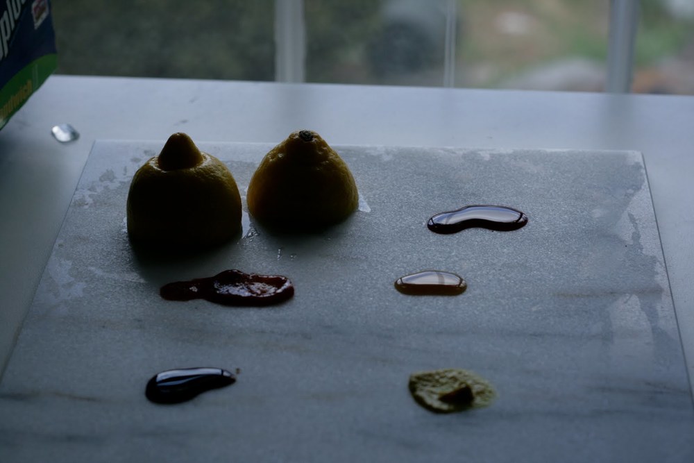
"Hi there, I am house sitting for some friends whose kitchen counters are (I believe) a type of dark slate.I acidentally left a paper towel soaked in lemon juice (I was making lemonade) on the counter and now it seems as though it has etched into the counter...the stain is very noticeable and cleaning it just stripped the sealer!! What can I do? Does it need to be resurfaced?" Thanks for your help. (name withheld) 

Dearest Name Witheld, 

It's not your fault - who, really, would even be able to germinate the thought that lemon could possibly etch a hard countertop material? VERY few. Etching is different than staining, and you may want to tip off the homeowner that they should attempt to find solutions for the etching problem. 

Image from countertopnetwork.comTell them what substance caused the problem (was it only lemon juice?) How much lemon juice and how long was it sitting on the countertop? What did you do after you saw it/how did you attempt to clean it up? That will be helpful information. 

Beyond that, I am not a stone expert, and there are countless types of stone countertop materials which makes it impossible to understand the properties of all of them. 

Image by A Bluebonnet in BeantownBest piece of advice I can give is to recommend that they seek, probably several opinions of stone specialists but start with the stone fabricator or showroom which sold it to them. Me, I like concensus, so I would naturally seek out several opinions to find concensus.

I cannot say if the etch marks can disappear via a rejuvenation of the countertop or not, but that is one method that might be suggested to the homeowners. 

Countertop durability is no joke. A great looking countertop may just be waiting for the chance to turn on the homeowner...just because it can! 

A few tips:

  • Get large samples of the countertops you are considering
  • Put the sample through substance testing: add dabs of ketchup, wine, oil, lemon, wine vinegar, worsc sauce, mustard, more
  • Add those substances to one half of the sample, taping it off in half so that the original side may be compared to the side with substances on it
  • After 48 hours, remove the substances and view the good (or bad) behavior of the countertop sample

Purchase accordingly!

Sears are applied on to many types of countertop surfaces, and they work very well as a rule. One aspect of using a sealer makes me nervous...it is often difficult to tell when the sealer has been worn away from use. The length of time that a sealer will last depends on:

the properties of the stone

the sealer

food products

other products having a home on the countertop or moving on/off/around the top

lifestyle use pattern (light/heavy use/in between.)

When should a sealer be reapplied? No one can advise a precise date based on the above variables, which partially defines the risk of installing porous countertop materials.

So, dear Namewithheld, it is not your fault...you had no idea of the properties of the countertop and unless you are a geologist or stone specialist, it's called an accident.


Kelly's Kitchen Sync - The Book!

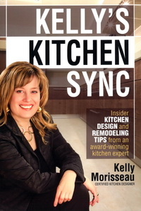
Kelly Morisseau, CMKBD, author of Kelly's Kitchen Sync, just released, has been a great friend, colleague and fellow blogger for many years. Kelly's new book provides a wealth of practical information and tips on all those pesky little details which make ALL the difference in a kitchen design that works for the way you live, both aesthetically and functionally, for perhaps, the next few decades or so.

I have reviewed a few books before. In one case, a long term professional relationship completely dissolved forevermore because my colleague's book on kitchen design, sent to me for review, was so far below my standard for useful (and current) information, that I felt that I could not and would not endorse it (there is no way to say that gently to a colleague, trust me on that). My memory fades on another two books that I also could not endorse, but one refusal was due to flat out inaccuracies that I easily uncovered. Point? My professional standards for information relating to the kitchen and bath industry and design process are VERY high and no, friendship does not trump endorsing what I might consider to be sub par information on kitchen design released to the public at large. I'm a bit wound tight like a lionness in that regard for some very strange reason. I know...I probably need to fix a margharita and relax. 

"Kelly's Kitchen Sync" is a good book. It's the real deal by a smart and experienced (key word) certified kitchen designer, and it offers solid information that is important to know as one navigates the universe of designing a kitchen. The information in Kelly Morisseau's book can truly enhance one's investment in one's home, often the biggest investment one makes, not to mention enhancing one's lifestyle in the kitchen.

Following are nuggets of information (every page offers valuable gold nuggets) that are not only good to know but will add a layer of detail that makes all the difference in the design process, resulting in a kitchen with a higher level of aesthetics and function, especially if one tackles the kitchen design without a professional kitchen designer (no one does that, right?) Following are snippets of good information!

"Clear as glass", page 97:

Kelly talks about mullions on glass wall cabinet doors intersecting with shelves and offers solutions to work around what can be a collision of lines which would otherwise most likely not have been noticed till...later. Four pages on glass shelves and glass doors? Impressive.

Here's just one insider tip on hardware...so simple, yet proportion and scale is the foundation behind this simple, but important, advice.

"Which is better, knob or pull, page 102:

Before you buy, check the width of both your smallest and widest drawers. Buy a few sizes and see what looks best. If your cabinet is 27" wide and the handles are 4" or less, I sometimes recommend using 2 handles, spaced 3"-5" from each side of the drawer."

 Ah yes...the insider's tips for ordering cabinetry correctly...

"Order up! The top 11 beginner mistakes of cabinetry orders (and how to avoid them)", page 81:

(One of my favorites) - "Tall cabinets, such as a 96" high x 24" deep cabinet, will NOT tilt upright in a 96" high room. It's a simple law of physics - the corner of the cabinet will strike the ceiling first."

Perhaps you get the idea - endless tips are provided throughout the book to help, yes, avoid disaster! An experienced kitchen designer has multiple solutions at the ready for nearly every situation that arises. Here, Kelly has laid the foundation for one to understand not only what those solutions are, but WHY these issues are important to know. And, she explains them in an easy going manner that is both entertaining and informative. Kelly's Kitchen Sync - the book!


Martha Stewart's Morning Living Program - 10 Tips To A Great Kitchen Design

Well, we covered a lot of territory in the chat on kitchens with Brian Kelsey (Kelsey On The House) host of Martha Stewart's Morning Living radio show on SiriusXM in which I was the guest. I know, since Brian is a lover of all things "home improvement" we could have kept the conversation going for a long time!

Here is a wrap up of ten tips for a great kitchen design:

1. How long will you be in your home? The answer to this question will guide you toward budget, style and issues of function. If you will be in your home less than 5 years - think in terms of resale and be conservative in your selections. Longer than 5 years, put more of "yourself" into the kitchen design to create a kitchen that works for you.

2. Speaking of personal design, that is surely where we are headed in recent years. Do the hard work up front to determine what is a habit and what is something you really desire in the kitchen. For example - do you want the dishwasher on the adjacent wall of kitchen because you are used to it or because you really like to use it in that position? Beware of kneejerk reactions - think carefully!

3. What is timeless? I think it is safe to say that classic wood species such as cherry, maple, and other, somewhat "quiet" grained woods in brown stained finishes are truly timeless, as they communicate a classic furniture quality. Whites as well are classic for kitchen cabinetry - who doesn't love a white kitchen?

4. How to get value? Value is received, as above, in a timeless design, in timeless products and components, in quality products which will last over time. It is a sustainable way of thinking as well.

5. What are cool products? Having been to many design shows, I can tell you that sinks with glass worktop covers to conceal the sink from an open kitchen are hot! Hardware in warm finishes and hardware that is more bulky in nature (more bang for the buck) works well in today's kitchens, and of course, hardware is the jewelry of the kitchen! A warm/modern look for the kitchen is what many people are thinking about now.

6. Appliances! Appliances are becoming increasingly concealed as the kitchen floorplan is becoming more open to surrounding rooms. Even ovens are being seen behind closed doors. Panels on appliances do the trick to disguise the function behind the cabinetry facade.

7. Social Network - The kitchen is the social hub of the house and we are seeing larger, multifunctional islands being designed into the kitchen. Easy to communicate with others and great for assisting the chef or a spot to use for entertaining purposes such as arranging wine and wine glasses on one end, islands serve endless social functions. 

8. Where to start? With so many activities happening in our kitchens, write a list of all the activities you see going on in your kitchen. What is your lifestyle? How much importance and use will certain activities take on in the kitchen? Be realistic about your lifestyle and a functional kitchen design will follow!

9. Healthy Kitchen Design - Appliances today have healthy features! Grills, steamers, steam cooking in ovens, rotisseries, filtered water in our taps, fresher refrigerator storage, induction cooking - these are some examples of how appliances can truly work to produce and enhance a more healthy lifestyle.

10. Take your time! The kitchen was not built in a day! The more time you can shed old habits and hone in on what is really important to your family "now", the better your kitchen will be aligned to the real "you." 

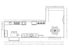
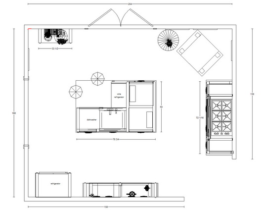
Below, a preliminary floorplan for an open kitchen. Cozy, social, ahhhhh!

Induction Cooking - Electrolux Icon 36" Cooktop

Electrolux invited me to review their Icon 36" induction cooktop in my personal kitchen. I accepted the invitation, looking forward to begin cooking with induction and with gratitude for the opportunity to replace my 20 year old gas cooktop with induction. I have cooked briefly on induction before, but I was very interested in cooking on an induction cooktop over a period of time, to truly understand its properties. I am approaching this review on several fronts.

AESTHETICS

Around this time, I was due to exhibit my new line of kitchen furniture, Bornholm Kitchen, at the Architectural Digest Show in New York. I thought it would be a good idea to incorporate an island into the show which would have a cooktop installed.
As Bornholm Kitchen is easily experienced as furniture and was designed as such, nonetheless, it was fun to see the reaction of visitors to my booth. The Electrolux Icon cooktop has such a low profile that many visitors to the booth were surprised that the island was meant to be designed into a kitchen and was not a dresser or other type of furniture. Their eyes lit up and we saw a smile, or heard a "wow". It is a response that made perfect sense, was fun to see, and confirmed to me that this type of cooktop is a real advantage for the open kitchen floorplan.

The point? Sleek = nearly invisible = aesthetically clean, especially in an open floorplan situation.

CONTROLS

The controls were very quickly and easily understood. I don't remember even looking at the manual before I started cooking; the cooktop is very intuitive. One more note about aesthetics - please remove the word "Induction" from the burners - it's simply not necessary and takes away from an otherwise GORG (gorgeous) stunning cooktop design. That said, I don't even notice it at all anymore - I have other things to think about when I'm cooking, but it's worth a mention.

If I'm going into another level of detail, I'll note that the design of the controls is, well, beautiful. The controls are simple in design and very cool. Less is more aesthetically, and all that. Well done.

COOKING!

I couldn't wait to cook my favorite things on this cooktop. I like to sear meat and fish, like filet mignon or salmon, then finish it in the oven for a perfect medium rare (especially for salmon, yum!) I also use grill pans to grill asparagas or other vegetables or to saute brocolli rabe, steam veggies or putting that pot of water on to boil, which I want done fast! We (my husband and I) cook with fresh foods all week and the induction cooktop has made the cooking experience a pleasure in all these ways mentioned.

The cooktop is fast. Very fast. Much faster than my gas cooktop. I'm impatient, so I like that, a lot! I'm also fundamentally lazy in some respects, so I like that all I have to do is to put my finger on either high or low, keep it there to control the heat, end of story. Fast, easy, intuitive. One of the very best features of induction cooking is that it has instant response - same as gas. So far, we have instant response to heat control, and more power than gas (see "power boost"). I'm happy. Is it more powerful than the most powerful gas btu burners? I'd love to see a test done. I do not know the answer to that.

A "Keep Warm" feature, multiple low heat 1/2 heat number selections, and a timer round out useful cooktop controls.

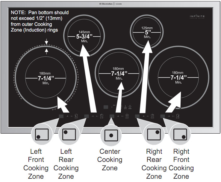
I love the versatility of the cooking zones and how different size pots can be used. I like flexibility. Take a look: 

Induction cooking is THE safest method of cooking, the most energy efficient way to cook, perhaps the fastest method and certainly the most understated in terms of aesthetics. These features are compelling reasons to seriously consider induction cooking. I have the utmost confidence in Electrolux Icon as a brand, based on my clients having purchased Electrolux products over the years and being very pleased with the products...and I hear feedback. 
I love induction cooking, and I'm NOT looking back at my much less powerful (and small) gas burners!


KBIS TOP TRENDS 2011

Where else could this be but Vegas?KBIS is always a carnival of great product discoveries to be found, and this year, although much smaller, it was no exception. The exhibitors had their best game on to present products that are beautiful, highly functional, and classic winners. 
I took 800+ pictures (I'm a little obsessive when I go to a design show) so the ones I show in this collection are those that truly spoke to me and which I feel are worthy to share. Also, take a look at the products that I will be entering in an ongoing basis in our New Products section. You may also find some connections to my previous post on KBIS trends. Enjoy the eye candy!!

And don't miss my post in the fabulous blog, Design Milk!

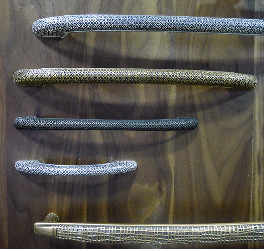
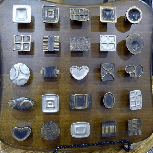
Below: I love this hardware, it's just my style - sort of organic yet whimsical and modern at the same time Schaub Hardware
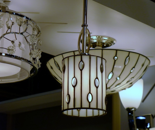
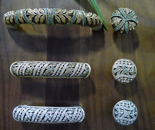
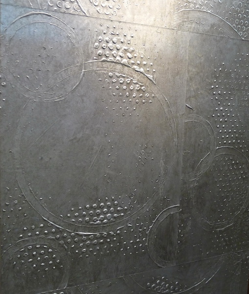
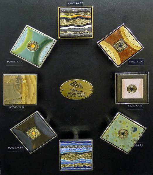
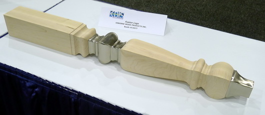
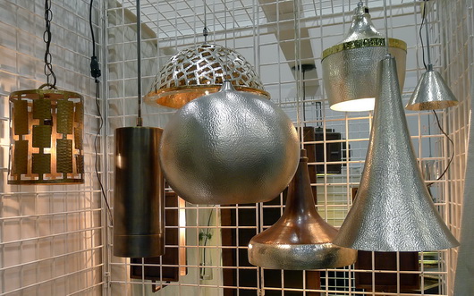
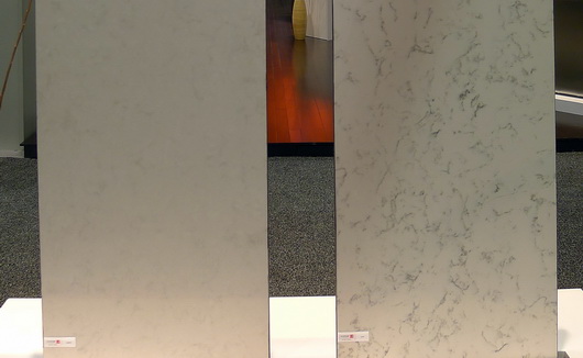
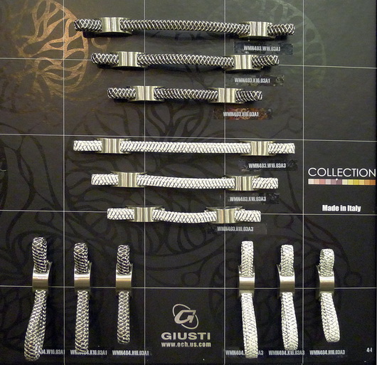
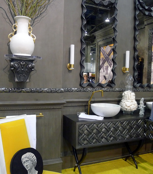
schaub_resize Below: Kichler always displays beautiful and innovative lighting at KBIS. Definitely worth a close look.  kichler_resize Below: Edgar Berebi Hardware - New to KBIS, this hardware company displayed true jewelry for the kitchen or bath! Unlike hardware I have seen before. Edgar Berebi_resize Below: Corian displayed their new colors in very interesting and creative ways at KBIS - Corian Spice Collection corian_resize Below: Custom hand painted wallpapers add a strength and vibrancy to any interior - awesome papers! Vahallan vahallan_resize Below: Wow-Perhaps you can tell that I was very impressed by all the beautiful hardware at KBIS, this year more than others. Love: Classic Hardware classic hardware_resize Below: Multi Media materials were the hot trend at KBIS - I would not expect a leg such as this to be a huge, mainstream trend, rather, a peripheral trend - so you're safe! Osborne Wood osborne wood_resize Below: The rounded relief pattern of Context, an eco friendly tile by Ann Sacks Below: Thompson Traders simply has stunning products - from hammered sinks to lighting, a real treat for the eyes Thompson Tradersthompson traders_resize Below: Enkeboll has introduced several new collections and metallic finishes! Enkeboll enkeboll_resize Below: The Nebula series by Silestone has depth and movement with an organic point of view Silestone Silestone Below: Beautiful hardware Giusti Hardware Giusti
Bosch Appliances–Beauty and Brains!

I was delighted to be invited to the Bosch training and showroom facility in beautiful Scottsdale, Arizona. I so welcome these opportunities to travel to corporate showrooms around the country (and abroad) for focused product training, which always adds another dimension of insight into a brand’s unique history and philosophy.

Robert BoschWho knew the founder’s name was Robert Bosch (1861-1942) who was equal parts socialist and capitalist, botanist and inventor, pacifist and philanthropist … whose company was one of the first to provide health care to its employees as well as the eight hour work day … who worked with Thomas Edison for a year here in the US and who had a commitment in theory and in practice to (what we now fashionably call) Reuse, Recycle and Reduce - in extreme ways? Bosch (the corporation) has recently celebrated 125 years of being in business as well as celebrating their equally long tradition to social commitment.

Half of the profit that Bosch generates each year goes toward philanthropic and environmental endeavors-nearly astounding! Since 1964 the Robert Bosch foundation has funded more than one billion euros toward the company’s social and environmental commitment. What an inspiring piece of “corporate history.”

BOSCH SHOWROOM DELIGHTS

I will have more information on some of the great features of Bosch appliances in another post. Quite frankly, I lost track of all the #1 awards Bosch has won, but it is impressive. Half the fun of going to these events is to enjoy the beautiful showroom design! I’ll take you for a short tour. Let’s take a look, and note the appliance integration. Enjoy the view.

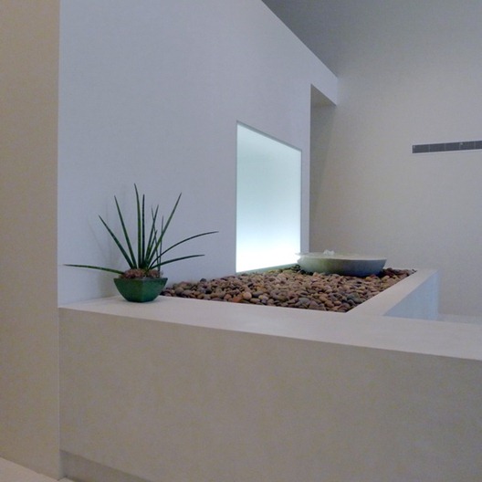
Below: A look at the Bosch reception area just past the front desk. Tranquil and serene, connected to the feeling of the Arizona landscape 

bosch showroom 1

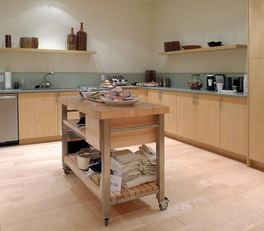
Below: A wide shot (with the exception of one leg of the “U” shape) of the kitchen we cooked in, with a complete suite of Bosch appliances. A simple design with just a touch of coolness in the countertop and tile backsplash, accented with cool (toned as well as featured) stainless steel appliances.

Bosch showroom 2

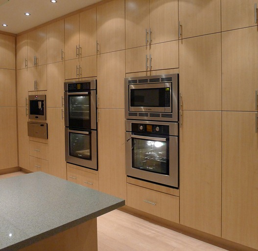
Below: The tall wall of appliances and storage – so popular in European kitchen design, it serves as a visual foundation to the kitchen.

Bosch showroom 3

bosch showroom 10

Below: We were all “Engineers in Training” for the day with real Bosch product engineers! Taking a short break in between learning all sorts of mathematical equations and theories-exhausting! Winking smile

bosch showroom 4

Below: A nice tight integration with cabinetry and countertop – the Bosch slide-in range. A slide-in range is a superb and elegant solution (and less costly than the purchase of a separate cooktop and oven) to what could otherwise be the bulky look of a freestanding range. An often forgotten product solution, the slide-in range provides a “flow” to your kitchen

bosch showroom 5

Below: A fantastic and delicious artisan focaccia, just out of the Bosch true convection oven. It was delicious! Part of our experience cooking with Bosch appliances

bosch showroom 6

Below: Now, let’s take a peak at a few other kitchens in the Bosch facility with either Thermador or Gaggenau appliances, both under the Bosch corporate umbrella

bosch showroom 7

bosch showroom 8

bosch showroom 9

bosch showroom 11

bosch showroom 12

Bye, Scottsdale! (sniff...)

bosch showroom 12a

English Fancy–Royal Wedding Edition

Are you all recovering from your Royal Wedding revelry?  I didn't think I'd get caught up in the hoopla, but found myself stalling my toddler from heading to the playground so we could catch the tail end of the festivities.  I bribed her with promises of seeing "horsies" and princesses err...Duchesses of Cambridge (?!).  Now, onto festivities of our own, though no less majestic - Moodboard Monday Royal Wedding Edition!

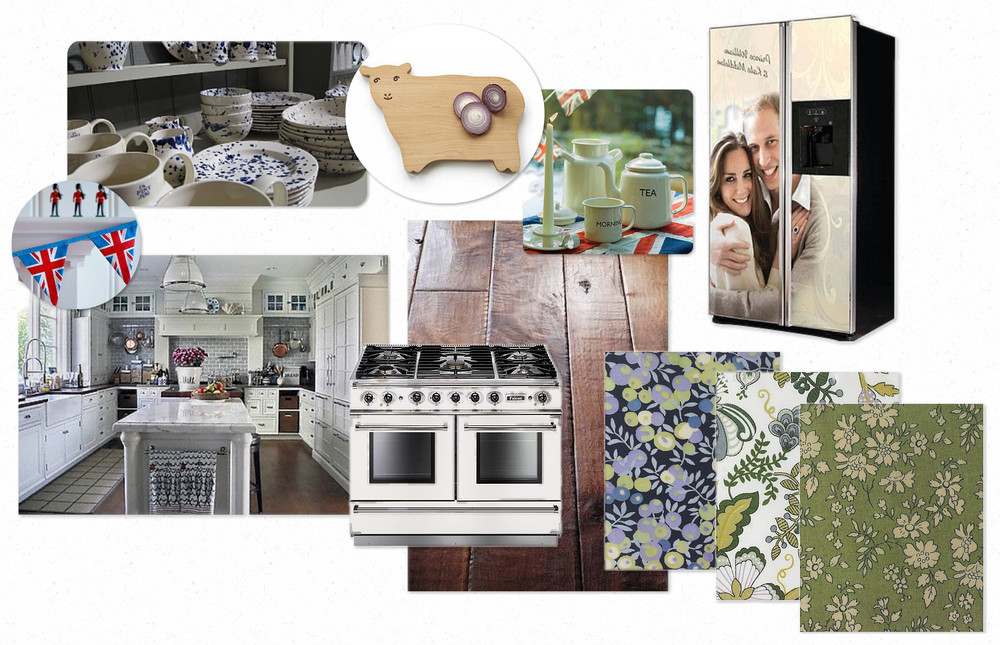
Paying homage to the formality of traditional English Kitchens, we've kept things sophisticated in this week's installment with a subtle and classic color palate of white, nickel & blue.  For initial inspiration I've drawn from one of my all-time favorite images of a gorgeous kitchen designed by our very own Susan.  Though not technically located in England, the aesthetic is definitely reminiscent of a traditional, luxurious English farmhouse kitchen. 

Loving the striking look of this Falcon Range, with its rich heritage as one of the UK's leading manufacturers of professional range equipment.  Care to greet a life size portrait of the happy couple every time you reach for the milk?  Enter this GE fridge and get your royal fix in a prominent manner. 

Finally, what Royal roundup would be complete without a healthy dose of the great UK emporium, Liberty?  Cut up some crumpets on Carmen the Sheep. Host tea time with thisEmma Bridgewater dish ware set, and sew up a quick apron & tea towels with these gorgeous Liberty textiles

Cheerio!

Best, Kelly

KBIS 2011 Kitchens

I always like to walk the kitchen and bath show and take pictures of the kitchen displays. Having just been at IMM Cologne in January, the kitchen designs were dramatically different at KBIS and I MUST gather together the images I have of full size kitchen displays from the IMM Cologne show.

There is much more detail in the KBIS kitchens (that is not a positive or negative, it's in the eye of the beholder.) The first image is from an Italian manufacturer and all others are American manufacturers - the style contrast is clear!

My opinion: in some cases, more is not better. Restraint is a good thing...less is more and all that. We also need to remember that we will have reactions to these different styles and there is a kitchen design for everyone, just like there is a guy for every girl and vice versa. Enjoy!


Get the flash player here: http://www.adobe.com/flashplayer


KBIS 2011 Decorative Details

I'm sitting at the gate waiting for a flight delayed quite a few hours. Let's take a look at random, decorative details in no order, seen at KBIS, for no reason other than I have time for a free form "gorgeous" fix.

Below, hardware from Schaub

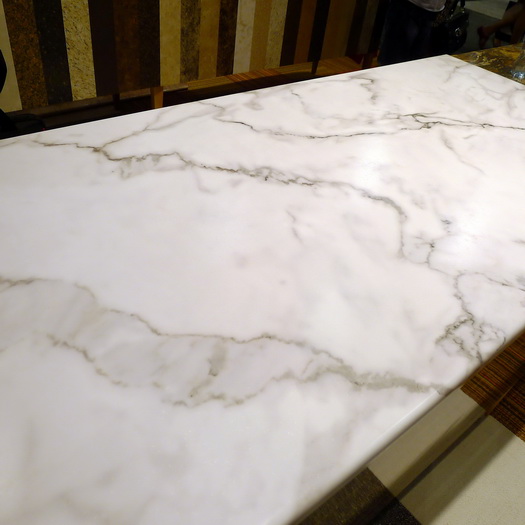
Below, Calacatta marble from Italy Formica

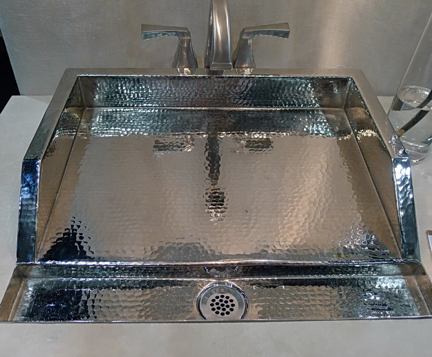
Below, a fabulous sink by Thompson Traders

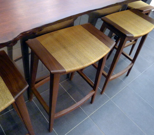
 Below, beautiful stools with no name at the Kallista booth