
Written By Kelly:
With the floorplan for my kitchen renovation decided upon in terms of work flow and lifestyle considerations, it was time to take a close look at an important functional aspect of the entire design - countertop prep space.
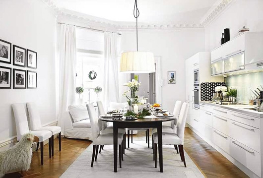
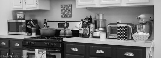 My old kitchen countertop with all the charming kitchen objects in place, allowing, maybe 9-10" of prep space front to back!
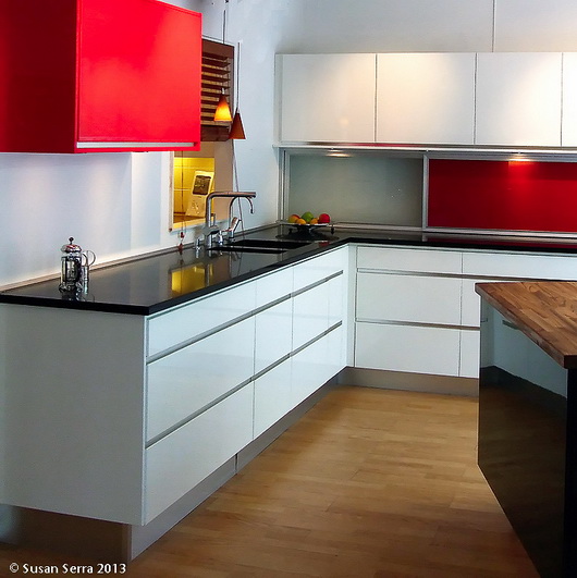
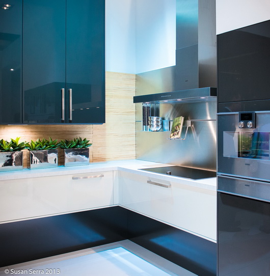
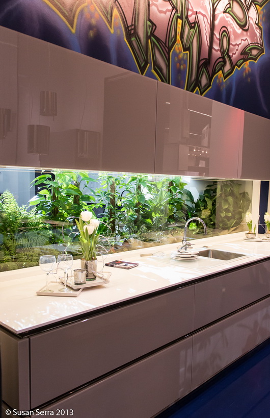
While, to me, my kitchen is a decent size having come from shoebox apartment kitchens in Manhattan, at 190 square feet, it is still small for suburbia. It was very important to both me and my mom/Susan/kitchen designer (all in one) to design in efficient countertop prep space; otherwise, really, what's the point? We immediately thought of Kessebohmer - a German brand we were familiar with that offers clever storage solutions as beautiful to look at as they are to use.
Since our main goal was freeing up counter space, I surveyed my counters in their current (read: cluttered) state and took stock of which elements would be most beneficial to our lifestyle and space and which could be moved off the counter. The Kessebohmer Linero collection became a quick answer to countertop clutter.
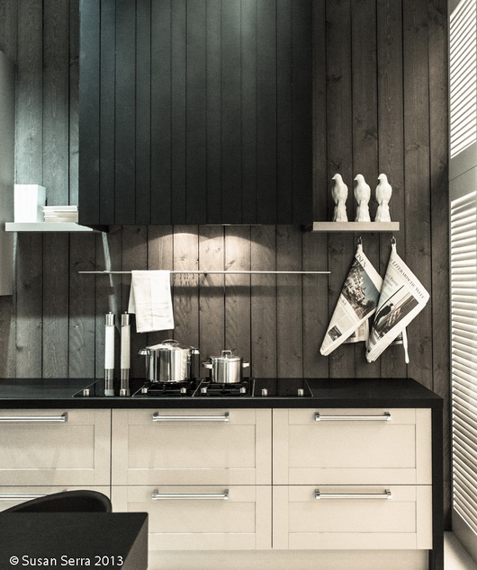
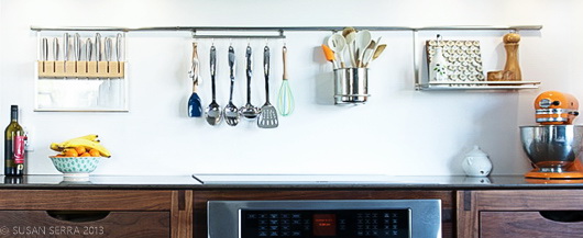
Linero is a classic modern rail system that is at once practical and extremely versatile. In fact, its beauty lies in its versatility. The simplistic design consists of a variable length horizontal rail that can be customized with any number of smart attachments.
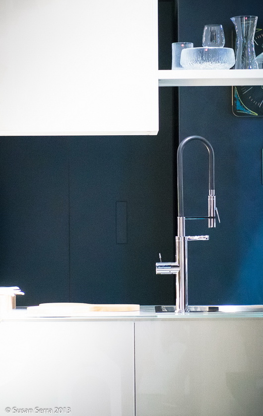
As Kessebohmer's collection is so intuitive, we arrived upon more accessories than I had space along my backsplash where the main rail would be positioned. How to choose? We elected to get each accessory that I thought I would use under different lifestyle situations, and change them out as needed.

This concept has since evolved into many different, and FUN, iterations, and has given us a tremendous amount of flexibility - which is THE keyword for my kitchen. Here are the elements we chose, and how they've been incorporated into our multi-functional kitchen:
Spice Rack - This accessory houses my most-used spices, kept conveniently at arms length for when I need them, literally, in a pinch! Positioned at the far end of the rail, it is situated a safe distance from the heat of the cooktop so as to not spoil the spices.

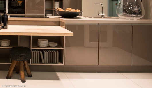
Multi-Purpose Shelf - Simply one, clean, stainless shelf. I use this to hold a few frequently used oils, or a decorative plate and ceramic bowl.
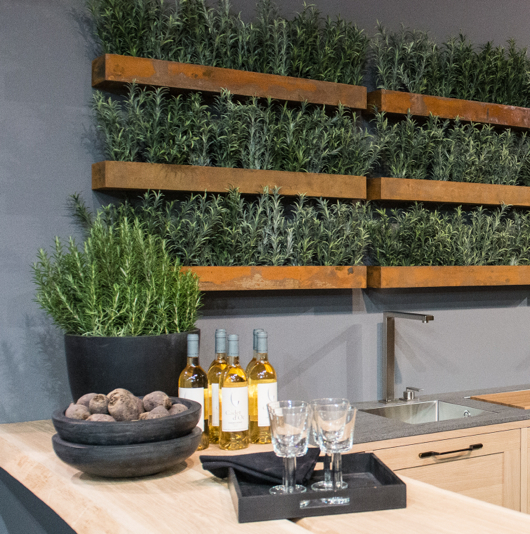
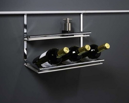
Wine Rack - Holds up to 3 wine bottles. We don't keep this up all the time, but trot it out when we're entertaining and want to take the kitchen from "cook's kitchen" to "Napa dining room" as it lends a very chic, festive feel to the unit.
Cookbook/iPad holder - Utilizing a second simple shelf on the rail for another use, I love this accessory purely for its functionality as previously noted. Having previously cracked my iPad screen with a falling spice jar (true story), this piece keeps your cookbook or ipad out of harm's reach. And, it's an excellent conversation piece as well - guests love it!
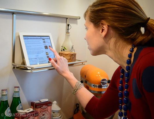 Kelly's using the ipad just before a dinner party
Single Utensil Jar - Raise your hand if your counters are currently housing the ubiquitous, cumbersome jar of utensils? Not mine! Previously the bane of my existence, my utensil jar is now conveniently suspended along my backsplash in close proximity to my cooktop for a quick grab of a wooden spoon or pasta ladle. More space to spread out the pizza dough on the countertop.
 Knife block - It was, perhaps, most satisfying to rid our counters of the clunky, ill-shaped knife block that came with our knife set. This sleek element keeps knives safely shielded in a natural wood sheath, and behind a pane of glass. What I love most about this is the ability to quickly grab your exact intended knife, instead of playing a guessing game with knife handles.
Utensil Hooks - This is a beautifully simplistic row of 6 hooks intended for hanging utensils. Of course, I ran out and purchased a crisp, matching set of Chrome utensils with holes in the handles, but the collection has evolved into an eclectic hodge-podge of trinkets (such as my beloved Danish bottle opener) and novelty utensils from Anthropologie. And I quite like it that way.
Three-Cup Utensil Holder - This is another accessory that we don't keep out every day, but when we're expecting guests, I'll fill it with fresh flowers, or other decorative objects.
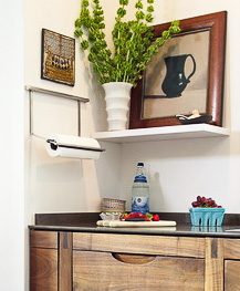 Paper-Towel Holder - My husband has an unearthly affinity for paper towels. This storage solution is much more favorable than an on-counter dispenser. We positioned it as the solo attachment on a short rail alongside the sink for quick, easy access.
One of the most valuable lessons I've learned from renovating my kitchen speaks to the benefits of having an open mind. Many elements that were designed and decided upon were based more on trusting my designer and a "sure, let's do it" attitude than an actual previously recorded need or desire. For example, I didn't truly know to what extent the Linero rail system would solve multiple cooking and lifestyle issues in the kitchen until it was installed, and as soon as I hung up those attachments, I knew there was no going back. The convenience and efficiency is remarkable, and the flexibility adds an exciting element of evolution and versatility to our kitchen.
Stay tuned for a later post where we show you a few different "outfits" for our Linero system. Linero does holidays, it does dinner parties, and most importantly, it puts the "fun" in function!
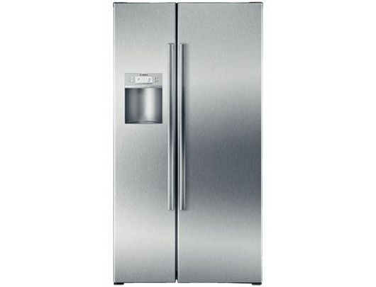
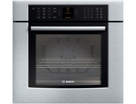
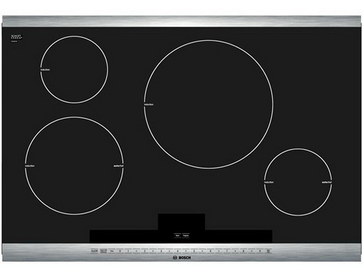
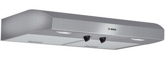
Thank you to partners: Kohler, Silestone, Bosch, Hafele, Kessebohmer, autokitchen and Kravet who donated products or services and who had the vision to know this renovation would use their products in interesting and creative ways!