InSinkErator Instant Tap for New Moms

We've posted before about our affinity for the InSinkErator instant tap.  However, the lovely folks at InSinkErator were kind enough to send over another unit and this devotion was taken to new heights immediately upon installation.  To clarify, this is the home of a second time new mom, with a newborn and a toddler under the same roof.  For the uninitiated, that means the need for lots and lots of purified water, both cold and hot, meals on the table before you can say "I don't want pasta tonight, mom!" and most importantly, an abundance of coffee.  STAT.

The InSinkErator Indulge Instant Water Dispenser has found so many uses in my home and I'd wholeheartedly consider it a must for new parents. Here are just a few uses I've found for it just two months in: 
  • First and foremost, instant hot water for my beloved Starbucks Via instant coffee any and every time of day. 
  • Easy and fast filtered water to drink endlessly and quench my nursing-induced thirst, and a quick filler-up of sippy cups.
  • Readily available boiling water to warm milk for bottles. 
  • Instant boiling water for frequent bowls of oatmeal, and pots of aforementioned pasta water. 
  • Fast opening of stuck-on caps of jelly jars and maple syrup jugs. 
  • Instant, and much needed, cup of tea at the end of the night, without the risk of waking the baby with that pesky tea kettle whistle.
The design of the Instant Tap spout is sleek and minimalist and is a beautiful complement to my mostly-country kitchen.  It's highly unobtrusive and a pleasure to use, with smoothly functioning hot/cold levers and a high-neck spout.  
Just a few of the features, from their site: 
  • Hot and Cool — Dispenses near-boiling 200°F and cool drinking water
  • Graceful high-arching spout swivels for greater convenience and stylish integrated levers provide a dramatic look
  • The hot lever automatically shuts off while the Stay-On™ cool lever remains on for easy use
  • Durable all brass dispenser construction
  • 5-Year We Come To You™ In-Home Service Warranty
  • NSF® listed
  • For use with InSinkErator's Stainless Steel Tank and F-201 Filtration System (tank not included)
  • Available in 11 designer finishes: white, biscuit, chrome, polished nickel, satin nickel, French gold, mocha bronze, black, matte black, brushed chrome, and oil rubbed bronze
All in all the InSinkErator has been a fabulous addition to our newly chaotic home, and those few minutes I can save, while previously waiting for a pot to boil or constantly refilling my old Brita, are treasured these days.  

Tile Trends - A Brief History Of The Kitchen Backsplash

Everywhere I look, I see small rectangular tile used on backsplashes and upper walls in the kitchen. It's getting a little bit worrisome to me. It's worrisome because, having been a kitchen designer since the very late 80s, I have perspective. Perspective helps my clients, and I hope it helps you too.

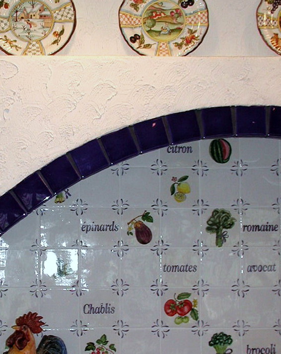
It started (my professional association with tile) with 4x4 ceramic glazed tiles and pretty fruit and vegetable or flower designs, often seen with corner motifs, sort of that Country Floors look. Definitely gorgeous. Funny, I'm seeing it more and more frequently again and it's still every bit as beautiful. Like Terracotta flooring, it was very popular, then went away. Now it is returning, at least on the periphery, to fashion again.
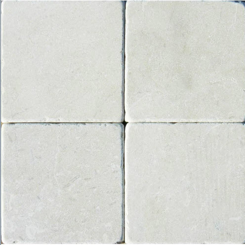
Then came 4x4 tumbled marble tile or matte, earthy, or light shades with fancy border tile. Tile was laid on the diagonal as a lower border against the countertop with a thin border tile above with square 4x4s above that (not on the diagonal), all over the backsplash on the diagonal with a square border at the countertop level, or maybe just in the cooktop area.
Later, probably near the start of the 2000s or a bit later, we began seeing 3x5 subway tile, which we still see, although not nearly as often as a few years back in terms of the "big trend". A very popular trend, subway tile harkened back to a more simple time, a period look, yet removed from the olde world look of tumbled marble 4x4s from the 90s and early 2000s. Mosaic tile in every possible color and material came on the scene first as an accent, then later on the entire backsplash.

Glass tile, too, in aqua/blue shades, emerged as a very popular option some years back for the modern kitchen, especially in the mosaic form but was/is also seen in subway sizes large and small.

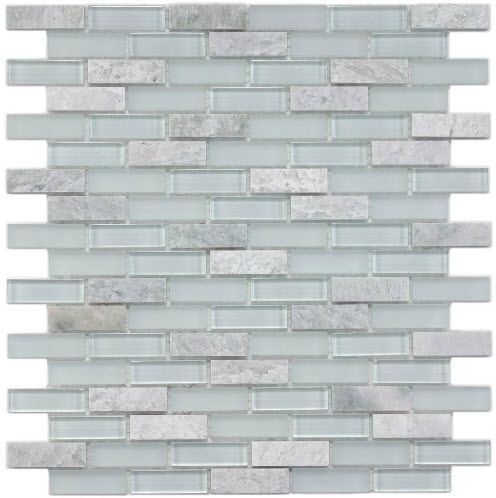
In the past couple of years, maybe a year earlier, we saw a strong trend toward very small rectangular, then longer rectangular subway tile shapes. These shapes are seen in matte finishes, iridescent and/or glass finishes and in typical glazed ceramics, and of course, marble, travertine, etc. It seems that at this moment, everyone LOVES small rectangular tile.
It occurs to me that I should not show full kitchen shots of my clients' kitchens to emphasize my point because in a sense, it certainly could be construed that I am encouraging the point of view that their kitchens be perceived as dated or "in waiting" to become dated. Classic or dated? That seems to be the question. 

The inspiration of this post came to me as Kelly and I recently looked at images of my work going back close to 20 years. When I viewed simple kitchen cabinetry, meaning UNadorned with the old world moldings, etc. of the 90s/early 2000s, which usually included a 4x4 tumbled marble backsplash, the kitchen looks dated due to the tile backsplash, and the cabinetry does not. That holds true for other tile motifs that I mentioned above, seen in other kitchens. Granite countertops? Yes, they played a role to a certain point, but this post is about tile.

These tile images except for the top image, are from Home Depot....probably a pretty good barometer for what is on trend for the unwashed masses. I shop at Home Depot too on a (rare) occasion, or in a pinch but hopefully with a designer's eye, so put me in that category too.

We all think that a tile type or shape is classic and in one sense, it is. When you see that particular shape nearly everywhere you look, especially in a very high end kitchen in a crazy expensive home, it may be amazingly beautiful, both dream worthy and swoon worthy, but it's still a trend. Possibly, it is a huge trend and from my perspective, probably a tile trend that will last 10 years or less (kitchen trends last much longer than fashion, but alas, they then trend downward fast.) Therefore, your kitchen will look dated to most of the world at large as a new shape and material has made its debut to the masses, washed and unwashed.

What is the answer then to deal with trend cycles? Next post, I will share my thoughts on how to think through the backsplash tile issue. I will talk about what is classic, what is trendy, if you should or shouldn't care about all this because "I love my kitchen anyway", and we will figure it out. I have several solutions for you to deal with this issue.

I already knew my responses to much of my work in terms of what is dated and what isn't, but when Kelly sat with me and said, as only a family member or very close friend would say: "that's dated, this is dated, that's dated too, you can't add that/submit that/show that" it told me what a young, design savvy woman thinks and sees right away, NOT being fully immersed in the kitchen world as I am-she is more general interior design focused. She knew immediately from her perspective what "felt" dated as I knew from my different perspective. I thought that was interesting, which was the inspiration for this post. Talk soon....


Introducing Scandinavian Made - Unique Ceramics & Hand Woven Rugs

As you’ve no doubt noticed, we’ve recently added the newest member to our family of brands under the Susan Serra Associates umbrella, Scandinavian Made.  You’ve heard us talk at length about Scandinavian design and style, as it’s the foundation of not only our heritage but our professional aesthetic as well.   Leveraging this passion, we are now bringing the best of authentic Scandinavian handcraft to your home with a carefully curated selection of one-of-a-kind vintage & newly woven rugs, and handcrafted ceramics direct from a select group of Scandinavian artisans.  Each of these artisans has never before presented their work in the US, and we are honored and privileged to be the vehicle for their debut on American soil.   

Take a peek inside our shop and you’ll be greeted with intricately textured and colored hand woven rugs, rich with a long history of an ancient Scandinavian craft and storied beginnings. 

Vintage Vara Rug

You’ll find delicate, ethereal ceramic work from Bornholm Artisan, Charlotte Thorup, and bold statement pieces Simon Koefoed. 

Charlotte Thorup's Wall Hanging Tile with Folds

Simon Koefoed's Puzzle Bowl

Dynamic texture, complex relief, and luscious glazes characterize Hanne’s work, while the dynamic duo behind Clib Klap allow rich hues to take center stage in their simple but strong colorblock vases.    

Hanne Bertelsen Oval Vase Bowl

Clib Klap Colorblock Vases

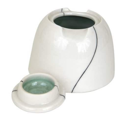
Ninna’s work shines in its simplicity, featuring a singular, stunning graphic line to define and elevate her useful, everyday pieces. 

Ninna Gotzche's Lidded Jar

Karin celebrates the organic and rustic nature of clay, using mottled, rich glazes and highlighting the subtle perfect imperfections of the medium.  

Karin Blach Nielsen's Stoneware Red Vase

We’ve thoroughly enjoyed poring over the works of each and every artisan and choosing the items that we felt best represented our aesthetic and that of our customers.  We hope you enjoy these pieces as much as we do.  They are intended to live with you through generations, bringing with them beauty and joy, and weaving artistry and hand craft through the fabric of your home.  

Electrolux Kitchen Appliances - Design Competition

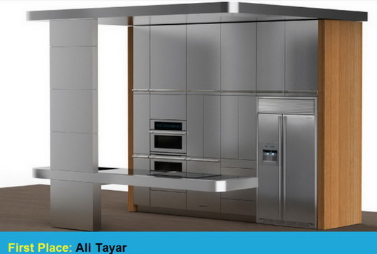
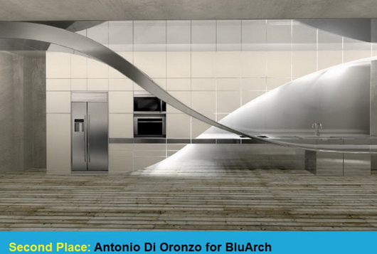
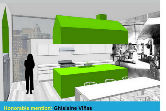
I had the privilege of being among an impressive group of design professionals serving as one of the judges for the Electrolux kitchen design competition, "The Kitchen Reimagined." We met in New York City in November at the offices of Interior Design magazine. 

Coming from different design disciplines, with me being the only kitchen design specialist, we dissected each submission from the global group of competition finalists.

Passionate dialogue, active listening in appreciation of all views of the design professionals in attendance and some open second guessing in search of verifying our instincts brought us closer to a smaller group of finalists. Time spent seeking to understand the points of view of all entrants eventually put the focus on the top 5 winners in the order we deemed appropriate. 

The entries to The Kitchen Reimagined competition were, in a word, inspirational - and that is the spirit with which we approached our work. Spirit, imagination and inspiration were celebrated attributes in seeking the best kitchen design submissions. Interior Design Editor in Chief, Cindy Allen, was our fearless leader for the day. 

For me, participation in this competition as a judge was a privilege and an honor - and a whole lot of fun too. I think you will find much excitement in these kitchen designs which seamlessly surround Electrolux appliances. Very cool stuf.


La Cornue - Kitchen Le Magnifique

I had the pleasure some weeks back of dining in New York City with Xavier Dupuy, president of La Cornue, my colleague and friend, Leslie Clagett from the blog KBCulture and a couple of PR people, always useful to fill in the blanks for a brand. I very much enjoyed this type of intimate setting.

I love up close and personal meetings with manufacturers. It helps me "get" the culture of the company which always trickles down to my understanding the quality of the product and the type of people who actually manufacture the product. 

Mr. Dupuy spent a fair amount of time talking about his factory workers - the length of time many of his employees have worked for La Cornue along with past generations of these employees' families who also worked at the factory. Lots of interesting stories. In times like these, it's nice to hear that. Mr. Dupuy takes immense pride in those who manufacture his products. This was not a short conversation!

La Cornue is a luxury brand of ranges and rotisseries that are made in France. Now, La Cornue is expanding their line of luxury appliances by adding a collection of custom made cabinetry (complete with the familiar metal banding if desired) called Culinary Architecture Memoire and a collection of handcrafted sinks. 

I've studied French kitchen design over the years. It's different. Here's why: the design emphasis is close to equal in regard to aesthetics and function. Function to the French (and to most other cultures other than, um, us in the US) does not mean that every single space gets filled for storage ... just because the space is there to fill. 

The negative space of the room is strongly considered an aesthetically important piece to the design of the kitchen, equal or nearly equal to functional pieces. What does that mean? It means an "unfitted kitchen" or a collection of islands or sections of cabinetry is preferred as opposed to continuous "runs" of cabinetry such as L-shaped, U-shaped kitchens, etc. Minimum wall cabinetry is also a part of La Cornue's kitchen design philosophy to achieve areas where the eye can rest.

Of course, the cooking area is considered the most important piece of the design ... after all, we know how seriously the French take their cooking!

A lovely evening, interesting insight into a brand and its philosophy, gorgeous products.

Kohler

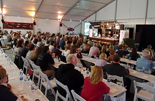
And here is the last, and I hope you'll agree, the best post of the series on my trip to Kohler's headquarters at Kohler, Wisconsin. The trip was a visual feast! It was also an actual feast throughout the weekend since my trip was centered around the Kohler Food and Wine Experience - a weekend event (among many all year 'round) that I highly recommend which takes place in October of each year. 

The piece de resistance of Kohler Village, to me, is the Kohler Design Center. A three level building of beautiful products and room vignettes in beautiful settings surrounded by fabulous materials, products, accessories and design elements, I want to share some of this gorgeousness with you. Without further ado...here we go (all images have been enthusiastically taken by me)!

Please see MORE images on my pinterest board, "Kohler's Design Center", and follow me!

I was so excited and wanted to take as many shots as I could that I did not stop to take note of each and every fixture, fitting or designer's name. If you have questions, please ask and I'll get the information to you!

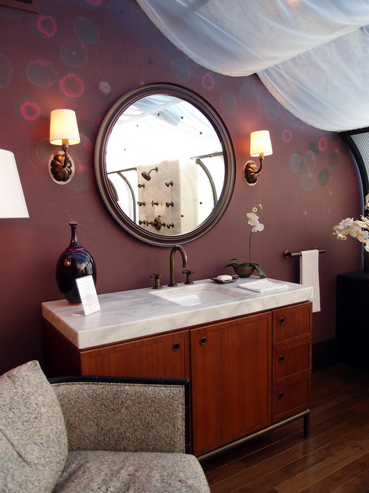
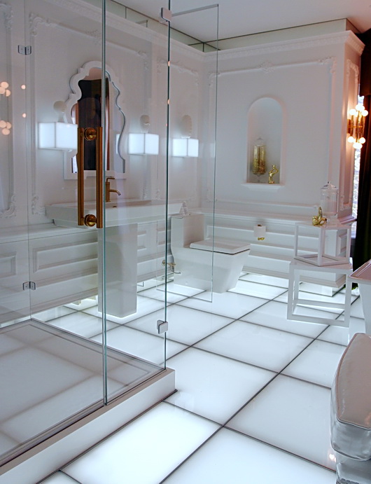
Below, a stunning interplay of warm and cool tones in a graphic, strong, yet elegant setting

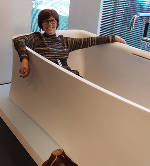
Below, this is a part of a larger master bath which is designed via a universal design philosophy

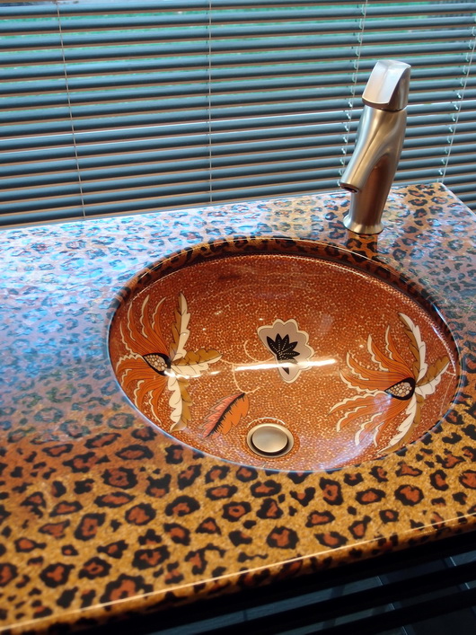
Below, modern, sophisticated, whimsical...creative

Below, an interesting combination of patterns and proportions that works beautifully

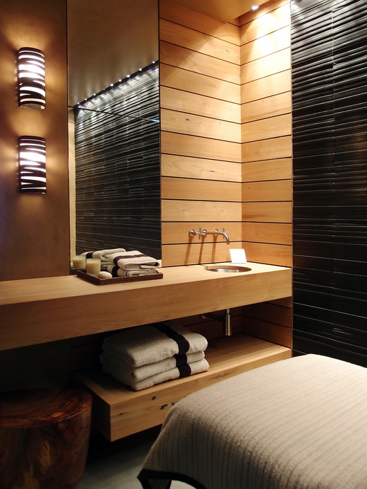
Below, I'm not sure what else to say besides: ahhhhhhhhh. I'm relaxed.

Below, I feel like a superstar being in this space, perhaps somewhere in Paris?

Below, a closer look at beautiful warm design elements set against the purity of white

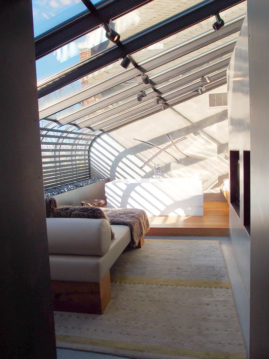
Below, I feel like I'm living in a loft in Soho - very cool design elements...always love the cool/warm mix

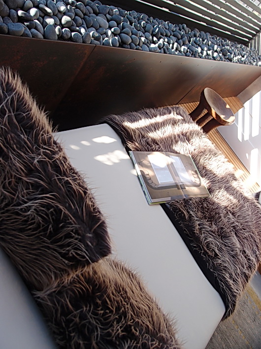
Below, a stunning environment that feels like it's in a penthouse - a warm modern design

Below, seen in the image above from a different angle. I'm on board!

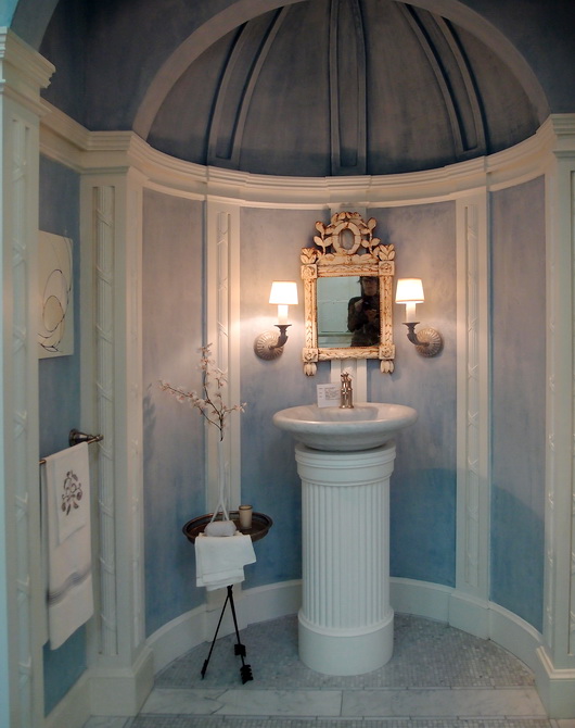
Below, simply stunning, elegant, perhaps Will and Kate's powder room?

Below, I'm awed and excited - I think I'd like to hang out in here!

Of course I knew that Kohler is all about design and function but visiting Kohler's headquarters was a reminder as well as a series of new visual lessons about their quest for beauty, innovation, always a celebration of tradition and a commitment to a strong and clear look to the future. Sounds like copy text, doesn't it? Can you question Kohler's intense interest in design in the most open way, celebrating all design styles? I can't. Just look at the previous posts just below this one. Kohler is a giant in the kitchen and bath industry...for very good reason. I'm also very proud to call Kohler a great American brand. 

From this....
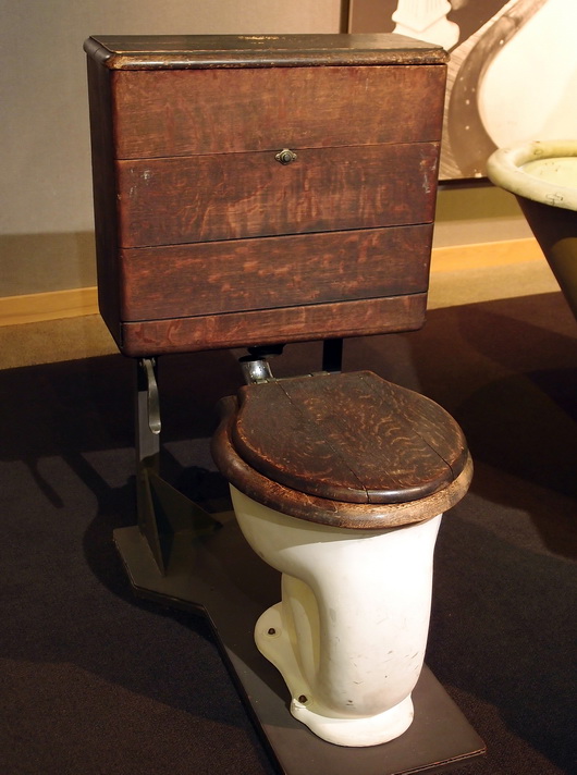
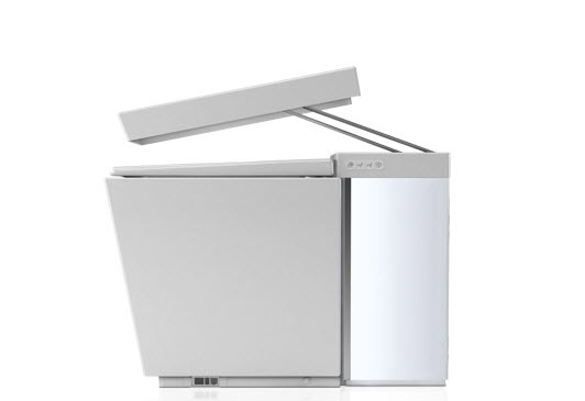
to this, introduced in 2010, the NUMI!


I hope you've enjoyed these posts. Don't forget to see more fabulous images on my Kohler's Design Center board on pinterest! Kitchen images are on that board too!!

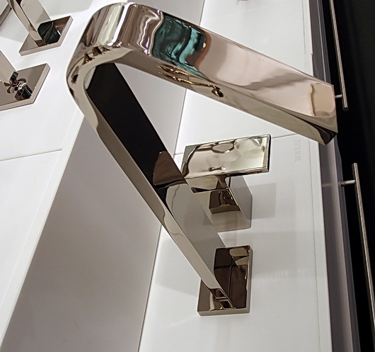
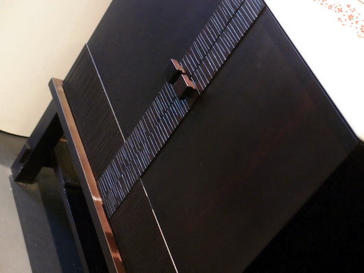
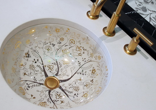
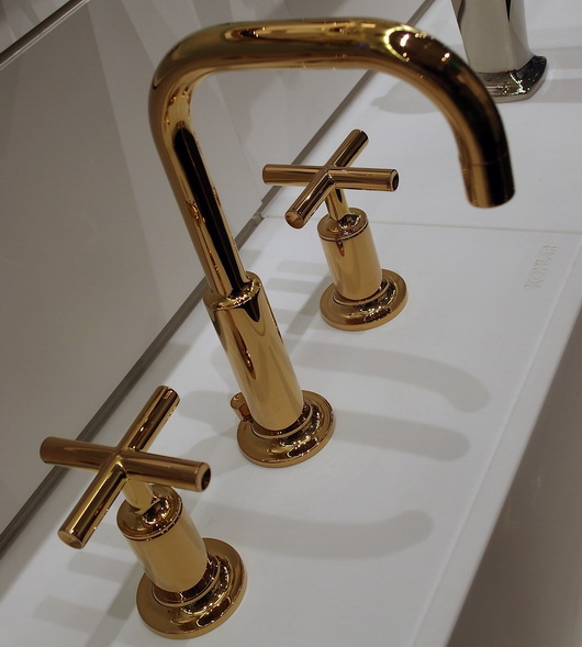
Kohler Design Center - Kitchen & Bath Plumbing Products, Furniture, Tile

The best part of my trip to Kohler's headquarters in Kohler, Wisconsin a couple of months back at the invitation of Kohler, was to visit the Kohler Design Center (how could I have said that without four "Kohler's" in the sentence??) A beautiful brick building in which all of Kohlers brands are showcased, it is a place that will take a design aficianado hours and hours to go through. There is something for everyone.

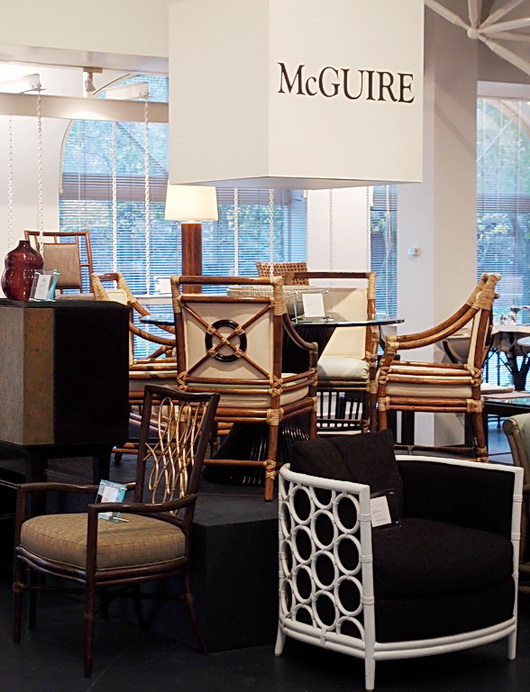
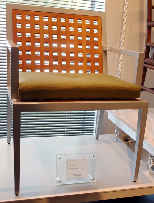
First, there were selections from Kohler's furniture brands such as Baker and McGuire...
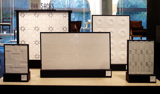
There was a display of stunning Ann Sacks tile and down the road, a tile store with the complete line

But here's what I REALLY came to see, below....and which did not disappoint. In fact, it made me see, as I learned about Kohler through the factory tour as well as discussions with Kohler designers, the incredible depth of design talent, commitment to design, and breadth of style that Kohler embraces and has embraced for decades. 

DID YOU KNOW that for nearly 40 years Kohler has offered an Arts/Industry Program in collaboration with the John Michael Kohler Arts Center in nearby Sheboygan to emerging artists? There have been nearly 400 artists in residence since the program's inception. These artists may work in the Kohler Co. pottery, iron and brass foundaries and enamel shop to hone their skills and explore their vision in functional and sculptural forms.

It was the Kohler family's desire some decades ago to celebrate art by introducing artists to freely reinterpret their products with a fresh vision and point of view. This philosophy has made Kohler's products known for beauty, creative design and originality. From many years in the kitchen and bath industry, I can tell you that Kohler's product introductions each year always excite the senses!

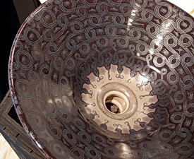
Ok then, time for the good stuff!! I do not have names on these pieces, but ask me what they are and I'll find out for you. These are random shots of product displays that I took from the first floor of the Design Center.

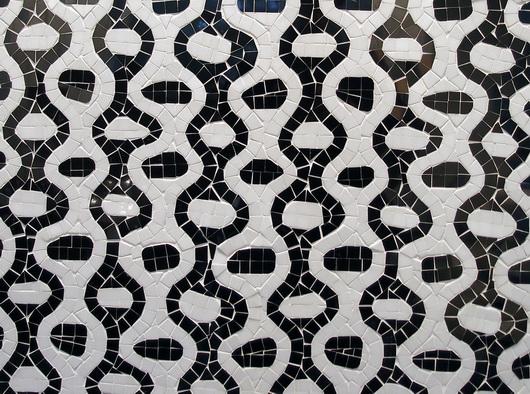
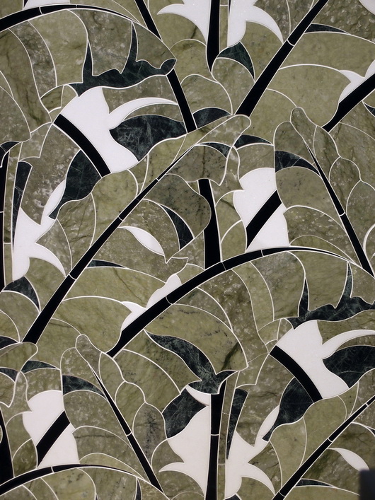
Ann Sacks tile below-looks like fabric!

And there's MORE....

There is so much to show you from this trip to Kohler's Design Center that I cannot leave out what rivals anything you have seen so far, and that is a peek at the fabulous kitchen and bath vignettes situated on the second floor of the Kohler Design Center. Coming soon. Can't leave them out!

As you can see, this is truly a destination. Who knew? More soon


Kohler Food and Wine Experience & The American Club Resort

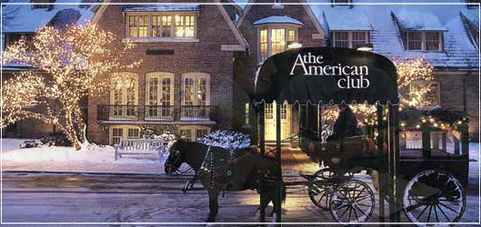
My weekend at Kohler, Wisconsin, at Kohler's gracious invitation, included attendance at a tempting array of food and wine related events of my choice. As I said in my previous post, I would go back to the Kohler Food and Wine Experience in a heartbeat. The vibe was fun, stimulating, insightful...and quite tasty. From beginning to end, all of my experiences, every one, were sincerely, and very solidly, positive. But first, a bit about the historic American Club Resort. (this season's winter image below)

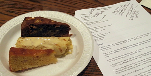
A Forbes Five-Star Resort Hotel and AAA Five Diamond Resort Hotel, the American Club Resort was founded by Walter J. Kohler, Sr., originally to provide rooms for immigrant workers who were employed at Kohler. A Tudor style building and interiors, the wood paneled hallways and public spaces lend an air of history and traditional design that is at once comfortable and inviting. The rooms? The word "divine" comes to mind. The bathrooms? Perfect...or certainly, near perfect if one wants to quibble (not me.) But, the weekend (an annual event in October) centered around food and wine, so here's a little taste (pun intended-image from the seminar on baking with apples-yum-I almost died when this was passed around!)

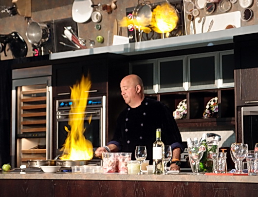
Celebrity chefs included Alexandra Guarnaschelli, Jacques Torres, Charlie Trotter, Andrew Zimmern, Jon Ashton and many more. Tastings, seminars, the Kohler Chefs' Challenge and signature events such as the Taste of the Vine are just the beginning of a very, very packed schedule of events. 

Parts of my itinerary included a cooking demo with Alex Guarnaschelli (she is truly hysterical), the Taste Of The Vine wine event, cooking demo with Andrew Zimmern, a seminar on baking with apples and a few other great cooking demos. To escape into the world of food and wine, for me, was sweet in more ways than one. The program was run so efficiently, with such attention to detail and with a whole lot of entertainment value, it was a super enjoyable experience.

Winter activities abound at Kohler Village. Check out Kohler Village's winter outdoor activities. Take a look at the Demonstration Kitchen events. Dog sled demonstration anyone? Check out these very cool winter events on the weekend of January 28-29. OR, just forget all those outdoor activities and studying how to slave in the kitchen and go to the Kohler Waters Spa - "dreamy" is an understatement. I went, I zoned out, I exfoliated.


Thermador Freedom Induction Cooktop

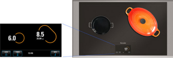
"Heat without boundaries", the holy grail for cooks, chefs, heater-uppers ... Thermador introduces a new cooktop with revolutionary natural mapping technology. What is that and what does it mean?

Imagine the following: you are sauteeing ingredients for Thanksgiving stuffing-let's say onions, celery, and sausage (I'll also add apple chuncks in mine) in a large pan. Another spot on the cooktop is needed to cook the fresh cranberry sauce. Don't forget the turkey stock - the stock pot needs a place too.

At different times of the cooking process each piece of cookware needs to be the center of attention, maybe moved to the front or off to the side to simmer or have more intense heat. The ability to move cookware around a cooktop at will is flexibility and freedom for any kind or type of cook. It's what you can do with the new Thermador Freedom Induction cooktop

 I saw this technology first hand at IMM Cologne, Germany, last year, and thought it would be quite awhile before we saw this technology in the US. This is big news, as this Thermador cooktop is the first cooktop with this innovative technology in the US, complete with 30 international patents.

Other features per Thermador's press release:

  • "A 6.5-inch, full-color touchscreen display that recognizes pot shape, size, and controls power setting and cooking time   
  • Surface area to accommodate a 21-inch x 13-inch pan with the largest cooking surface in the industry
  • A range of 4,600-watt maximum power output with Boost feature and 15-watt minimum power output

The Thermador Freedom Induction Cooktop surface is made from transparent ceramic glass, which allows for the integration of the color touchscreen. In additional to the touchscreen interface showing the position of all cookware on the cooking surface, the touchscreen also performs live updates as cookware is moved to a different position, giving the home cook an intuitive cooking experience." MSRP is $4949.

A game changer!

Kohler - A Great American Brand

I had the distinct pleasure and privilege of visiting Kohler at their campus in none other than: Kohler, Wisconsin at their invitation. To see and feel the heartbeat of this great American brand was a professional goal fulfilled. 

I visited Kohler's headquarters at the end of October during a perfect fall weekend. It also happened to be the weekend of Kohler's Food and Wine Experience, a weekend filled with food and wine related events, seminars and workshops. I'm not overstating that this was such a great series of events that I'd love to go annually!

There are clearly several posts which I would like to share surrounding this weekend. First, you'll see some interesting pieces of Kohler's history. Second, I'll give you a look at the weekend's events which I know you'll also love. Third and probably fourth as well, you've just GOT TO SEE Kohler's fabulous Design Center! It will be worth the wait, I promise!

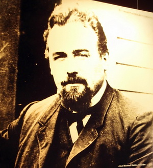
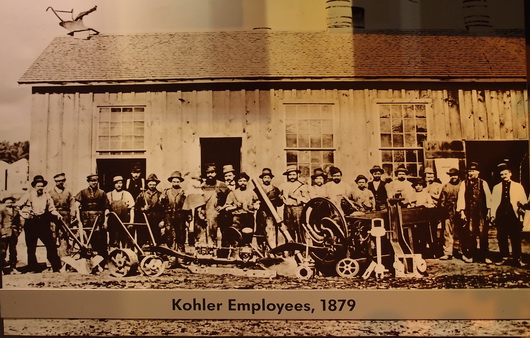
John Michael Kohler was 10 years old when his family came to the US from Austria and settled on a farm near St. Paul, Minnesota. At age 18, he moved to Chicago and became a traveling salesman for a wholesale grocery house and later sold furniture. His territory was the western seaboard of Lake Michigan. He formed a partnership in 1873 with Charles Silberzahn when they bought a foundry and machine shop from Kohler's father-in-law, Jacob Vollrath.

Kohler expanded the foundry to manufacture decorative iron pieces, cooking utensils and plumbing products. At the end of the 1800s a new factory was built in today's existing location, Kohler Village. Halfway through construction the plant burned down. Three months later John Michael Kohler died. Kohler's sons rebuilt the plant and renamed the busines John Michael Kohler Sons Co. in 1901. This is the overview. 

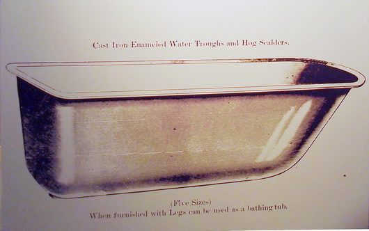
Below, plumbing begins...

In 1883, John Michael Kohler, and I quote, "enameled the inside of a horse trough/hog scalder, attached four cast iron legs, and sold it to a farmer as a bathtub. By 1891, the company expanded its line to include roll-rim bathtubs, washbowls, and drinking fountains. Acceptance of the Kohler bathtub and other enameled cast iron plumbing fixtures rapidly spread beyond the farm community. Cast iron products attained the reputation of being durable, sanitary, and 'superior as to beauty of design, excellence of finish, and quality of workmanship' " 

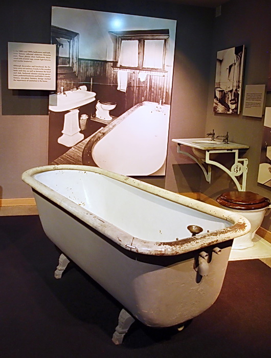
Below, a bathroom from 1900

The mission of the company, from a 1900's catalog:

Over twenty years' experience in the manufacture and sale of Feed and Ensilage Cutters, Horse Powers, Feed Mills, and other Agricultural Implements has given us a thorough knowledge of the business. It has always been our aim during this time to manufacture the best goods that ingenuity and money can produce. There are grades of cheaper machines than ours on the market, we thoroughly believe, however, in the maxim, "That the best articles are the cheapest in the long run" and we have made it a rule not to see for how little money we could make an article, but how good we could make it for a moderate price. The fact that farmers who bought our machines twenty years ago are still using them, is conclusive proof of their excellence and a good endorsement. Our cutters and powers are all built on the most improved, scientific and practicable principles. We manufacture both the fly-wheel and the cylindar cutters. 

We trust that the following pages will prove interesting and if in want of any machinery therein illustrated you will give them a fair, unprejudiced inspection and trial. Liberal discounts from lists allowed. Correspondence solicited. Respectfully, Kohler, Hayssen & Stehn Mfg. Co., Sheboygan, Wisconsin, USA.

As I put together this post, I truly am honored to have had the opportunity to learn about the history of a great American brand. I also walked through several large, old buildings (with state of the art machinery) that houses Kohlers factories and foundry. I saw the molten iron worked by expert craftspeople. I also saw highly skilled craftspeople work with great precision applying a finish. Impressive procedures, machinery and cleanliness are what I observed first hand. This was no small tour - it was 2 1/2 hours of walking and learning, led by a retired factory worker. It sure was memorable. 

I hope you've enjoyed this first installment of my time spent at Kohler's headquarters. More to come, just wait!

My Lovely Trip To Bornholm, Denmark

Bornholm is such a special place. It is at once simple yet dramatic, heavily textured yet clean, colorful yet sometimes viewed in neutrals for as far as the eye can see. It's where one side of my family tree is documented, so far, to the mid 1800s, having been born on Bornholm. Funny, the other side of my family tree is documented to the very early 1800s far away from Bornholm, also in Denmark, in Jutland, the largest piece of land one thinks of when one thinks of Denmark. 

I went to Bornholm, then to Copenhagen in late August, alone, in search of artisans for my and my daughter's new brand, Scandinavian Made, a webshop of artisans' works that are made in Scandinavia, by the artisan, whose works are available in the US exclusively in our webshop.

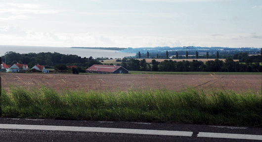
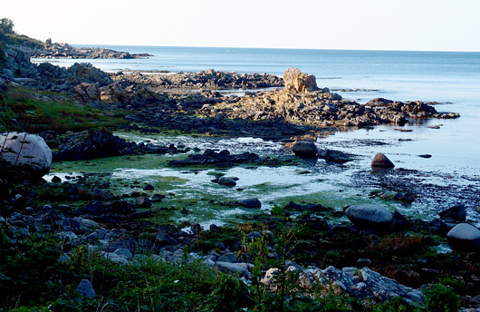
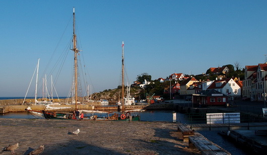
I drove around Bornholm, often losing my way and not caring, and found the most amazing artisans! The landscape is incredible, the people are friendly and the food is, to me, amazing!! I've been to Bornholm before, and it always refreshes my spirit. Here are images of Bornholm in late summer, perfect for this cold winter's day. All images taken by me.

Below, a stop off on the side of the road

Below, one of my most favorite images, ever. The sand on this beach is famous for having been used as hour glass sand, it is so incredibly fine.

Below, stunning rock formations in the sea

Below, on a rugged path, looking down to the sea

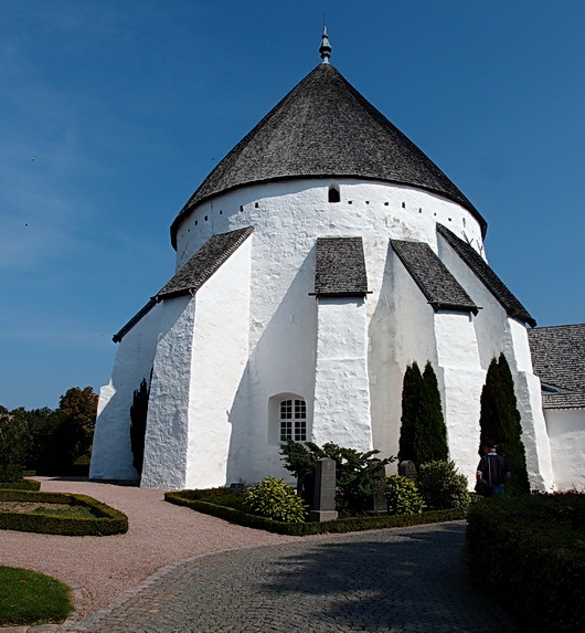
Below, I was moved by the beautiful, ancient, round churches in Bornholm, one in which my grandmother was baptized. Below, a church built in 1150!

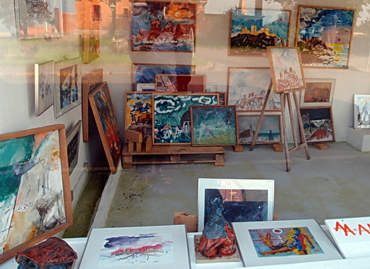
Below, a gallery that I wish were open! Artists have been drawn to Bornholm for many years, as the quality of light is said to be unique and inspiring

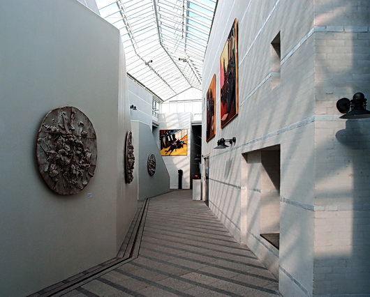
Below, the Bornholm art museum, a stunningly beautiful place

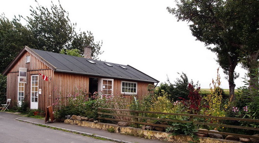
Below - One day, as I was wandering, I came upon this lovely ceramics shop, owned by the artisan, that was open

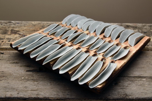
Below - I was truly astounded/touched/moved by the beauty of the pieces I encountered. I saw that these pieces were made by the artisan with what appears to be raw emotion. You can see more of this fabulous artisan's original works in my and my daughter Kelly's webshop, Scandinavian Made

The lovely small villages on the coast are serene

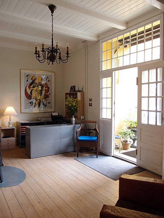
And last but not least, the reception area of a beautiful inn that I stayed at. The decor is that great Scandinavian eclectic combination of classic traditional furnishings set within a modern decorative foundation (floors, furniture, lots of white and art.)

What does this post have to do with kitchens? Everything! It's all inspiration which touches all future projects.

Healthy Kitchen Design - And The Medifast Program

We're thinking about living a healthy life (again) now that New Year's Day will be here shortly. Can a kitchen be designed that actively contributes to, and encourages, healthy eating? I'm not (entirely) sure, but here's how I would approach the design, plus a few tips on healthy eating. 

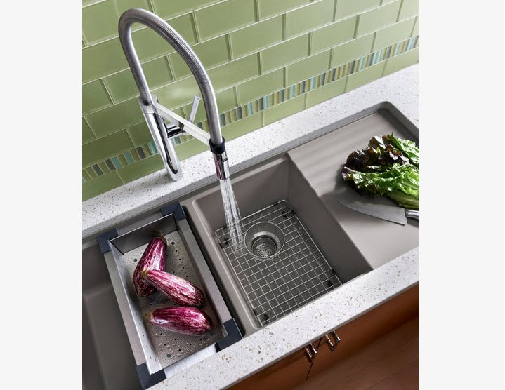
Below, a Blanco sink

SINK AREA

  • Design in two sinks including one prep sink to encourage easy access for prepping fruits and veggies
  • Have colanders near the sink to drain fresh fruits/veggies
  • Have a cutting board near the sink and/or trash for prep work
  • Add a filtered cold water tap to encourage you and your family to drink water
  • Keep the salad spinner nearby

COOKING APPLIANCES & METHODS

  • Have steam baskets or a portable steamer easily accessible to encourage cooking steamed vegetables
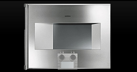
  • Alternatively, design a steam oven into the kitchen to cook vegetables, meat and fish in a healthy manner
  • Add a grill pan to the cooktop, a portable electric grill, or design a built in grill into a new kitchen as a tasty, healthy, cooking method
  • Have on hand an electric rotisserie or a built in rotisserie in the wall or oven for flavorful, lower fat, cooking
  • Use a vertical poultry roaster in the oven which allows fats to drip off the chicken
  • Cook with dried and fresh herbs frequently to add a layer of elegant taste to your foods

Below, Gaggenau's Steam Oven

SMALL APPLIANCES

  • Leave the cuisinart out on the counter to encourage quick prep of veggies
  • A blender is great for smoothies, gazpacho and preparation of other healthy foods any time of day
  • Keep knives sharp for ease of use with all fresh foods

OTHER APPLIANCES

  • Select the right size refrigerator for your family - too big and too much food will sit in the refrigerator for too long a period of time growing old and tasteless. 
  • Package food properly in the refrigerator to maintain optimum taste and freshness

DINING

  • Eat on small plates occasionally in an effort to control portion size
  • Invest in a good quality oil and vinegar for super tasty salads
  • Eat vegetables you are unfamiliar with to add interest to everyday meals

GENERAL

  • Frequent your local farmer's markets, farm stands or coops to experience the selection of fresh foods in a delightful setting
  • Plant and raise fruits and vegetables!
  • Have healthy foods such as fruits, vegetables, nuts and whole grain foods on hand for snacking
  • Make the shift to whole grains for everything - pasta, bread, cereals, baked goods


MY STORY

BEFORE - Thankfully this hairstyle is goneI've used just about all of these techniques and others in a decision to eat healthy this past year. Last year, the Monday after Thanksgiving (an unusual time to start), I started a journey to lose the weight added over 20 years after the birth of my 3rd child. I did not hold out much hope for success (as usual) and started it with a "whatever."

Day by day, week by week, to my surprise, I became committed to this weight loss program that my doctor recommended to me and the weight came off. It both put me into food rehab and helped me learn to eat healthy at the same time. My total weight loss was ... drumroll .... 75 pounds! THAT amount of weight has been a life changer. Logistically, had I felt hungry (it was rare) I would never, ever, have stuck to it. That was my one requirement - I could not be hungry all day, every day! Hunger is curbed on the plan I went on: Medifast. That was really the catalyst for success for me.
AFTER - Thankfully this hairstyle is gone too!!Before: Flat shoes, shapeless clothes, low energy, and I refused to wear denim jeans for at least 15 years. Now: Heels? Yes-4" high. Skinny jeans? 5+ pairs. Cinched belts? Quite a few. Leggings? YES! I am far healthier, energetic, happier, and confident, than I have been in 20 years. It was a big moment when I purchased my first pair of denim jeans, in the spring, in well over a decade. It was just a principle for me-I would not wear denim jeans while being overweight. 

Medifast is so easy, safe and simply works. I am now a coach for Medifast via their sister site, TSFL-Take Shape For Life. Are you ready to get healthy and slim? I know this: When the time is right, the desire and motivation will be there. In my case, it came a couple of days into the program. If I can do it, you can too.  Contact me for further information. 

So, yes, I know first hand how to design and equip a healthy kitchen based on personal experience living with all of these suggestions made here, for some time. I will add more tips on designing a healthy kitchen soon! 


Kitchen Backsplash Height

The height of the backsplash, the space between the countertop and the bottom of the wall cabinets, is often left as an afterthought by many kitchen designers and homeowners. It's rare in my experience that the client expresses an opinion about the backsplash height. However, If the height of the backsplash is not considered carefully, comfort and function could very well be at risk and affect one's lifestyle in the kitchen - for a very long time.

Below, a backsplash height calculated for a variety of issues: a concealed microwave, height of the client, function and display.

Just this morning, I received a question from a fellow kitchen designer. I wrote back an answer and realized that the answer was good information for a blog post. 

Hi Susan,

In discussions with my design team I am questioning the distance between the counter top and the bottom of the wall cabinets.  Two of my designers, who have over 75 + years of experience feel strongly that “custom design” should be a distance of 15” to maybe 16.5” 

I, on the other hand , being 6’3” tall feel that anything less than 18” (or with a molding applied to hide lighting) 17.5” is too tight a space.  I’m not asking for a definitive answer, but I thought with all of your travels and experience in the marketplace you might be kind enough to share your design thoughts with me about this.

I wish you and yours a very safe and enjoyable Holiday Season, and I very much enjoy reading your blog. Thank you for your time.

My answer:

Sure, I'm very happy to weigh in on this issue. However, you answered your own question! Where possible, which is nearly always the case, one should attempt to customize the height of the backsplash depending on the height of the homeowners and/or primary chef/bottle washer. It's a nuance, actually.

Below, calculations based on multiple criteria as above: client height, storage needs, display.

Two tall homeowners? Increase the height.

Two short homeowners? Shorten the height but beware of countertop appliance heights since that must be dealt with.

Two homeowners, one short/one tall, both helping out? That's a negotiation that might take a little more time and is a personal decision between the homeowners. In that case, the proposed/negotiated backsplash height really must be mocked up so each can experience the height and decide what works and what does not work.

Perhaps, then, tall pantry storage can come into play where access is more "democratic." Or, one area may have a lower backsplash and another could have a higher backsplash if designed to make sense visually. A countertop wall cabinet will help too.

The other issue, of course, is if trim is added below the wall cabinets, potentially shrinking an already short backsplash or not allowing countertop appliances to fit.

Then, you have children. Do the homeowners wish children to take an active role in the work within the kitchen? If so, storage should be planned to be at lower levels via base cabinets (dish drawers) or a pantry with better access.

Below: Kitchen of Cynthia Bogart, editor of The Daily Basics

I'm always compelled to note that there is a 15+" wide cabinet to the left of the range :)

For my clients of typical height, I usually opted for a 17" backsplash and ran it past them to verify that worked for their lifestyle and did not interfere with countertop appliances. I was taught way back that the average backsplash height could be from 15-18". That, however, is like saying "I'd like a brown stained cabinet" ... it's only a starting point.
I hope that helps!!
Regards, 
Susan

What I did not add into this note (and should have) was the issue of physical abilities of the homeowners. Having a family member (in my own home) whose reach and bending ability has changed dramatically, the physical ability of family members is a critical question to ask as well.

Decorating For Christmas In The Kitchen!

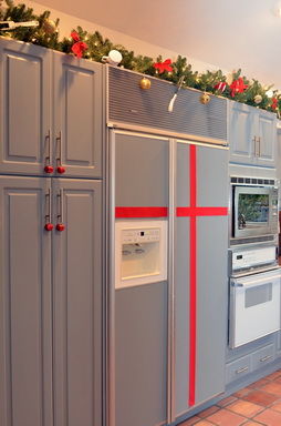
I've been thinking quite a bit about decorating the kitchen for Christmas, and that does not mean that it has to be this big, ambitious, undertaking. Chances are you already have nearly all the "ornaments" that you need on hand to do the job.

Prior to decorating my own kitchen for Christmas (disclaimer, we moved to this home 3 years ago and have not yet renovated the kitchen so it's definitely not "me") I was a guest on Martha Stewart radio on Monday, December 2nd to talk about this very topic. So, let's get on with the ideas! 


Around the same time, I had a lovely offer from Balsam Hill, retailer of artificial Christmas trees to use some of their products in my home. Of course, since the kitchen is usually the poor step sister in terms of Christmas decorating, I thought it was a great topic to share. Here we go!

1. Frame a kitchen window with greens and twinkling lights - or a huge, oversized wreath!

2. Change out dining chair seat cushions, placements and other easily changeable fabrics with holiday colors/motifs.

3. scan the kitchen collectibles on display and replace with holiday themed colorful and decorative items.

4. Don't forget the floor - replace the kitchen rug or runner for the holidays to have a fresh look! 

5. Add small twinkling holiday lights around the base of a kitchen island or on the sides and back of an island for a holiday glow.

6. Add a grouping of bulbs to hang just below the bottom of the kitchen table light fixture.

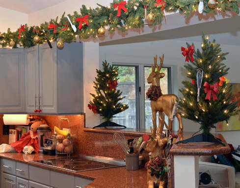
7. Add roping around the kitchen: above the cabinets or under the wall cabinets and tie in dime store kitchen utensils in your favorite holiday color.

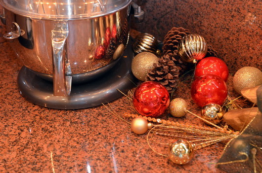
8. Gather branches from outdoors, keep natural or spray paint in a holiday color and bundle together with twine and/or add ornaments to the arrangement.

9. Use Japanese Mashing Tape (Washi tape) and tape up past family photos or greeting cards on a wall in the shape of a Christmas tree (a simple triangle shape.)

10. Lots of candles all over - we LOVE the idea of an ebelskiver pan to use as a candle holder when not in service on the stovetop! 

11. Hang ornaments or bells on cabinet hardware (ok, not toooo many bells).


12. Paint cardboard fit to size in your holiday color and fit it to the rear of glass door cabinets for a holiday pop of color, easy to remove after the holiday. 

In my kitchen, I really enjoyed digging through my kitchen drawers (and combing through the local five and dime store) to find lots of small kitchen utensils to hang on the lovely roping from Balsam Hill. The two small Christmas trees came from them as well, and I think they are a perfect anchor for the shelf on each side.

Of course, anything goes, keep it simple or ambitious, but above all, don't stress! Have fun! The kitchen will thank you for it (it would be nice if it were grateful enough to clean itself...)


Silestone Kitchen Countertops - Classic Style & Modern Function

I had the pleasure of visiting Cosentino's headquarters, the parent company of Silestone, in Spain about 6 weeks ago. We toured Barcelona, we dined, we traveled to Almeria, we learned - I was a part of a small group invited to have a well rounded introduction to two fantastic areas of Spain and to have a multi-layered understanding of Cosentino's breadth of products.

Of course, we all know Silestone as the original engineered stone material for kitchen countertops, a market focus the company has always had and which remains the centerpiece of Cosentino's efforts. To that end, Silestone continues to introduce interesting, eco-friendly, and highly durable materials into the kitchen and bath marketplace. 

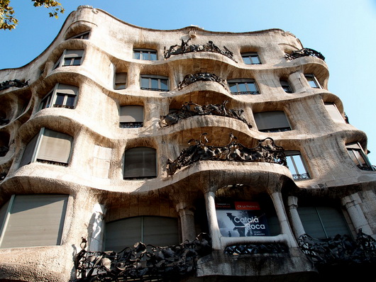
That's a general, and brief, overview, with more details to come. But, I did want to start talking about this trip by showing you some great images of a kitchen that I toured, preserved from the early part of the 20th century. The apartment building in which the kitchen is situated was designed by the amazing Antoni Gaudi called Casa Mila.

Below, the pretty incredible apartment building, designed by Antoni Gaudi...wow!

Below, images of the apartment. But first...I thought it would be fun to imagine which Silestone colors and styles would serve nicely as a modern day substitute in the event the new homeowner wished to, um, rip out the countertops (blasphemous!)

Top left: Grey Amazon | Top right: Lyra | Bottom left: Gedatsu | Bottom right: Sonora Gold

silestonegreyamazon silestonelyra
silestonegedatsu silestonesonoragold

Take a look at these gorgeous images of this historically preserved kitchen...
 

Get the flash player here: http://www.adobe.com/flashplayer


It was a privilege to walk through this authentic vintage apartment to see this very interesting kitchen.
The work stations look quite defined, certainly, with ergonomic features such as lower countertops in certain areas, adequate countertop space, adequate storage, and storage that starts well above our typical 4" off the floor.

Shelves and glass cabinets add visual aids to storage and the tall cabinets to the ceiling makes good use of extra storage. The cabinetry is built into the architecture of the space in some awkward but interesting ways. The incredible textured window adds glam in a big way. 

Much more coming soon on this incredible trip to Spain!!


Decorex 2011 – Blog Tour Kitchen Inspiration

As part of the fabulous Blog Tour 2011 group, founded by Veronika Miller of the equally fabulous Modenus.com website, our trip to Decorex, part of the London Design Festival, was simply fantastic, end of story. The creativity and innovation was such a joy to experience. Another type of joy was to see the way that classics, that is, materials or design, were updated to create a new aesthetic, a new definition of classic as well as modern. THAT experience = inspiration.

Here are some kitchen design elements that I found interesting at Decorex.

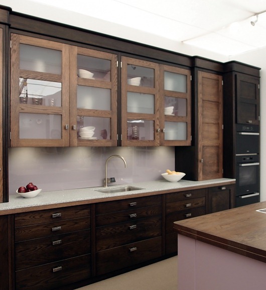
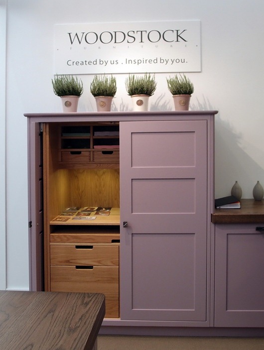
Below, cabinetry by Woodstock – who doesn’t love that name? Of course, the star is the fresh color, but I love the function too and the height of this taller cabinet.

woodstock kitchen

Below, also from Woodstock, the cool mix of light and dark neutrals. Notice, too, the subtlety of the rounded moldings. Love. Backsplash and styling – needs some love…

woodstock kitchen2

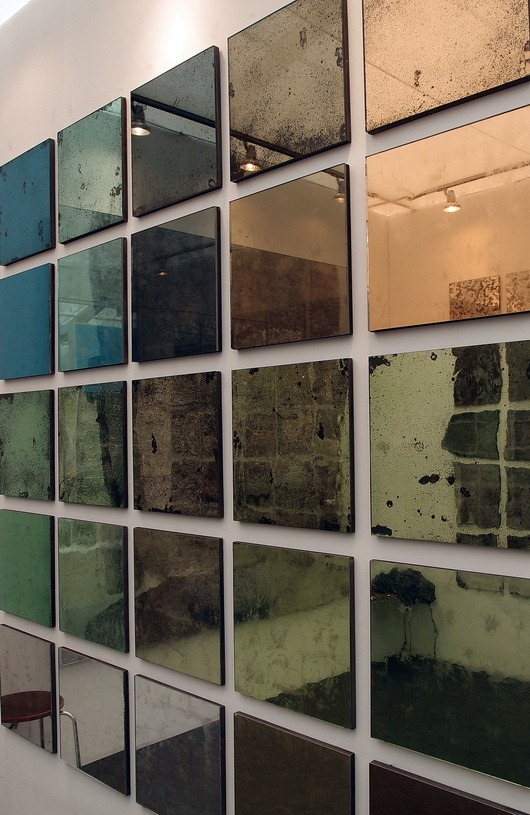
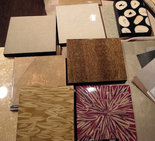
Below, gorgeous Dominic-Schuster mirror – could be a backsplash or wall area maybe? For pantry doors? Yummy! And it comes in a gazillion textures.

dominic-schuster

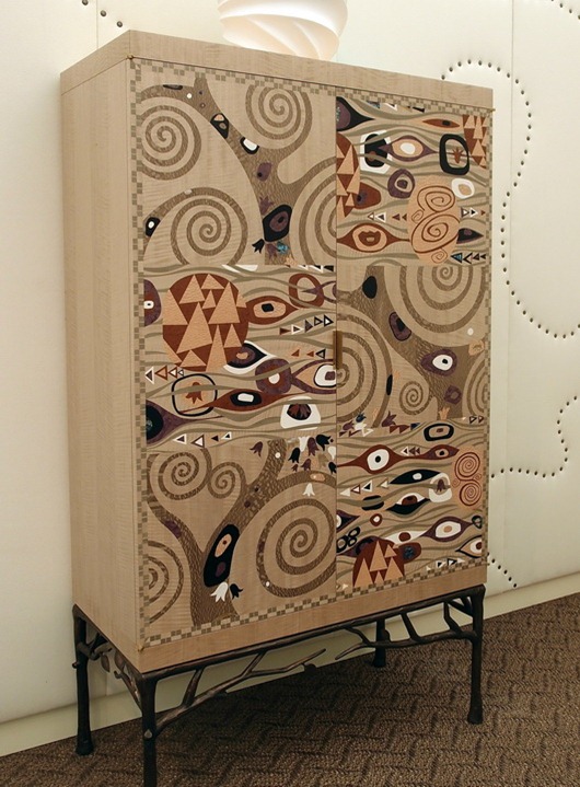
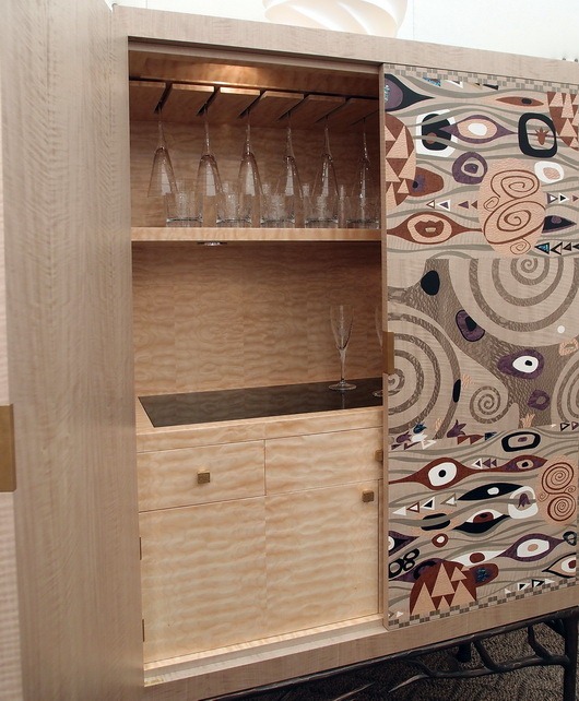
Below, a fabulous update of an armoire, bar cabinet, kitchen pantry, or breakfast room dish storage

archersmith


 archersmith2

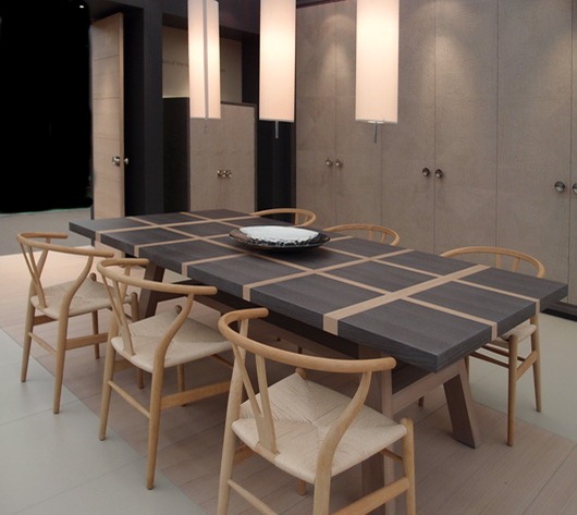
Below, a GOR-juss dining table with Hans Wegner chairs by Isis Furniture

isis furniture

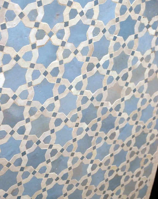
Below, Moroccan tile by Habibi (you are viewing the tile at an angle)

habibi

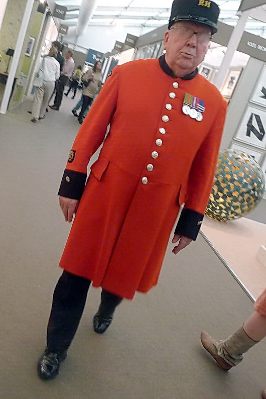
And, a quick shot of this very impressive gentleman who I know does something really important, but he’s also cute!


What’s your favorite??

Decoration & Design Building - Fall Market 2011

Last week, I was honored to be an invited design blogger to attend the D and D Building's Fall Market. The D and D building, in New York City, is simply, a fabulous building which houses world class interior design showrooms. Here, you can see the finest fabrics, furniture, lighting, accessories, window treatments, wall coverings, paint, and many more decorative products for the residential interior. It's awesome in its collective design offerings.

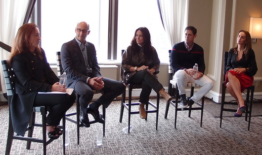
The Fall Market had a great array of educational workshops, seminars, talks and panels, with nationally known designers, manufacturers, and print and online editors. Going from a beautiful showroom to a insightful, spirited, talk, for me, was design heaven! Hanging out with the other invited design bloggers to Fall Market was equally inspiring! This discussion, below, was on Transcending Branding Boundaries, hosted by Editor in Chief of Traditional Home, Ann Maine.

left to right: Beth Fuchs Brenner, Peter Sallick, Windsor Smith, Jonathan Adler, Christina Juarez

I'd like to share some of the WONDERFUL products I came across that are located in the D and D Building!

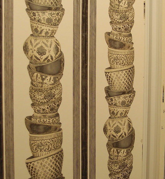
Pierre Frey

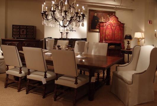
EbanistaBelow, interesting organic designs for dining tables

Evanson

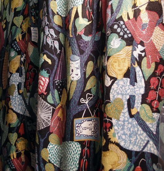
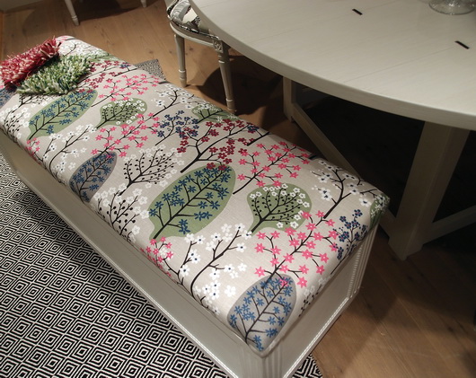
Country Swedish

Country Swedish

Country Swedish

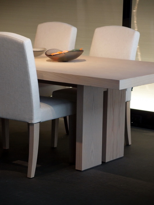
Armani Casa

I hope you've enjoyed these selections from the endless products that basically assault your senses once you enter this building! (That's a good thing!) 

Poggenpohl Kitchen Showroom

During a recent trip to London, I had the opportunity to spend some quality time at Poggenpohl’s Waterloo kitchen showroom. This London trip was arranged courtesy of Blog Tour 2011, an idea conceived by Veronika Miller, founder of Modenus, to bring design bloggers to the London Design Festival. Luckily for me, a visit to a Poggenpohl kitchen showroom was on our agenda!

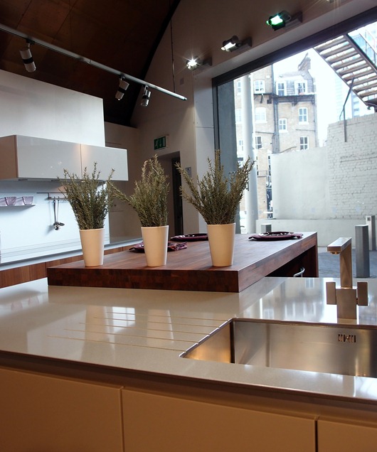
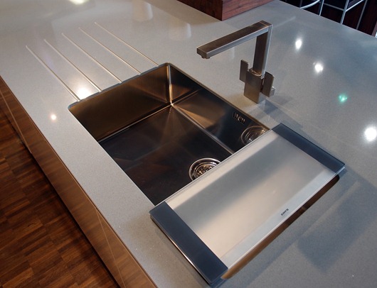
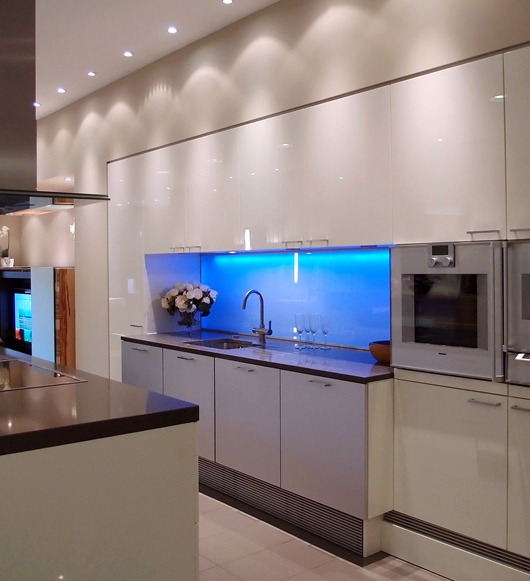
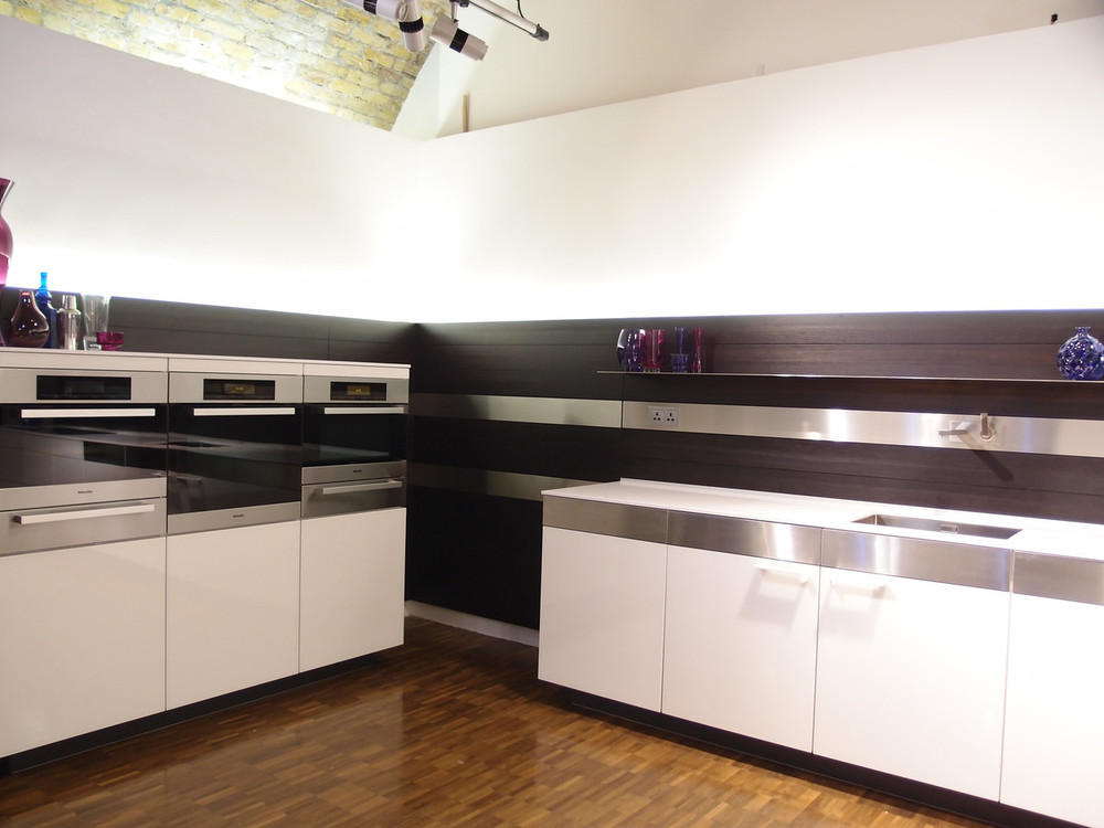
Following are interesting design ideas that I spotted at the showroom – and check out the Blanco sinks!

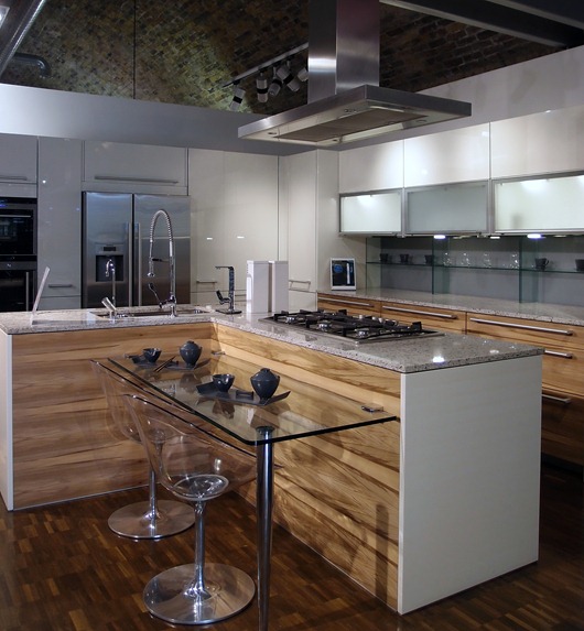
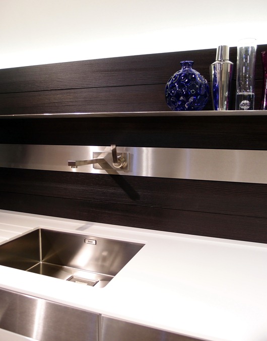
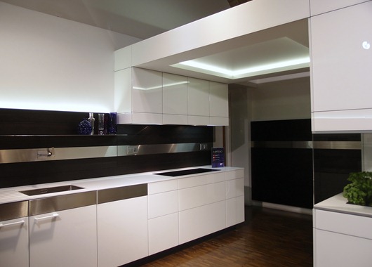
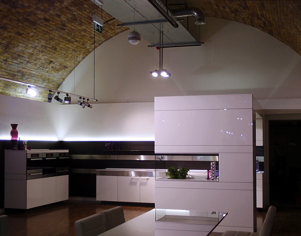
Below, highly textured wood cabinetry paired with sleek white and stainless steel-take a look at the lucite dining chairs and glass table-cool!

poggenpohl 1

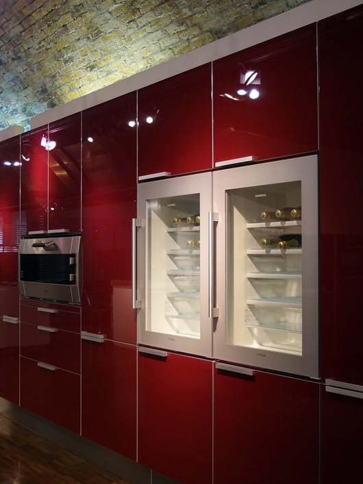
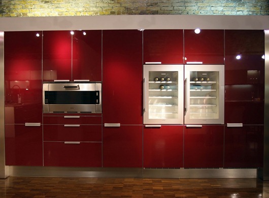
Below, I'm thinking that, after removing the third bottle of wine during dinner, this higher position of the wine refrigerator should prove to be useful!

poggenpohl 7

poggenpohl 2

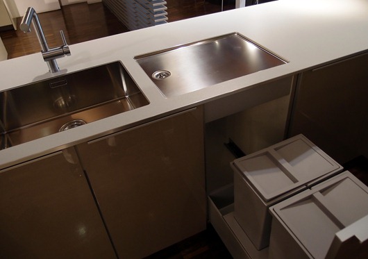
Below, a crisp/tailored undermount sink and separate drainboard by Blanco. I love the look of the separate pieces and the recycling bins below are perfectly situated.

poggenpohl 8

Below, another Blanco sink and interesting countertop shapes and forms.

poggenpohl 5

blanco sink 2

Below, note the difference in countertop thicknesses - the island is thick, the opposite countertop is thin - quite interesting to change it up.

poggenpohl 3

Below, exploiting horizontal lines...

poggenpohl 9

Below, sleek white cabinetry, playing with volume...

poggenpohl10

Below, on trend neutral, flesh tone shades in textured wood juxtaposed with sleek, glossy, cabinetry.

I have more images of this beautiful showroom I will share, but in the meantime, thank you to those at the Poggenpohl Waterloo showroom for giving us such a warm welcome!

Tent London–London Design Festival

I’m here in London, fully immersed in Design Heaven! Part of the Blog Tour 2011 group care of Modenus.com and other sponsors, we are moving about London from one design exhibition to another, spending quality time at each inspiring venue.

Here’s a glimpse of some cool, kitcheny, products I’ve seen so far…

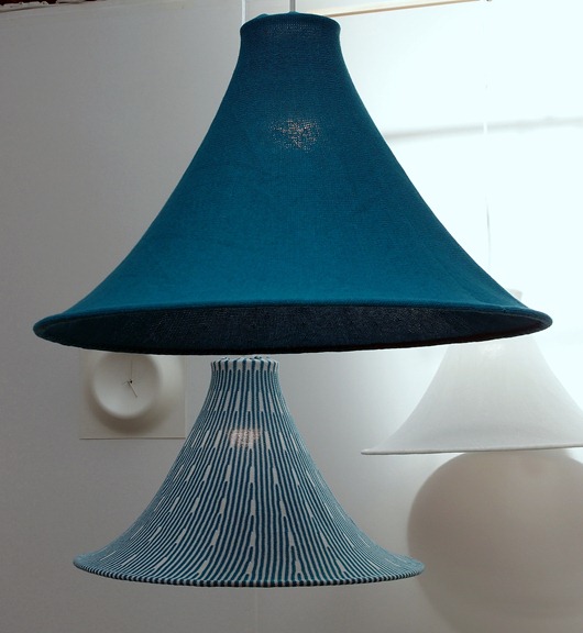
Below: Hanging light fixtures that leaves me warm and fuzzy by Kenichiro Oomori Moving Design

kitchen lamp

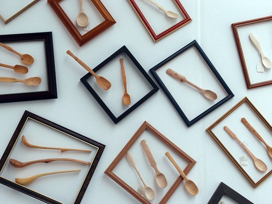
Below, beautifully made wooden kitchen utensils by Stovell Design

kitchen utensils

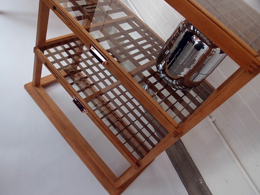
Below, awesome kitchen shelving by Studio Johnmale

kitchen shelving

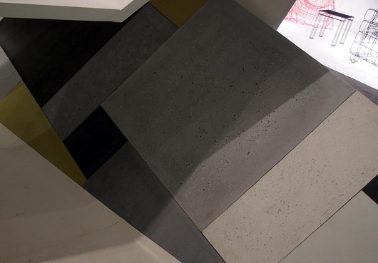
Below, textured concrete tiles by Ivanka Workshop

concrete tiles

More design inspiration coming your way soon from Merry Olde England! Today, I’ll be “working” my way through 100% Design!

London Design Festival, Blog Tour 2011 and Modenus.com

The 9-day London Design Festival and all its 300 events throughout the city commences today! In a few days, I will be on a plane to London with 18 other U.S. design bloggers to do nothing but observe, learn, interact with, breathe, and talk design. I am honored to be a part of this impressive initiative to bring US design bloggers to London. The concept to sort of comingle bloggers from the US and from the UK was that of Veronika Miller, founder of the design-rich website, Modenus. In a moment, we will hear Veronika's own words, as she describes the creative thinking behind BlogTour2011.
As a kitchen design professional, I am especially grateful to be included in this group. I have paid increased attention to the world of interior design, apart from kitchen design, in recent years having taken the time (and money) to travel to many design shows and events. As the kitchen is ever more connected to surrounding rooms and products and materials from surrounding rooms are finding their way into the kitchen, it is very important to be an astute observer of what's happening in interior design today. I will look for products, materials and design concepts which can be brought into the kitchen in a seamless way to create the "flow" that connected well designed spaces have. I just cannot WAIT to take it all in!
Here is some great information about Blog Tour 2011 and its fearless leader, Veronika Miller. Oh, and Veronika? She goes to an ENORMOUS number of design shows throughout the year. She may be one of the most knowledgeable people on interior design products and materials there is and that is no exaggeration.
Events in London just on one day!1. Veronika, how and why was this idea born, to bring US design bloggers to the UK to find design inspiration? 
Blog Tour was born, as are many good ideas, over a drink and some scribbles on a paper napkin. We had just created a very successful gathering for bloggers at Arch Digest Show in NYC in March at which bloggers kept telling me that Modenus should host blogger events more often. People see us as a hub for interior design resources so it was a natural next step to create something that would boost design bloggers' visibility whilst helping Modenus report from trade shows and design exhibits with content from select groups of bloggers. 

 It was a spontaneous moment between Troy Hanson at MMPI and Modenus which resulted in such a fun and inspired concept, something with a distinctly international tinge reflecting Modenus as a platform that is based in the US and the UK. So, over a few dirty Martinis in Hell's Kitchen NYC, BlogTour was born.

2. What are your professional goals for this trip; what does success look like?

Bloggers have an opportunity to immerse themselves in design inspiration, meet international designers, journalists and peers and flex their social media muscle to show just how much buzz they can create for an event or a brand. I think it's important to show that design bloggers can be very influential and professional contributors to digital media. Many of them should absolutely be considered as media partners for larger brands or design related initiatives.

Sponsors benefit from the immense buzz created through each BlogTour group prior to every event and by actually meeting bloggers in real life at their showrooms or at one of the exciting venues we've chosen to include in our itinerary. Making a brand visible through digital and social media is, of course,  very important but making it tangible through real life relationships is vital

Modenus was launched, and has grown, exclusively through social and digital media. BlogTour is a natural extension of Modenus and, as well as everything else, has further increased the visibility and reputation of Modenus in the US, UK and around the globe.


3. The agenda is so well rounded outside of the Decorex event. How do you hope these other opportunities for design exploration will inspire design bloggers?

London Design Festival is unique in that it offers 9 days of design events which are anchored by big trade shows like 100% Design, Tent London and just after LDF, Decorex. We've covered London Design Festival for several years now and know how inspiring British design can be and how important it is to focus not only on the larger brands but on the hundreds of creative artisans and artists who exhibit independently or at smaller venues or even through pop-up shops.

Designs can be over the top and  provocative and other times just beautiful and inspired but the point is that that, in my eyes, it is in those smaller shops and venues that great design trends are born. I think bloggers will take away a lot of inspiration for future blog posts or design work and hopefully benefit from the great personal relationships they'll be able to forge while in London.   

4. I know that I, as a design blogger, welcome opportunities to get up close and personal with manufacturers' products any way that I can. It's always a learning experience. I'm curious - what are the BlogTour sponsors' expectations and plans to interact with the design bloggers in an effort to showcase new design or technology in their products? 

We are thrilled and honoured every time a sponsor steps up to join BlogTour in London or any of the tours scheduled for 2012 because it is such a new concept but we realize they are seeing the same potential we're seeing.

Some of the sponsors will indeed be meeting us at  their showrooms or at a dinner venue in order to spend some time up close and personal with our American bloggers as well as some of the UK bloggers, while others appear to be quite happy to allow BlogTour to promote their brands through Twitter and other social media outlets to help them grow their own social media following. 

 Modenus has always worked with every vendor on a customized basis to meet their marketing and budget needs and BlogTour is no different...we listen and come up with a solution that will give them the type of exposure they seek. 

 Thank you to all of our BlogTour sponsors: 

BLANCO America
Samuel Heath
Victoria & Albert Baths
Poggenpohl
Wallunica
Achica Living
 
DuVerre Hardware
Spirit of Sports