Modenus + BlogTour = Inspiration Defined

Modenus is a web based interior design resource with carefully, even lovingly, curated products found in all corners of the world presented in an organized, and beautiful, directory. The products on Modenus are at a level beyond "the usual." The site is a delightful journey of discovery. Veronika Miller, founder of Modenus, personally travels to design shows in the U.S. and abroad, continually in search of new, different, and fabulous products for designers and homeowners to find. But, that's only part of Veronika's mission. 

It was upon my return to my bubble (my office) after an eight day, very busy, design focused trip to Denmark and Germany 10 days ago, that I thought more about Veronika, which compelled me to write this post.

Veronika, a designer herself, going back some years, fully understands what it means to work day in and day out as a creative professional. Understanding what designers need, she developed and launched an extension of Modenus, called BlogTour. Veronika and her team select a group of influential design bloggers and take them to a city to participate in that city's "design week" shows and events. 

Image: Susan Serra | Thinking of design as I walk in London with the BlogTour group!

Veronika understands that designers and those who love design are creative people, open minded to new points of view, design concepts and product inspiration. But, beyond this insight, what really happens on BlogTour is a little bit of magic.

Veronika, on behalf of Modenus, knows that this love of design that design bloggers have translates to a heightened awareness of design in all of its forms, particularly when experienced in a new location, outside of the design blogger's bubble.  Design bloggers (some are working professionals) attend events of a diverse design nature during BlogTour. These varied events over the course of 5 days (with much free time to walk the design events in one's own way) open the design bloggers' collective awareness to:

  • new experiences where one has the luxury of being a "follower" and can just take it all in
  • new friendships with people of different states, regions, countries adding interesting social dimension
  • discover cutting edge, exciting, products, design concepts, solutions and materials as well as products of other period styles and themes
  • engage in endless conversations on design with lots of smart people in different design disciplines
  • view design in a historical context, whether walking down the street, visiting a museum, or a 100 year old pub
  • observe many different design disciplines, whether graphic design, industrial design, packaging, mechanical, fashion, crafts...and more
  • listen to speakers, noted local and sometimes internationally known designers and manufacturers who speak just to our group
  • more...more...more via many types of visual arts and printed materials, as tools which stir the senses

Veronika's mission, in a nutshell, is to nurture designers in an effort to achieve all of the above benefits just mentioned, in a location (often) far from home. BlogTours have taken place twice in London (one of which I attended), New York City (twice) and Germany (with a bonus day in Amsterdam.) 
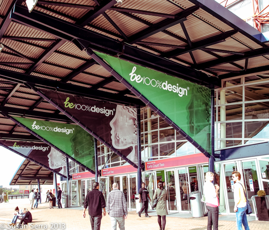
One of many design events we attended along with other, both small + large venues around London

Just 2 weeks ago, I went to Cologne, Germany as part of the BLANCO Design Council group tour to IMM Cologne LivingKitchen. The Modenus Cologne LivingKitchen edition of BlogTour with all of its enthusiastic, top design bloggers, were there as well. Both groups gathered together at planned events. We talked design, saw old friends, forged new friendships and had a whole lot of fun. Heartfelt thanks and appreciation go to BLANCO as well, for their continuing demonstrated commitment to inspiring designers via their own version of a tour to the LivingKitchen fair for members of their Design Council (I am a member).

My point here is that for some reason upon my return, I realized in a much bigger way than I do typically, that designers NEED to get out of their design bubble (their offices) as often as possible - and going far away is a bonus.

While truly a guardian angel of designers, perhaps a designer whisperer as well, Veronika Miller a.k.a. Modenus needs partners to make BlogTour happen. Product sponsors underwrite the costs - a huge win-win for sponsors to have attention focused on their products by top bloggers who write about them from their own unique point of view. It's a gift that never stops giving for sponsors (as well as for organically discovered non-sponsored products found at all the events). Once all the blog posts are up, google search takes it from there. Then, there are all the other social media channels humming with design bloggers' authentic opinions on what they have seen and learned during their trip. It's a win-win-win for designers, sponsors and most of all, other trade professionals who could not attend design week and, of course, countless homeowners, those with commercial design needs, among others.

My own BlogTour experience was truly the best design focused experience I think I have ever had - and I do not say that lightly. Being completely immersed in different TYPES of design expanded my creative thought process immensely in ways I have described above. I went to London ready to be fully open minded. Veronika knows this will happen to those who love design. 

Veronika works through a variety of issues before and during any given BlogTour such as delays, changes in plans, spot decisions, ridiculous travel logistics and remains focused and moving forward. I wonder if she has ever been called a guardian angel of designers. That's what she is. I'm grateful to have attended BlogTour. It made me a little bit better of a designer. 
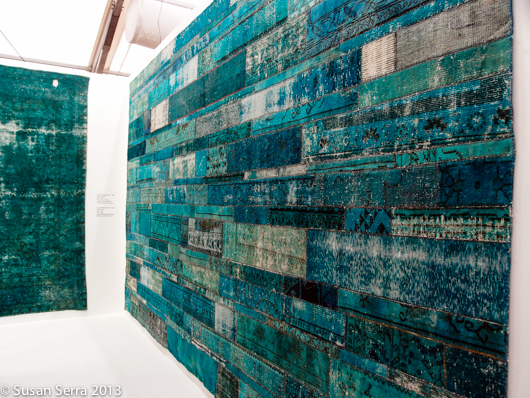
Refreshed interpretation of a traditional woven rug

My passport has been getting a lot of use these last few years as I travel to design events. Upon my return from this trip, as I now think back on it, it's all so worthwhile...and important to my growth as a designer. Interestingly, at a Twitter chat which took place earlier this evening (I've been working on this post for 3 days) these tweets authentically support the BlogTour experience I am speaking of, so I share them here.

 so true! RT : A4 biggest takeaway: theres a whole world out there - embrace it, learn from it#blogtourcgn

 A4 also, to be better designer + blogger get out and live life more, seek to see new things, meet new people

 What blogtours are all abt “: A4 biggest takeaway: there's a whole world out there - embrace it, learn from it #blogtourCGN 

Just recently, Modenus was tapped by the NKBA and other industry sources to bring fresh ideas and insight to the venerable trade show, KBIS 2013 as clear recognition of the understanding Veronika and her team have of designers and what their needs are. I can't wait to attend!

Discover the products in Modenus, read the blogs and other design news within the Modenus site, AND read the blogs of those who have gone on BlogTour - you will find passion, renewed design insight and a little bit of magic that has been cultivated by the BlogTour experience.

Kitchen Cabinet Trends - IMM Cologne LivingKitchen 2013

SO! Now the fun part starts as I begin a series of follow-up posts to my initial breakdown of kitchen design trends I spotted while at IMM Cologne LivingKitchen a couple of weeks back. The first category to focus on is cabinetry style. Without further ado, the gorgeous images!

Cabinetry Style 

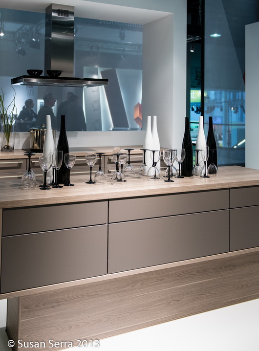
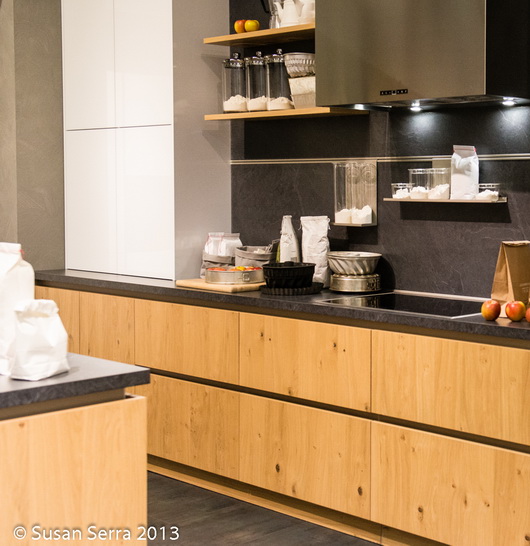
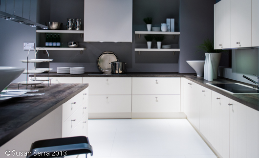
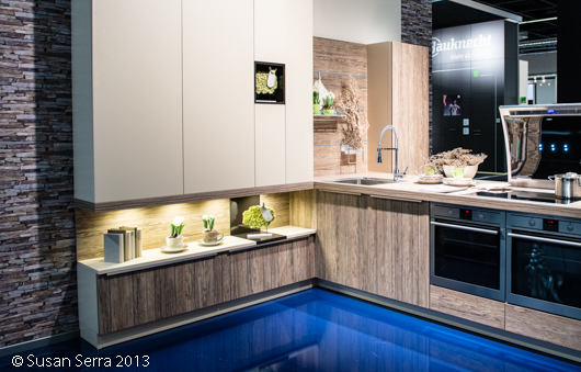
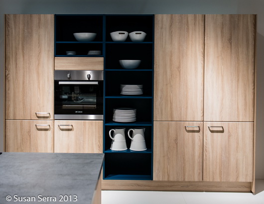
Below: Without equivocation, neutrals remain the stronghold of today's cabinet finishes. White painted or laminate cabinetry, light woods (more than I've previously seen in the past several years) and greige dominate. Black cabinetry is well on the periphery, as are dark wood finishes.

What do you think of these styles? Due to this image-heavy post on just the first kitchen design trend noted, I'll leave it here for now and will be covering all of the trends noted as quickly as possible!

Kelly's New Kitchen - It's Personal, Smart, and Flexible

Kelly's kitchen (see Kelly's picture on the right sidebar and wave!) was just finished a couple of months ago after a year of planning and 2 months of renovation! While our images quickly show the overall design of the kitchen, there are MANY features, both aesthetic and functional, that bear dissecting and sharing with our readers. 

Design is often the art of nuance, and this kitchen is all about nuance!! You'll see how soon - this is the start of our series! In each post, we will provide important tips, insight on how a designer thinks, the collaborative process and product information.

When you design a small kitchen, in this case, close to 200 sq ft, (small for the suburbs, huge for Manhattan-and we have (separate) personal living experience in no less than 6 Manhattan kitchens) every decision, no matter how small, is critical! With no additional dining space in the home and needing to accommodate a wide range of activities, it's a design that is either pass or fail once kitchen living begins post-renovation.

Kelly's new kitchen reflects the choices and compromises of real life needs and desires of a young family in their first home. It's a mix of DIY, designing around architectural elements we chose to keep in place and others that we chose to remove and replace. It's about designing with the end always in sight, including the surprisingly important decorative layer.

The kitchen (as many do) needed to serve these purposes:

  • A social kitchen - comfortable to be in for long periods of time
  • Able to accommodate as many people as reasonably possible
  • Appear as spacious as possible while balancing storage needs
  • Allow for a decorative layer including "real" artwork and treasured artifacts
  • Capable of change, which we will talk about in depth later, possibly the most exciting aspect of this kitchen renovation
  • To add an enhanced dimension of efficiency and function to the cooking process
  • Accommodate multi-functional activities (more about that later)
  • Reflect a highly personal design aesthetic overall

We are fortunate to have wonderful partners who donated their products and who had the foresight to see that this kitchen design would provide intelligent and interesting solutions to common design issues. We're proud of how it all came together, and as mother and daughter, we didn't even have a whole lot of drama during the process! Ok, we each took turns with some creative techniques of persuasion...true enough! I may or may not have coached Kelly on how to present controversial design ideas to her husband, a "trust but verify" kind of guy. ;)

So, thank you to our partners:

Next up, Kelly talks appliances - what was selected and why, where they should be best positioned, features, design integration, and more. Here's our nuclear family-the only one missing is baby Annabelle.

Kitchen Design Trends At IMM Cologne - LivingKitchen 2013

As I get settled in to closely study the nearly 1800 images that I took in a 3 day period at the fabulous IMM Cologne's fabulous LivingKitchen trade fair, I see that this first post needs to simply be an overview of the trends that I spotted. The images that I captured of the stunning displays at the show demand multiple posts, an expanded visual documentation of these trends-coming next. 

I will also be spreading the image love throughout my other social channels, so please follow me here: The Kitchen Designer blog - right here! Sign up for the feed top right or via email, under my picture on the sidebar:   Twitter  +  Google+  +  Facebook +  Pinterest (Pinterest will have both blog images as well as lots of new images from my hard drive). I'm barely beginning to add those images, so check back.

As I look through the images, there are two main categories of design that come to the forefront for me. The first category is those companies whose sole purpose is to be on trend and second, those companies whose purpose it is to do their own thing without much, or less, concern for trends. BOTH types of design are extremely creative, but that word, "trend" can manifest itself in a tricky way if the entire kitchen design one puts in one's home in 2013 is solely based on the hot, new, trends. Like chocolate, trends are fun to indulge in, but an all chocolate diet (while enjoyable to dream of) will cause problems later! Don't trend-binge design! 

Since I also attended this show when it was last held two years ago, it's an interesting exercise to compare both sets of images that I took to get a better sense of how design has evolved in Europe. Here and there, I will be mentioning what's evolved since 2010. And, a thank you to the U.S. and German teams at BLANCO for inviting their U.S. Design Council members, of which I am one, to experience this show with them, providing opportunities for our group to bond as colleagues and friends.

Here are the 2013 Kitchen Trends I Spotted - Brief notes are below with more details/features/thoughts to come in subsequent posts! "M" means it's a mainstream trend throughout the show. "P" means some dots were connected throughout the show but it is not mainstream. "P+" means more than peripheral, less than Mainstream.

Cabinetry

Cabinetry Style:

  • White (lots), light woods, and greige colors - NEUTRALS as a foundation - M
  • Use of texture/natural elements integrated into the design, whether in countertops, backsplash, or cabinetry, often driftwood-y looks, real or faux - M
  • More warmth in the designs overall than I found two years ago-definitely, added comfort - M
  • Gloss or glass combined with texture/more glass in general - P+
  • Color blocking - the color accent of choice for this show was orange! P
  • Blue/dark gray, usually medium to dark GE's new slate finish is on that one! P+
  • Warm, modern design overall - M
  • Usually soft contrast in coordination of material colors in a kitchen display, but sometimes bolder contrasts - P+
  • Use of horizontal lines in overall design (not new, but an important European design element) - M

Cabinetry Features:

  • VERY long drawers, lots of countertop lifts for multi-use (countertops/wall cabinetry/more) and as always-useful, very cool drawer inserts - M
  • Seemingly even shorter toekicks - P+
  • More cabinet cubicles than open shelves-often in unexpected places, always with lighting - P
  • As in 2010, lots of fun and playful geometry in cabinet design - P
  • Integrated benches to rest, sit, or display decorative or useful items - P
  • Tight/seamless appliance integration - M
  • Integrated handles or long, modern, pulls - M
  • Same countertop as cabinet fronts - P
  • Channels between drawers and under countertop - P+
  • Concealed close-like tall and wide sections  - P+
  • Open concept philosophy, considering a kitchen's design connection to surrounding living areas-very clear to me - M
  • Intersecting design elements - P+
  • Open cubicles designed into tall cabinetry for interest - M

Accessories

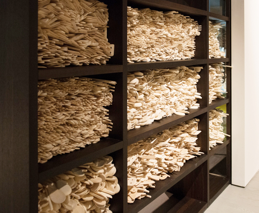
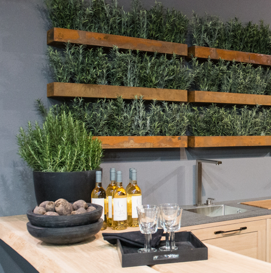
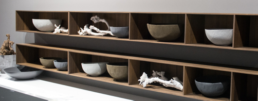
  • Organic in nature via textural ceramics, hand carved wood pieces, real greens and other handmade items - M
  • A fair amount of skins seen on floors and benches - P+
  • Rather than pattern, accessories communicate the style and theme - M
  • Large in size (perhaps to call attention to the display since it is a trade show) - M
  • Lots of rail systems - attention to universal design, seemingly even shorter toekicks - P+

Countertops

  • All thicknesses - super thin, thick, or in between - M
  • Different materials next to one another in a flush installation - P+
  • Patterned countertops - plaid, modern art, new designs (new look, not a trend) - P
  • Glass - P
  • Wrapped countertops - waterfall on each exposed side (not new, but it's still current and is SO chic) - P+
  • Lifts to raise/lower or conceal a cooktop - much more prevalent than two years ago - P+
  • Cooktops integrated flush with the countertop - P+
  • Built in dining configurations - M
  • Intersecting design elements - P+
  • Stainless steel with integrated/seamless stainless sink - P
  • Virtually no granite or marble - just simple, understated, tightly patterned surfaces - M

Backsplashes

  • Simple, plain, continuous, whether wood, engineered stone, or glass - M
  • Sometimes a 1/2-3/4 height, leaving wall space below the upper wall cabinets - peripheral trend - P
  • Very little tile - M
  • Real wood or faux - M

Appliances

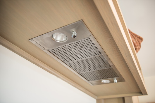
  • Hoods - Look like lamps (not new, but getting nicer) - P+
  • Hoods - double hoods over cooktop - P+
  • Hoods - Integrated/toned down/hidden hoods and blowers - P
  • New, warm, greige mid tone to dark glass appliances - P+
  • Stainless/color mix (reminds me of Whirlpool ICE - P
  • All appliance types very seamless/tightly integrated into cabinetry - M
  • More white appliances seen - P+
  • Ovens concealed - as seen last time too - P+
  • Ovens as an important design element - M
  • Flexible, open, vessel placement (anywhere) on induction cooktop - P+
  • INVISIBLE refrigeration - M
  • Sinks & Faucets - matte, modern, quietly elegant - M

General 

  • Doubles - double hoods, double light fixtures, double cabinets, other doubles - P+
  • Not much vintage/retro/industrial representation - a touch here and there but mostly warm/earthy/modern design - M
  • Occasional attempt at what looks like American Shaker - P

Cool Factor! - Images to come, for now, just descriptions (these are sometimes one-offs)

  • Countertop lifts 
  • Glass patterned countertops
  • Framed multiple ovens
  • Nearly invisible induction burners integrated into countertop
  • Choice of touch screen or knob controls
  • Plaid cabinets
  • Colored glass cabinetry applied as modern art (wait for the image)
  • Awesome, seen more than once, patchwork of wall cabinetry
  • Glass countertop, cabinetry and glass supports in one display
  • Loved the function of a glass sink surround
  • Glass drawer inserts
  • I'm sure I'll select more! 

Lighting

  • LED lights for shelving, around cabinetry, in open shelf cabinets - M
  • LEDS een as a feature in color in appliances (not a trend, just something new)
  • LARGE lighting fixtures, oven seen in doubles over an island - M
  • Simple, rounded, modern shapes in fixtures, often in matte finishes - M

Flooring

  • Lots of light, textured, natural wood, very light, very Scandinavian - M
  • OR, gray or white solid flooring of some sort, with no pattern, perhaps vinyl - M

Dining

  • Benches - M
  • Benches with cushions or skins - M
  • Modern design - M
  • Natural, matte, wood surfaces or matte stone tabletops - M
  • Fresh, modern, designs - M
  • Surprisingly, chairs are often matching or closely coordinated - M

This post is so long that I'm only going to show one image that I took from the show - shortly, LOTS AND LOTS OF IMAGES to illustrate my points above!!!

Leicht Display-Image by Susan Serra


International Kitchen Design 2013 - Introduction to IMM Cologne

Attending the Living Kitchen fair in Cologne, Germany, as a special guest of BLANCO and member of BLANCO's Design Council, is the equivalent of closing your eyes as you prepare to go to sleep and soon after, entering dreamland - kitchen dreamland!

The kitchen dream is intense, one of those really vivid dreams; it takes you to wonderful new frontiers in kitchen design and technology. There is beauty in many forms, you're surrounded by great people, many of whom are real life friends! This kitchen dreamland, Living Kitchen, is an international fair, showcasing kitchen products from 20 countries and takes place in 11 halls, set up like a campus.

For the moment, I'll share a few fun images of large, graphic, design elements that are part of a booth's design as well as accessories that embellish an individual kitchen display to get us warmed up for the posts coming shortly!

At last count, and this is probably close to the final count, I see that I took 1,744 images, with possibly a small amount of more images to count.

I worked this show as I do all shows-with a hunger to find common threads in different product and lifestyle categories among hundreds of displays. And, I love the process of the hunt and discovery!! 

Just prior to arriving in Germany, I spent 3 days in Copenhagen to visit family, collect my Scandinavian magazines that I love so much (19 of them, this time) and run through a number of showrooms to see the latest in Scandinavian design, which I will compare to what I saw in Germany. I have about 650 gorgeous images from those few days - more, beautiful, discoveries!!


I've already categorized all of my images, looked through them to find those common (mainstream) threads, uncovered some peripheral trends, and evaluated a bunch of products and/or design elements that qualify for "the cool factor" which I will also show...and more. There is a wealth of information and images to come, so stay tuned!!


So much more eye candy to come!

BLANCO Sinks & Faucets At Living Kitchen 2013

Just a few days ago, I returned from my trip to the fabulous Living Kitchen international kitchen show at IMM Cologne in Germany. This was my second trip to the Living Kitchen show at the invitation of BLANCO. This time around I paid my own way (except for a few fabulous dinners with the BLANCO team) because I wanted additional flexibility in my schedule while there...not that there wasn't an ample amount of free time-I just wanted complete freedom...so of course, I ended up attending nearly every event!

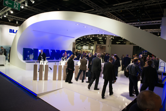
One section of BLANCO's dramatic booth!

I am a member of the BLANCO Design Council, which is truly an honor, as I have the opportunity to contribute to shaping product design and strategy from time to time. BLANCO, while a global brand, has a corporate culture that in my experience with the company over a number of years, feels like a small, local, company (a good one!) The CEO, Achim Schreiber, greets, chats with and listens to anyone and everyone in a casual, friendly, way. I didn't realize who he was when I was chatting with him last week. I thought he might be a local BLANCO distributor or a regular, friendly, guy who had something to do with BLANCO till I found out later. He's relaxed, easy going, friendly and a great listener-a lovely man.

All others connected to BLANCO-in Europe, Canada, US and elsewhere whom I've met over time, are also every bit as friendly and positive from my experience. I have to say, having an interest in "corporate culture", I often observe and try to figure out a company's vibe over time, by connecting the dots from different types of communications and other experiences. I'm convinced that the values of a corporate culture, as has been said before by others, travel from the top down on roads that are either positive, negative, fearful, confused, apathetic, passionate, good enough and so on. BLANCO's U.S. team, a truly great group of people, has a genuine dedication to, and belief in the brand that is remarkable, but let me also say, very well placed.
From my point of view, BLANCO, the corporation, takes the positive, socially intelligent, and passionate paths - from the top down - to create an absolutely superb range of products that has that desirable mix of precision engineering and beauty. BLANCO's products are at once on trend and reflective of a classic modern design which renders them timeless. BLANCO does a whole lot of things right. They know their customer...very well.

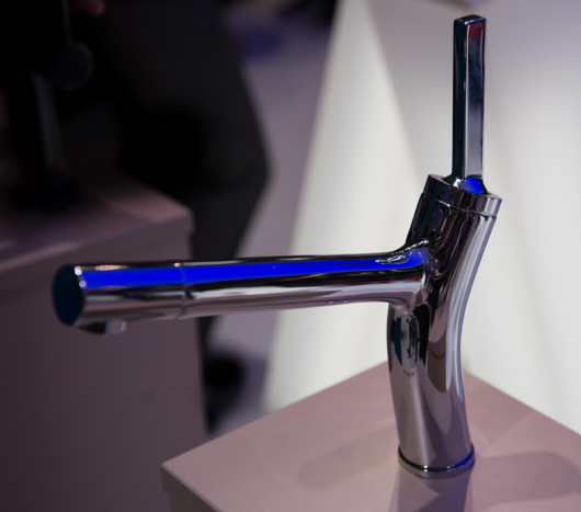
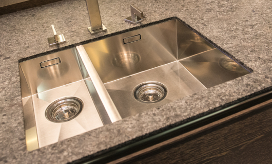
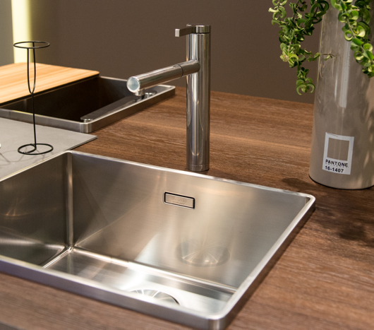
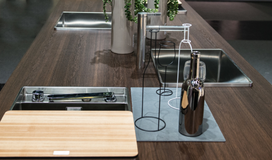
Ok, time to see some of the gorgeous products that I shot from the show floor. Some products are not available in the US, many are, but the point here is to help you experience that special mix of design and engineering. Take a look at swoon-worthy kitchen sinks and faucets!

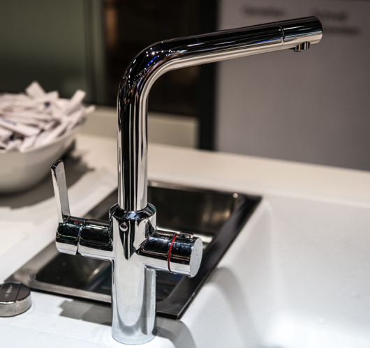
Above: The new BLANCOLIAN kitchen faucet

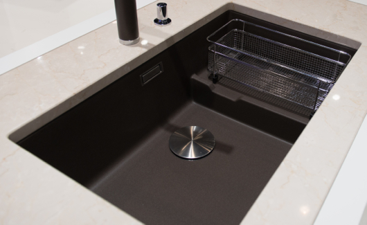
Above: Note the understated, elegant color, Truffle, the continuity of the flowing lines of the drainboard and the stainless steel rack, the simplicity of the drain cover, and the overall form of this top mount sink.

Above: BLANCO's new faucet, BLANCOHOT, that supplies both near boiling water as well as normal hot and cold water from a single spout

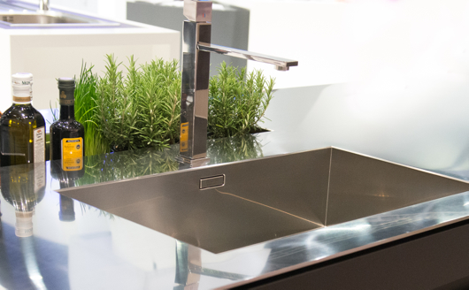
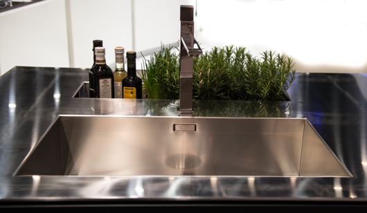
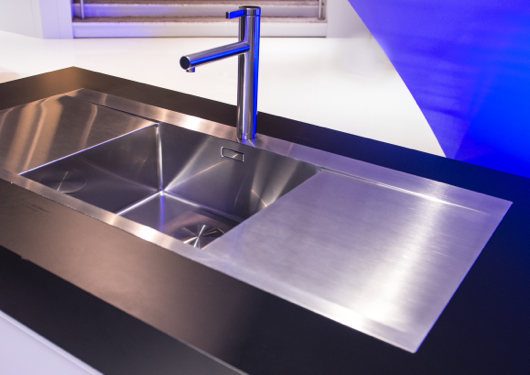
Above: Simply, precision stainless steel sink and faucet

Above: A sink with a beautiful form featuring an edge with an interesting, modern dimension

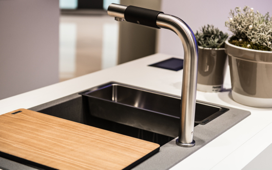
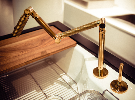
Above: A beautiful island in BLANCO's booth - note the faucet that can be lowered to the sink surface and covered with the cutting board - flexible design

Above: Seamless, stunning, stainless steel

Above: Another shot of this fully integrated, elegant stainless steel BLANCO SteelArt sink and countertop

Above: A new faucet by BLANCO which is easy to operate-ideal for universal design purposes by twisting the soft black section back and forth and side to side to operate flow and temperature

Above: A new take on mixing materials - note the stainless steel trim, the indestructible Silgranite material in the sink and coordinating finishes in the faucet - elegant

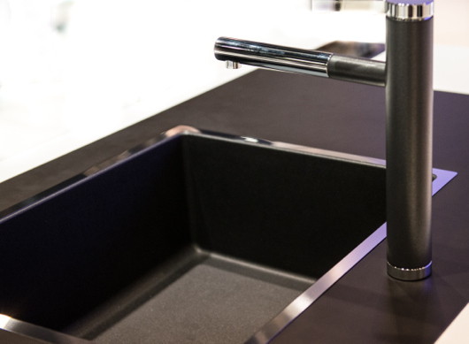
Above: BLANCO's new color, Cinder, with matching color on the faucet as well as a useful sink, sectioned off by a lower separation for design flexibility, once again

Above: BLANCO SteelArt, useful and beautiful - I could see this paired with a wood countertop for those who are fearful of mixing sinks with wood tops

Above: Simply, a close up of that precision engineering - I happen to really love BLANCO's use of stainless and matte colors on their faucets

I hope you have enjoyed these shots and that they communicate BLANCO's dedication to quality and design!


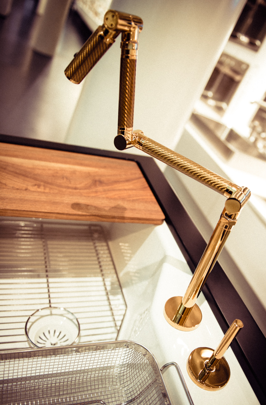
Kohler Karbon Faucet

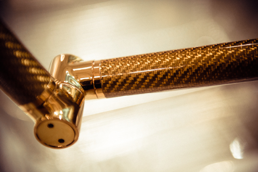
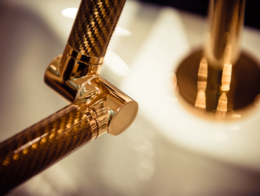
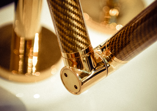
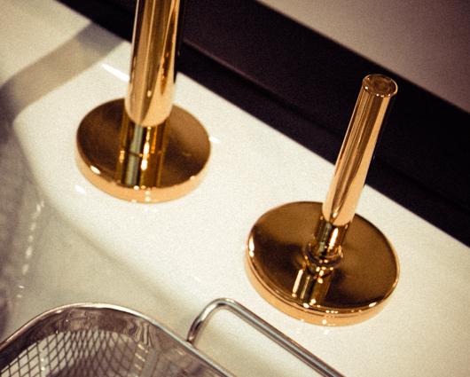
I had the opportunity to go to Kohler, Wisconsin in October, courtesy of Kohler, to attend the Kohler Food and Wine Festival, quite simply, a food and wine fantasy weekend escape! While there, I had so many wonderful experiences which I will share here and there, but as I casually went through my images today, I was struck by those I took of the Karbon faucet at the Kohler Design Center, here, in the Vibrant Moderne Brushed Gold finish. How gorgeous is this faucet? It's like owning a sculptural, or 3D, piece of art in the kitchen. It also comes in a wall mounted version.


My Appearance on Martha Stewart Radio - Holiday Kitchen Decorating!

On Tuesday, (today) November 26, just after 8 am, I'll be a guest on Martha Stewart Radio talking about decorating in kitchens and dining areas. There are SO MANY great ways to express your personal style in the kitchen during the holidays that both Kelly and I came up with for whatever your version of holiday is. 

SEE OUR PINTEREST BOARD ON HOLIDAY KITCHENS HERE

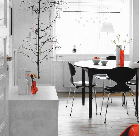
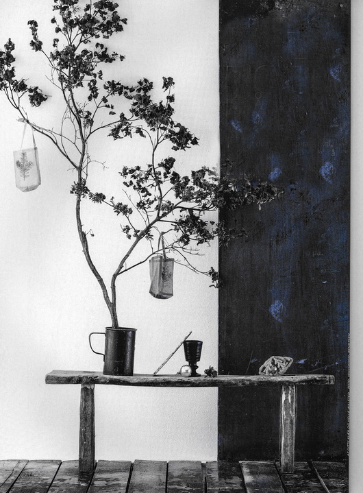
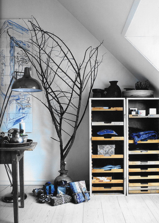
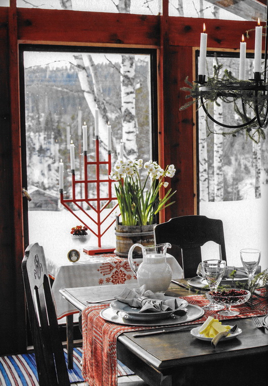
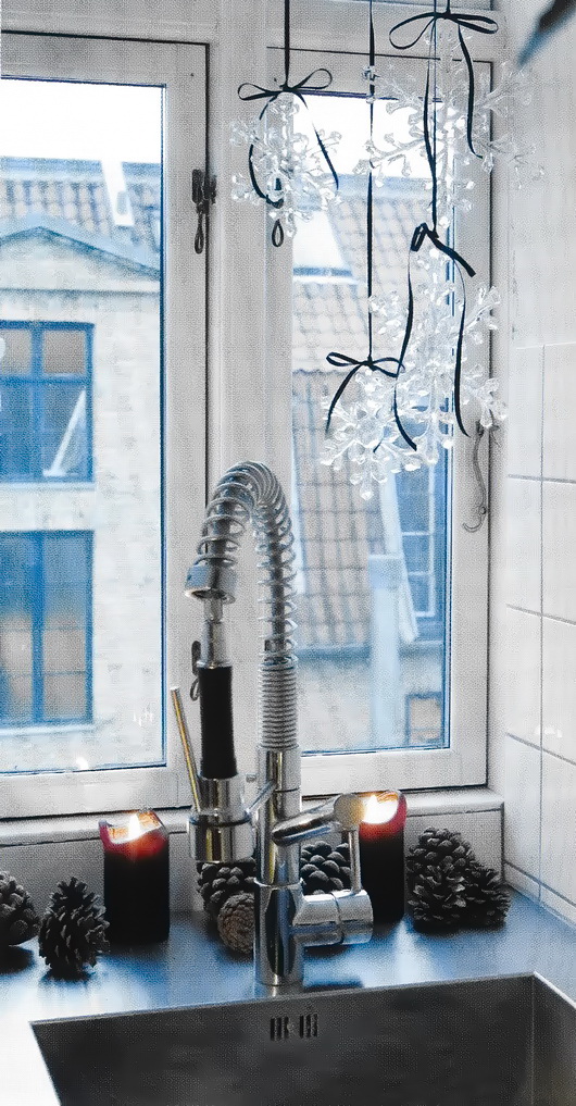
Below are a boatload of tips on holiday kitchens along with some images of a Scandinavian style holiday from Bolig Magasinet and Skona Hem.

I suggested that I chat with the hosts of Morning Living, Brian Kelsey and Betsey Karetnick about tips for decorating the kitchen as well as tips for helping the kitchen function better. I definitely got carried away and brought with me way too many tips than time allows for - but that's what this blog is for, to fill in the blanks!

KITCHEN DECORATING TIPS

Pick a theme! Modern, traditional, natural chic, farmhouse, urban - coordinate with the theme of your home's existing design OR add a small mix of another style if you want a fresh look.

Remove the artwork in the kitchen on one wall - hang a collection of wreaths fairly close together to appear as one arrangement, of various types and sizes to add lots of texture and interest!

Bring winter nature inside - birch branches, evergreen cuttings, pine cones in bowls, any kind of branches will do. I often cut evergreen cuttings from the back of a shrub and I just recently cut down some dead cattails for a stunning indoor display. I will add white twinkling lights inside the tall glass vase!

Spray paint pine cones and simple twigs a metallic gold or silver for a little holiday bling.

Arrange oranges studded with cloves for fragrant pommander in decorative platters or bowls.

Add small kitchen utensils to garland draped around cabinetry - a single theme of different shaped/sizes of wooden spoons around a large wreath, or a mix of utensils in red and silver or blue and silver - or all white looks festive. 

Add a string of lights and/or garland around the bottom of the kitchen island

Add big, gold, red, silver, white or blue bows to the back of kitchen chairs and stools

Collection of 10-20 glittering ornaments on ribbons, hung from one point in the ceiling so they fan out - put them in front of a window, over the island OR add them separately, hung from the ceiling, for a look of charming chaos.

Above the kitchen wall cabinets, add brightly wrapped boxes for a clean, bold, look.

Have some extra space in the breakfast room? Put a small tree, decorated in white lights in a worn gray metal bucket.

Gather silver serveware and arrange the pieces in a collection. Add metallic ornaments, tinsel and other festive ornaments plus a touch of evergreen or red.

Candles, candles, candles - especially in small kitchen pitchers, clear coffee cups, glasses.

Tea lights in mason jars with red ribbon tied around the mouth of the jar.

Branches wrapped in yarn, placed in a vase with felt ornaments hung on it.

Pitchers with an assortment of outdoor greens, cranberries, metallic touches and/or spray painted branches add life to the kitchen - make the arrangements as tall as the receptacles allow!

Put ornaments in and around a decorative bundt pan and wrap the bottom with pieces of small green garland. 


TIPS FOR A USEFUL HOLIDAY KITCHEN

Keep serveware at the ready.

Bring out holiday dishes and after the holidays, use them all season, not just for gatherings.

Bake a few batches of cookies and muffins to freeze for impromptu holiday gatherings or gifts.

Purchase or make a cutting board to cover the cooktop to add additional counter space, especially for entertaining, when the cooking is done. Make it a bit wider than the cooktop on sides and front to back, and a bit taller than the cooktop for a seamless fit.

Cook meals that can be served in the same pot they were cooked in via stove to table cookware such as Le Creuset or Staub.

Clean the countertops and hood filter in anticipation of heavy use.

Clean the countertops and reasses what really needs to be there with the goal of finding more counter space for intense cooking sessions!

Arrange spices in alphabetical order!

Arrange pantry items in categories - baking, cooking, snacks, cereals, etc.

Gather together measuring cups, spoons, baking equipment and other like cooking equipment and store near point of use in the kitchen for easy access.

The holidays are a hectic time, but with a little organization and a festive environment, the cooking, baking, prep and cleanup process may lower your stress level and allow for FUN to become one of the most important ingredients in the kitchen! Bring on the cookies!


The Kitchen Countertop - Where To Put The Philips Saeco Espresso Maker!

Whether you are a domestic goddess, work at home or can't wait to get home after a long day at the office, I can report that, I for one, seek out a little treat here and there during the day. It's a reward. And, it's most likely going to be a short or a tall cup of good coffee - and could well be a quick shot of espresso.

Funny thing is - over the span of 25+ years, I never drank coffee. Maybe here and there in a restaurant, sure. Never every day. Since my husband retired from a work injury nearly 3 years ago, little by little I joined him for a cup of coffee. Now, I'm up to 2 cups a day, one of which may be a shot of espresso or a capuccino, one of our favorite food groups!

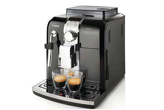
He or I would go out to get the afternoon shot of espresso, so when the nice people at Philips Saeco asked if I would be interested in reviewing the Philips Saeco Syntia espresso machine, I felt it was a natural fit into our lifestyle-and hopefully into the kitchen countertop, which I was quite curious about.

Owning your own personal espresso machine is an enhancement to your lifestyle, I can definitely say that. The Philips Saeco Syntia has rapid steam, a quiet grinder, an easy-clean system, large capacity 40-oz water tank and so many other cool and highly technological but easy to use features. It has an understated beautiful design and is quite compact. 

Which brings me to the larger issue of finding room on the countertop for an espresso maker. Here are some tips:

1. How often is the espresso maker used? If daily or several times per week, it deserves easy access. 

2. Consider a coffee station in the kitchen.  A spot where cups and mugs are stored, one or more coffee makers, utensils, other coffee accessories, teas and more. 

3. Mugs and cups - Begin a collection. Half the enjoyment of drinking coffee is to drink from a beautiful cup. Select the proper cup according to your mood! Display your cups too!

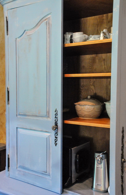
4. The coffee station can live in a kitchen armoire that looks like a piece of furniture, such as a breakfront, with retractable doors, serving as a gracious spot to easily prepare a favorite beverage.


5. Scan the countertops - In a small kitchen where space for a coffee station is often not available, check to make sure that over time the countertop has not adopted other small appliances or decorative objects that are not being used. Declutter, scan, rearrange, and chances are a spot can be found for the espresso maker.

5. The compact size of the Philips Saeco Syntia espresso maker can fit easily within the typical backsplash height, a critical issue when shopping for espresso makers if it will live on the countertop, but be sure to check your backsplash height before purchase.

6. Besides its size, is it a good looking piece of equipment? If small appliances are going to live on my countertop, I am fine with that, but it is also important that they have a look of quality. Is that true for you too? 

7. Simple lines without an abundance of dials, knobs and other projecting parts will add far less "visual clutter" and will appear more elegant and more visually quiet on the countertop.

8. Alternatively, the espresso maker can have a home just below the countertop in a cabinet with a roll out shelf, or on an upper open shelf, if use is somewhat less frequent.

I have experienced nothing annoying or bothersome about this machine at all and I love the glossy black finish. It's not immediately intuitive - you have to sit down and read the manual or the quick start guide (who doesn't love a quick start guide?) It has both text and simple pictures to get you going, which I appreciated and needed.

It's great to have lots of wonderful features in your espresso maker of choice, but first, take a look at how you can best integrate this new treasured appliance into your existing space. Check features, dimensions, style and you will find the perfect spot.

Cultivate.com Renovation Diaries - Kelly's Kitchen Remodel

Kelly and I are extremely excited to announce the start of a series in Cultivate's Renovation Diaries on Kelly's kitchen remodel which starts today!

We are, right now, in the thick of the remodeling process with (literal and emotional) sparks flying, changing decisions, agonizing over details, declaring the progress GOOD (sometimes after a change or three) and all that goes along with a remodel of the heart and soul of a home executed by a bunch of hearts bound together as a family.

Join us for this five-part series on Cultivate, coming to you on each of the next five Mondays, beginning today.

I'm not controlling. Just because we had this email exchange about our Cultivate portrait:

On Thu, Sep 27, 2012 at 8:13 AM, Kelly Serra Donovan <Kelly's email address> wrote:

other way around!

On Thu, Sep 27, 2012 at 7:53 AM, Susan Serra <susan's email address> wrote:

We could do a funny pic of me inside the house and you peeking through the window...just a thought!

It has no bearing on my thought process - really! ;)

We would like to acknowledge the generosity of our partners - Bosch, Silestone, Kohler, Hafele, Kravet and Kessebohmer who shared our vision by donating products to create a "different" type of kitchen that, with smart product choices and an innovative floor plan, would provide inspiration to others to make your kitchen "your own." Cabinetry is by our brand, Bornholm Kitchen and the kitchen will feature beautiful accessories from Scandinavian Made as well as from Kelly's personal collection.

The first five posts as well as the big reveal will be seen on Cultivate, and after that series is over, end October/early November, we will have much more to talk about on this remodeling journey right here!

New Kitchen Product Introductions

I thought I'd share some great products that I have discovered recently. It's something I should do more often because there are so many truly great products being introduced all year. I'll try to keep up the product info!

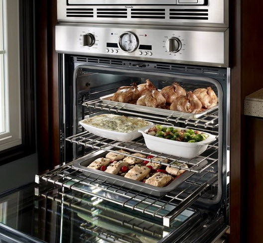
Thermador presents its 2012 line of built-in wall ovens. Who doesn't love to see the latest appliances?? You have the industry's only "softclose" door, the largest commercial style rotisserie with a 12 lb capacity (sign me up), a super large oven cavity at 4.7 cu. ft., the fastest preheat, a 2-hour self clean mode and a lot more! The design, as always, is VERY beautiful. Do you like the knobs? I do.

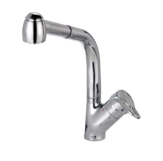
On the green front, it's well worth noting that BLANCO has recently introduced 9 new kitchen faucets that are focused on saving water in a significant way. With a 20-30% reduction in water consumption, these faucets give you both style and real life energy savings. The HYDRA faucet is ultra efficient, conserving 30% water usage over conventional faucets. 

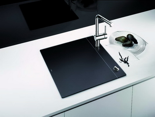
Another winner by BLANCO is their recently introduced Crystalline sink, available in both black and white. We want our kitchens open. At the same time, we have small kitchens. Now you can entertain in style with a "closed" sink, and during periods of prep, or entertaining for that matter, you have additional worktop space. This is not a small product feature. I think it's huge both due to its many functional properties as well as its fabulous looks. Keep things chilled, hide dirty dishes, work on it, put stuff on it, use it partway on, partway off for all sorts of functions.

ThinkGlass is one of the most creative glass brands I know of. An eco-chic solution, ThinkGlass tabletops are made from 100% recyclable glass. I like the textured finish because of its highly durable properties - no staining and it hides smudges and scratches, unlike wood tables! Practical and stylish.

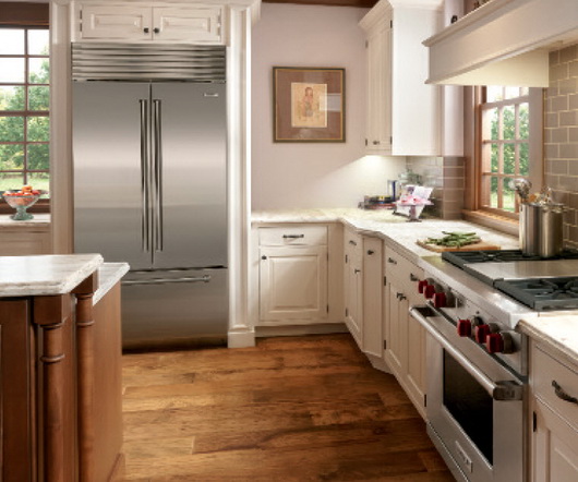
Sub-Zero now has a French door refrigerator. Great for galley kitchens where you want full size/built in flexibility but cannot install a full width 36" door, here's the answer. Perfect for apartment dwellers or those who have a tricky refrigerator installation where a full width door would pose a problem. It's available in stainless steel with a choice of handles or as an overlay model. Some people think there are energy savings to opening one small door - depends on if you know where things are located in the refrigerator, but that could also be good, green, thinking.

Lots more cool products to show you, coming soon!


A French Kitchen Renovation

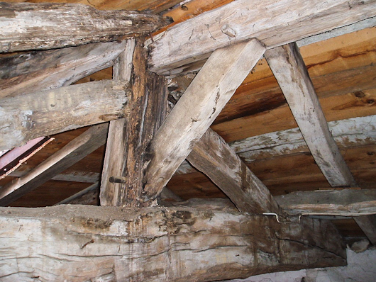
Some time ago I corresponded with an American living in France who was about to undergo a kitchen renovation in their 200 year old home in a small French village. We talked about working together and for various logistical reasons in connection to the renovation work, it didn't work out (trust me, my bags could have easily been packed in short order!) 

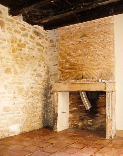
I was so pleased to receive an email yesterday (months after our conversations) with images of the home with its bones exposed...and intact! The home is small. The first floor is 220 square feet and will serve as the kitchen which also features a wood burning fireplace. I am told that the front interior wall will be exposed stone. The homeowner says, "The floor under linoleum is original terracotta tile." Original.Terracotta.Wow!

They will be installing traditional French kitchen cabinetry, made by a local shop called Muebles Baluteau - just look at the beautiful cabinetry in the website. I feel like I've stepped into a French fantasy when I look at some of these pieces.

The whole point is, I wanted to share these cool images with you. Normally, when a house is gutted in the states, we see wood studs, pieces of sheetrock and a plywood subfloor. This gutted space is a beautiful sight to behold!

Below, pretty crazy construction with hand hewn timbers:

Below, a lovely combination of original materials - stone, terracotta, hand hewn beams, a simple and elegant fireplace, and beautiful, narrow brick. 

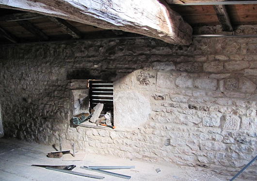
Below, another view of stone, a staircase and large, hand hewn beams:

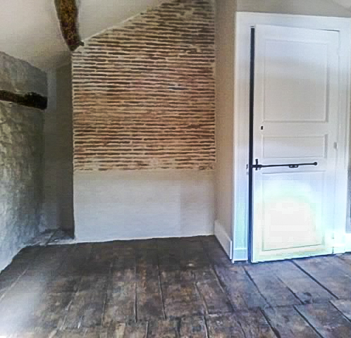
Below, more beautiful, original and authentic surfaces

Below, once again - fantastic, preserved, materials

What a privilege to take a look at the exposed interior of this home. I hope to share more images with you as the renovation progresses! 

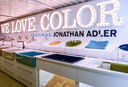
Kohler Colors by Jonathan Adler

As color, wonderful, bright, bold, free-spirited, color, has moved into the center of our lives, seen in our clothing, in our interiors in so many forms, in our outdoor living areas - and in all sorts of graphic design online and in print (and that is just for starters-as we know, color has upped its presence everywhere) it makes me think that such a significant part of Kohler's culture has been color-focused.

Kohler has had a love affair with color, and few would disagree. Kohler has quietly kept an exceptionally wide range of colors in its collection of products year after year. Although white is king in the kitchen and bath and always a classic, nevertheless, Kohler's commitment to color has been enduring - and passionate! Even if you really dislike a color, I KNOW, as a designer that any one of Kohler's colors is able to play the perfect role, whether bold or understated, a focal point or a quiet design element, in every kitchen and bath - yes, even those peachy, fleshy tones (pair them with white or charcoal for a sophisticated look!)

Take a look at this very interesting, brief, history of Kohler's colors. I loved looking at Kohler's color timeline.

Jonathan Adler Colors

It is with real interest that I observe Kohler's special edition colors by Jonathan Adler. I view these four colors as decidedly non-trendy colors, which is to say, they are colors that you can use to clearly personalize your kitchen or bath that will stand the test of time, and I do not say that lightly.

The colors, Piccadilly Yello, Greenwich Green, Palermo Blue and Annapolis Navy, are not neon - the color darling of the moment. THESE colors can be translated into a kitchen design that can be centered around elegance, country comfort, modern design, or one with a playful theme. These colors are versatile....thus, personal!

Quite honestly, I purposely did not read the press release about these colors because I wanted to go by my instincts as a designer when I went to see the collection in person. It's often a practice I employ for many new product introductions. I knew as soon as I saw this collection first hand, taking my time to work through the colors and sink configurations, that design flexibility is built in, in a very, very smart and aesthetically pleasing way. Surely, that was Kohler's intent-intelligent design flexibility.

I have to say that Kohler is providing the tools for pretty much wherever your design inspiration will take you...so many tools!! The Jonathan Adler collection is available for a limited time but the colors will prove to be enduring - sweet!

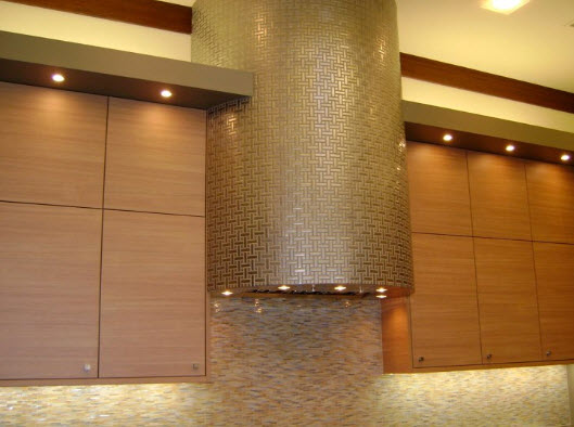
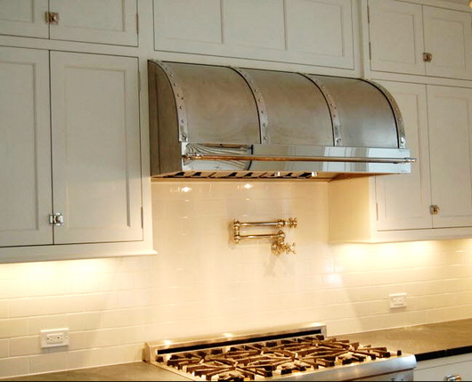
Modern-Aire Ventilating

I know of Modern-Aire Ventilating for many, many years. I know it as a bit of an under-the-radar resource for ventilation products, usually specified by professional kitchen designers. I know Modern-Aire to be highly reliable, super flexible as to what they are willing to do for their design professional clients in terms of customizations and they are also a manufacturer of high quality products. It pretty much says it all.

Modern-Aire has their own collection of, let's say, standard hood sizes and designs as well as a broad/standard palette of colors. That is only the beginning, however. Take one of their standard hoods and design it any which way, and/or make it Sky Blue Pink and the folks at Modern-Aire are all zen-like about it - it's your world. 

Don't care for the standard hoods? Design your own. Reinvent the wheel. It's all good.

I always firmly believe that the culture of a company, good, bad, or indifferent, is reflected by philosophies and attitudes of those at the top. I have had the pleasure of getting to know a few of the people who run Modern-Aire and they're all zen-like too - in the best of ways....pleasant, happy, enthusiastic people, passionate about their products. Can you be zen and passionate simultaneously? Yes!

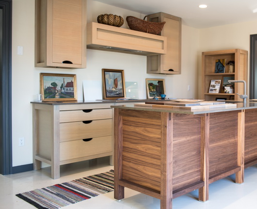
But, wait, that's not all!! Designers like flexibility. I had a plan for the Bornholm Kitchen display at the Sag Harbor showroom of Kitchen Designs by Ken Kelly to design an interior ventilating system that would be a) short in height b) powerful and c) able to have its duct directed straight back rather than vertical in order to allow for a completely open space above the short, horizontal, hood. 

I brought my problem to Trevor Lawson at Eurostoves and he came back to me with the solution - problem solved. Sometimes a design will call for an understated, yet powerful, ventilation solution. There are precious few companies who will reinvent the wheel 7 days a week, but Modern-Aire does that. 

Trevor has special programs and benefits for designers and other trade professionals who specify Modern-Aire. Service is one of those benefits. You can't rattle Trevor, he is a sea of calm, and he is a wealth of information. As a designer, I know Modern-Aire will do what they can to figure out how to give me what I'm looking for. So many companies default to "no.....because...." and that's why this is all so glowing - Modern-Aire does not do that unless physics tell them otherwise. So, then, what we have is design flexibility, high end quality and superb function. Simple.

Kitchen Design Chat

Although I'm already working on negative time during every 24 period (I'd clone myself but the clone would prove to be too annoying) it occurred to me many months back that I'd really love to talk (live) about kitchens on a regular basis. 

After a long career thinking/dreaming/plotting/planning about every single, little, aspect of kitchens, and coupled with real world hands on experience starting from producing my own drawings (always), to order writing to project supervision to 2 hernia operations from hauling cabinet parts off of trucks at the jobsite and everything in between, I know that there is so much to talk about! 

The chat is:

  •  #KDChat - This is the Twitter hashtag for the chat
  • The chat takes place every 1st and 3rd Mondays
  • It begins at 5pm ET

Here are some initial ideas on topics that we will discuss and these will be specifically noted on the official Kitchen Design Chat site. The social kitchen, the healthy kitchen, the technological kitchen, the aesthetic kitchen, the functional kitchen, the sustainable kitchen, the accessible kitchen are but a precious few topics, each of which has many pieces to it to focus on.  Some topics will be practical, some-deeply thought provoking, but the spirit of the conversation is best, to me, to be casual, honest, free spirited, filled with friendly debate and lots of interesting conversation. We will also talk brands, products, materials and overall design.

FOLLOW #KDCHAT HERE:

@KDChat_ on Twitter (embrace the underscore!)

#KDChat when we chat

Kitchen Design Chat Website

Kitchen Design Chat Facebook Page


Please join me. The kitchen is the only room of the home that touches all five senses - there is much to talk about and share!

THIS kitchen is all potential!


House Beautiful Kitchen of The Year 2012 (KOTY) Designed By Mick DeGiulio

I always look forward to attending House Beautiful's Kitchen of The Year and this year was no exception - it's one of the highlights of the summer for sure! House Beautiful is such a great American brand (I love great American brands partially because they have trudged through so many crazy times-in this case since 1896) with lots of good old American sheer determination. Impressive, to say the least. But, I'm digressing a bit. Point is, I have great respect for House Beautiful and what it has stood for and this is a good excuse to express that!

This piece will be a critique, as it has to be, in one sense, since I've been a certified kitchen designer and owner of a kitchen design studio for many years. For this reason, my perspective on this kitchen must include both pros and (constructive) cons.

Mick DeGiulio designed the KOTY (Kitchen of The Year) for House Beautiful. I've known of Mick's work for many years. Mick is a talented kitchen designer and produces exquisite kitchens. At the press event last Monday, in opening remarks, Newell Turner, EIC of House Beautiful, said: "Mick DeGiulio is one of the best kitchen designers in the country, if not THE best kitchen designer." That last part immediately threw me for a loop and I can't not address it!

Being very involved in the kitchen industry in various ways, which includes having built/financed a website for kitchen designers that was in place for 8 years with thousands of members, serving as a judge of kitchen design contests, and having a wide circle of kitchen designer friends and colleagues, I know that there are MANY kitchen designers throughout the U.S. who do truly amazing (amazing) work. 

So, as a long time ally/friend/passionate advocate of the kitchen design profession and supporter of kitchen designers (the good, dedicated ones) the first part of Newell's statement has a good deal of merit to it, but the second part does not. It's very important to add in a little real world perspective. 

Following is my critique of this year's House Beautiful Kitchen of The Year, and here we go!

THE KITCHEN - THE GOOD

Open Shelf/Breakfast Section: The kitchen as a whole is lush, it's gorgeous, it's luxurious, it's stunning. The separate area, "la mattina", Italian for "morning" is a wonderful, highly useful area in which to prepare a light meal. The storage behind the backsplash of fabulous Ann Sacks tile with a beautiful visual depth to it, is a fantastic idea. I have seen a strong upswing in the use of sliding doors for upper, lower and tall storage this past year.

This backsplash storage area solves several problems - it reduces countertop clutter, provides a home for small appliances, is a virtually (visually) seamless design element and is great to use, ergonomically. It's very smart, too, to continue the tile on the inside of the storage area. The open shelves add charm, but not just charm, CHARM. Charm meets elegance meets usefulness in this open shelf feature.  Nice hardware and nice configuration of base cabinetry in this section. The non white toekick creates a floating effect for the cabinetry.

Chrome and Stainless Accents: What comes to mind next are the polished chrome accents throughout the kitchen. They are smart and stunning. This accent adds significantly to the luxe feeling all around the space. You do not normally see a wood hood trimmed in polished chrome, a simple but very creative touch. The polished chrome trim surrounding the tall appliances-oven and refrigerator, was also highly creative. The trim makes the refrigerator look high end and the ovens are just beautiful. Appliances by Whirlpool. I'm crazy about the brushed stainless steel handles on the white refrigerator. It could have been a no brainer to do a stainless refrigerator but white works well in this context.

Cabinetry and more: The tall pot/pan storage with glass doors, dark gray lower cabinets, brushed stainless interior and polished chrome and glass exterior, left of the cooktop section is (that word again) stunning. This grouping of tall, dark, cabinetry visually balances the larger white cooking section to its right. Speaking again of the emerging popularity of moving panels, this design element, used behind the cooktop for additional storage is a useful and smart feature, especially with the dark gray contrast behind the panels which showcases colorful spice jars.

The cabinetry, (all) by KraftMaid, on the island is beautiful, and I love the hardware. The variety of countertop edges adds interest and is another opportunity to create unique design elements throughout the kitchen. I love the feeling of the zen-like sitting area - overall, it's all about comfort. 

High/Low Budget: This kitchen illustrates how one can selectively choose fabulous (and fabulously expensive) products as well as very affordable products. It's a strong trend in kitchen design today, and a smart one. 


Get the flash player here: http://www.adobe.com/flashplayer


THE KITCHEN - CONSTRUCTIVE CRITICISM

Misc. Observation: This has nothing to do with Mick's design or any sponsor - it's just an observation but as a kitchen designer, I can't resist. The wonderful non-cooking lite meal prep area with the open shelf feature begs for a refrigerator drawer due to the main refrigerator being situated so far away. Whirlpool does not offer an under counter beverage appliance, so that was not possible to include. I might also have wanted to include a single drawer dishwasher or a small, 18" dishwasher, given there is a good sized sink in this section.

The Island: Looking at the island when standing at the sink, the white dishwasher really stands out to me as being a very different white than the white cabinetry. In a kitchen with so many luxury touches and finishes, it does not work, especially, too, with a very modern handle next to traditional hardware.

First, there could have been a piece of the stainless toekick attached or otherwise adhered to the bottom white access panel for a continuous toekick on the island. Second, since this dishwasher does not take a front wood panel, a stainless steel dishwasher should have been used here. Here's why: the white (different colored) dishwasher is viewed as a large, unadorned white slab, visually incongruent with the busy surrounding cabinetry. The white monolithic refrigerator fares much better being separated via chrome trim from the different white of the nearby cabinetry. While the opposite argument is that a stainless dishwasher is visually "choppy", it's an upgraded and improved look, more conducive to inclusion in a KOTY design.

I do not love the island in general. I think it is too big (and I do love big islands) and/or it could have had a more interesting cabinet configuration, and general shape. I would have positioned the wood countertop section about an inch or so above the Caesarstone white countertop and made the Grothouse wood countertop thicker. I think a little dimensional interest with this separate countertop section would be a natural choice. I did not care for both countertops being on the same plane.

I would not have added the open shelf lower cabinet facing the table - it just does not seem to contribute design value to the kitchen as a whole or to the island, specifically. I would have included a 3rd white/dark gray cabinet there or designed something entirely different. As is, I would have added more space in the island seating area and taken away space from the cabinets at left - the seating area seems slightly out of proportion to the cabinets at left.

Actually, when viewing the island and cooking wall from the seating or dining area, the short/wide cabinets behind the island do not balance well with the tall, narrow dark gray pot storage cabinets just beyond. Balance and proportion of these lines seem off to my eye. One does not always have to follow the rules, of course, but I'm not seeing a visual connection here.

Cooking Wall: At the cooking area, I'm not sure if the hood, notched up into the soffit area above was intentional or a mistake. The execution looks a little awkward to my eye. It does look very out of proportion to the 30" cooktop in this particular context (although an enormous hood over a smaller cooktop is done in highly styled kitchens but is a design element used most often over larger cooktops/ranges.) I would have added a second 30" cooktop, two cooktops side by side, relating better to the hood, and configured the lower cabinetry differently. With an island this large and with multiple work areas in this large kitchen, this section needs more than one 30" cooktop!

Living/Dining Areas: I like living flexibly, and I may have put casters on the upholstered chairs, loveseat, or both so that the furniture (by Kravet) can easily relate to the table or the island or both on a whim. There was ample room for a larger sofa, in part, to balance the very large island. 

I can't say that I am on board with the concept of a small dining table. With such a large kitchen (and a large island) presumably, the kitchen, being talked about as a living area, also requires either a larger dining area that is more proportionate to the island and other kitchen elements, or, a table that is capable of expansion. The living and dining areas looked unnecessarily small to my eye. 

I assume that the higher than normal coffee table can duplicate as a dining area. I did not sit and experience the upholstered chairs and table. I would like to have known who the TV serves, the dining or sofa area or both. I may have tried lining the right edge of the tv up with the left edge of the fire wood recessed enclosure. 

Refrigerator/Oven Wall: My eye very quickly wanted the trim area immediately surrounding the refrigerator to be brushed stainless steel to coordinate with the brushed stainless cabinet above the ovens and on the ovens themselves. I think that would have been a perfect opportunity to further tie in height-wise, the refrigerator and oven sections. Overall, this wall is a little awkward and the vertical lines in the center cabinet are busy.

Lighting: I would have added lighting within both backsplash storage areas and in the pot/pan cabinet as well. If it was there, I missed it.

Overall: I would like to have seen more artwork. The lack of color was obviously part of the plan (except for Kohler's gorgeous sinks) but it did not leave me with a warm feeling as I experienced the space despite touches of linen and other textures, but with a cool, formal feeling overall. With this much time taken to critique the kitchen, there is no time to discuss the butler's pantry. I'll say this - awesome countertops and ceiling treatment! I mentioned that the various countertop edges were a creative touch and they are, but, and this is a quibble, I feel it was one "note" too many to do the thinly wrapped countertop at the cooking wall.

CONCLUSION

It is certainly unclear how much time is available for a designer to micro manage this (KOTY) project. I think it's important for a designer to do that (micro manage it) and I hope House Beautiful provides adequate time, and I also know, having designed and produced many projects this size, that it can take many months and super focus to get your head fully into the details to get it all right. Delegation to others vs. complete hands on control vs. a combination of these is also a factor in how a project comes together.

Some issues above are more significant to me than others. I leave it to you, the reader, to decide which issues are more or less important for you.

And, then there's this: everyone's a critic! Actually, I think I may be the only one! But, this critique and analysis has been done in the spirit of pointing out that there are many ways to experience a kitchen design as well as to offer my detailed professional interpretation and insight, hopefully, in a constructive and interesting (ok, I know it's a tome) way. It sort of took on a life of its own... I know one thing - it's an exciting event and it always stirs the senses!


French Kitchen Design - Paris Inspiration!

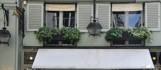
As the Tour de France (which I LOVE to watch every year, often multiple times a day) is heading toward the great finish in Paris this weekend, my thoughts this morning went to the incredibly inspiring colors, textures, materials that I encountered in the streets of Paris over a week long leisurely stay. I've been compelled to write about the Tour de France and kitchen design more than once!

I started looking at my many images of Paris. I began to look at which pieces within a given image could be used as design inspiration, to be translated into a kitchen plan. By looking beyond and around the objects in an image, you can bring a sort of abstract yet highly authentic design concept into a kitchen design. Open your eyes and your mind and the inspiration will come!

Inspiration for your kitchen design theme can come from travel, nature, your home town, a literary work, really, anything. It doesn't have to come solely from looking at images of other kitchens! By looking elsewhere for inspiration, in unexpected places, you can create a kitchen design that is highly personal. That, to me, is a very exciting way to plan the aesthetic layer of your kitchen!

I isolated 40 images that I felt had great ideas that could be translated easily into design concepts. Maybe I'll do a few of these posts. 

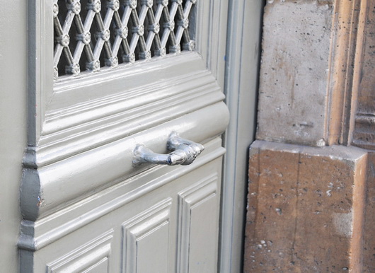
Below: Soft, calm, green-as-neutral accented with a small amount of black and oh-so-elegant soft and light silver...music to my eyes and what a color palette for a kitchen. Don't miss the gilt gold factor!

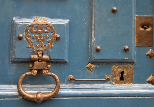
Below: Complementary colors on the color wheel, this warm blue and warm gold are perfect aesthetic companions. This hardware can translate into lighting fixtures, faucet, sink, hardware and other accents combined with blue cabinetry, countertop or flooring.

Below: Colorful artwork brings life into the kitchen as well as a feeling of culture, telling a story about the overall design of the kitchen. Anywhere you can find room for art in the kitchen, do it! I've been saying this since I started this blog in 2007 - art will stir the emotions in this very utilitarian space

Below: Industrial and authentically worn stainless steel meets elegantly worn wood flooring in the always wonderful European herringbone pattern. The cool/warm thing - always an interesting contrast

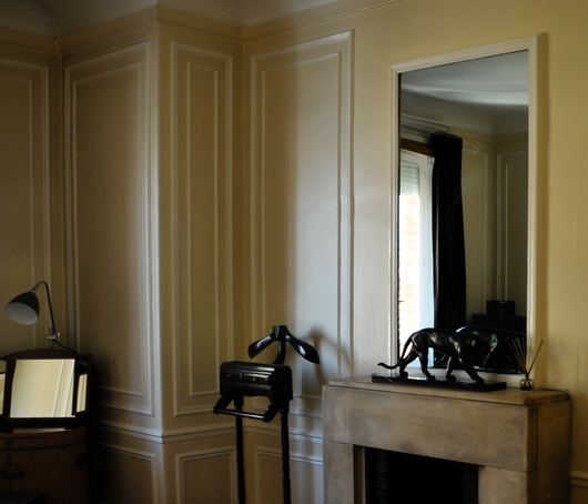
Below: That elegant look of paneling, but look closer and you'll see that it is applied molding - SO easy to do, even diy. Anywhere you can logically frame something will transform the kitchen into....Paris, and don't forget to frame the ceiling and possibly paint sections within the paneling

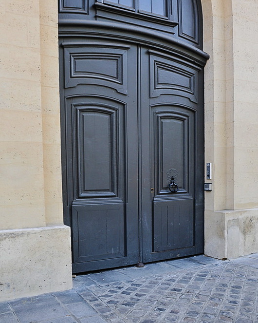
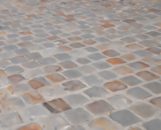
Below: These 3 images below feature a similar color palette, lovely for a kitchen. Again, the cool/warm factor is a natural, and the images show various combinations of lights and dark, each color, allowing the opposite color to pop. To my eye, these are all sophisticated yet easy to use colors in the kitchen. The very dark door MAY be a bit of a trendy color in kitchen cabinets today, but I would like it as a countertop color. Love the blue/gray street!

Below images pertains to the above grouping but is intentionally blurred to remove bad things that happen on the street!

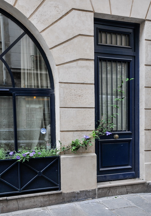
Below: Happy color as seen in the very traditional door design yet viewed as a friendly, casual design element. A color such as this blue can be used in an accent piece in the kitchen which is usually a better choice due to an otherwise potentially overwhelmingly heavy balance. Or, do small pops of color like the great purple color seen in the flowered vine, an analogous color to the navy door and window, but in a light color for added interest and contrast. Love the navy, beige and gray colors in that image.
Look for inspiration anywhere! Start a folder in a project management system of some sort that might be labeled color, inspiration, ideas, design concepts, what I love, whatever makes sense. Or, of course, in pinterest! It's a fabulous way to discover your own, very personal, definition of creativity. It's fun too!


Kips Bay 2012 Kitchen

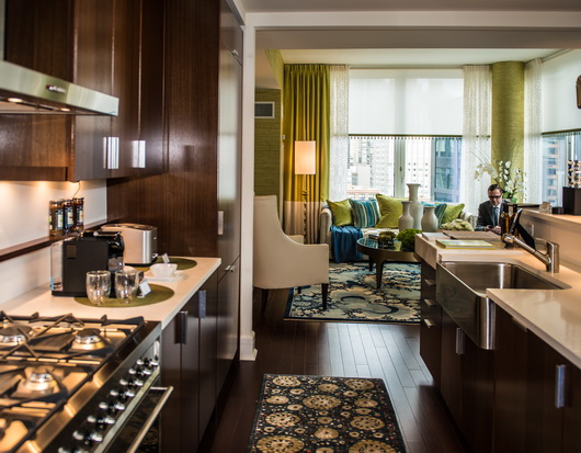
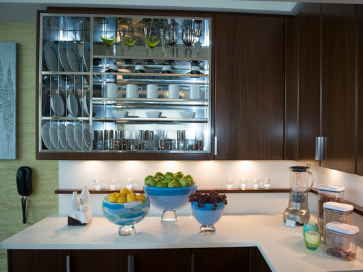
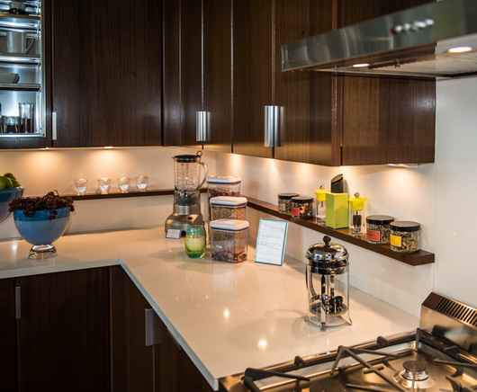
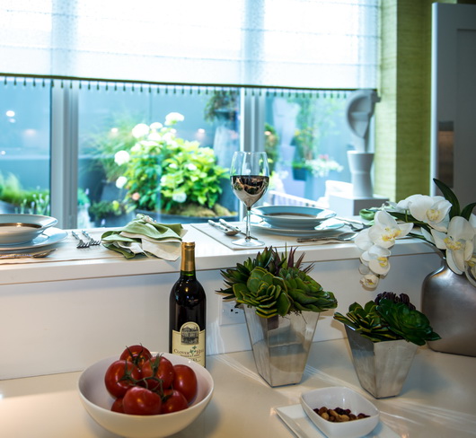
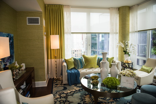
Last month I went to see the Kips Bay Decorators Showhouse in New York City where there were not one, but two great kitchens, and I will feature the second kitchen soon. The walnut species kitchen and living area of this first kitchen were designed by James Rixner, interior designer from New York city. Here are my thoughts on this kitchen!

Below: The view from kitchen to living area. Someone tell me, what's not to like...not much! The kitchen is (relatively) simple, clean, modern, colorful and interesting. What I love is the use of white, seen in the kitchen and in the furnishings. To my eye, the white shade, especially in the kitchen, serves to reflect light, always a good thing in a small space and it also sort of tones down the feeling of formality.

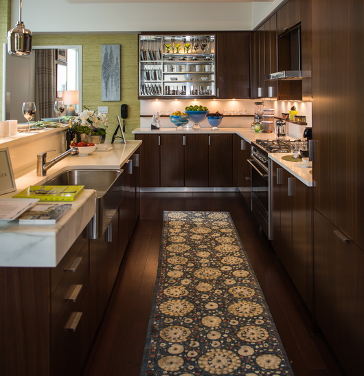
In addition, the seamless white countertop and backsplash allows the space to flow, undisturbed by visual clutter (I'll get to that later.) Less is more is a mantra I always have in my head and having the strong interest of the rug as a patterned visual anchor...on the floor, in this case, is an excellent place to use pattern. I don't think I would have used the stainless steel apron sink, but that is another quibble where there is no right or wrong to attach to it. The rug's connection (and the floor as well) to the living area also makes perfect sense visually. Love.

Below: Here is where I will talk about visual clutter and in one respect, it is a quibble. For those who have not lived in a New York City apartment (among my immediate family, 3 of us lived in NYC apartments for a collective total of 22 years) a few things out of place have a way of pretty much drastically affecting the feeling of spaciousness. To my eye, there are too many accessories in this kitchen. It's also a simple fix to edit the accessories here.

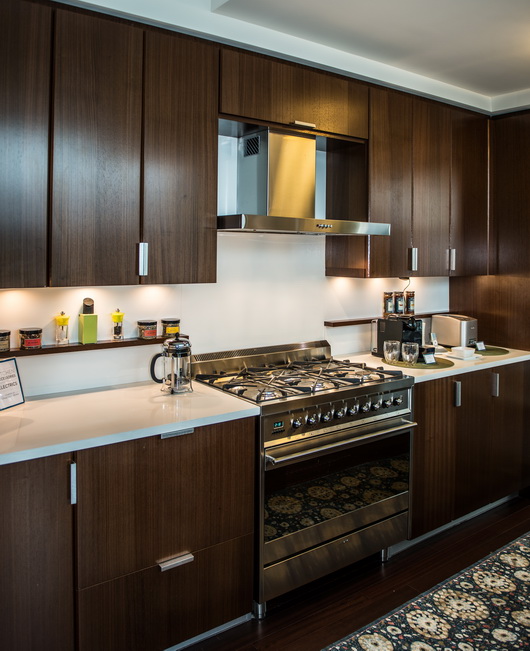
Below: Another quibble - the shelf is so shallow, I would have continued it across range or included a stainless steel shelf of the same dimension. You never know what a coop board will or will not allow, however.

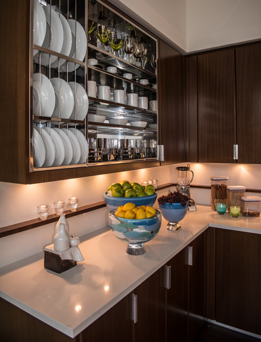
Below: A visually strong feature, I think I would have designed this stunning stainless steel wall cabinet to be in the center of this particular countertop section with an equal amount of wood on each side, probably ending in line with the base cabinet corner, but it's an interesting and creative feature, very much so.

Below: I do really like the shallow wood shelf that runs along the backsplash. It is useful and a great feature, as it is elegant, simple, and just different. I like it.

Below: Another view of the shelf. It works for me. The stainless material throughout in various places ties in beautifully, accentuating a cool/warm feature, allowing each element to "pop."

Below: Yes, it's a narrow ledge for casual dining, but, hey, it's New York City and you are lucky to have that alternative dining spot!

Below: To me, this is near perfect. I'm good with all of it. Too many accessories? Maybe, and that's a quibble.

Below: Warm, stunning, lively, absolutely beautiful.

Below: Love the glass table and love the white. I also love the varying shades of blue and the analogous color scheme.

This kitchen is a beautiful execution with a feeling of elegance, the right amount of comfort and great function. What do you think?


House Beautiful KOTY - And Kids!


By Kelly Serra Donovan

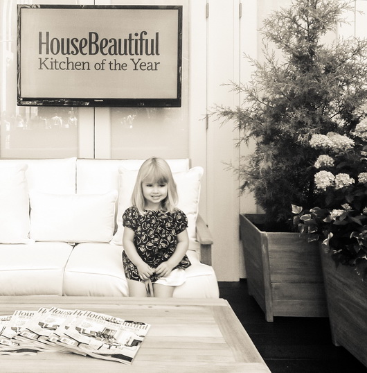
The much anticipated House Beautiful Kitchen of the Year descended upon Rockefeller Center in NYC yesterday.  I was lucky enough to attend, my inaugural visit, and see the fantastic display in person this year.  And, consequently, so were my two daughters, Chloe 3 years and Annabelle 6 months, courtesy of a last minute emergency that kept my childcare unable to come through.

From the moment we clumsily pushed the extra wide double stroller through the gates, we were greeted with nothing short of hospitality and grace, despite the marketing staff most definitely not anticipating a bottle-sucking, mommy-tugging crowd amongst the early visitors to their "press only" debut. Susan sent an email the day before asking if it was ok, with a reply "it's fine with us!" They handled the underage party crashers with aplomb, even doling out an extra name tag so Chloe could rub shoulders with Newell and Mick.
 
This hospitality was tangibly conveyed (over and over again by House Beautiful staff-and others) once we were inside the event, as we instantly felt as if we were in a cherished friend's warm and cozy home.  The wooden ceiling beams and heringbone floors offered a nice contrast to the clean lines, stark shades (save for a rich pop of blue from the beloved Kohler Jonathan Adler Atlantis Sink), and ever so slight industrial edge of the Kitchen of the Year.
 
I'll save the full nuts-and-bolts review for our resident expert, Susan, to follow shortly, but I would certainly be remiss to not shout from the proverbial rooftops my appreciation for the welcome reception and accommodation we received from the House Beautiful staff.
 
Susan here: Oh, and Newell...Kelly and I enjoyed chatting with you and when Chloe, uh, whipped the nametag lanyard against your shins, you didn't skip a beat! :)

As Kelly, Chloe, Annabelle and I departed the event en route to the Bryant Park carousel and lunch, Chloe proudly wore her nametag through the streets of New York (and insisted I keep mine on as well...which I did.) I think House Beautiful just scored a positive brand connection with one member of Gen Z.


Bosch Appliances + BLANCO = The Perfect Couple

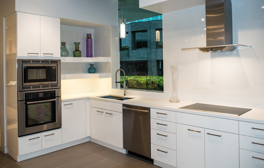
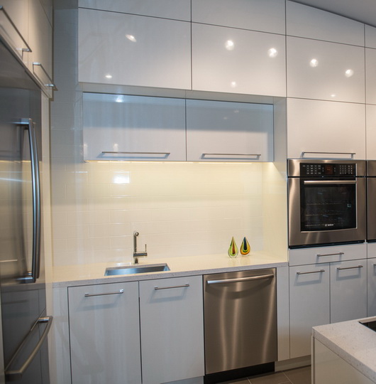
The two German brands, Bosch and Blanco, came together logically and flawlessly throughout the new Bosch, Thermador, and Gaggenau showroom in Irvine, California. I was invited, along with others from the media, to attend the opening of this big, beautiful, state of the art showroom.

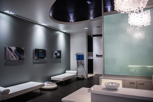
The reception area of the Bosch/Thermador/Gaggenau showroom

Two words: German Engineering. It's immediately apparent how perfectly these two brands go together aesthetically, not to mention their beautiful, precise, engineering-the fit and finish is superb. 

But, here's the thing -  although the Bosch portion of the showroom is quite minimalist and of wholly modern design, if you look past that, it's easy to see that both of these brands' products (most of them) can transition easily and logically to a range of kitchen design themes, from modern to traditional and beyond. Some faucets are more clearly suited to one style or another. Others play very well in a variety of styles.

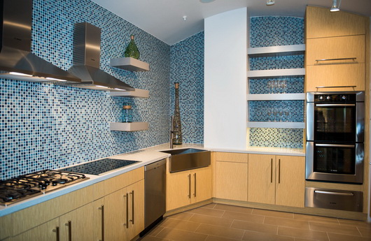
For the price point, you get a WHOLE lot of style, substance, precision and performance. More pretty pictures from this fabulous showroom...
Did you know that Bosch has a slide in range? Allows the design of a clean backsplash

Note the sink cutout - it's interesting to see the sink section. I like that look.
Blanco and Bosch are the happy couple!

Sleek, simply designed built-in appliances

Note the small stainless sink detail surrounding the countertop cutout - cool

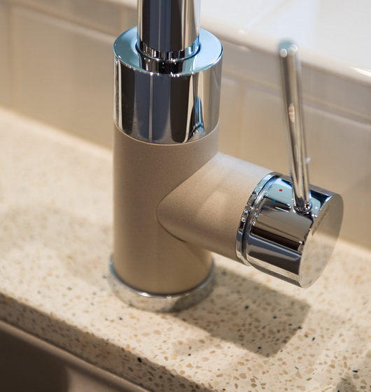
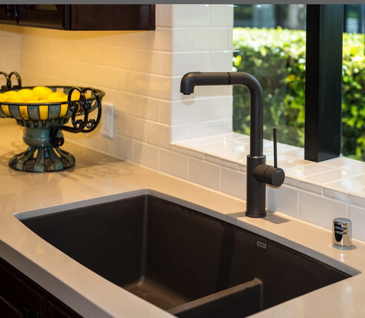
My absolute FAVE combination of Blanco faucet finishes and I love Blanco's silgranite sink-talk about performance!

Perfection in the details

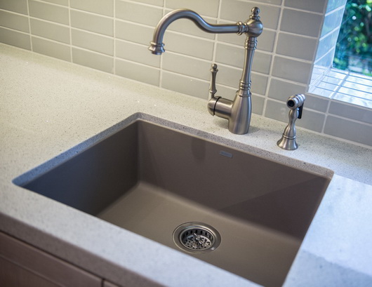
Try this combination - Truffle (color) and a traditional Blanco faucet

I always love a cooktop and under cabinet oven combination-so elegant

Note the lower divider in the sink and the rich, beautiful, faucet finish

A combination kitchen/display area for multiple appliances

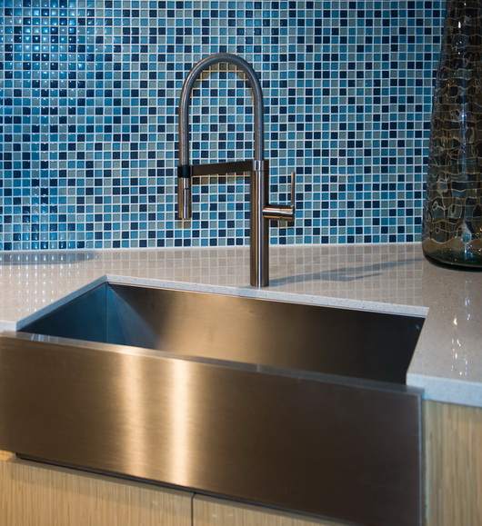
Yes, Blanco does a stainless apron sink + the beautiful, sculptural Culina faucet

Can you see the quality shine through in these pictures?